Exciting Graphs for Boring Maths
Understanding style options available in Seaborn that can enhance your explanatory graphs and other visuals.
Introduction
Welcome to my blog! Today, I will be discussing ways to leverage Seaborn (I will often use the ‘sns’ abbreviation later on) into spicing up python visuals. Seaborn [and Matplotlib – abbreviated as ‘plt’] are powerful libraries that can enable anyone to swiftly and easily design stunning and impressive visuals that can tell interesting stories and inspire thoughtful questions. Today, however, I would like to shift the focus to a different aspect of data visualizations. I may one day (depending on when this is read – maybe it happened already) write about all the amazing things Seaborn can do in terms of telling a story, but today that is not my focus. What inspired me to write this blog is that all my graphs used to all be… boring. Well, I should qualify that. When I use Microsoft Excel, I enjoy taking a “boring” graph and doing something exciting like putting neon colors against a dark background. In python, my graphs tend to be a lot more exciting in terms capability in describing data but were boring visually. They were all in like red, green, and blue against a blank white background. I bet a lot of readers out there may know some ways to spice up graphs by enhancing aesthetics but I would like to discuss that very topic today for any readers who may not really know these options are available (like I didn’t at first) and hopefully, even provide some insights to more experienced python users. Now, as a disclaimer: this information can all be found online in Seaborn documentation, I’m just reminding some people it’s there. Another quick note: Matplotlib and Seaborn go hand in hand but this blog will focus on Seaborn. I imagine at times it will be implied that you may or may not also need Matplotlib. Okay, let’s go!
Plan
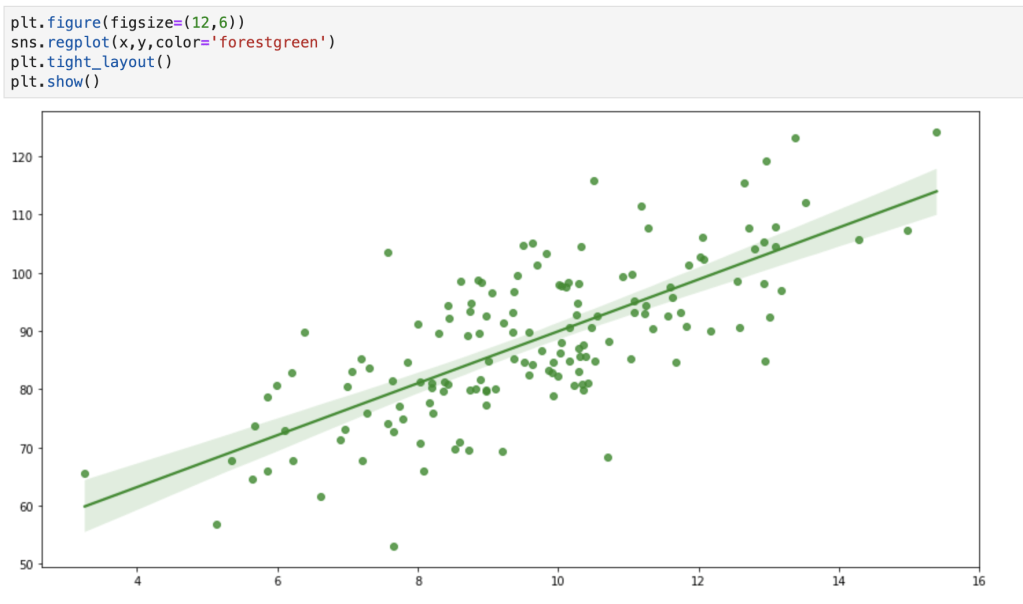
First of all, I found the following image at this blog: https://medium.com/@rachel.hwung/how-to-make-elegant-graphs-quickly-in-python-using-matplotlib-and-seaborn-252344bc7fcf. It’s not exactly a comprehensive description of what I plan to discuss today, but let me use it as an introduction to give you an understanding of some of the style options available in a graph.
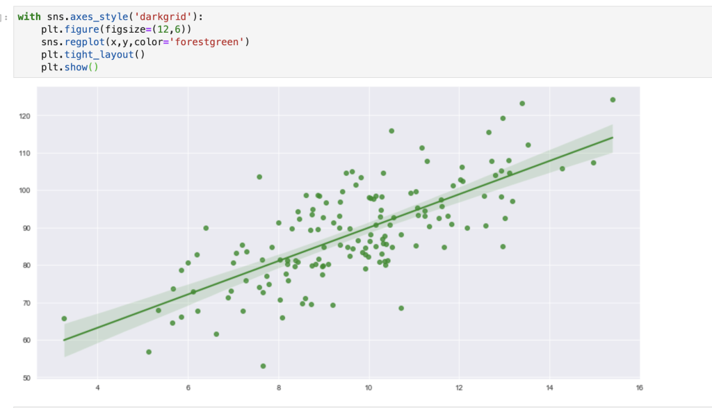
(I hope you are comfortable with scatter plots and regression plots). The plan here is to go through all the design aesthetics functions in Seaborn (in particular – style options) and talk about how to leverage them into spicing up data visualizations. One quick note here: I like to use the ‘with’ word in python as this does not change all my design aesthetics for my whole notebook, just that one visual or set of visuals. In other words – if you don’t write ‘with’ your changes will be permanent. Let me show you what I mean:
It may be annoying to always add the with keyword, so you obviously can just set one style for your whole notebook. I’ll talk about what happens when you want to get rid of that style later on.
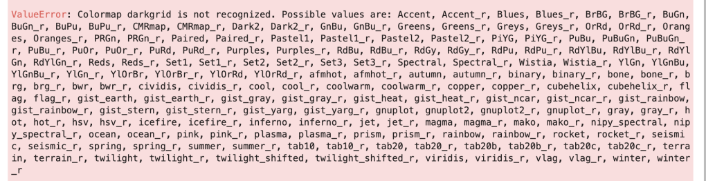
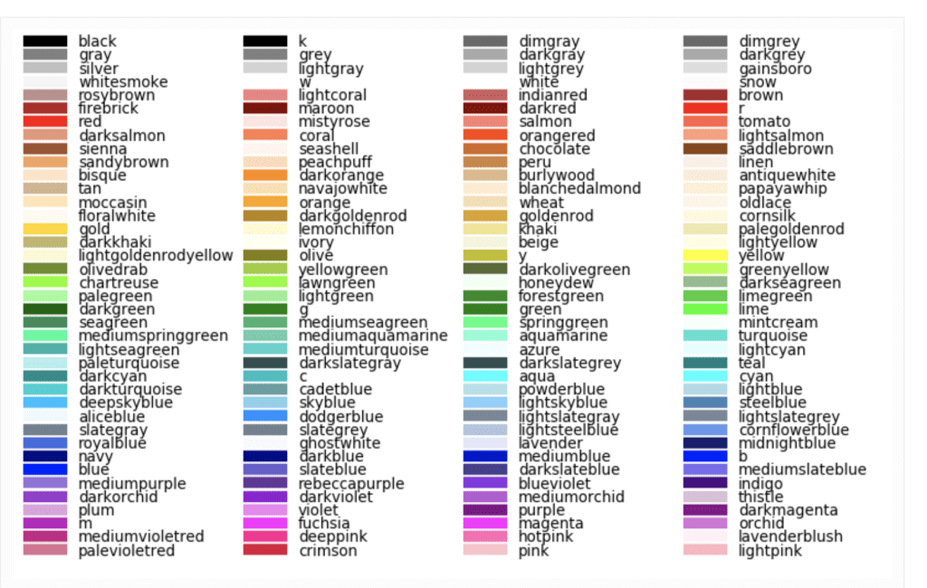
One more note: You may notice I added a custom color. Below I have included every basic python color and color palette (at least, I think I have). I’m fairly certain you can create custom colors but that is beyond the scope of this blog (I may blog bout that some other time and that very blog may already exist depending on when this is read, so keep your eyes open). The reason that the color palettes are in an error message is to give any reader a trick to remember them all. If you use an incorrect color palette (which will be discussed shortly), then python will give you your real options. I really like this feature. Just keep in mind that some of these, like ‘Oranges,’ go on past the end of the line, so make sure that doesn’t confuse you. You may also notice that every palette has a ‘normal’ color and a second ‘normal_r’ color. Look at ‘Blues’ and ‘Blue_r,’ for example. All it means is that the colors are reversed. I’m not familiar with Blues, but if it were to start with light blue and move toward dark blue, I imagine the reverse would start at dark and move to light. Color palettes sometimes can be ineffective if you don’t need (or don’t want) a wide range of colors. Example: my graph above of a regression plot. In the case that color palettes are of little value, I have provided the names of colors as well.
Okay, let’s start!
sns.reset_defaults()
This is probably the easiest one to explain. If you have toyed with your design aesthetic settings, this will reset everything.
sns.reset_orig()
This function looks similar to the one above but is slightly different in its effect. According to the Seaborn documentation, this function resets all style but keeps any custom rcParams. To be honest, I tried to put this in action and see how it was different than reset_defaults( ). I was not very successful. In case you want to learn more about what rcParams are, check out this link: https://matplotlib.org/3.2.2/users/dflt_style_changes.html. I think rc stands for ‘Run & Configure.’ I’ll need to investigate this further. If any readers understand this and how it is different from reset_defaults(), please feel free to reach out.
sns.set_color_codes()
This one is quick but interesting. My understanding is that it allows you to control how Matplotlib colors are interpreted. Let me show you what I mean:
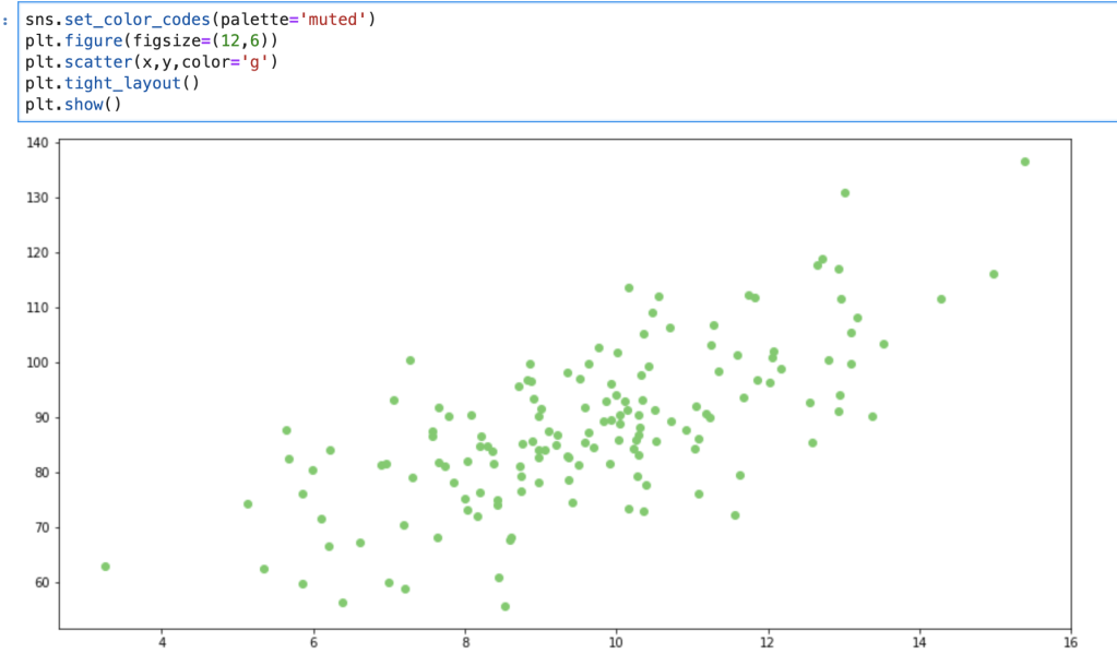
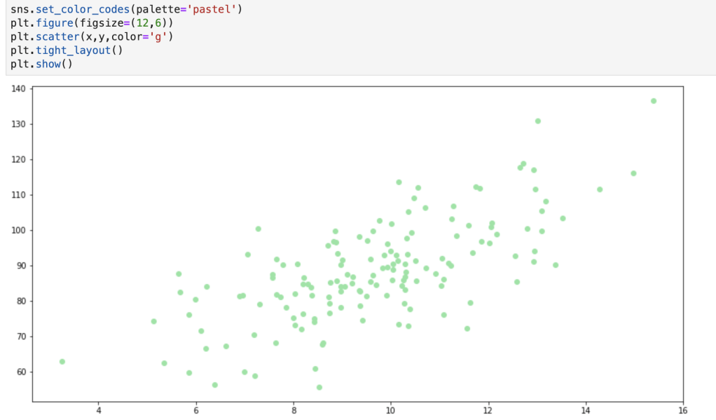
The change above is subtle, but can be effective, especially if you add further customizations. In total, color code options include: deep, muted, pastel, dark, bright, and colorblind.
I’d like to record a quick realization here: while writing this blog I learned that there are also many Matplotlib customization options that I didn’t know of before and, while that is beyond the scope of this blog, I may write about that later (or have already written about it depending on when this blog is being read). I think the reason I never noticed this is because, and I’m just thinking out loud here, I only ever looked at the matplotlib.pyplot module and never really looked at modules like matplotlib.style. I’m wondering to myself now if the main virtue of Seaborn (as opposed to Matplotlib) is that Seaborn can generate more descriptive and insightful visuals as opposed to ones with creative aesthetics.
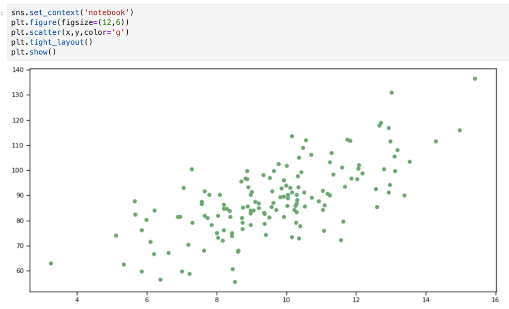
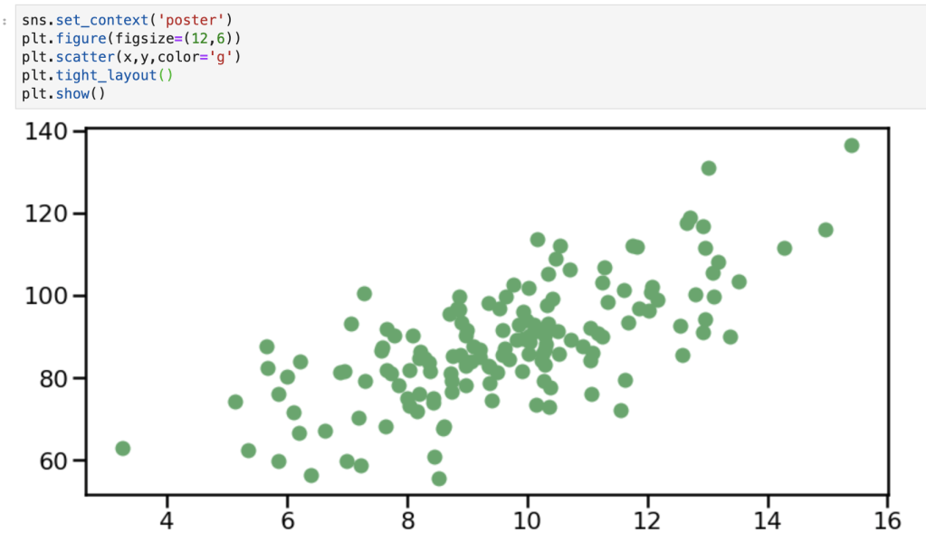
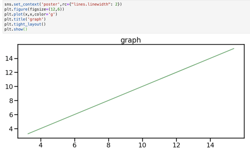
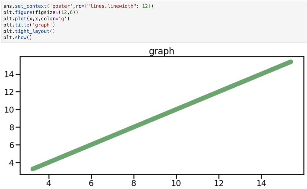
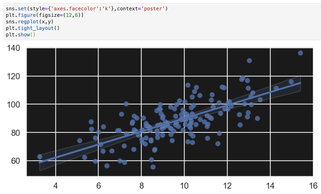
sns.set_context()
This one is very similar to one yet to be discussed. Anyways, to quote the documentation: “This affects things like the size of the labels, lines, and other elements of the plot, but not the overall style.” There are 4 default contexts: talk, paper, notebook and poster. This function also (can) take the following parameters: context (things like paper or poster), font_scale (making the font bigger or smaller), and rc (a dictionary of other parameters discussed earlier used “to override the values in the preset [S]eaborn context dictionaries” according to the documentation). Here are some visuals:
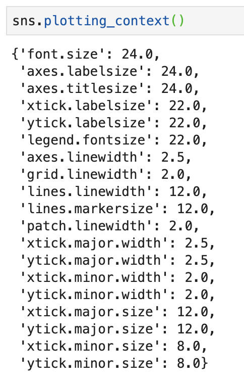
sns.plotting_context()
This function has the same basic application as the one above and even has the same parameters. However, as will be the trend with other topics, by typing the function above you will actually get a return value. To be clear, by typing sns.plotting_context() (I’ll have a visual) you will get a return value of a dictionary that provides you with all the rcParams available for plotting context. So not only can you set a context, but you can also see your options if you forget what’s available. One difference I have found between this function and the one above is that this one works (maybe only works?) with something like the ‘with’ keyword as opposed to the one before which functions independently of that keyword. (I’ll need to do some more research here). In any case, we’re going to see another dictionary later, but here is our first one.
sns.set_style()
I’m going to skip this, you’ll understand why.
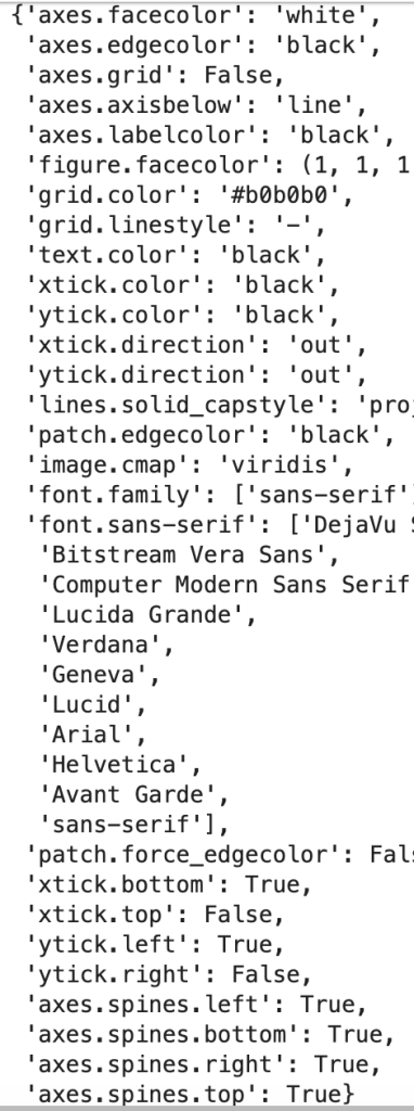
sns.axes_style()
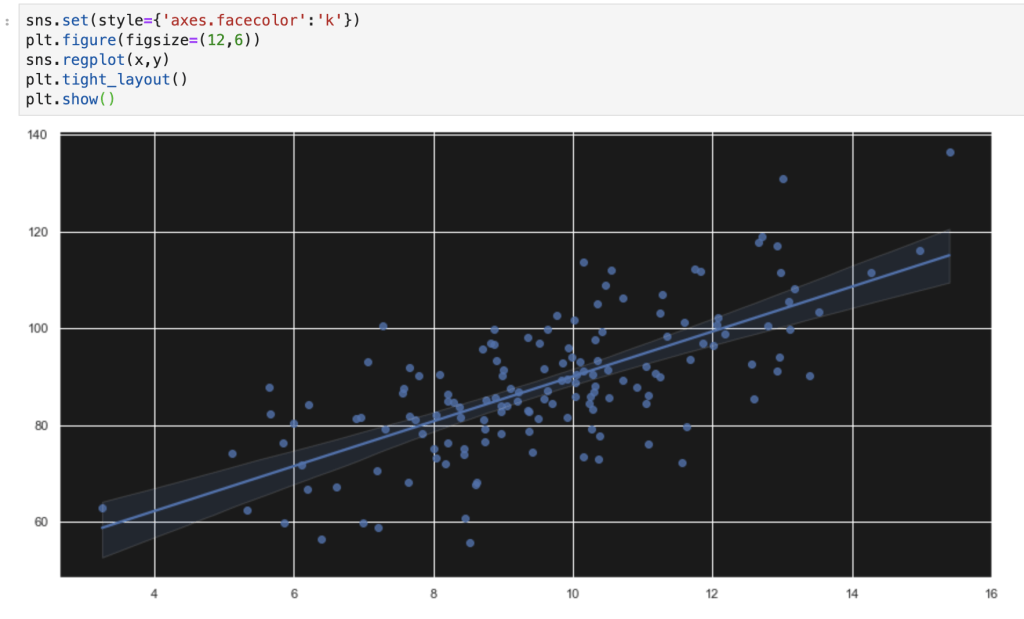
The two functions listed above basically work together in the same way that set context and plotting context do. The default options for setting an axes style are: darkgrid, whitegrid, dark, white, and ticks. In addition, in the axes_style version, you can just enter sns.axes_style() to return a dictionary of all your additional options. If you look back at the regplots at the beginning of the blog you may notice that I leveraged the darkgrid option and I encourage you to scroll back up to see it in action.
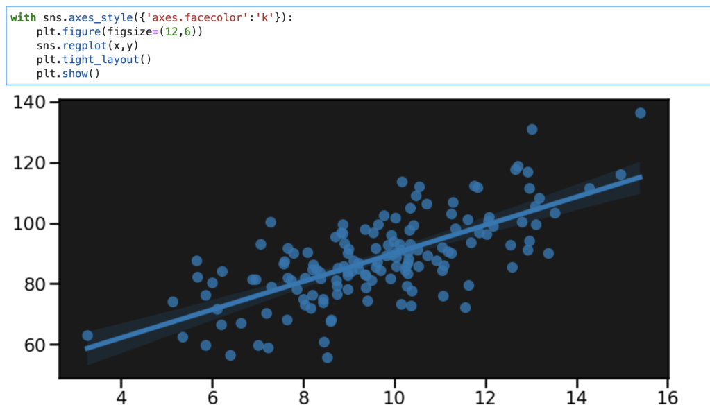
All I did in the graph above was set a black background, but now the graph looks far more exciting and catchy than any of the ones above.
I’d like to record another thought here. It really does seem that the ‘with’ keyword only works with some functions as described above. Unless I am missing some key point, I find it works with things like axes_style and plotting_context but not set_style and set_context. I’m going to have to dive deeper into what that means about the functions and how they are different.
sns.set()
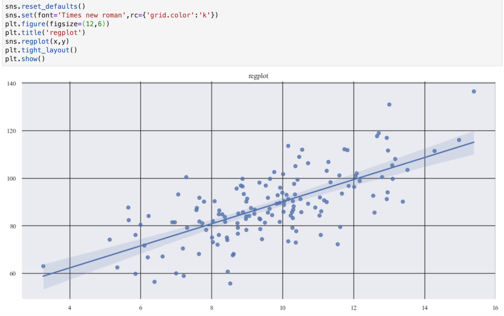
Today’s blog is about style options and this is the last one to cover (although I didn’t really go in any particular order). I think that this function is a bit of a catch-all. The parameters are: context, style, palette, font, font_scale. The documentation says that context and style correspond to the parameters in the axes_style and plotting_context ‘dictionaries’ cited above. I’d like to also look at the palette option. I alluded to this earlier in the blog with all the available color palettes. In the documentation color palette is not part of the style options. I would still encourage using the (with) sns.color_palette() function (that can use the ‘with’ keyword) to be able to set interesting color palettes like the ones listed above. It appears that this function (back to sns.set()) doesn’t easily work with the ‘with’ keyword. Also, the color_codes parameter is a true-false value, but it’s not entirely clear to me how it works. Here’s what the documentation says: ‘If True and palette is a Seaborn palette, remap the shorthand color codes (e.g. “b”[lue], “g[reen]”, “r[ed]”, etc.) to the colors from this palette.’ I found this link for all the fonts available for Seaborn / Matplotlib: http://jonathansoma.com/lede/data-studio/matplotlib/list-all-fonts-available-in-matplotlib-plus-samples/. When I provide some visuals, I encourage you to pay attention to how I enter the font options.
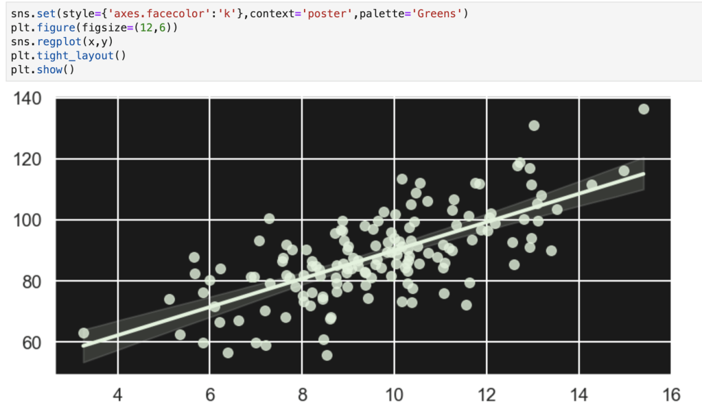

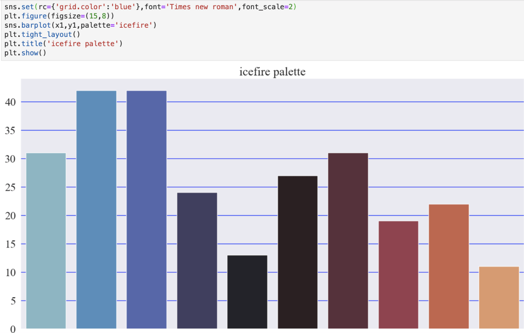

You may notice how I added the palette in the function that makes the graph. Yes, it is an option. However, if you want to make a lot of graphs it can be inefficient. I suppose one interesting option would be to create a list of palettes and just loop through them if you want to keep mixing things up.
Conclusion
Creating visuals to tell a story or identify a trend is exciting and important to data science inquiries. If this is indeed the case, why not make your visuals catchy and exciting? People are drawn to things that look ‘cool.’ In addition, while I know the focus in this blog was on style, we did briefly explore color options. I found this blog that quickly talks about strategically planning how you use colors and color palettes in your visuals: https://medium.com/nightingale/how-to-choose-the-colors-for-your-data-visualizations-50b2557fa335. Like I said, though, the focus here has been on style options. Writing this blog has been a bit of a learning experience for me as well. I have realized that there are a lot more options to spice up graphs and make them more interesting and meaningful. For example, I probably haven’t taken full advantage of all the options available in Matplotlib and its various modules. I’m going to have to do more research on various topics and possibly update and correct parts of my blog post here, but I think this is a good starting point.
Thanks for reading and have a great day.
By the way… here’s some graphs I made using Matplotlib and Seaborn: