Imposing data balance in order to have meaningful and accurate models.
Introduction
Thanks for visiting my blog today!
Today’s blog will discuss what to do with imbalanced data. Let me quickly explain what I’m talking about for all you non-data scientists. If I am screening people too see if they have a disease and I accurately screen every single person (let’s say I screen 1000 people total). Sounds good, right? Well, what if I told you that 999 people had no issues and I predicted them as not having a disease. The other 1 person had the disease and I got it right. This clearly holds little meaning. In fact, I would basically hold just about the same level of overall accuracy if I had predicted this diseased person to be healthy. There was literally one person and we don’t really know if my screening tactics work or I just got lucky. In addition, if I were to have predicted this one diseased person to be healthy, then despite my high accuracy, my model may in fact be pointless since it always ends in the same result. If you read my other blog posts, I have a similar blog which discusses confusion matrices. I never really thought about confusion matrices and their link to data imbalance until I wrote this blog, but I guess they’re still pretty different topics since you don’t normally upsample validation data, thus giving the confusion matrix its own unique significance. However, if you generate a confusion matrix to find results after training on imbalanced data, you may not be able to trust your answers. Back to the main point; imbalanced data causes problems and often leads to meaningless models as we have demonstrated above. Generally, it is thought that adding more data to any model or system will only lead to higher accuracy and upsampling a minority class is no different. A really good example of upsampling a minority class is fraud detection. Most people (I hope) aren’t committing any type of fraud ever (I highly recommend you don’t ask me about how I could afford that yacht I bought last week). That means that when you look at something like credit card fraud, the majority of the time a person makes a purchase, their credit card was not stolen. Therefore, we need more data on cases when people are actually the victims of fraud to have a better understanding of what to look for in terms of red flags and warning signs. I will discuss two simple methods you can use in python to solve this problem. Let’s get started!
When To Balance Data
For model validation purposes, it helps to have a set of data with which to train the model and a set with which to test the model. Usually, one should balance the training data and leave the test data unaffected.
First Easy Method
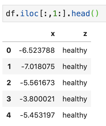
Say we have the following data…
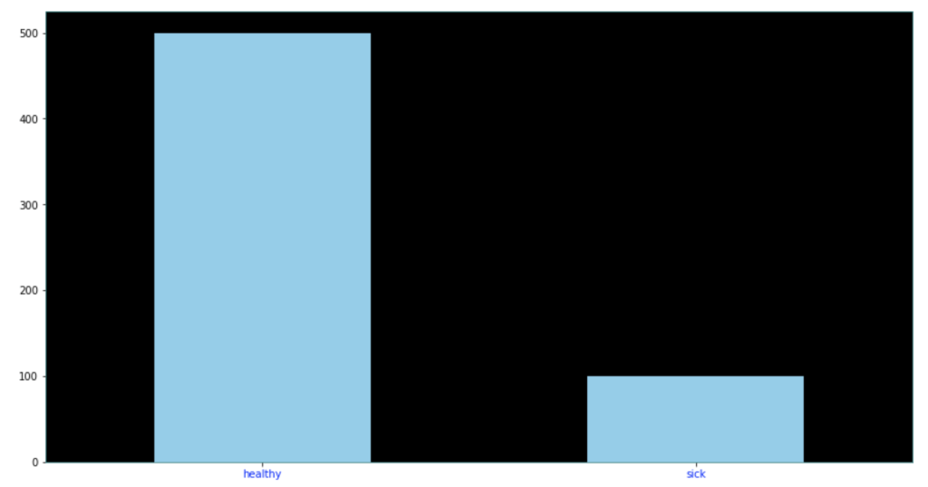
Target class distributed as follows…
The following code below allows you to extremely quickly decide how much of each target class to keep in your data. One quick note is that you may have to update the library here. It’s always helpful to update libraries every now and then as libraries evolve.
Look at that! It’s pretty simple and easy. All you do is decide how many of each class to keep. After that, a certain number of rows resulting in one target feature outcome and a certain number of rows resulting in an alternative target feature outcome remain. The sampling strategy states how many rows to keep from each target variable. Obviously you cannot exceed the maximum per class, so this can only serve to downsample, which is not the case with our second easy method. This method works well when you have many observations from each class and doesn’t work as well when one class has significantly less data.
Second Easy Method
The second easy method is to use resample from sklearn.utils. In the code below, I decided to point out that I was using train data as I did not point it out above. Also in the code below, I generate new data of class 1 (sick class) and artificially generate enough data to make it level with the healthy class. So all the training data stays the same, but I repeat some rows from the minority class to generate that balance.
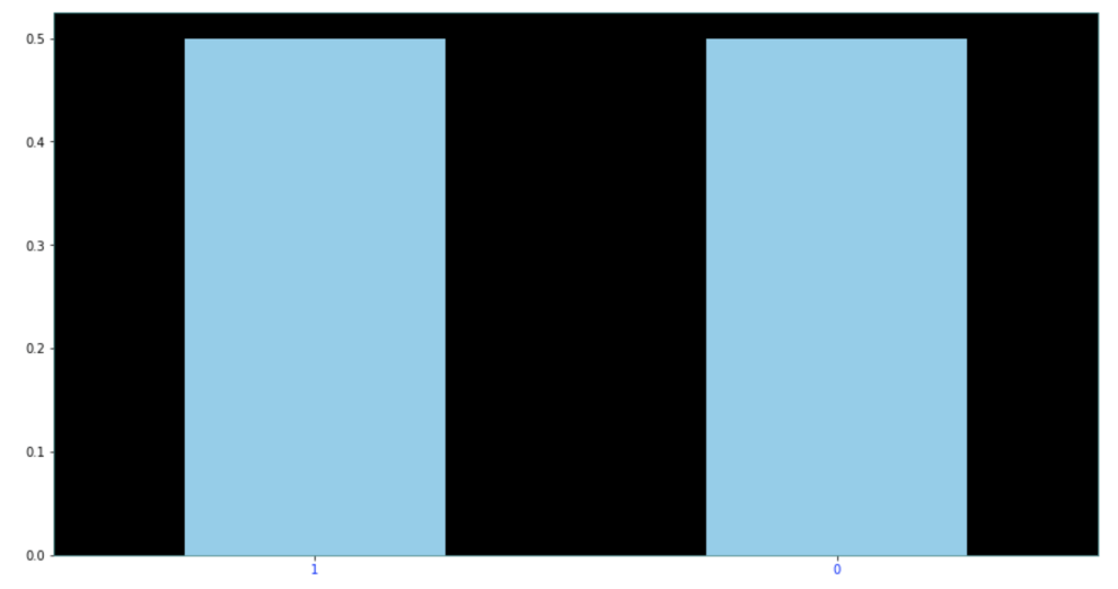
Here are the results of the new dataset:
As you can see above, each class represents 50% of the data. This method can be extended to cases with more than two classes quite easily as well.
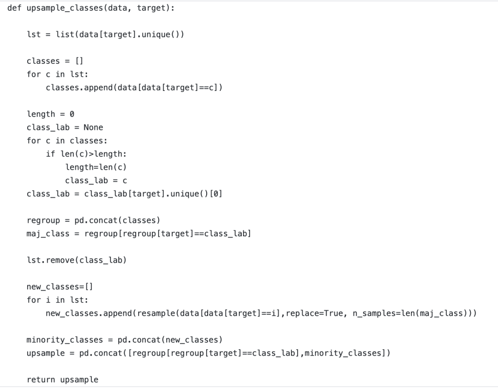
Update!
If you are coming back and seeing this blog for the first time, I am very appreciative! I recently worked on a project that required data balancing. Below, I have included a rough but good way to create a robust data balancing method that works well without having to specify the situation or context too much. I just finished writing this function but think it works well and would encourage any readers to take this function and see if they can effectively leverage it themselves. If it has any glitches, I would love to hear feedback. Thanks!
Conclusion
Anyone conducting any type of regular machine learning modeling will likely need to balance data at some point. Conveniently, it’s easy to do and I believe you shouldn’t overthink it. The code above provides a great way to get started balancing your data and I hope it can be helpful to readers.
Recently, I was introduced to an interesting library geared toward building fast and accurate machine learning models using a library called AutoGluon. I don’t claim credit for any of the fancy backend code or functionality. However, I would like to use this blog as an opportunity to quickly introduce this library to anyone (and I imagine that includes most people who are data scientists) and show a quick modeling process. A word I used twice in the past sentence was “quick.” As we will see, that is the one of the best parts of AutoGluon.
Basic Machine Learning Model
In order to evaluate whether AutoGluon is of any interest to me (or my readers), I’d like to first discuss what I normally want from an ML model. For me, outside of things like EDA, hypothesis testing, or data engineering, I am mainly looking for two things at the end of the day; I want the best possible model in terms of accuracy (or recall or precision) and also want to look at feature importances as that is often where the interesting story lies. How we set ourselves up to have a good model that can accomplish these two tasks in the best way possible is another story for another time and frankly it would be impossible to tell that entire story in just one blog.
An autogluon Model Walkthrough
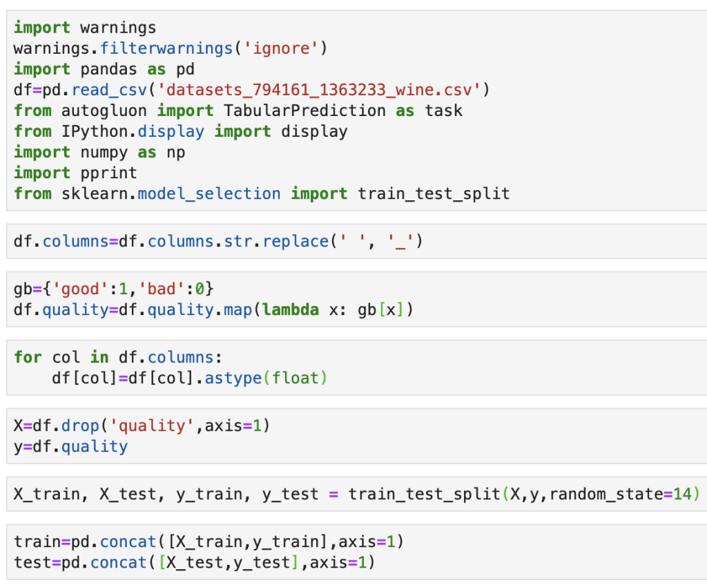
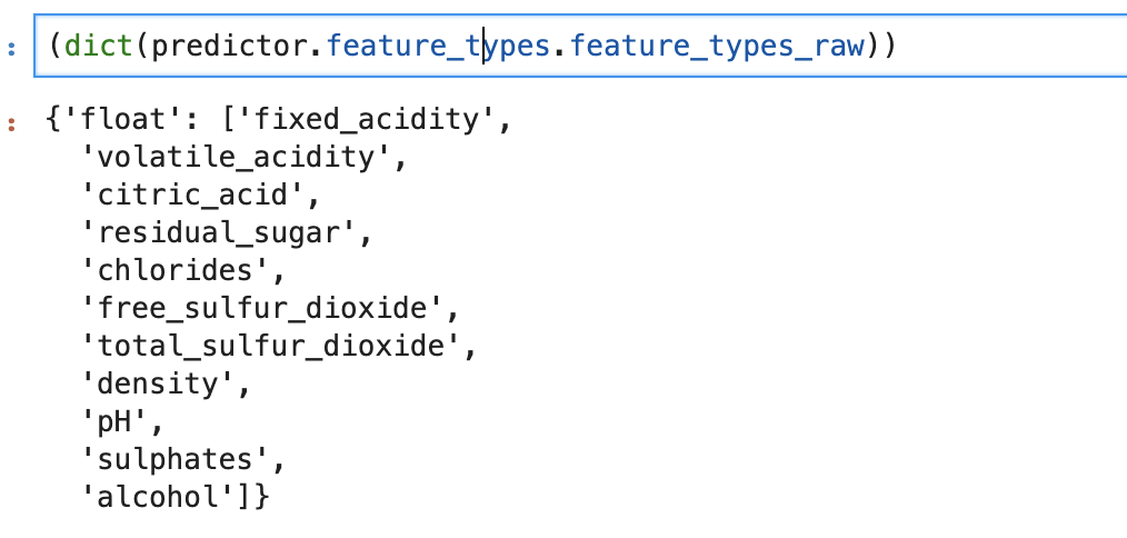
So let’s see this in action. I will link the documentation here before I begin: (https://autogluon.mxnet.io/). Feel free to check it out. Like I said, I’m just here today to share this library. First things first though: my data concerns wine quality using ten predictive features. These features are citric acid, volatile acidity, chlorides, density, pH level, alcohol level, sulphates, residual sugar, free sulfur dioxide, and residual sulfur dioxide. It can be found at (https://www.kaggle.com/uciml/red-wine-quality-cortez-et-al-2009). This data set actually appears in my last blog on decision trees.
Ok, so the next couple lines are fairly standard procedure, but I will explain them:
Basically, I am loading all my functions, loading my data, and splitting my data into a set for training a model and a set for validating a model.
Here comes the fun stuff:
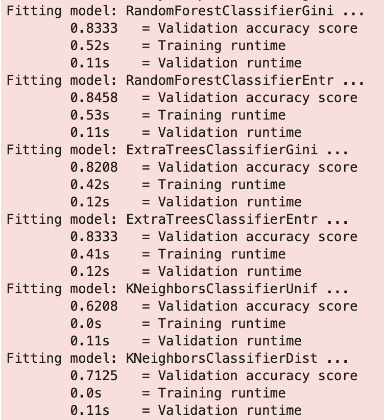
So this looks pretty familiar to a data scientist. We are fitting a model on data and passing the target variable to know what is being predicted. Here is some of the output:
That was fast. We also what models worked best.
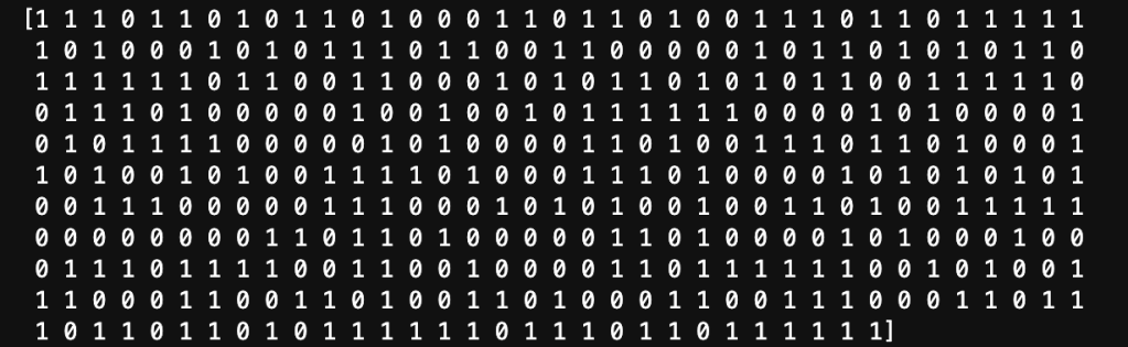
Now let’s introduce new data:
Output:
Whoa is right, it looks we just entered The Matrix. Ok… this is really not that complex, so let’s just take one more step:
Output:
Ok, now that makes a bit more sense.
We can even look backward and check on how autogluon interpreted this problem:
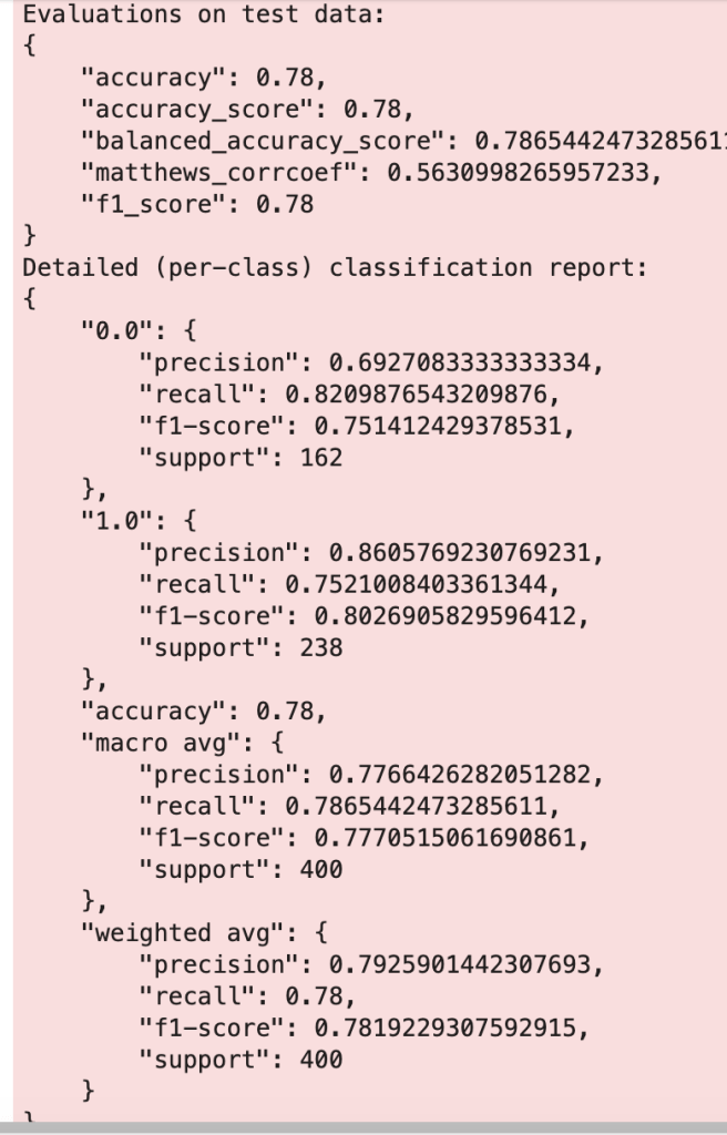
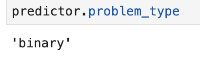
We have a binary outcome of 0 or 1 containing features that are all floats (numbers that are not necessarily whole).
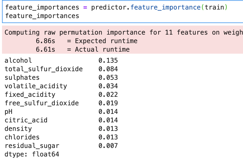
What about feature importance?
So we see our feature importances above, and run time also. This library is big on displaying run times.
Conclusion
AutoGluon is an impressive python library that can accomplish many different tasks in a short amount of time. You can probably optimize your results by doing your cleaning and preprocessing, I would imagine. Whether this means upsampling a minority class or feature selection, you still have to do some work. However, if you are looking for a quick and powerful library, AutoGluon is a great place to start.
Understanding how to build a decision tree using statistical methods.
Introduction
Thanks for visiting my blog today!
Life is complex and largely guided by the decisions we make. Decisions are also complex and are usually the result of a cascade of other decisions and logic flowing through our heads. Just like we all make various decision trees in our heads (whether we actively think about them or not) to guide our decisions, machines can also leverage a sequence of decisions (based on logical rules) to come to a conclusion. Example: I go to a Blackhawks game. The Blackhawks are tied with 2 minutes left. It’s a preseason game. Do I leave early to avoid the parking lot they call “traffic” and catch the rest on TV or radio, or do I stay and watch a potential overtime game (which is always exciting). There’s nothing on the line for the Blackhawks (and therefore their fan base) but I paid money and took a chunk of time out of my day to see Patrick Kane light up the scoreboard and sing along to Chelsea Dagger. There are few experiences that are as exciting as a last second or overtime / extra-time game winning play and I know from past live experience. Nevertheless, we are only scratching the surface of what factors may or may not be at play. What if I am a season ticket holder? I probably would just leave early. What if I come to visit my cousins in Chicago for 6 individual (and separate) weeks every year? I might want to stay as it’s likely that some weeks I visit there won’t even be a game. Right there, I built a machine learning model in front of your eyes (sort of). My de-facto features are timeInChicago, futureGamesAttending, preseasonSeasonPosteason, timeAvailable, gameSituation. (These are the ones I made up after looking back at build-up to this point and think they work well – I’m sure others will think of different ways to contextualize this problem). My target feature can be binary; stay or leave. It can also be continuous; time spent at game. It can also be multi-class; periods stayed in (1, 2, or 3). This target feature ambiguity can change the problem depending on one’s philosophy. Whether you realize this or not, you are effectively creating a decision tree. It may not feel like all these calculations and equations are running through your head and you may not even take that long or incur that much stress when making a decision, but you’re using that decision tree logic.
In today’s blog we are going to look at the concepts surrounding a decision tree and discuss how they are built and make decisions. In my next blog in this series (which may or may not be my next blog I write), I will take the ideas discussed here and show an application on real-world data. Following that, I will build a decision tree model from scratch in python. The blog after that will focus on how to take the basic decision tree model to the next level using a random forest. After that blog, I will show you how to leverage and optimize decision trees and random forests in machine learning models using python. There may be more on the way, but that’s the plan for now.
I’d like to add that I think I’m going to learn a lot myself in this blog as it’s important, especially during a job interview, to explain concepts. Many of you who may know python may know ways to quickly create and run a decision tree model. However, in my opinion, it is equally as important (if not more) to understand the concepts and to be able explain what things like entropy and information gain are (some main concepts to be introduced later). Concepts generally stay in place, but coding tends to evolve.
Let’s get to the root of the issue.
How Do We Begin?
It makes sense that we want to start with the most decisive feature. Say a restaurant only serves ribeye steak on Monday. I go to the restaurant and have to decide what to order, and I really like ribeye steak. How do I begin my decision tree? The first thing I ask myself is if it’s Monday or not. If it’s Monday, I will always get the steak. Otherwise, I won’t be able to order that steak. In the non-Monday universe, aka the one where I will be guaranteed to not get the steak, the whole tree changes when I pick what to eat. So we want to start with the most decisive features and work our way down to the least decisive features. Sometimes the trees will not have the same branches at the same time. Say the features (in this restaurant example) are day of the week, time of day, people with me eating, and cash in my pocket. Now I really like steak. So much so that every Monday I am willing to spend any amount of money for the ribeye steak (I suppose in this example, the cost is variable). For other menu items, I may concern myself with price a bit more. Price doesn’t matter in the presence of value but becomes a big issue in the absence of value. So, in my example: money in pocket will be more decisive in the non-Monday example than the Monday example and therefore find itself at a different place in the tree. The way this presents itself in the tree is that 100% of the times it is Monday and I have the cash to pay for the steak I will pay for it and 100% of the time I don’t quite have enough in my pocket I will have to find some other option. That’s how we start each branch of the tree, starting with the first branch.
How Do We Use Math To Solve This Problem?
There’s a couple ways to go about this. For today, I’d like to discuss gini (pronounced the same as Ginny Weasley from Harry Potter). Gini is a measure of something called impurity. Most of the time, with the exception of my Monday / steak example, we don’t have completely decisive features. Usually there is variance within each feature. Impurity is the amount of confusion or lack of clarity in the decisiveness of a feature. So if we have a feature that has around 50% of the occurrences resulting in outcome 1 and 50% resulting in outcome 2, we have not learned anything exciting. By leveraging the gini statistic, we can understand which of our features is least impure and start the tree with that feature and then continue the tree by having the next branch be whatever is least impure in reference to the previous branch. So here is the equation we have all been waiting for:
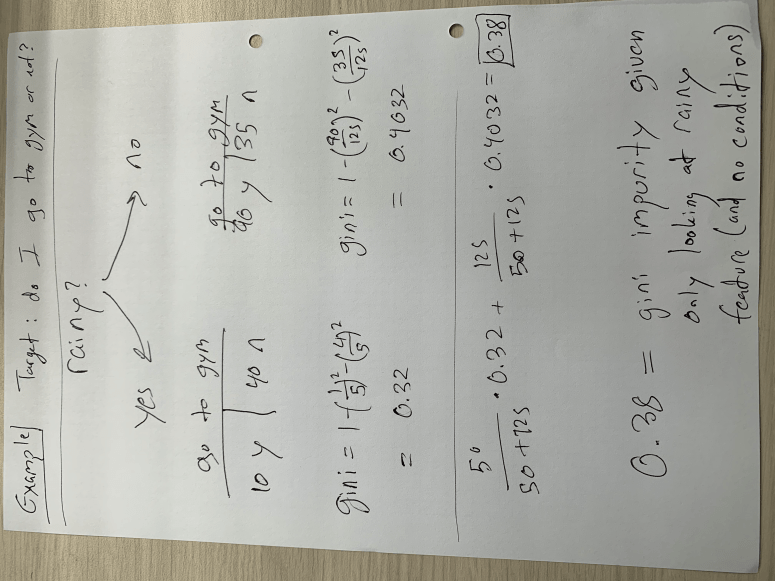
Here’s a quick example, and then I’ll get back to the equation (I apologize for the rotation):
In the example above, I only compare the target feature to whether it’s rainy or not. There is no conditional probability here on things like time of day or day of week. This implies that we are at (or deciding) the top of the tree and seeing if raininess is as strong a predictive feature as other ones. We see that if we assume it is rainy, our gini impurity, as measured by one minus the probability of yes and the probability of no (both squared), sits around 0.32. If it is not a rainy day, the gini impurity is a bit higher, meaning we don’t have as much clarity as to whether or not I will go to the gym. In the weighted average result of 0.38, we see that this number is close to 0.4 than 0.32 because most days are not rainy days. In my opinion, using this data generated on the spot for demonstration purposes, the gini impurity for raniness is quite high and therefore would not sit at the top of the tree. It would be a lower branch. This concept is not exclusive to the binary choice, however it presents itself differently in other case. Say we want to know if I go to the gym based on how much free time I have in my day and my options include a range of numbers such as 60 minutes, 75 minutes, 85 minutes, and other values. To decide how we split the tree, we create “cutoff” points (corresponding to each value – so we create a cutoff at over 67.5 minutes and below 67.5 minutes followed by testing the next cutoff at over 80 minutes and below 80 minutes) to find the “cutoff” point with the least impurity. In other words, if we assume that the best way to measure whether I go or not is by deciding if I have more than 80 minutes free or less than 80 minutes free, than the tree goes on to ask if I have more than 80 minutes or less than 80 minutes. I also think this means that the cutoff point can change in different parts of the tree. For example, the 80 minute concept may be important on rainy days but I may go to the gym even with less free time on sunny days. Note that the cutoff always represents a binary direction forward. Basically we keep following the decision tree down using gini as a guide until we get to the last feature. At that point we just use the majority to decide.
Conclusion
Decision trees are actually not that complex, they can just take a long time when you have a lot of data. This is great to know and quite comforting considering how fundamental they implicitly are to everyday life. If you’re ever trying to understand the algorithm, explain it in an interview, or make your own decision tree (for whatever reason…), I hope this has been a good guide.
Effectively Predicting the Outcome of a Shark Tank Pitch
yikes
Introduction
Thank you for visiting my blog today!
Recently, during my quarantine, I have found myself watching a lot of Shark Tank. In case you are living under a rock, Shark Tank is a thrilling (and often parodied) reality TV show (currently on CNBC) where hopeful entrepreneurs come into the “tank” and face-off against five “sharks.” The sharks are successful entrepreneurs who are basically de-facto venture capitalists looking to invest in the hopeful entrepreneurs mentioned above. It’s called “Shark Tank” and not something a bit less intimidating because things get intense in the tank. Entrepreneurs are “put through the ringer” and forced to prove themselves worthy of investment in every way imaginable while standing up to strong scrutiny from the sharks. Entrepreneurs need to demonstrate that they have a good product, understand how to run a business, understand the economic climate, are a pleasant person to work with, are trustworthy, and the list goes on and on. Plus, contestants are on TV for the whole world to watch and that just adds to the pressure to impress. If one succeeds, and manages to agree on a deal with a shark (usually a shark pays a dollar amount for a percentage equity in an entrepreneur’s business), the rewards are usually quite spectacular and entrepreneurs tend to get quite rich. I like to think of the show, even though I watch it so much, as a nice way for regular folks like myself to feel intelligent and business-savvy for a hot second. Plus, it’s always hilarious to see some of the less traditional business pitches (The “Ionic Ear” did not age well: https://www.youtube.com/watch?v=FTttlgdvouY). That said, I set out to look at the first couple seasons of Shark Tank from a data scientist / statistician’s perspective and build a model to understand whether or not an entrepreneur would succeed or fail during their moment in the tank. Let’s dive in!
Data Collection
To start off, my data comes from kaggle.com and can be found at (https://www.kaggle.com/rahulsathyajit/shark-tank-pitches). My goal was to predict the target feature “deal” which was either a zero representing a failure to agree on a deal or a 1 for a successful pitch. My predictive features were (by name): description, episode, category, entrepreneurs, location, website, askedFor, exchangeForStake, valuation, season, shark1, shark2, shark3, shark4, shark5, episode-season, and Multiple Entrepreneurs. Entrepreneurs meant the name of the person pitching a new business, asked for means how much money was requested, exchange for stake represents percent ownership offered by the entrepreneur, valuation was the implied valuation of the company, shark1-5 is just who was present (so shark1 could be Mark Cuban or Kevin Harrington, for example), and multiple entrepreneurs was a binary of whether or not there were multiple business owners beforehand. I think those are the only features that require explanation. I used dummy variables to identify which sharks were present in each pitch (this is different from the shark1 variable as now it says Mark Cuban, for example, as a column name with either a zero or one assigned depending on whether or not he was on for that episode) and also used dummy variables to identify the category of each pitch. I also created some custom features. Thus, before removing highly correlated features, my features now also included the dummy variables described above, website converted to a true-false variable depending on whether or not one existed, website length, a binned perspective on the amount asked for and valuation, and a numeric label identifying which unique group of sharks sat for each pitch.
EDA (Exploratory Data Analysis)
The main goal of my blog here was to see how strong of a model I could build. However, an exciting part of any data-oriented problem is actually looking at the data and getting comfortable with what it looks like both numerically and visually. This allows one to easily share fun observations, but also provides context on how to think about some features throughout the project. Here are some of my findings:
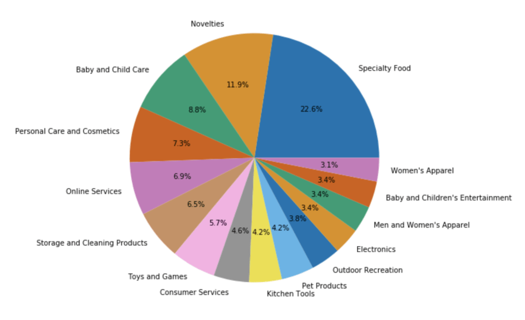
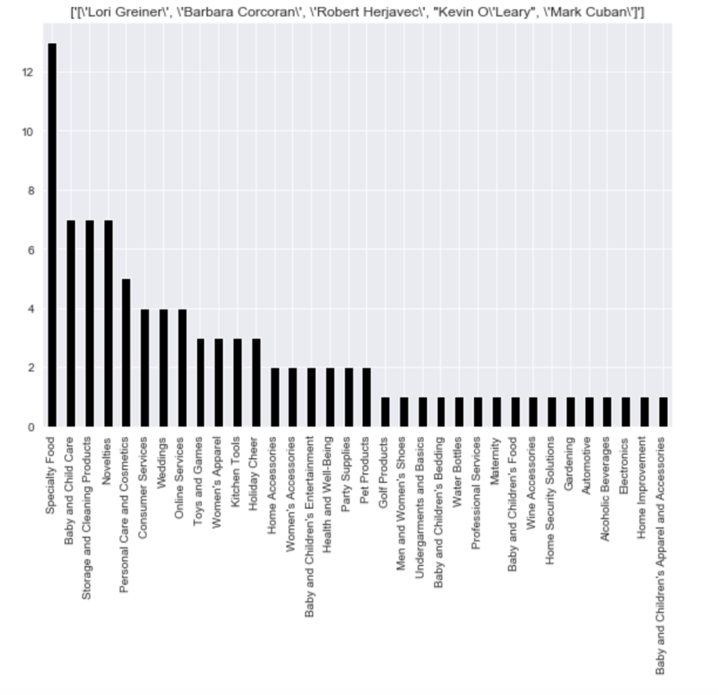
Here is the distribution of the most common pitches (using top 15):
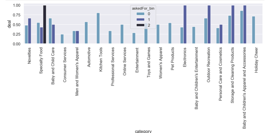
Here is the likelihood of getting a deal by category with an added filter for how much of a stake was asked for:
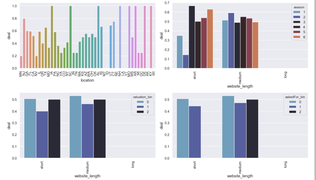
Here are some other relationships with the likelihood of getting a deal:
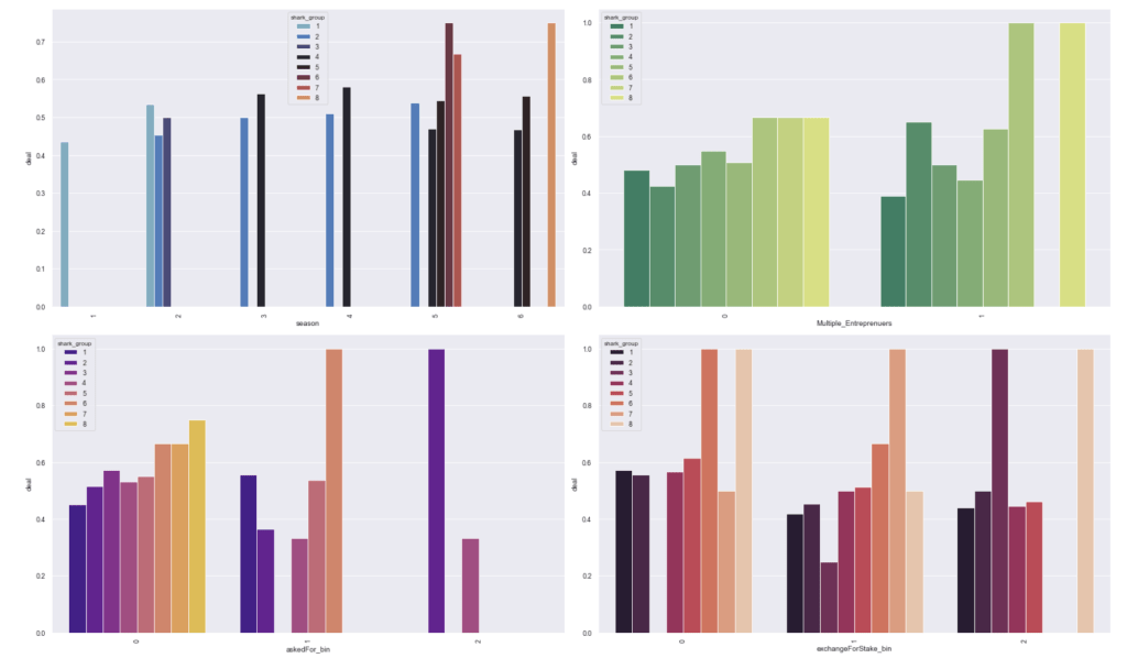
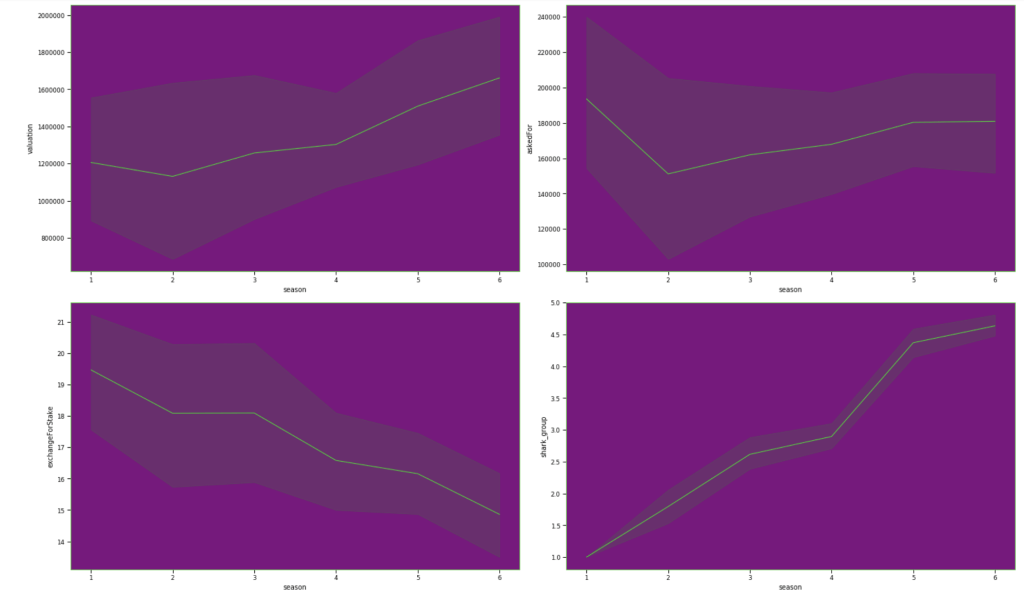
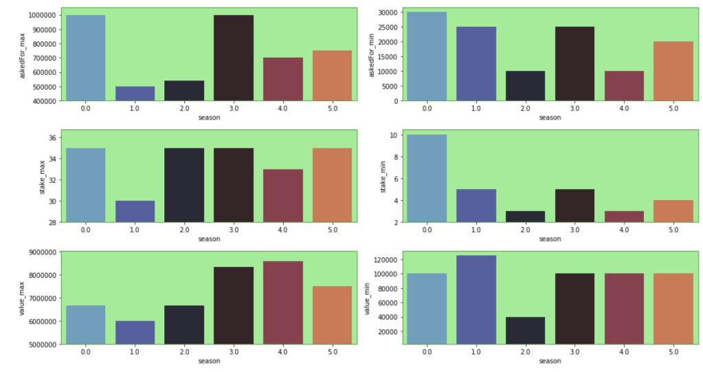
Here are some basic trends from season 1 to season 6:
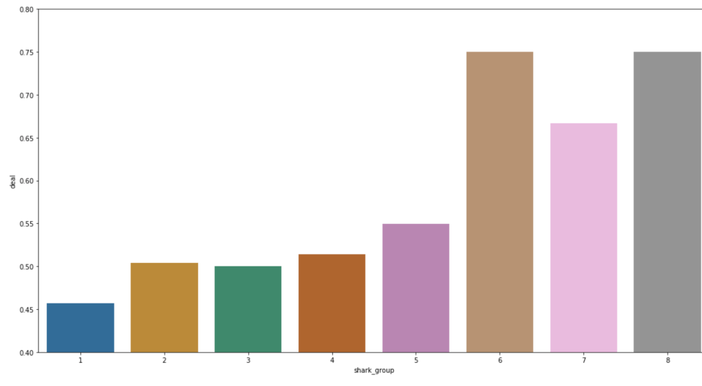
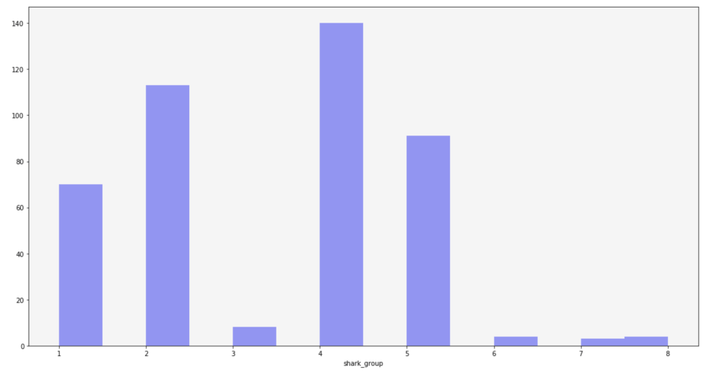
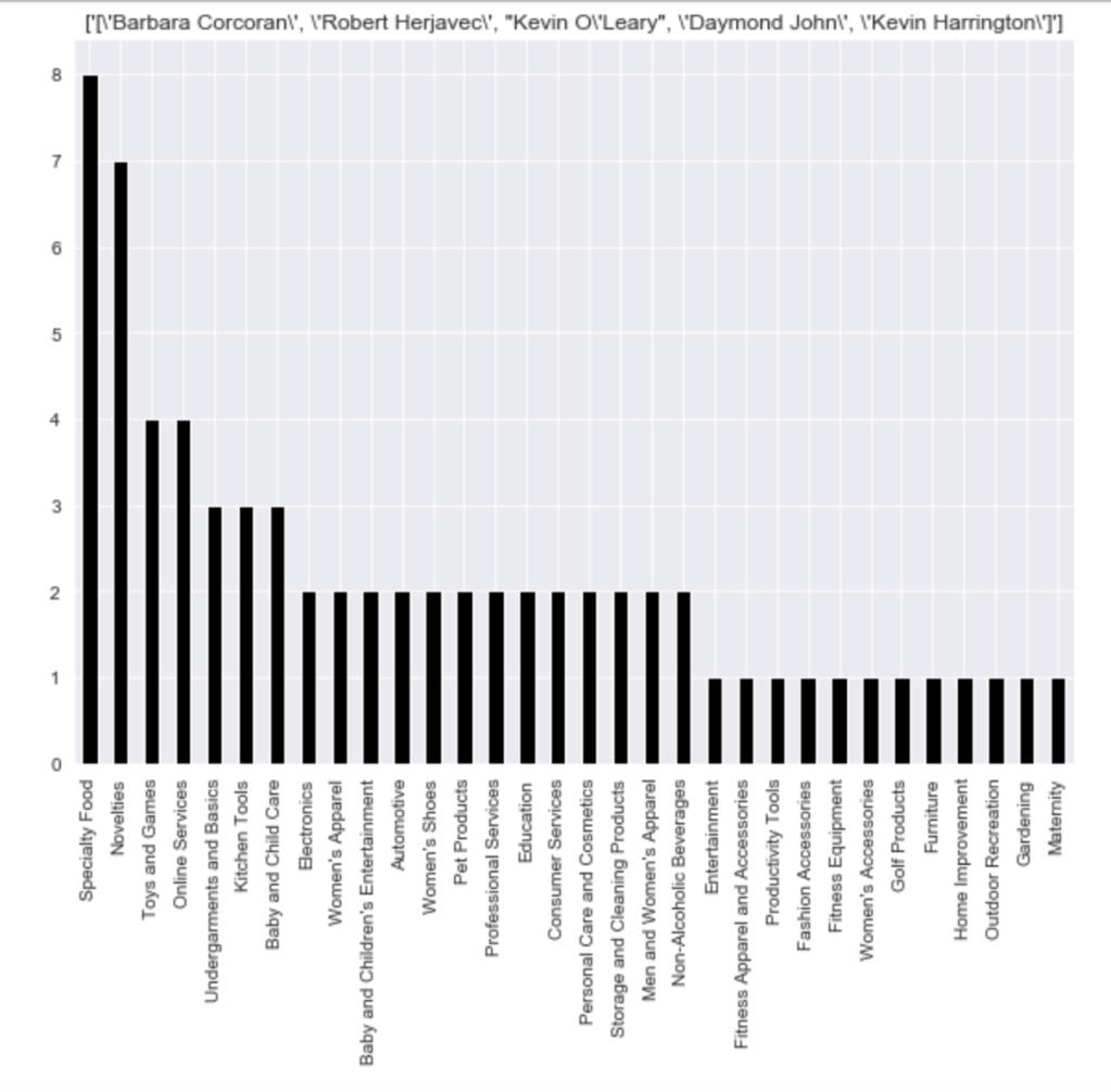
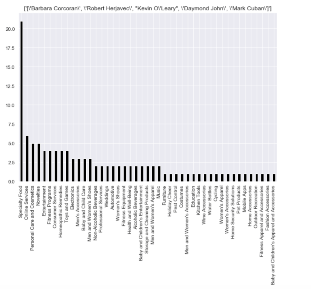
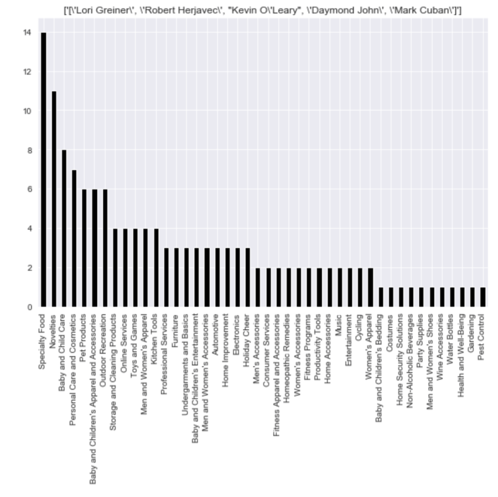
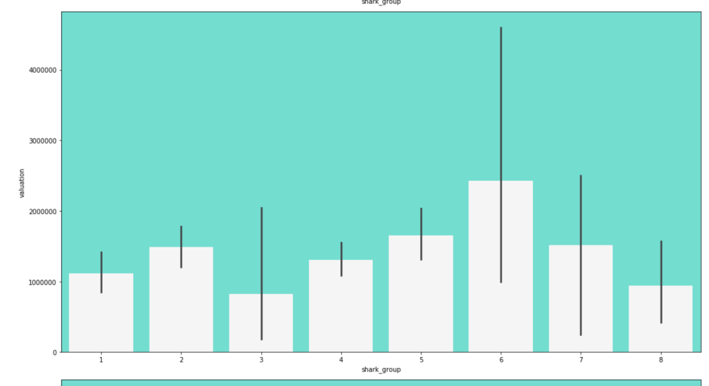
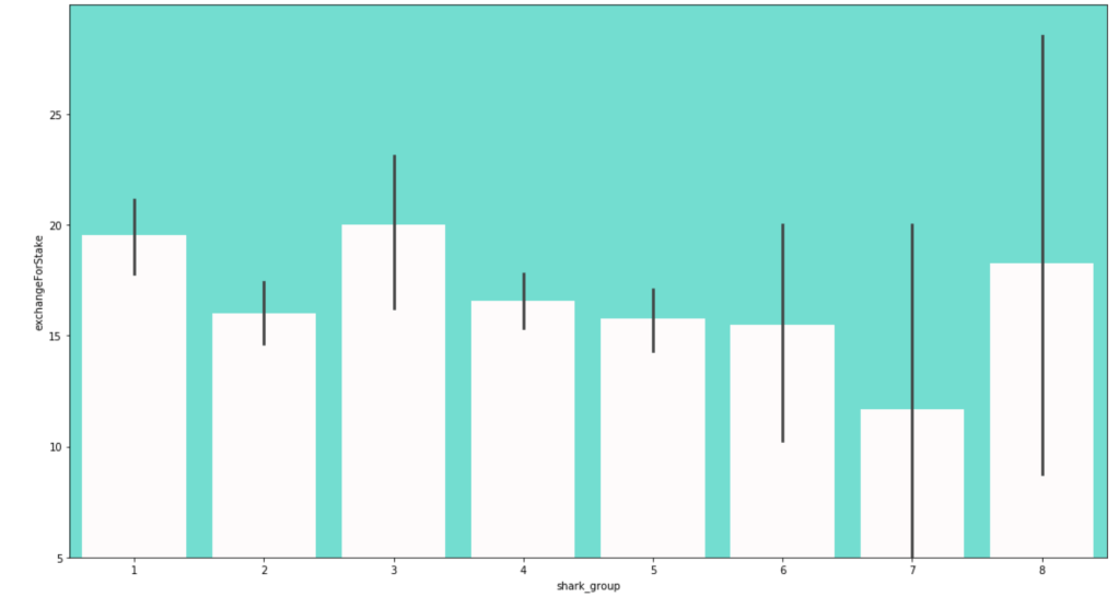
Here is the frequency of each shark group:
Here are some other trends over the seasons. Keep in mind that the index starts at zero but that relates to season 1:
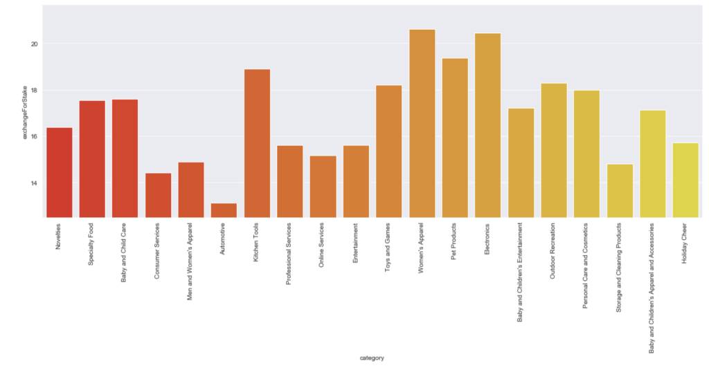
Here is the average stake offered by leading categories:
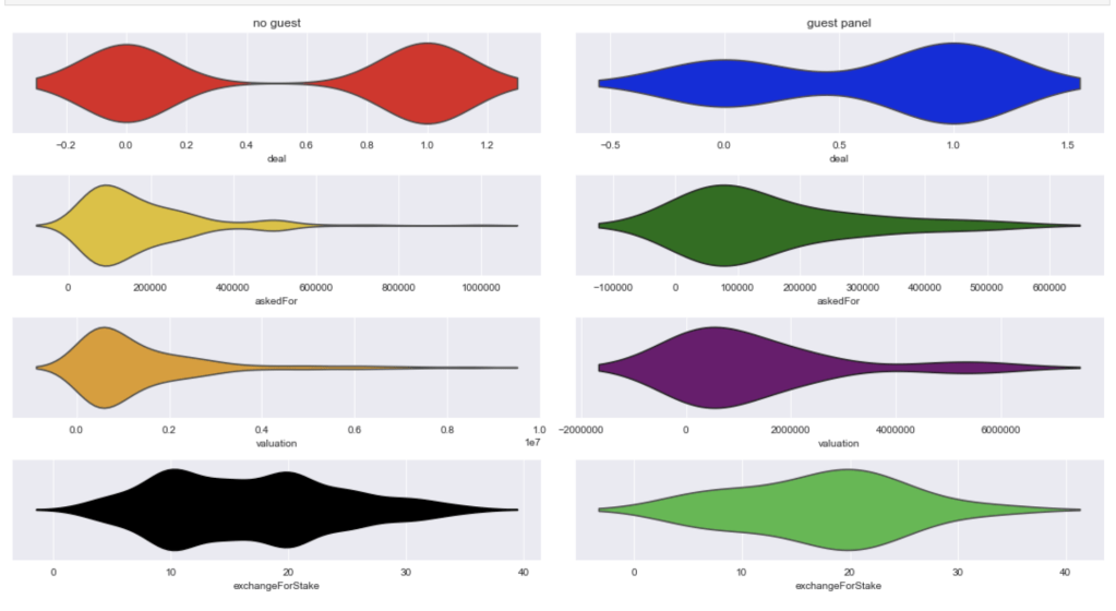
Here comes an interesting breakdown of what happens when there is and is not a guest shark like Richard Branson:
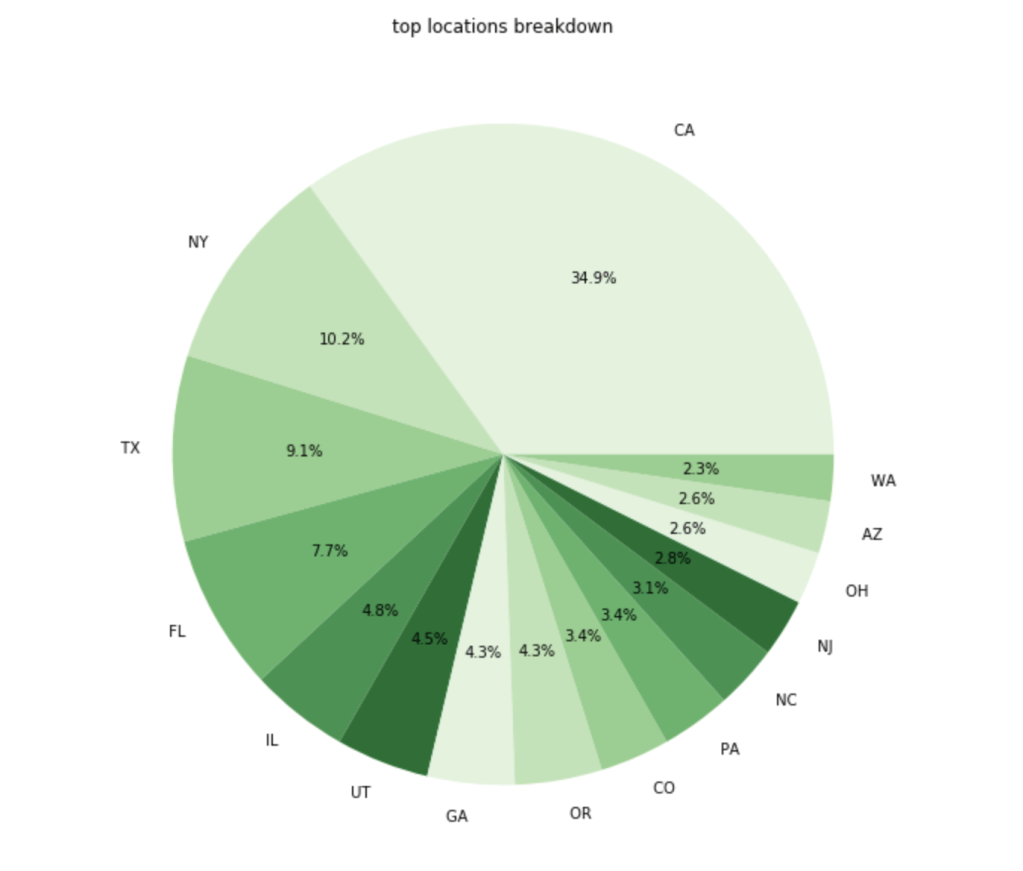
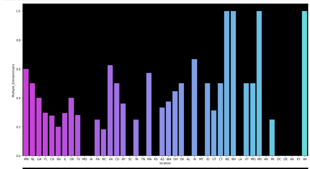
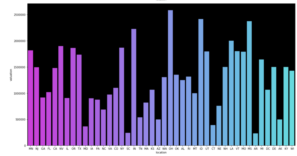
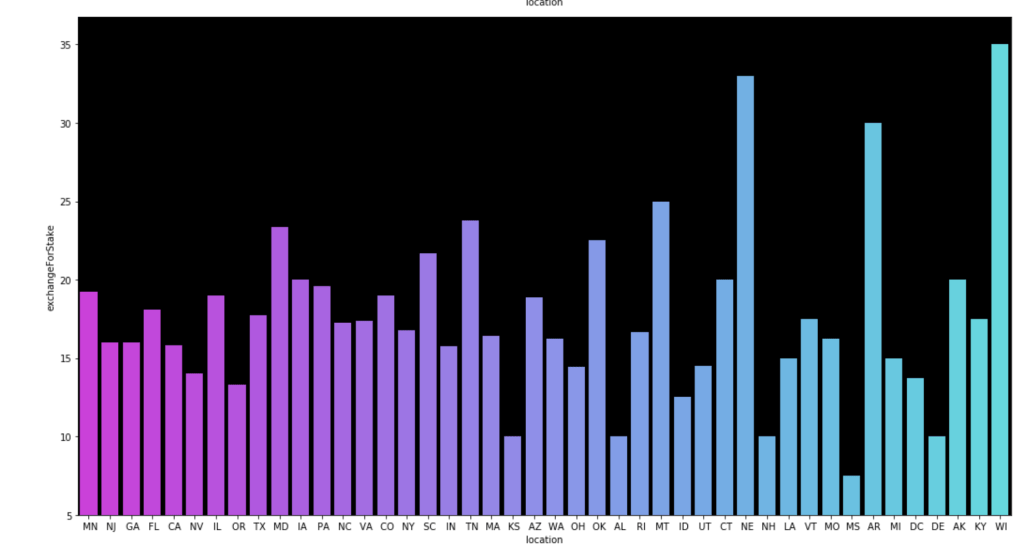
Here is a breakdown of where the most common entrepreneurs come from:
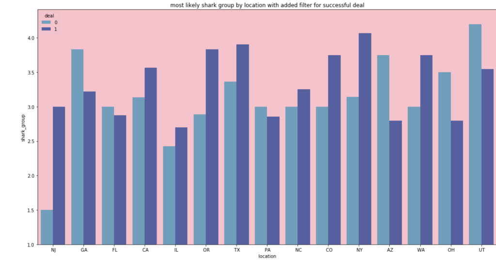
In terms of the most likely shark group for people from different locations:
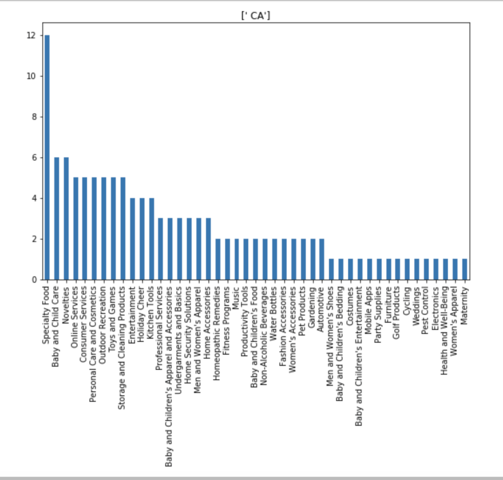
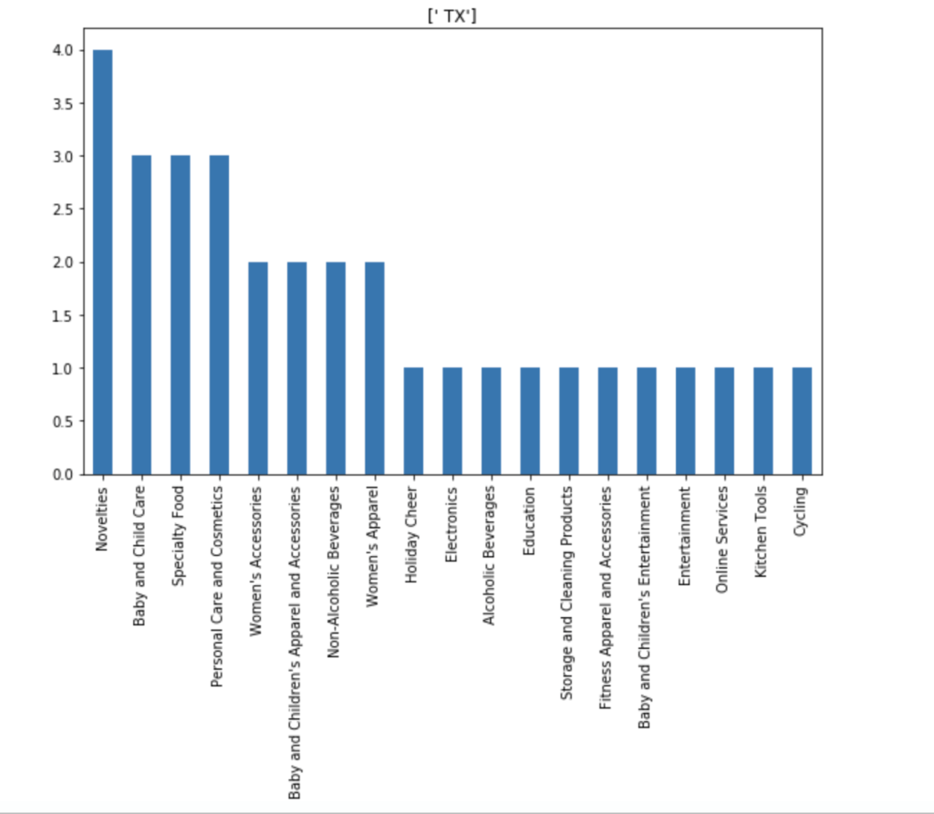
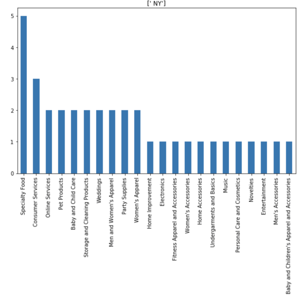
I also made some visuals of the amount of appearances of each unique category by each of the 50 states. We obviously won’t go through every state. Here are a couple, though:
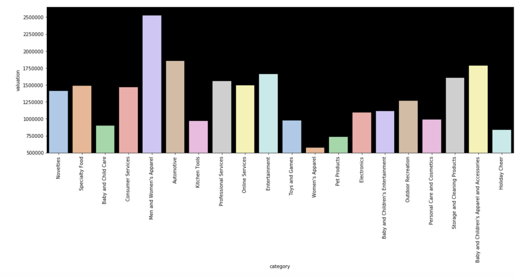
Here is the average valuation by category:
Here is a distribution of pitches to the different shark groups (please ignore the weird formatting):
Here come some various visuals related to location:
Here come some various visuals related to shark group
This concludes my EDA for now.
Modeling
After doing some basic data cleaning and feature engineering, it’s time to see if I can actually build a good model.
First Model
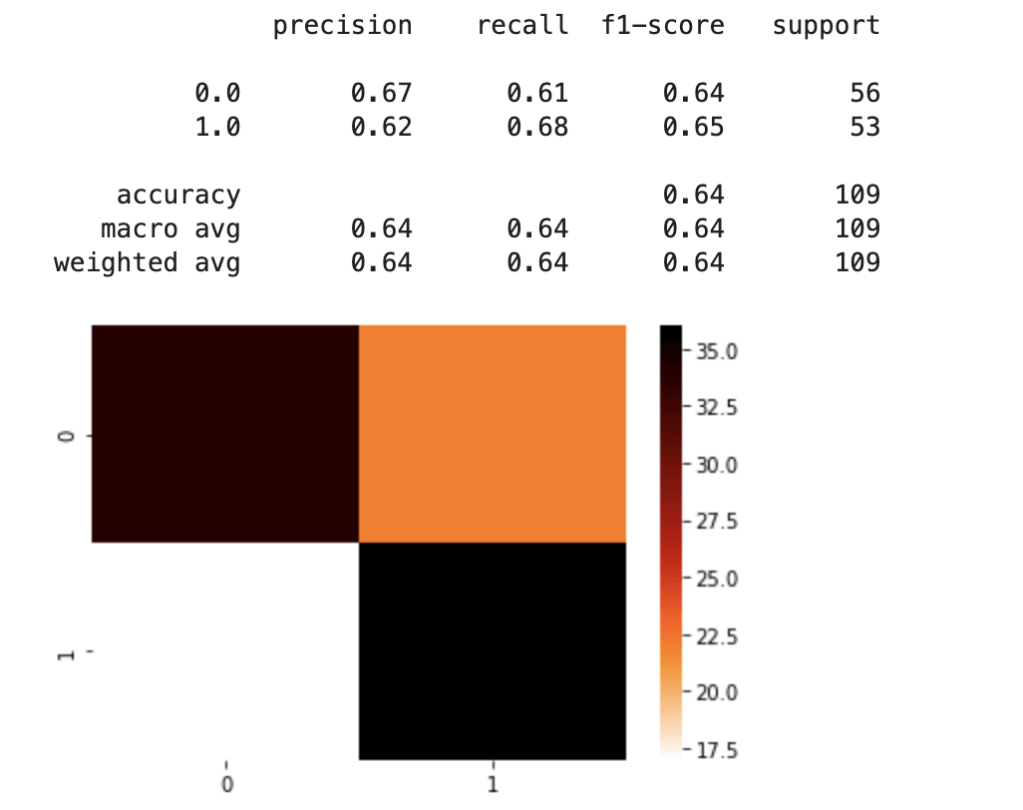
For my first model, I used dummy variables for the “category” feature and information on sharks. Due to the problem of having different instances of the category feature, I split my data into a training and test set after pre-processing the data. I mixed and matched a couple of scaling methods and machine learning classification models before landing on standard scaling and logistic regression. Here was my first set of results:
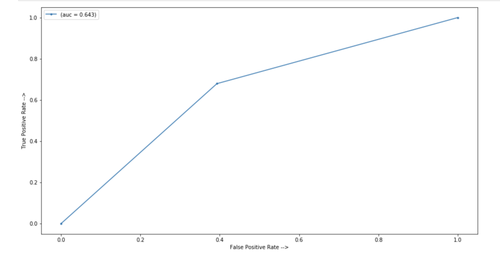
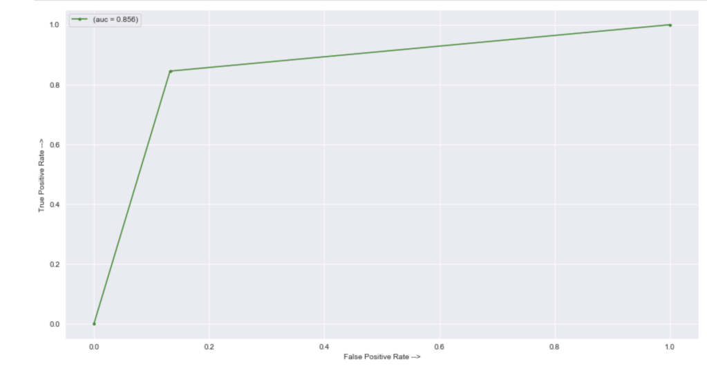
In terms of an ROC/AUC visual:
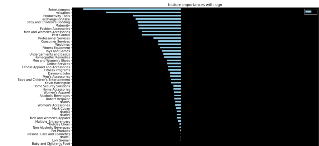
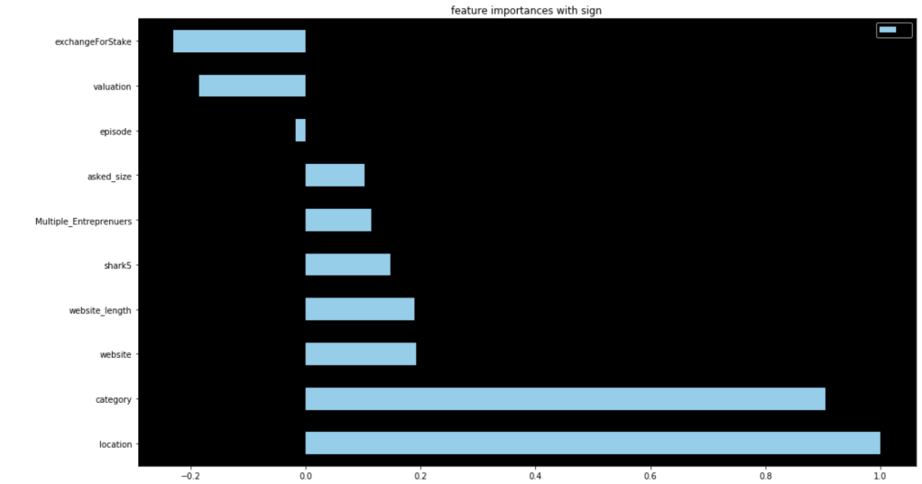
64% accuracy on a show where anything can happen is a great start. Here were my coefficients in terms of a visual:
Let’s talk about these results. It seems like having Barbara Corcoran as a shark is the most likely indicator of a potential deal. That doesn’t mean Barbara makes the most deals. Rather, it means that you are likely to get a deal from someone if Barbara happens to be present. I really like Kevin because he always makes a ridiculous offer centered around royalties. His coefficient sits around zero. Effectively, if Kevin is there, we have no idea whether or not there will be a deal. He contributes nothing to my model. (He may as well be dead to me). Location seems to be an important decider. I interpret this to mean that some locations appear very infrequently and just happened to strike a deal. Furniture, music, and home improvement seem to be the most successful types of pitches. I’ll let you take a look for yourself to gain further insights.
Second Model
For my second model, I leveraged target encoding for all categorical data. This allowed me to split up my data before any preprocessing. I also spent time writing a complex backend helper module to automate my notebook. Here’s what my notebook looked like after all that work:
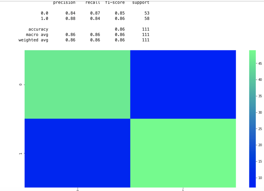
That was fast. Let’s see how well this new model performed given the new method used in feature engineering:
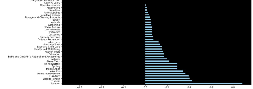
There is clearly a sharp and meaningful improvement present. That said, by using target encoding, I can no longer see the effects of individual categories pitched or sharks present. Here were my new coefficients:
These are a lot less coefficients than in my previous model due to the dummy variable problem, but this led to higher scores. This second model really shocked me. 86% accuracy for predicting the success of a shark tank pitch really surprised me given all the variability present in the show.
Conclusion
I was really glad that my first model was 64% accurate given what the show is like and all the variability involved. I came away with some insightful coefficients to understand what drove predictions. By sacrificing some detailed information I kept with dummy variables, I was able to encode categorical data in a different way which led to an even more accurate model. I’m excited to continue this project and add more data from more recent episodes to continue to build a more meaningful model.
Thanks for reading and I hope this was fun for any Shark Tank fans out there.
Building an Understanding of Gradient Descent Using Computer Programming
Introduction
Thank you for visiting my blog.
Today’s blog is the second blog in a series I am doing on linear regression. If you are reading this blog, I hope you have a fundamental understanding of what linear regression is and what a linear regression model looks like. If you don’t already know about linear regression, you may want to read this blog: https://data8.science.blog/2020/08/12/linear-regression-part-1/ I wrote and come back later. In the blog referenced above, I talk at a high level about optimizing for parameters like slope and intercept. Well, we are going to talk about how machines minimize error in predictive models. We are going to introduce the idea of a cost function soon. Even though we will be discussing cost functions in the context of linear regression, you will probably realize that this is not the only application. That said, the title of this blog shouldn’t confuse anyone and all should understand that gradient descent is more of an overarching subject for many machine learning problems.
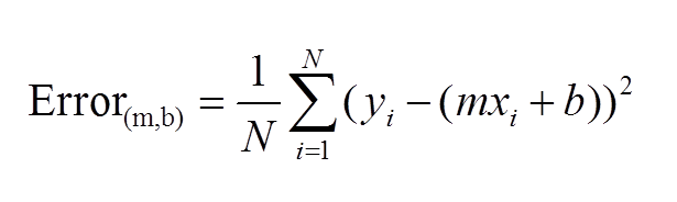
The Cost Function
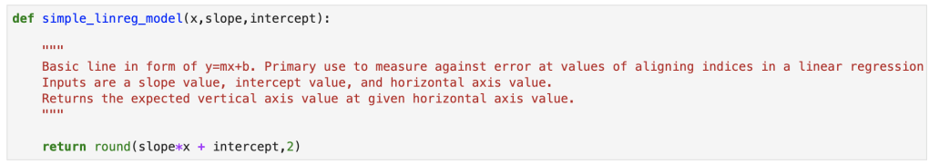
The first idea that needs to be introduced, as we begin to discuss gradient descent, is the cost function. As you may recall, we wrote out a pretty simple calculus formula that found the optimal slope and intercept for the 2D model in the last blog. If you didn’t read last blog, that’s fine. The main idea is that we started with an error function, or MSE. We then took partial derivatives of that function and applied optimization techniques to search for a minimum. What I didn’t tell you in my blog, and people who didn’t read my blog may or may not know is that there is in fact a name for the function that takes a partial derivate in an error function. We call it the cost function. Here is a common representation of the cost function (for 2-dimensional case):
This function should be familiar. This is basically just the sum of model error in linear regression. Model error is what we try to minimize in EVERY machine learning model, so I hope you see why gradient descent is not unique for linear algebra.
What is a Gradient?
Simply put, a gradient is the slope of a curve, or derivative, at any point on a plane with regards to one variable (in a multivariate function). Since the function being minimized is the loss function, we follow the gradient down (hence the name gradient descent) until it approaches or hits zero (for each variable) in order to have minimal error. In gradient descent, we start by taking big steps and slow down as we get closer to that point of minimal error. That’s what gradient descent is; slowly descending down a curve or graph to the lowest point, which represents minimal error, and finding the parameters that correspond to that low point. Here’s a good visualization for gradient descent (for one variable).
The next equation is one I found online that illustrates how we use the graph above in practice:
The above two visual may seem confusing, so let’s work backwards. W t+1 corresponds to our next predicted value for optimal coefficient value. W t was our previous assumption for optimal coefficient value. The term on the right looks a bit funky, but it’s pretty simple actually. The alpha corresponds to the learning rate and the quotient is the gradient. The learning rate is essentially a parameter that tells us how quickly we move. If it is low, models can be computationally expensive, but if it is high, it may not hit the best concluding point. At this point, we can revisit the gif. The gif shows the movement in error as we iteratively update W t into W t+1.
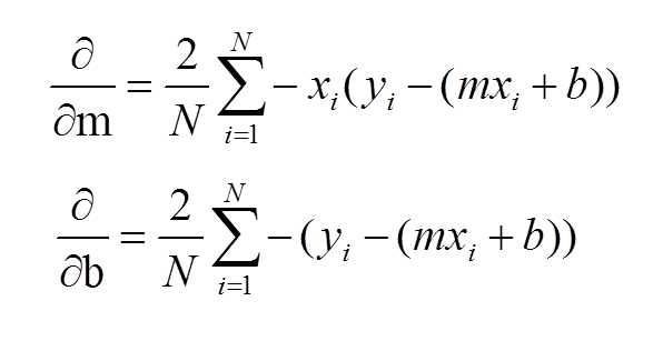
At this point, I have sort-of discussed the gradient itself and danced around the topic. Now, let’s address it directly using visuals. Now keep in mind, gradients are partial derivatives for variables in the cost function that enable us to search for a minimum value. Also, for the sake of keeping things simple, I will express gradients using the two-dimensional model. Hopefully, the following visual shows a clear progression from the cost function.
In case the above confuses you, I would not focus on the left side of either the top or bottom equation. Focus on the right side. These formulas should look familiar as they were part of my handwritten notes in my initial linear regression blog. These functions represent the gradients used for slope (m) and intercept (b) in gradient descent.
Let’s review: we want to minimize error and use the derivative of the error function to help that process. Again, this is gradient descent in a simple form:
I’d like to now go through some code in the next steps.
Gradient Descent Code
We’ll start with a simple model:
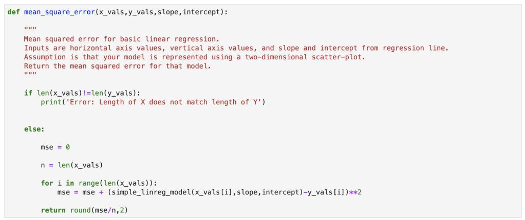
Next, we have our error:
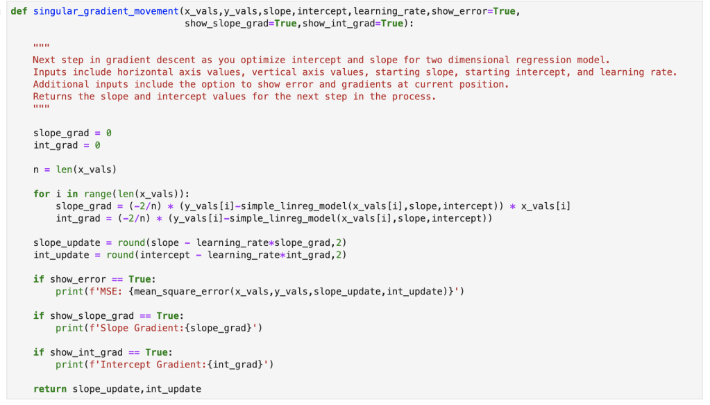
Here we have a single step in gradient descent:
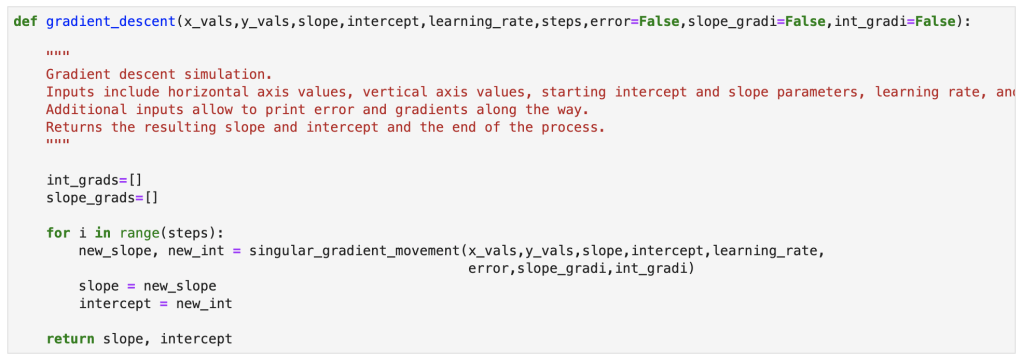
Finally, here is the full gradient descent:
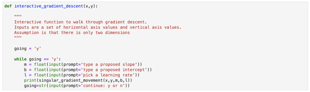
Bonus Content!
I also created an interactive function for gradient descent and will provide a demo. You can copy my notes from this notebook with your own x and y values to run an interactive gradient descent as well.
Gradient descent is a simple concept that can be incredibly powerful in many situations. It works well with linear regression, and that’s why I decided to discuss it here. I am told that often times, in the real world, using a simple sklearn or stastsmodels model is not good enough. If it were that easy, I imagine the demand for data scientists with advanced statistical skills would be lower. Instead, I have been told, that custom cost functions have to be carefully though out and gradient descent can be used to optimize those models. I also did my first blog video for today’s blog and hope it went over well. I have one more blog in this series where I go through regression using python.
Understanding the Elements and Metrics Derived from Confusion Matrices when Evaluating Model Performance in Machine Learning Classification
Introduction
Thanks for visiting my blog.
I hope my readers get the joke displayed above. If they don’t and they’re also millennials, they missed out on some great childhood fun.
What are confusion matrices? Why do they matter? Well… a confusion matrix, in a relatively simple case, shows the distribution of predictions compared to real values in a machine learning classification model. Classification can theoretically have many target classes, but for this blog we are going to keep it simple and discuss prediction of a binary variable. In today’s blog, I’m going to explain the whole concept and how to understand confusion matrices on sight as well as the metrics you can pick up by looking at them.
Plan
Provide Visual
Accuracy
Recall
Precision
F-1
AUC-ROC Curve
Quick note: there are more metrics that derive from confusion matrices beyond what’s listed above. However, these are the most important and relevant metrics generally discussed.
Visualization
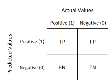
I have three visuals. The first one displays the actual logic behind confusion matrices while the second displays an example and the third displays a heat-map. Often, using a heat-map can be easier to decode and also easier to share with others. I’d like to also note that confusion matrix layouts can change. I would not get caught up on one particular format and just understand that rows correspond to predicted values columns correspond to actual values. The way the numbers within each of those are arranged is variable.
Basic explanation.
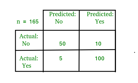
Now you will always have numbers in those quadrants and generally hope that the top left and bottom right have the highest values.
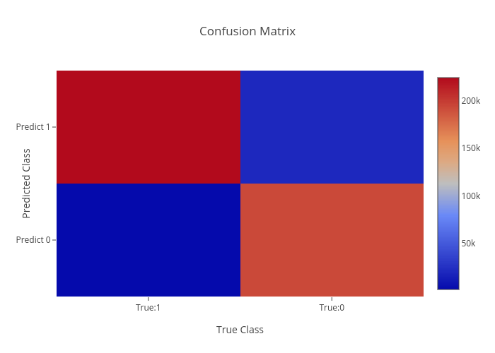
Heat-map.
As we can see above, knowing that red corresponds to higher values quickly gives us the reflection that our model worked well. In “error” locations, we have a strong blue color, while in “correct” areas we see a lot of red.
Before I get into the metrics, I need to quickly explain what TP, FP, TN, and FN mean. This won’t take long. TP is a true positive, like someone correctly being predicted to have a disease. TN is true negative, like someone correctly predicted to not have a disease. FN is a false negative, like some who was predicted to not have a disease but actually does. FP is a false positive, like some predicted to have a disease but actually doesn’t. This is a preview of some metrics to be discussed, but for certain models the importance of FN, FP, TN, and TP is variable and some may matter more than others.
Quick note: When I think of the words “accuracy” and “precision,” the first thing that comes to mind is what I learned back in Probability Theory; accuracy means unbiasedness and precision means minimal variance. I’ll talk about bias and variance in a later blog. For this blog, I’m not going to place too much focus on those particular definitions.
Accuracy
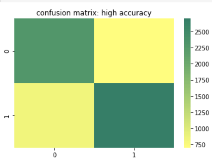
Accuracy is probably the most basic and simple idea. Accuracy is determined by summing true positive and true negative results over both the true positive and true negative predictions but also false positive and false negative predictions. In other words, of every single prediction you made, how many of them were right. So this means we want to know that if it was a negative how many times did you predict correctly and vice-versa for a positive. That being the case, when does accuracy become the most important metric to your model and when does accuracy fall short of being a strong or important metric? Let’s start with the cases where accuracy falls short. If you have a large class imbalance such as 10 billion rows in class 0 and 1 row in class 1, than you don’t necessarily have a strong model if it accurately predicts most of the majority class and predicts the minority class accurately the one time it occurs (or doesn’t predict the minority class correctly for that matter). Accuracy works well and tells a good story with more balanced data. However, as discussed above, it can lose meaning with a target class imbalance.
Here is a heat map of a high accuracy model.
Recall
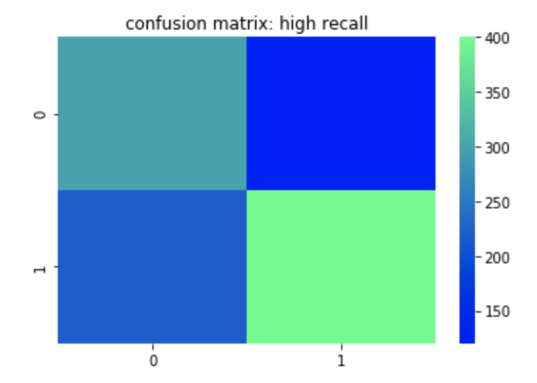
Recall can most easily be described as true positives divided by true positives and false negatives. This corresponds to the number of positives correctly identified when in fact the case was positive. A false negative means an unidentified positive. False positives and true negatives are not meant to be positives (in a perfect model) so are not included. So if you are trying to identify if someone has a disease or not, having high recall would be good for you model since it means that when the disease is present, you identify it well. You could still have low accuracy or precision in this model if you don’t predict the non-disease class well. In other words if you predict every row as having the disease than your recall will be high since you will have correctly predicted every occurrence where the disease was actually present. Unfortunately, however, the impact of having a correct prediction will be diminished and mean a whole lot less. That leads us to precision.
Here is a heat map of a high recall model.
Precision
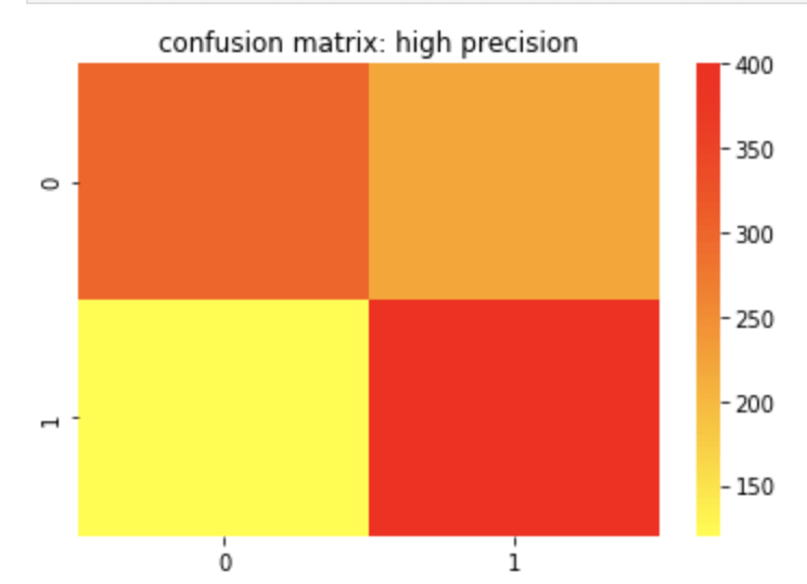
Precision can most easily be described as true positives divided by true positives and false positives. Unlike recall, which is a measure of actual positives discovered from the pool of all positives, precision is a measure of actual positives from predicted positives. So false negatives and true negatives don’t matter as they were not predicted to have been positive in the first place. A great way to think about precision is how meaningful a positive prediction is given the context of your model. Off the top of my head, I would assume that in a business where you owe some sort of service or compensation based on a predicted positive, having high precision would be important as you would not want to waste resources. I recently worked on an email spam detector. That is another example where high precision is ideal.
Here is a confusion matrix of a high precision model.
F-1 Score
The F-1 score is the harmonic mean of the precision and recall score which means its maximum value is the arithmetic mean of the two. (For more info on what a harmonic mean actually is – here is a Wikipedia page you may find helpful: https://en.wikipedia.org/wiki/Harmonic_mean). As you may have gathered or assumed from what’s written above, the F-1 score matters more in situations where accuracy may fall short.
Receiver Operating Curve (ROC) Curve
The basic description of this curve is that it measures how an increase in false positives to a model would correspond to increasing true positives which can evaluate your models ability to distinguish between classes. The horizontal axis values extend from 0% to 100% (or 0 to 1). The larger the area covered using the curve, the better your model is. You may be confused due to the lack of a visual. Let me show you what I mean:
Above, the “No Skill” label means that you’ll get 50% of classifications right at random (don’t get too caught up on that point). The high increase early in the x values on the corresponding vertical axis are a good sign that as more information is introduced into your model, than its true positive rate climbs quickly. It maxes out around 30% and then begins a moderate plateau. This is a good sign and shows a lot of area covered by this orange curve. The more area covered, the better.
Conclusion
Confusion matrices are often a key part of machine learning models and can help tell and important story about the effectiveness of your model. Since there are varying ways data can present itself, it is important to have different metrics that derive from these matrices to measure success for each situation. Conveniently, you can view confusion matrices with relative ease using heat maps.
Developing a process to predict which NBA teams and players will end up in the playoffs.
Introduction
Hello! Thanks for visiting my blog.
After spending the summer being reminded of just how incredible Michael Jordan was as a competitor and leader, the NBA is finally making a comeback and the [NBA] “bubble” is in full effect in Orlando. Therefore, I figured today would be the perfect time to discuss the NBA playoffs (I know the gif is for the NFL, but it is just too good to not use). Specifically, I’d like to answer the following question: if one were to look at some of the more basic NBA statistics recorded by an NBA player or team on a per-year basis, with what accuracy could you predict whether or not that player may find themselves in the NBA playoffs. Since the NBA has changed so much over time and each iteration has brought new and exciting skills to the forefront of strategies, I decided to stay up to date and look at the 2018-19 season for individual statistics (the three-point era). However, only having 30 data points to survey for team success will be insufficient to have a meaningful analysis. Therefore I expanded my survey to include data back to and including the 1979-80 NBA season (when Magic Johnson was still a rookie). I web-scraped basketball-reference.com to gather my data and it contains every basic stat and a couple advanced ones such as effective field goal percent (I don’t know how that is calculated but Wikipedia does: https://en.wikipedia.org/wiki/Effective_field_goal_percentage#:~:text=In%20basketball%2C%20effective%20field%20goal,only%20count%20for%20two%20points.) from every NBA season ever. As you go back in time, you do begin to lose data from some statistical categories that weren’t recorded yet. To give to examples here I would mention blocks which were not recorded until after the retirement of Bill Russell (widely considered the greatest defender to play the game) or three pointers made as three pointers were first introduced into the NBA in the late 1970s. So just to recap: if we look at fundamental statistics recorded by individuals or in a larger team setting – can we predict who will find themselves in the playoffs? Before we get started, I need to address the name of this blog. Gregg Popovich has successfully coached the San Antonio Spurs to the playoffs in every year since NBA legend Tim Duncan was a rookie. They are known to be a team that runs on good teamwork as opposed to outstanding individual play. This is not to say they have not had superstar efforts though. Devin Booker has been setting the league on fire, but his organization, the Phoenix Suns, have not positioned themselves to be playoff contenders. (McCaw just got lucky and was a role player for three straight NBA championships). This divide is the type of motivation that led me to pursue this project.
Plan
I would first like to mention that the main difficulty in this project was developing a good web-scraping function. However, I want to be transparent here and let you know that I worked hard developing that function a while back and now realized this would be a great use of that data. Anyhow, in my code I go through the basic data science process. In this blog, however, I think I will try to stick to the more exciting observations and conclusions I reached. (here’s a link to GitHub: https://github.com/ArielJosephCohen/postseason_prediction).
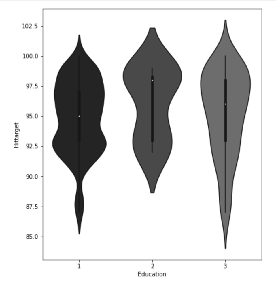
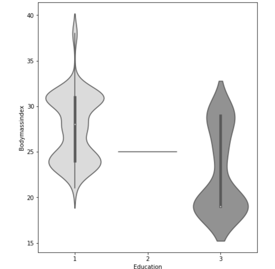
The Data
First things first, let’s discuss what my data looked like. In the 2018-19 NBA season, there were 530 total players to play in at least one NBA game. My features included: name, position, age, team, games played, games started, minutes played, field goals made, field goals attempted, field goal percent, three pointers made, three pointers attempted, three point percent, two pointers made, two pointers attempted, two point percent, effective field goal percent, free throws made, free throws attempted, free throw percent, offensive rebounds per game, defensive rebounds per game, total rebounds per game, assists per game, steals per game, blocks per game, points per game, turnovers per game, year (not really important but it only makes the most marginal difference in the team setting), college (or where they were before the NBA – many were null and were filled as unknown), draft selection (un-drafted players were assigned the statistical mean of 34 – which is later than I expected. Keep in mind the drat used to exceed 2 rounds). My survey of teams grouped all the numerical values (with the exception of year) by each team and every season using the statistical mean of all its players that season. In total, there were 1104 rows of data, some of which included teams like Seattle that no longer exist in their original form. My target feature was a binary 0 or 1 with 0 representing a failure to qualify for the playoffs and 1 representing a team that successfully earned a playoff spot.
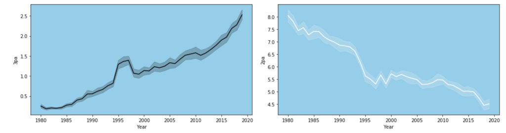
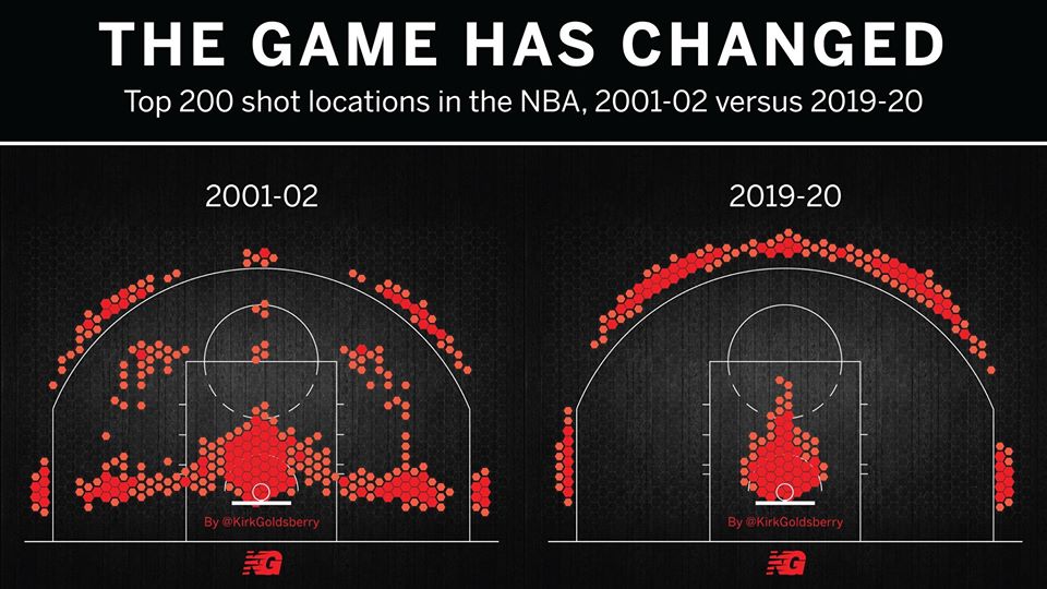
One limitation of this model is that it accounts for trades or other methods of player movement by assigning a player’s entire season stats to the team he ended the season with, regardless of how many games were actually played on his final team. In addition, this model doesn’t account for more advanced metrics like screen assists or defensive rating. Another major limitation is something that I alluded to earlier: the NBA changes and so does strategy. This makes this more of a study or transcendent influences that remain constant over time as opposed to what worked well in the 2015-16 NBA season (on a team level that is). Also, my model focuses on recent data for the individual player model, not what individual statistics were of high value in different basketball eras. A great example of this is the so-called “death of the big man.” Basketball used to be focused on big and powerful centers and power forwards who would control and dominate the paint. Now, the game has moved much more outside, mid-range twos have been shunned as the worst shot in basketball and even centers must develop a shooting range to develop. Let me show you what I mean:
Now let’s look at “big guy”: 7-foot-tall Brook Lopez:
In a short period of time, he has drastically changed his primary shot selection. I have one more visual from my data to demonstrate this trend.
Exploratory Data Analysis
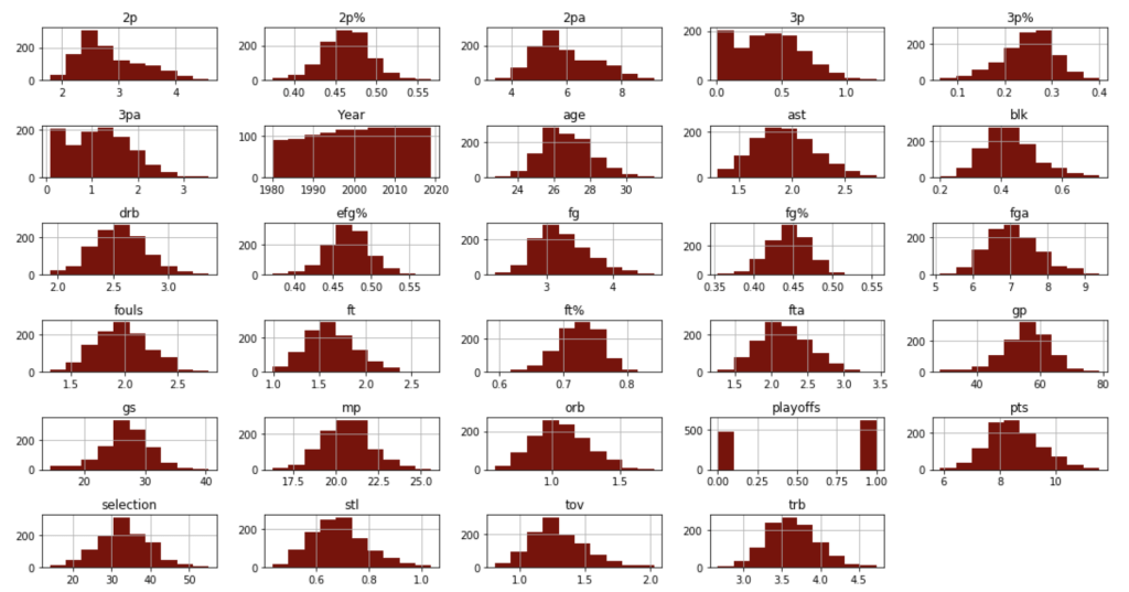
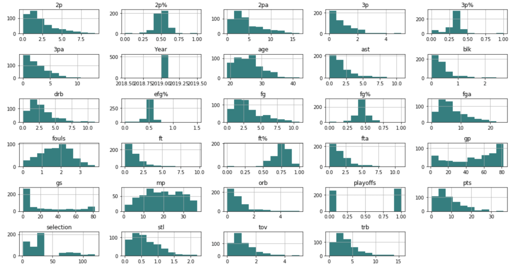
Before I get into what I learned from my model, I’d like to share some interesting observations from my data. I’ll start with two histograms groups:
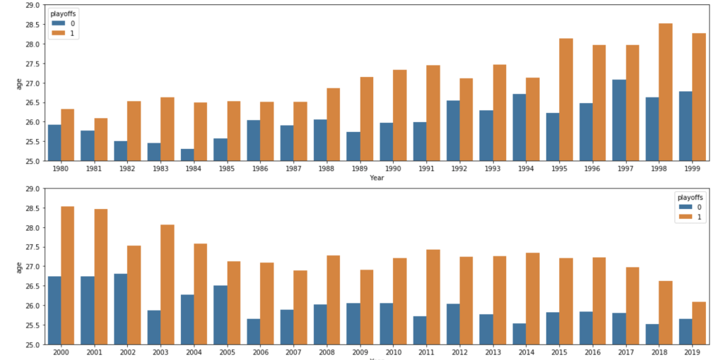
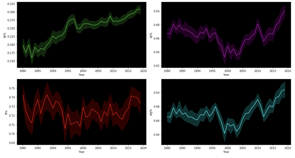
Team data histogramsIndividual data histogramsEvery year – playoff teams tend to have older playersTrends of various shooting percentages over time
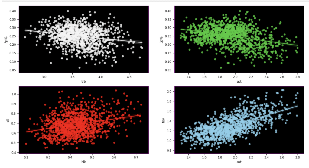
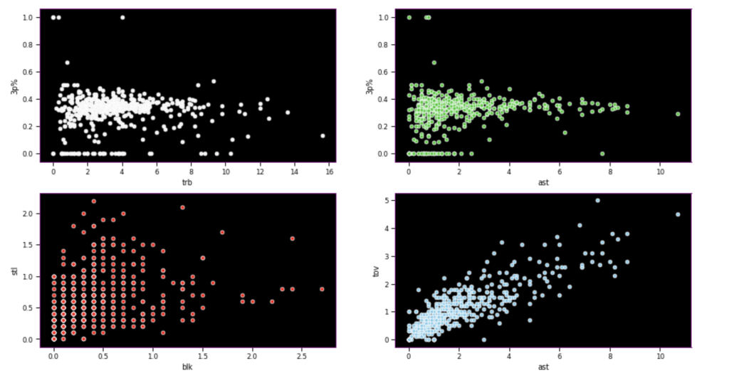
Here, I have another team vs. individual comparison testing various correlations. In terms of my expectations – I hypothesized that 3 point percent would correlate negatively to rebounds, while assists would correlate positively to 3 point percent, blocks would have positive correlation to steal, and assists would have positive correlation with turnovers.
Team dataIndividual data
I seem to be most wrong about assists and 3 point percent while moderately correct in terms of team data.
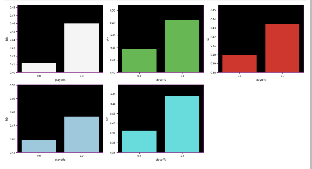
The following graph displays the common differences over ~40 years between playoff teams and non-playoff teams in the five main statistical categories in basketball. However, since the mean and extremes of these categories are all expressed in differing magnitudes, I applied scaling to allow for a more accurate comparison
It appears that the biggest difference between playoff teams and regular teams is in assists while the smallest difference is in rebounding
I’ll look at some individual stats now, starting with some basic sorting.
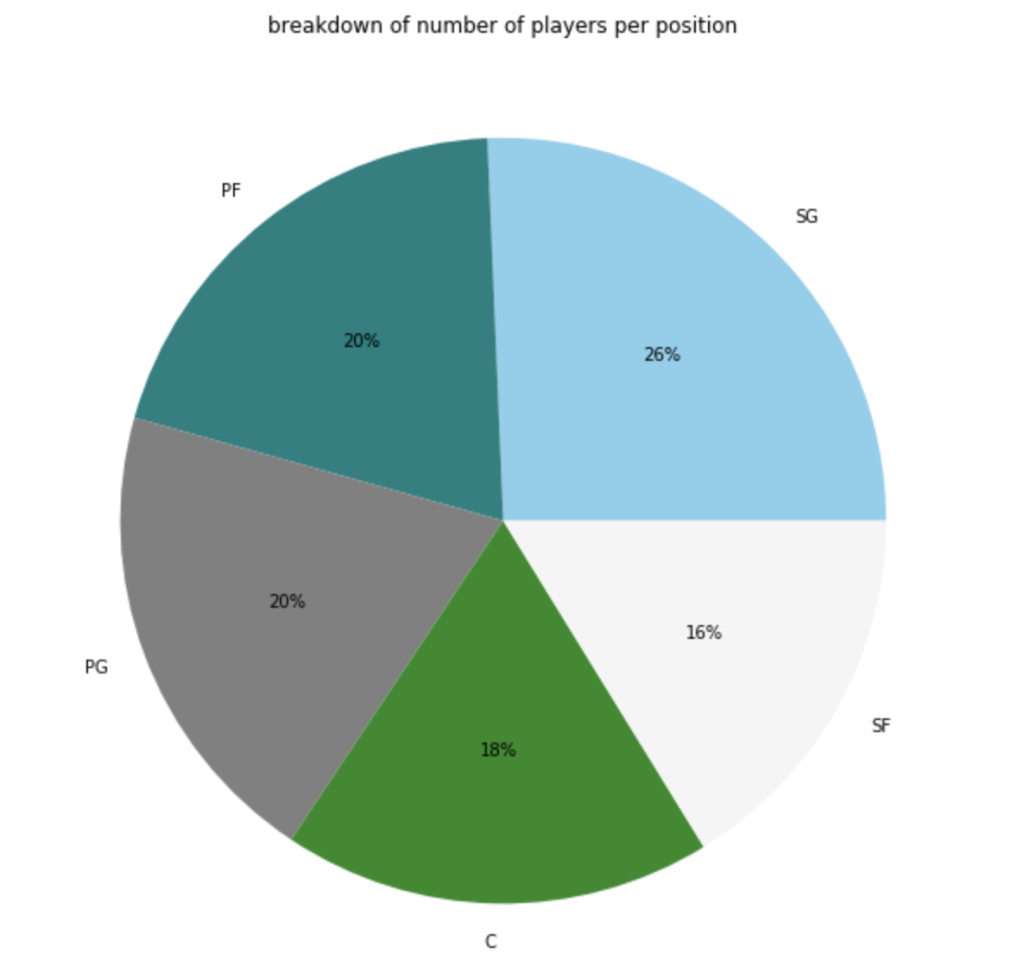
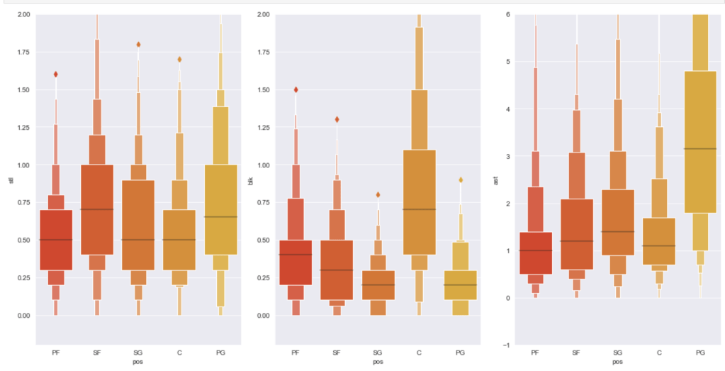
Here’s a graph to see the breakdown of current NBA players by position.
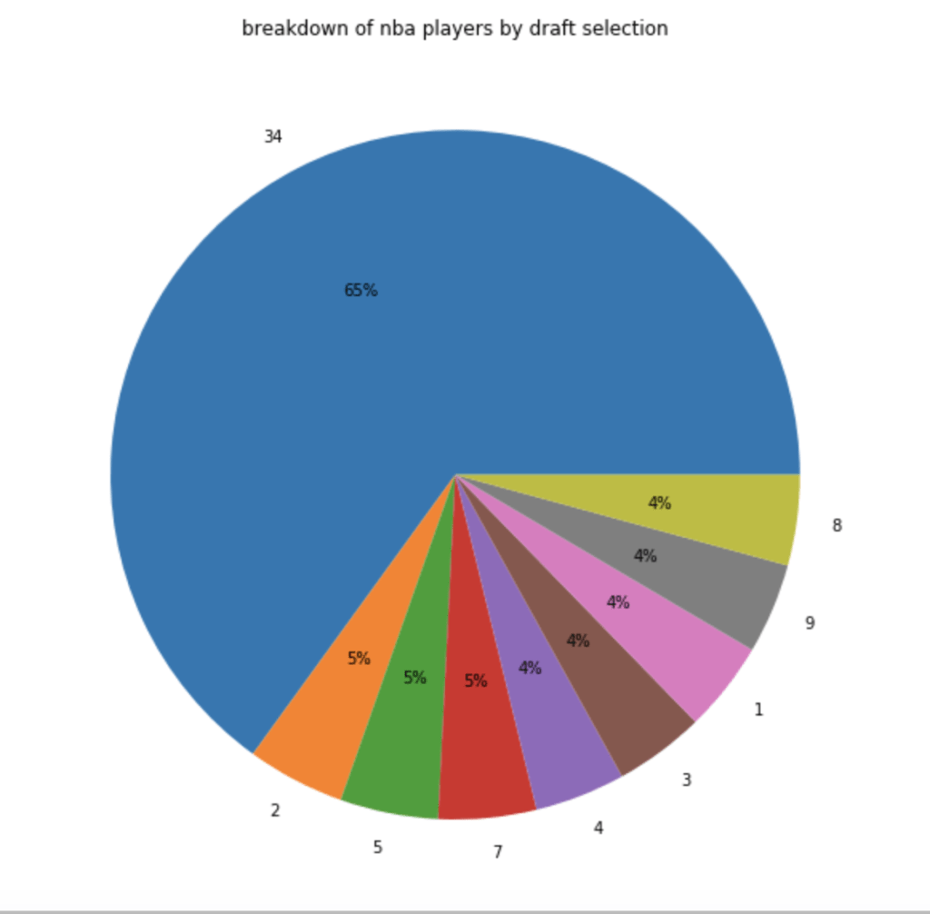
In terms of players by draft selection (with 34 = un-drafted basically):
In terms of how many players actually make the playoffs:
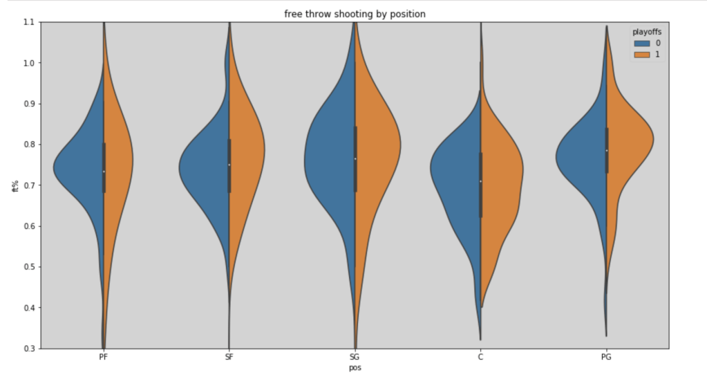
Here’s a look at free throw shooting by position in the 2018-19 NBA season (with an added filter for playoff teams):
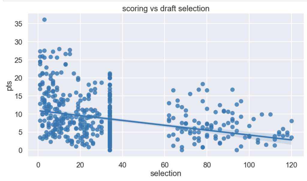
I had a hypothesis that players drafted earlier tend to have higher scoring averages (note that in my graph there is a large cluster of points hovering around x=34. This is because I used 34 as a mean value to fill null for un-drafted players).
It seems like I was right – being picked early in the draft corresponds to higher scoring. I would guess the high point is James Harden at X=3.
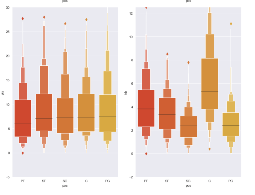
Finally I’d like to share the distribution of statistical averages by each of the five major statistics sorted by position:
Model Data
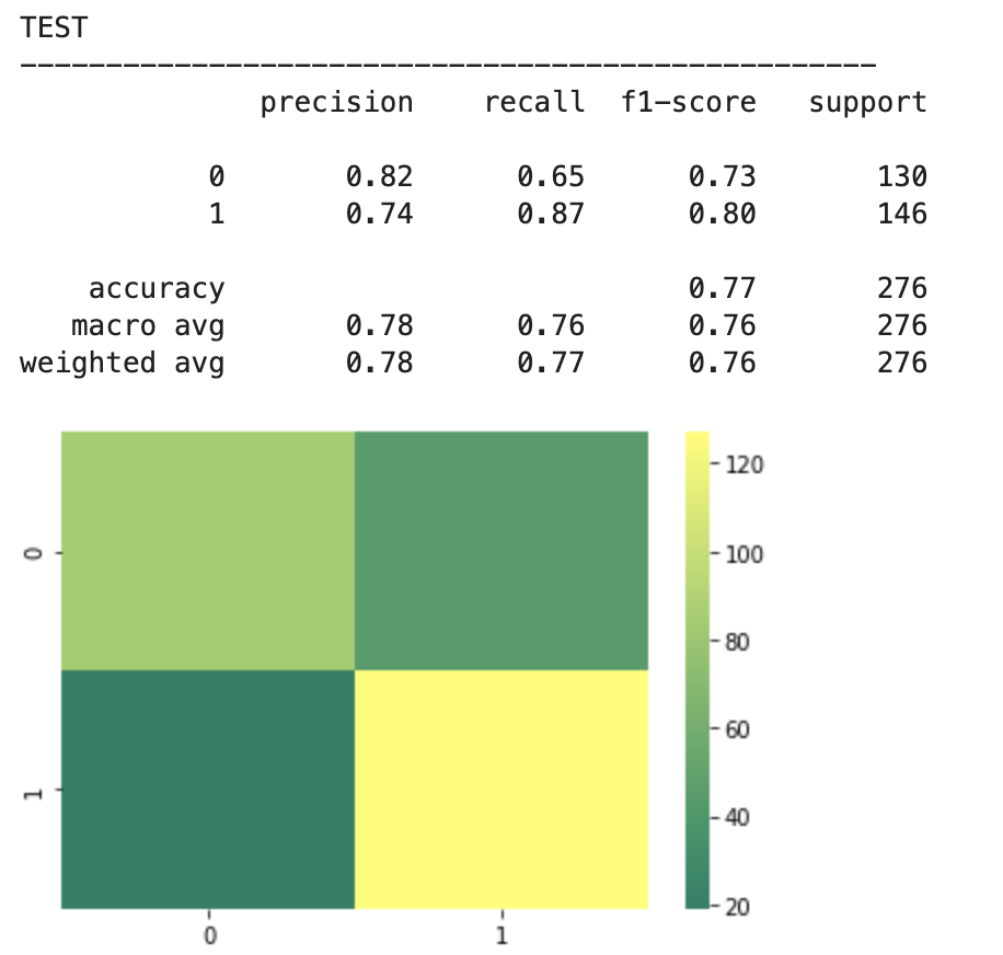
I ran a random forest classifier to get a basic model and then applied scaling and feature selection to improve my models. Let’s see what happend.
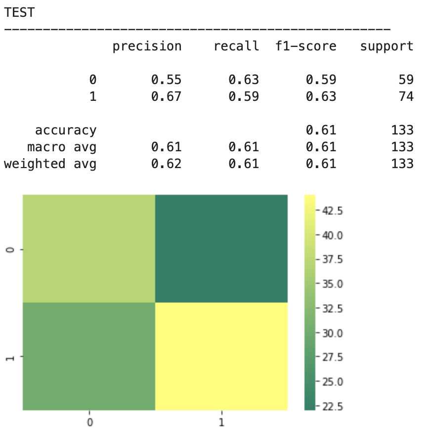
2018-19 NBA players:
The above represents an encouraging confusion matrix with the rows representing predicted data vs columns which represent actual data. The brighter and more muted regions in the top left and bottom right correspond to the colors in the vertical bar adjacent to the matrix and indicate that brighter colors represent higher values (in this color palette). This means that my model had a lot more values whose prediction corresponded to its actual placement that incorrect predictions. The accuracy of this basic model sits around 61% which is a good start. The precision score represents the percentage of correct predictions in the bottom left and bottom right quadrants (in this particular depiction). Recall represents the percentage of correct positions in the bottom right and top right quadrants. In other words recall represents all the cases correctly predicted given that we were only predicting from a pool of teams that made the playoffs. Precision represents a similar pool, but with a slight difference. Precision looks at all the teams that were predicted to have made the playoffs and the precision score represents how many of those predictions were correct.
Next, I applied feature scaling which is a process of removing impacts from variables determined entirely by magnitude alone. For example: $40 is a lot to pay for a can of soda but quite little to pay for a functional yacht. In order to compare soda to yachts, it’s better to apply some sort of scaling that might, for example, place their costs in a 0-1 (or 0%-100%) range representing where there costs fall relative to the average soda or yacht. A $40 soda would be close to 1 and a $40 functional yacht would be closer to 0. Similarly, a $18 billion yacht and an $18 billion dollar soda would both be classified around 1 and conversely a 10 cent soda or yacht would both be classified around 0. A $1 soda would be around 0.5. I have no idea how much the average yacht costs.
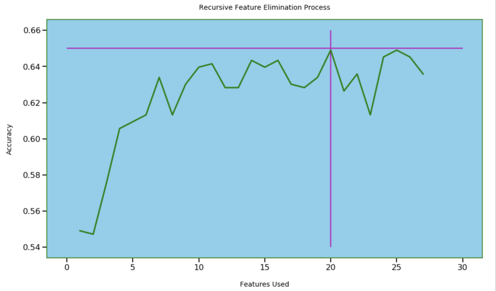
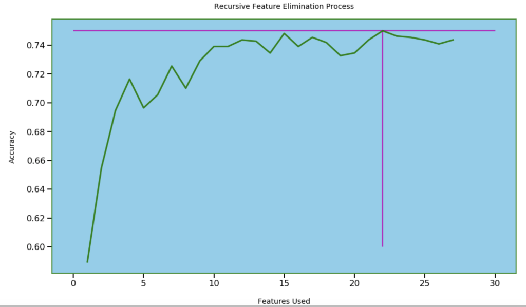
Next, I wanted to see how many features I needed for optimal accuracy. I used recursive feature elimination which is a process of designing a model and the using that model to look for which features may be removed to improve the model.
20 features seems right
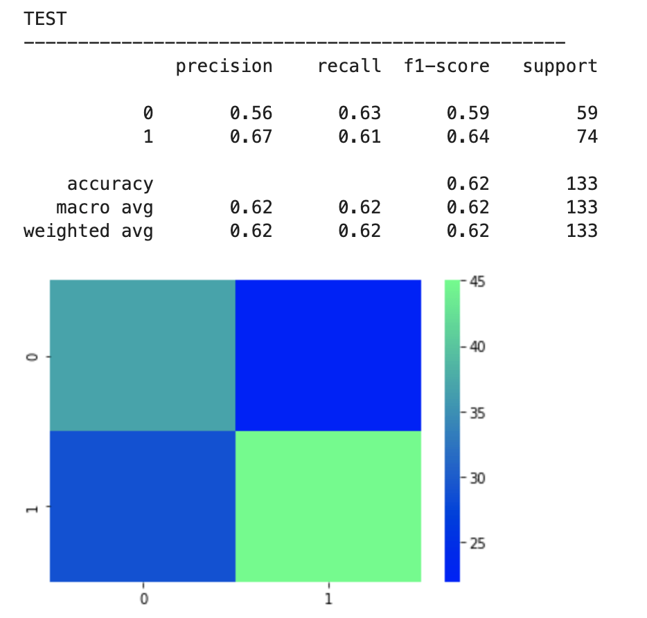
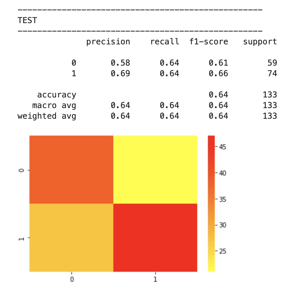
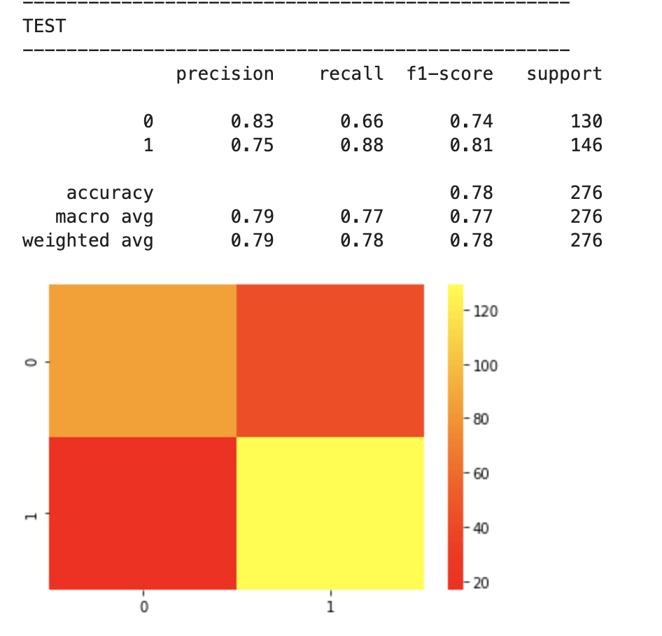
After feature selection, here were my results:
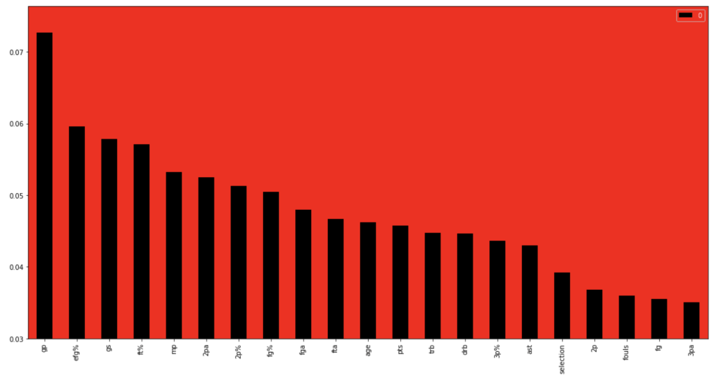
64% accuracy is not bad. Considering that a little over 50% of all NBA players make the playoffs every year, I was able to create a model that, without any team context at all, can predict to some degree which players will earn a trip to the playoffs. Let’s look at what features have the most impact. (don’t give too much attention to vertical axis values). I encourage you to keep these features in mind for later to see if they differ from the driving influences for the larger scale, team-oriented model.
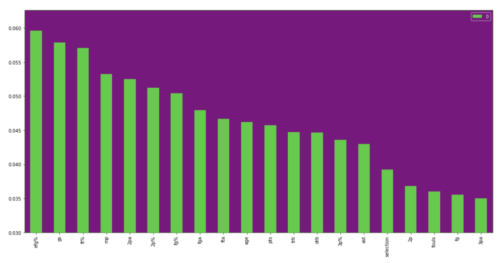
If I take out that one feature at the beginning that is high in magnitude for feature importance, we get the following visual:
I will now run through the same process with team data. I will skip the scaling step as it didn’t accomplish a whole lot.
First model:
Feature selection.
Results:
78% accuracy while technically being a precision model
Feature importance:
Feature importance excluding age:
I think one interesting observation here is how much age matters in a team context over time, but less in the 2018-19 NBA season. Conversely, effective field goal percent had the opposite relationship.
Conclusion
I’m excited for sports to be back. I’m very curious to see the NBA playoffs unfold and would love to see if certain teams emerge as dark horse contenders. Long breaks from basketball can either be terrible or terrific. I’m sure a lot of players improved while others regressed. I’m also excited to see that predicting playoff chances both on individual and team levels can be done with an acceptable degree of accuracy. I’d like to bring this project full circle. Let’s look at the NBA champion San Antonio Spurs from 2013-14 (considered a strong team-effort oriented team) and Devin Booker from 2018–19. I don’t want to spend too much time here but let’s do a brief demo of the model using feature importance as a guide. The average age of the Spurs was two years above the NBA average with the youngest members of the team being 22, 22, and 25. The Spurs led the NBA in assists that year and were second to last in fouls per game. They were also top ten in fewest turnovers per game and free throw shooting. Now, for Devin Booker. Well, you’re probably expecting me to explain why he is a bad team player and doesn’t deserve a spot in the playoffs. That’s not the case. By every leading indicator in feature importance, Devin seems like he belongs in the playoffs. However, let’s remember two things. My individual player model was less accurate and Booker sure seems like an anomaly. However, I think there is a bigger story here, though. Basketball is a team sport. Having LeBron James as your lone star can only take you so far (it’s totally different for Michael Jordan because Jordan is ten times better, and I have no bias at all as a Chicago native). That’s why people love teams like the San Antonio Spurs. They appear to be declining now as their leaders have recently left the team in players such as Tim Duncan and Kawhi Leonard. Nevertheless, basketball is still largely a team sport. The team prediction model was fairly accurate. Further, talent alone seems like it is not enough either. Every year, teams that make the playoffs tend to have older players. Talent and athleticism is generally skewed toward younger players. Given these insights, I’m excited to have some fresh eyes with which to follow the NBA playoffs.
Understanding the main influences and driving factors behind how a phone’s price is determined.
Introduction
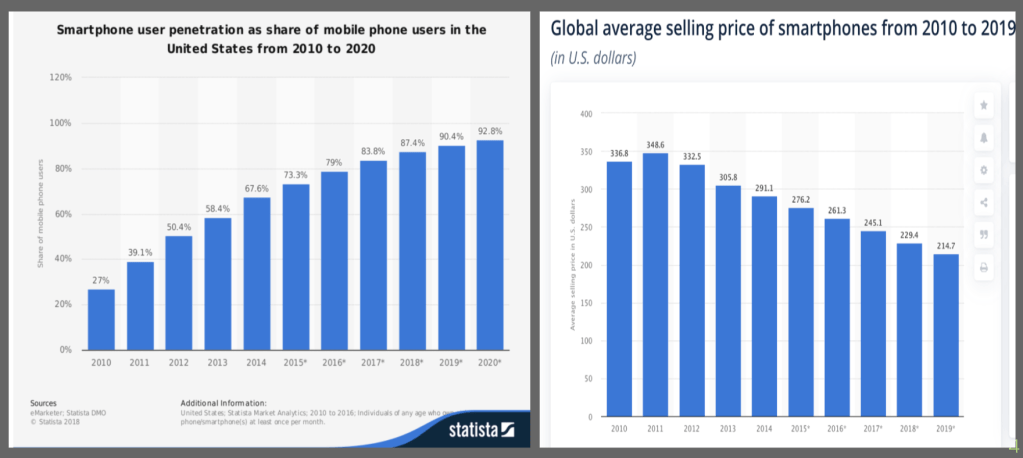
If you made it this far it means you were not completely turned off by my terrible attempt to use a pun in the title and I thank you for that. This blog will probably be pretty quick I think. Recently, I have been seeing some buzz about the phone pictured above; the alleged iPhone 12. While every new iPhone release and update is exciting (yes – I like Apple and have never had an android), I have long been of the opinion that there hasn’t been too much major innovation in cell phones in recent years. While there have been new features added or camera upgrades, there are few moments that stick out as much as when Siri was first introduced. (I remember when I tried to use voice recognition on my high school phone before everyone had an iPhone). Let’s look at the following graph for a second:
The graph above indicates that as popularity in smartphones has gone up, prices have declined. I think that there are many influences here, but surely the lack of major innovation is one reason why no one is capitalizing on this obvious trend and creating phones that are allowed to be more expensive because of what they bring to the table. This led me to my next question; what actually drives phone pricing? iOS 9 still sticks out to me all these years later because I loved the music app. However, it could be that others care nothing about the music app and are more interested in other features like camera quality and I was really interested in seeing what actually mattered. Conveniently, I was able to find some data from kaggle.com and could investigate further.
Data Preparation
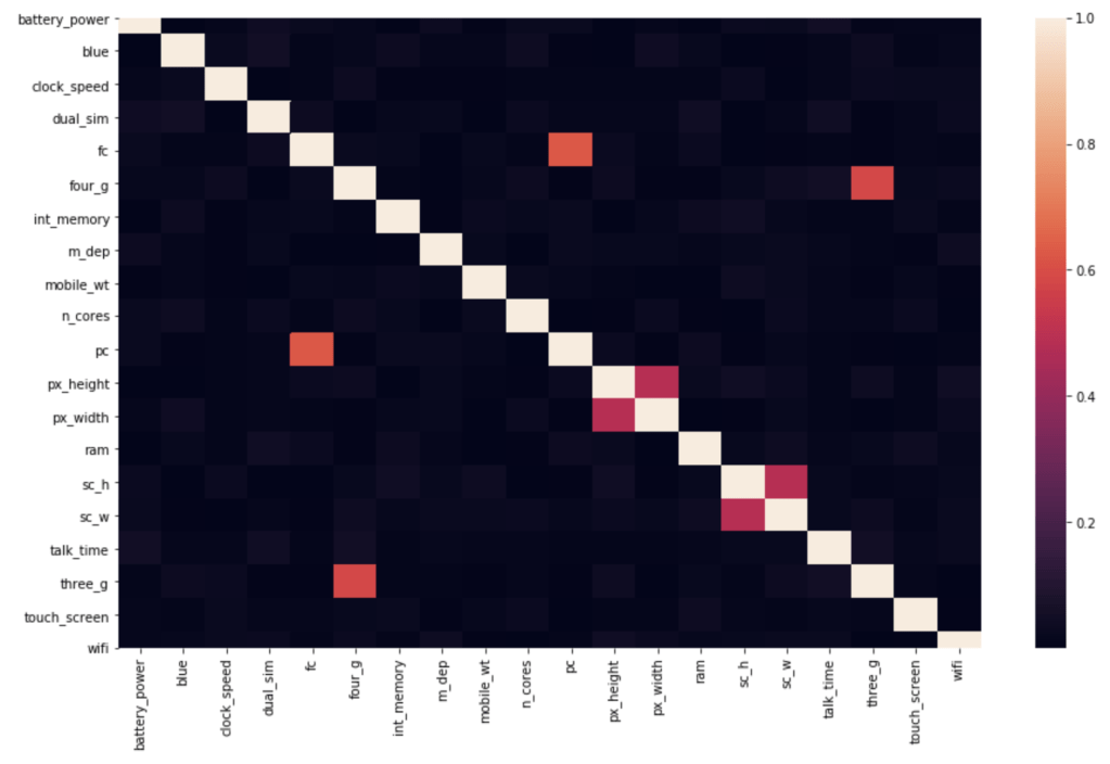
I mentioned my source: kaggle.com. My data contained the following features as described by kaggle.com (I’ll add descriptions in parentheses when needed but also present the names as they appear in the data): battery_power, blue (presence of bluetooth), clock_speed (microprocessor speed), dual_sim (dual sim support or not), fc (front camera megapixels), four_g (presence of 4G), int_memory (storage), m_dep (mobile depth in cm), n_cores (number of cores of processor), pc (primary camera megapixels), px_height (pixel resolution height), px_width, ram, sc_h (screen height), sc_W (screen_width), talk_time (longest possible call before battery runs out), three_g (presence of 3G), touch_screen, wi_fi. The target feature is price range which consists of 4 classes each representing an increasing general price range. In terms of filtering out correlation – there was surprisingly no high correlation to filter out.
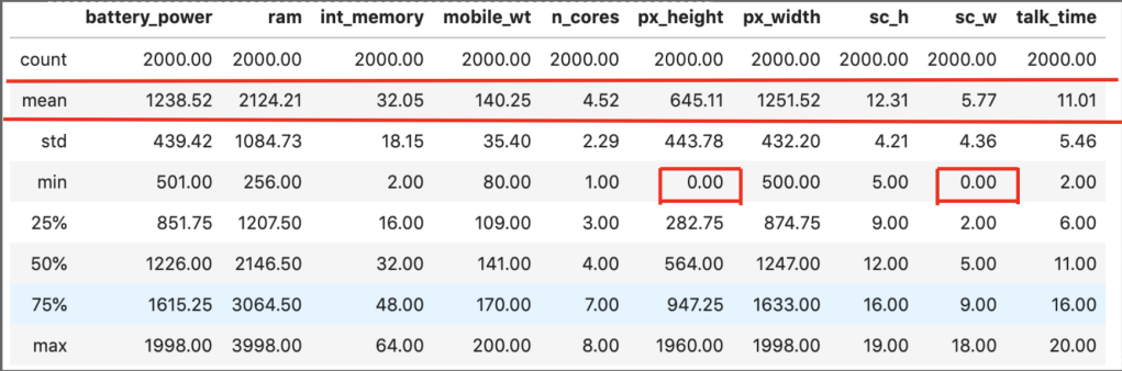
There were some other basic elements of data preparation that are not very exciting so will not be described here. I would like to point out one weird observation, though:
In those two smaller red boxes, it appears that some phones have a screen width of zero. That doesn’t really make any sense.
Model Data
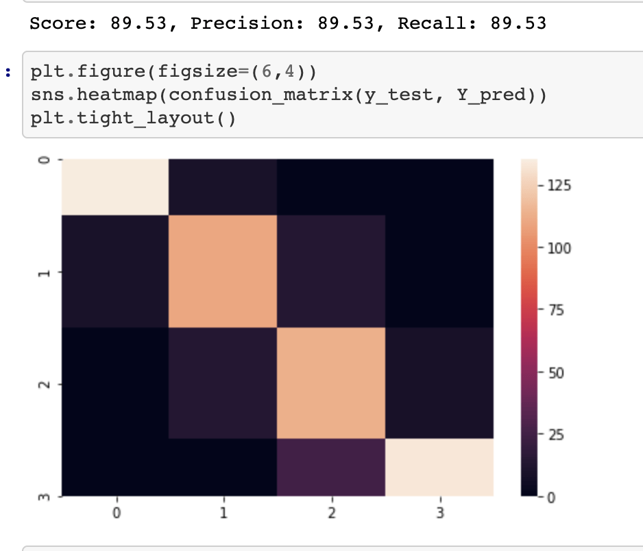
I ran a coupe different models and picked the logistic regression model because it worked best. You may notice that when I post my confusion matrix and metrics that precision = recall = f1 = accuracy. That is always the case with evenly balanced data. Even after filtering outliers I had a strong balance in my target class.
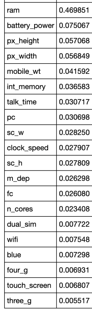
In terms of determining what drives pricing by using coefficients determined in logistic regression:
I think these results make sense. At the top you see things like RAM and battery power. At the bottom you see things like touch screen and 3G. Almost every phone includes these features nowadays an there is nothing special about a phone having those features.
Conclusion
We now have an accurate model that can classify the price range of any phone given it’s features and we also know what features have the biggest impact on price. If companies are stuck on innovation, they could just keep upping the game with things like higher RAM, I suppose. I think the next step in this project is to collect more data on other features not yet included but to also take a closer look at what the specific differences in each iteration of the iPhone were as well as how the operating systems they run on have evolved. I actually saw a video today about iOS 14 and it doesn’t look to be that innovative. Although, I am curious to see what will happen as Apple begins to develop their own chips in place of Intel ones. At the very least, we can use the model established here as a baseline to be able to understand what will allow companies to charge more for their phones in the absence of more impactful innovation.
It’s important to keep track of who does and does not show up to work when they are supposed to. I found some interesting data online that gives information on how much work from a range of 0 to 40 hours any employee is expected to miss in a certain week. I ran a couple models and came away with some insights on what my best accuracy would look like and what it would tell me are the most predictive of time expected to miss by an employee.
Process
Collect Data
Clean Data
Model Data
Collect Data
My data comes from the UC Irvine Machine Learning Repository (https://archive.ics.uci.edu/ml/datasets/Absenteeism+at+work). While I will not go through this part in full detail, the link above talks about the numerical representation for “reason for absence.” The features of the data set, other than the target feature of time missed, were: ID, reason for absence, month, age, day of week, season, distance from work, transportation cost, service time, work load, percent of target hit, disciplinary failure, education, social drinker, social smoker, pet, weight, height, BMI, and son. I’m not entirely sure what “son” means. So now I was ready for some data manipulation. However, before I did that, I performed some exploratory data analysis with some custom columns being binning the variables with many unique values such as transportation expense.
EDA
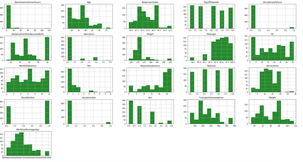
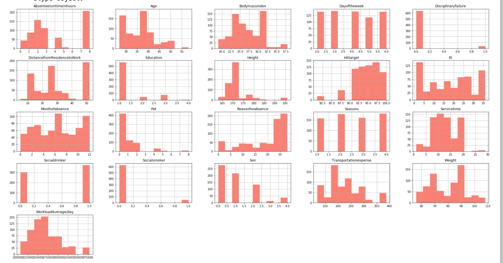
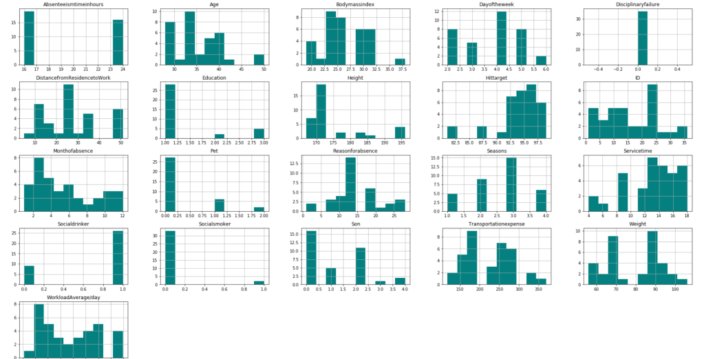
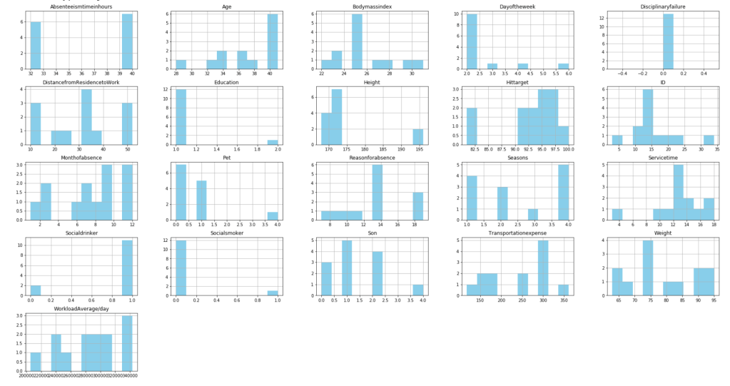
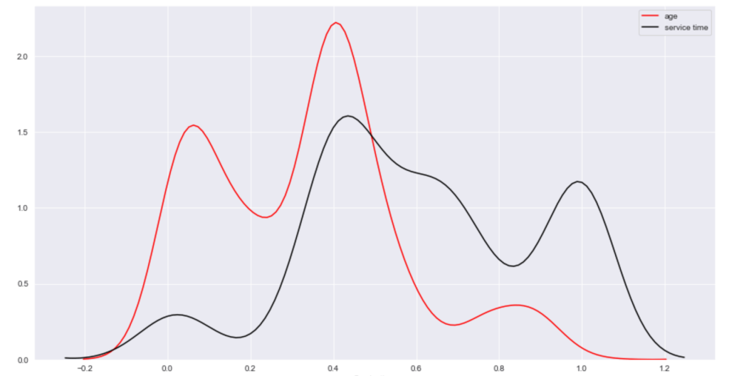
First, I have a histogram of each variable.
After filtering outliers, the next three histogram charts describe the distribution of variables in cases of missing low, medium, and high amounts of work, respectively.
LowMediumHigh
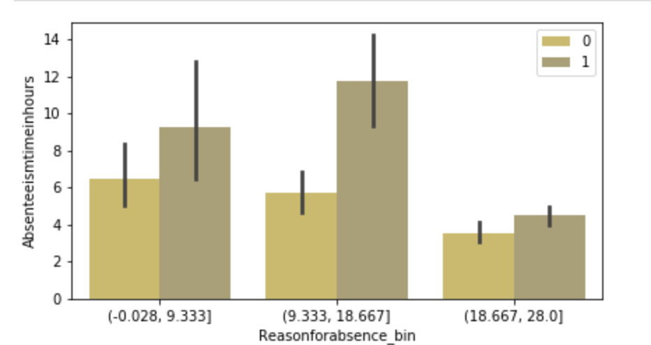
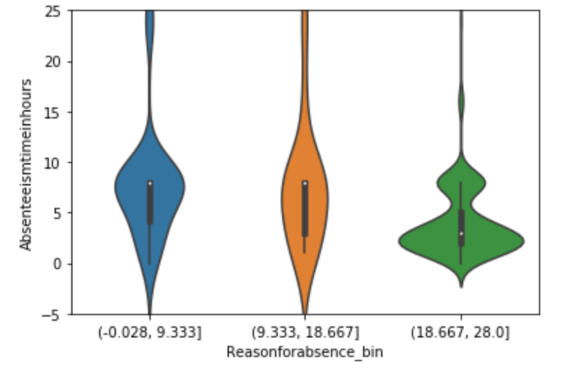
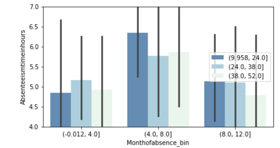
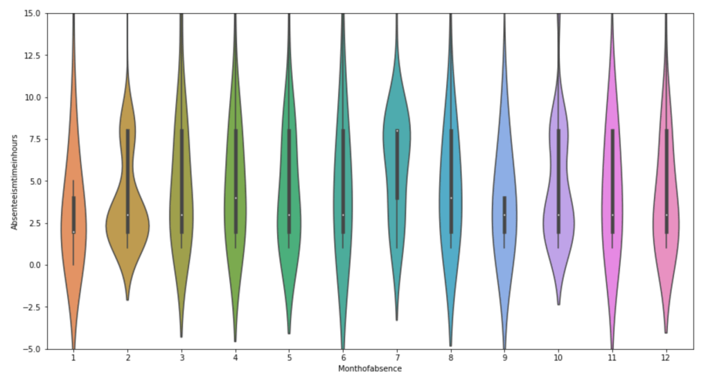
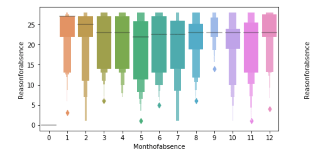
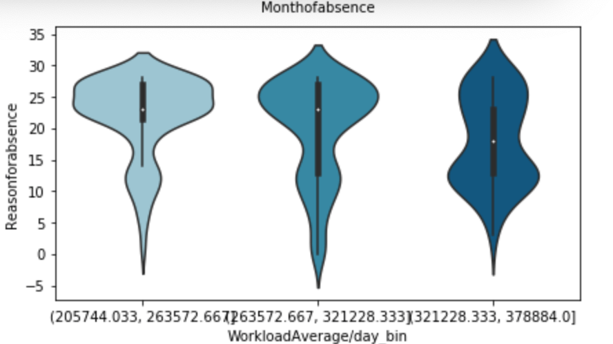
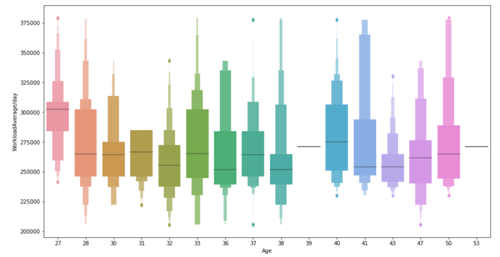
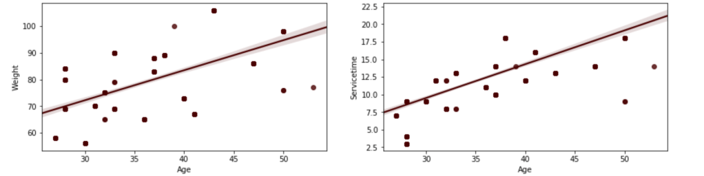
Below, I have displayed a sample of the visuals produced in my exploratory data analysis which I feel tell interesting stories. When an explanation is needed it will be provided.
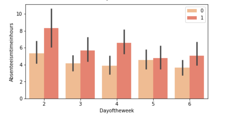
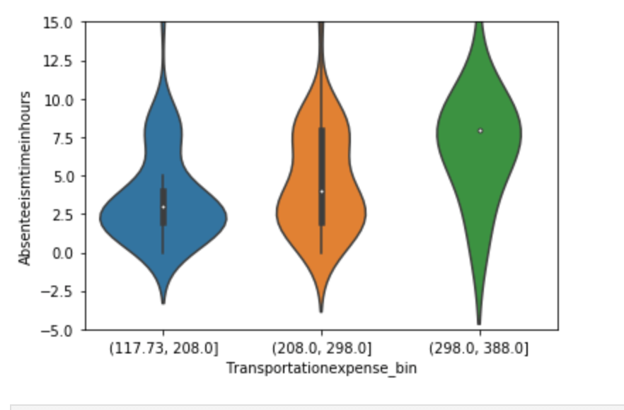
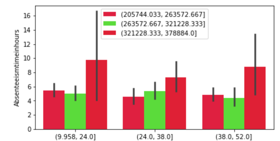
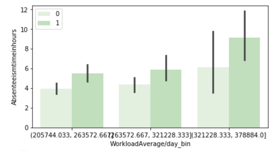
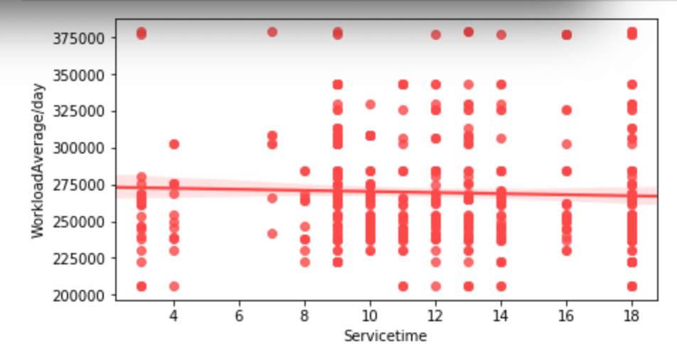
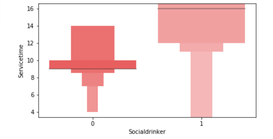
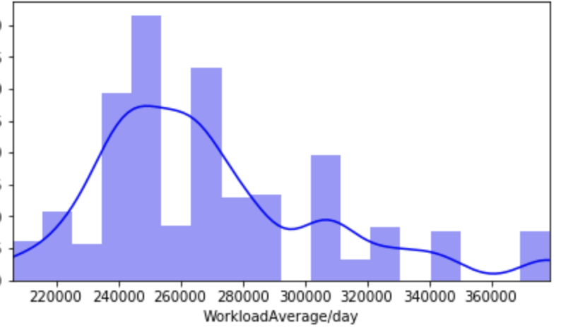
(O and 1 are binary for “Social Drinker”)(The legend refers distance from work)(O and 1 are binary for “Social Drinker”)(The legend refers transportation expense to get to work)(The legend reflect workload numbers)(O and 1 are binary for “Social Drinker”)Histogram(Values adjusted using Min-Max scaler)
This concludes the EDA section.
Hypothesis Testing
I’ll do a quick run-through here of some of the hypothesis testing I performed and what I learned. I examined the seasons of the year to see if there was a discrepancy in the absences observed in the Summer and Spring vs Winter and Fall. What I found was that there wasn’t much evidence to say a difference exists. I found with high statistical power that people with higher travel expenses tend to miss more work. This was also the case with people who have longer distances to work. Transportation costs as well as distance to work also have a moderate effect on service time at a company. Age has a moderate effect on whether people tend to smoke or drink socially but not enough to have statistical significance. In addition, there appears to be little correlation with time at the company and whether or not targets were hit. However, this test has low statistical power and has a p-value that is somewhat close to 5% implying that an adjusted alpha may change how we view this test both in terms of type 1 error and statistical power. People with less education tend to drink more as well. Education has a moderate correlation with service time. Anyway, that is very quick recap of the main hypotheses I tested boiled down to the most easy way to communicate their findings.
Clean Data
I started out by binning variables with wildly uneven distributions. Next, I used categorical data encoding to encode all my newly binned features. Next, I applied scaling so that all the data would be within 3 standard deviations of each variable’s mean. Having filtered out misleading values, I binned my target variable into three groups. Next, I removed correlation. I will go back and discuss some of these topics later in this blog when I discuss some of the difficulties I faced.
Model Data
My next step was to split and model my data. One problem came up. I had a huge imbalance among my classes. The “lowest amount of work missed” class had way more than the other two classes. Therefore, I synthetically created new data to have every class have the same amount of cases. To find my most ideal model and then improve it… well I first needed to find the best model. I applied 6 types of scaling across 9 models = 54 results and found that my best model would be a Random Forest model. I even found that adding polynomial features would give me near 100% accuracy on training data without much loss on test data. Anyway, I went back to my random forest model. I found the most indicative features of time missed in order from biggest indicator to smallest indicator were: month, reason for absence, work load, day of the week, season, and social drinker. There are obviously other features, but these are the most predictive ones. The others provide less information.
Problems Faced in Project
The first problem I had was not looking at the distribution of the target variable. It is a continuous variable, however, there are very few values in certain ranges. I therefore split it into three bins; missing little work, a medium amount of work, and a lot of work. I also experimented with having two bins as well as different cutoff points to pick the bins, but three bins worked better. This also affected my upsampling as the different binning methods resulted in different class breakdowns. The next problem I had was a similar one. How would I bin variables? In short, I tried a couple of ways and found that three bins worked well. All this binning was not done using quantiles, by the way. That would imply no target class imbalance which was not the case. I tried using quantiles, but did not find it effective. I also experimented with different categorical feature encoding but found that the most effective method was to bin based on mean value in connection with target variable (check my home page for a blog about that concept). I ran a gridsearch to optimize my random forest at the very end and then printed a confusion matrix. This was not good, but I nee to be intellectually honest. Predicting when someone would fall into class 0 (“missing low amount of work”) my model was amazing and its recall exceeded precision. However, it did not work well on the other two. Now keep in mind that you do not upsample test data and this could be a total fluke. However, that was still frustrating to see. An obvious next step is to collect more data and continue to improve the model. One last idea I want to talk about is exploratory data analysis. Now, to be fair, this could be inserted into any blog. Exploratory data analysis is both fun and interesting as it allows you to be creative and take a dive into your idea using visuals as quick story-tellers. The project I had just scrapped before acquiring the data for this project drove me kind of crazy because I didn’t really have a plan for my exploratory data analysis. It was arbitrary and unending. That is never a good plan. EDA should be planned and thought out. I will talk more / have talked more about this (depending on when you read this blog) in another blog but the main point is you want to think of yourself as person who doesn’t do programming who just wants to ask questions based on the names of the features. Having structure in place for EDA is less free-flowing and exciting than not having structure, but it ensures that you work efficiently and have a good start point as well as stop point. That really helped me save a lot of stress.
Conclusion
It’s time to wrap things up. At this point, I think I would need more data to continue to improve this project, and I’m not sure where that data would come from. In addition, there are a lot of ambiguities in this data set such as the numerical choices for reason for absence. Nevertheless, I think that by doing this project I learned how to create an EDA process and how to take a step back and rephrase your questions as well as rethink your thought process. Just because a variable is continuous, this does not imply it requires regression analysis. Think about your statistical inquiries as questions, think about what makes sense from an outsider’s perspective, and then go crazy!
Accounting for the Effect of Magnitude in Comparing Features and Building Predictive Models
Introduction
The inspiration for this blog post comes from some hypothesis testing I performed on a recent project. I needed to put all my data on the same scale in order to compare it. If I wanted to compare the population of a country to its GDP, for example, well… it doesn’t sound like a good comparison in the sense that those are apples and oranges. Let me explain. Say we have the U.S. as our country. The population in 2018 was 328M and the GDP was $20T. These are not easy numbers to compare. By scaling these features you can put them on the same level and test relationships. I’ll get more into how we balance them later. However, the benefits of scaling data extend beyond hypothesis testing. When you run a model, you don’t want features to have disproportionate impacts based on magnitude alone. The fact is that features come in all different shapes and sizes. If you want to have an accurate model and understand what is going on, scaling is key. Now you don’t necessarily have to do scaling early on. It might be best after some EDA and cleaning. Also, while it is important for hypothesis testing, you may not want to permanently change the structure of your data just yet.
I hope to use this blog to discuss the scaling systems available from the Scikit-Learn library in python.
Plan
I am going to list all the options listed in the Sklearn documentation (see https://scikit-learn.org/stable/modules/preprocessing.html for more details). Afterward, I will provide some visuals and tables to understand the effects of different types of scaling.
This code can obviously be generalized to fit other scalers.
Anyway… lets’ get started
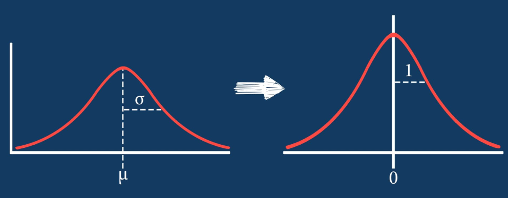
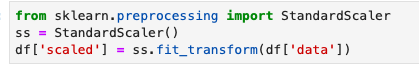
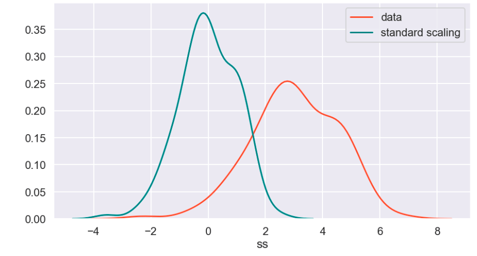
Standard Scaler
The standard scaler is similar to standardization in statistics. Every value has its overall mean subtracted from it and the final quantity is divided over the feature’s standard deviation. The general effect causes the data to have a mean of zero and a standard deviation of one.
Min Max Scaler
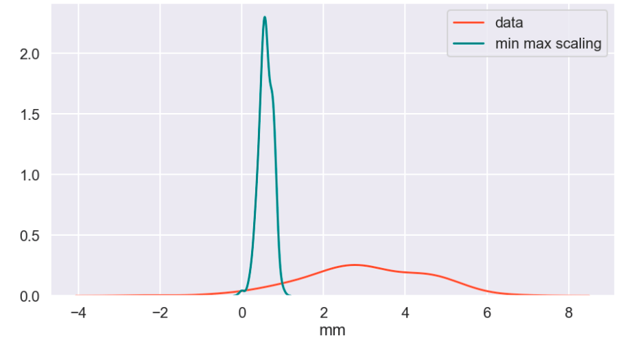
The min max scaler effectively compresses your data to [0,1]. However, one should be careful not to divide by negative values or fractions as that will not yield the most useful results. In addition, it does not deal well with outliers.
Max Abs Scaler
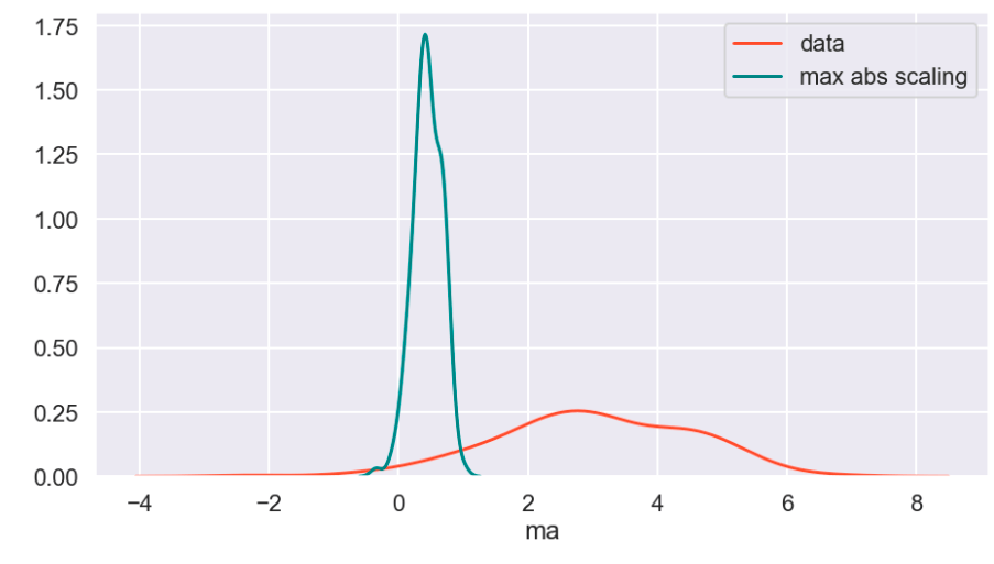
Here, you divide every value by the maximum absolute value of that feature. Effectively all your data gets put into the [-1,1] range.
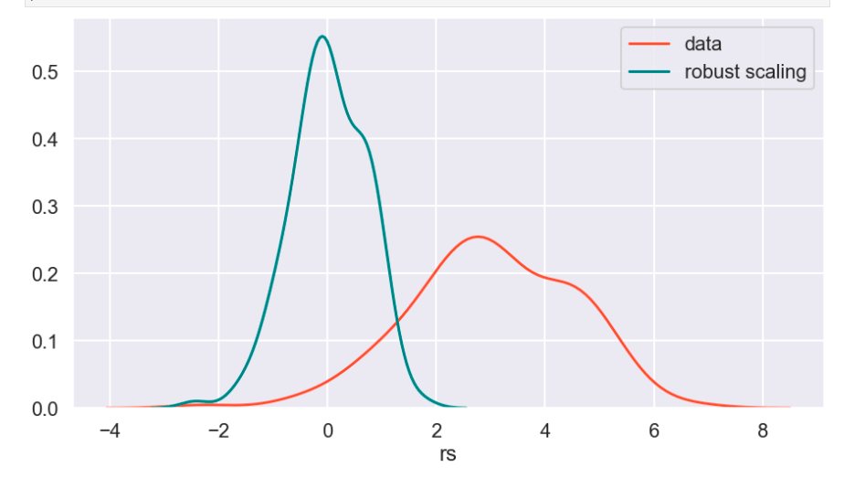
Robust Scaler
The robust scaler is designed to deal with outliers. It generally applies scaling using the inner-quartile range (IQR). This means that you can specify extremes using quantiles for scaling. What does that mean? If your data follows a standard normal distribution (mean 0, error 1), the 25% quantile is -0.5987 and the 75% quantile is 0.5987 (symmetry is not usually the case – this distribution is special). So once you hit -0.5987, you have covered 1/4 of the data. By 0, you hit 50%, and by 0.5987, you hit 75% of the data. Q1 represents the lower quantile of the two. It’s very similar to min-max-scaling but allows you to control how outliers affect the majority of your data.
“PowerTransformer applies a power transformation to each feature to make the data more Gaussian-like. Currently, PowerTransformer implements the Yeo-Johnson and Box-Cox transforms. The power transform finds the optimal scaling factor to stabilize variance and mimimize skewness through maximum likelihood estimation. By default, PowerTransformer also applies zero-mean, unit variance normalization to the transformed output. Note that Box-Cox can only be applied to strictly positive data. Income and number of households happen to be strictly positive, but if negative values are present the Yeo-Johnson transformed is to be preferred.”
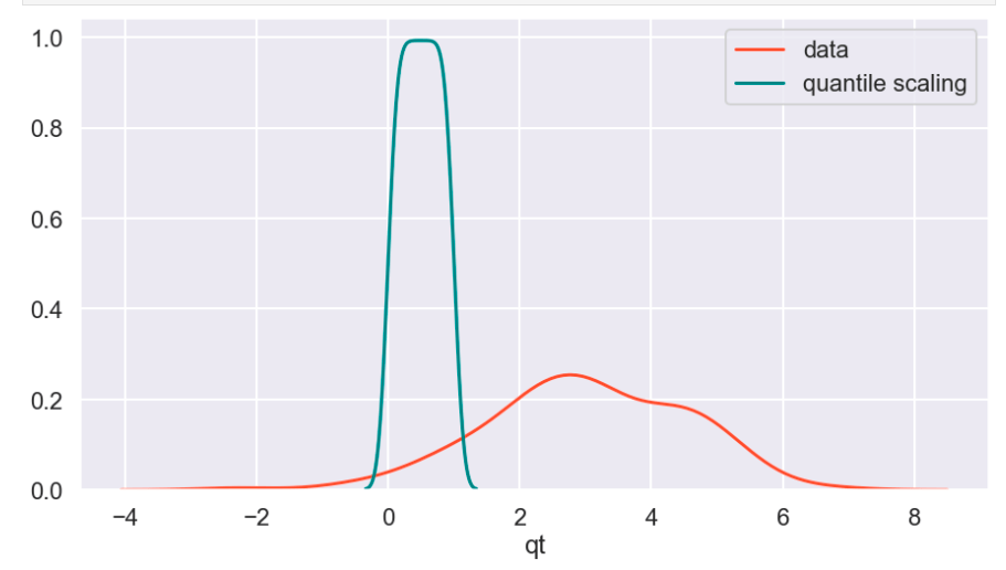
Quantile Transform
The Sklearn website describes this as a method to coerce one or multiple features into a normal distribution (independently, of course) – according to my interpretation. One interesting effect is that this is not a linear transformation and may change how certain variables interact with one another. In other words – if you were to plot values and just adjust the scale of the axes to match the new scale of the data, it would likely not look the same.
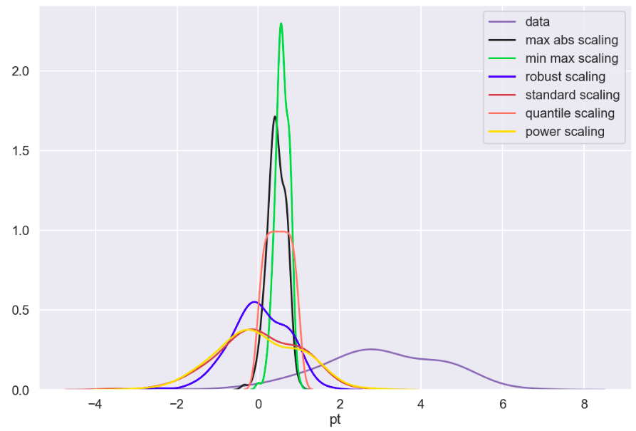
Visuals and Show-and-Tell
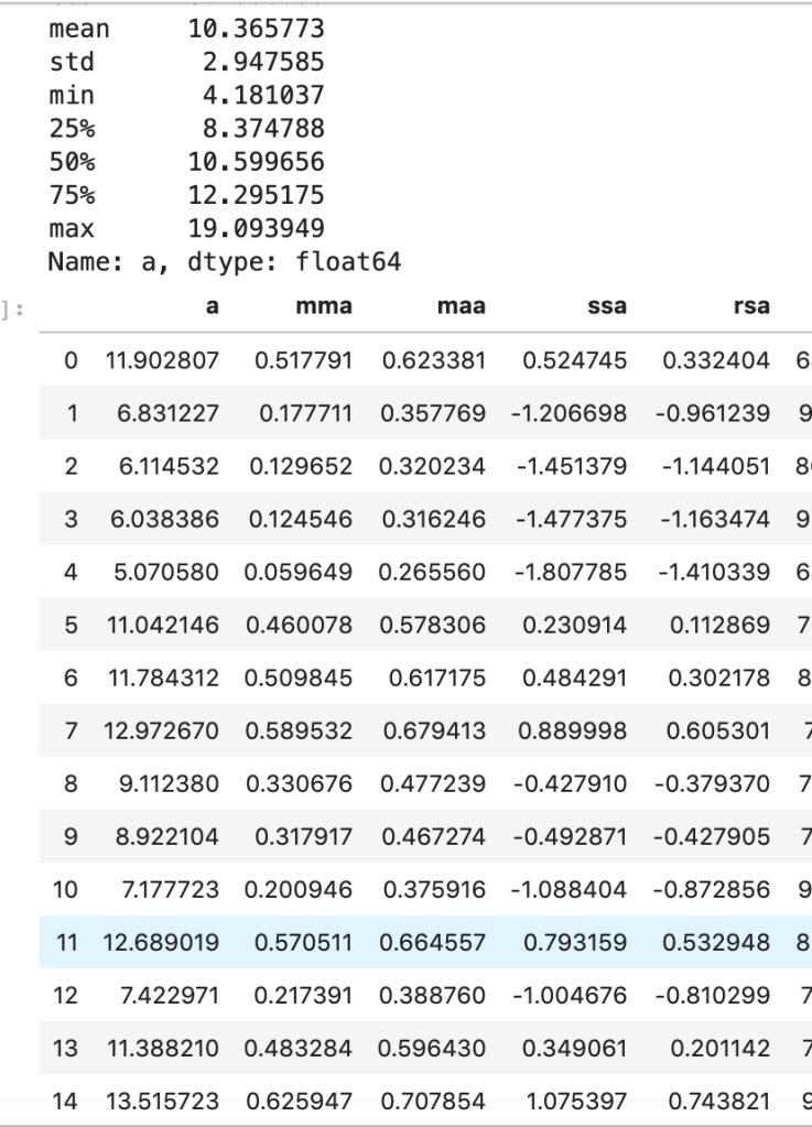
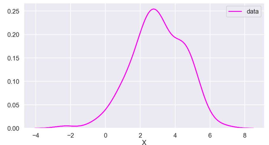
I’ll start with my first set of random data. Column “a” is the initial data (with description in the cell above) and the others are transforms (where the first two letters like maa indicate MaxAbsScaler).
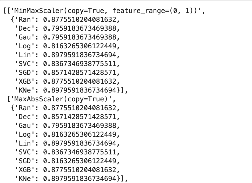
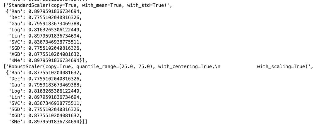
This next output shows 9 models’ accuracy scores across four types of scaling. I recommend every project contain some type of analysis that resembles this to find your optimal model and optimal scaling type (note: Ran = random forest, Dec = decision tree, Gau = Gaussian Naive Bayes, Log = logistic regression, Lin = linear svm, SVC = support vector machine, SGD = stochastic gradient descent, XGB = xgboost, KNe = K nearest neighbors. You can read more about these elsewhere… I may write a blog about this topic later).
More visuals…
I also generated a set of random data that does not relate to any real world scenario (that I know of) to visualize how these transforms work. Here goes:
So I’ll start with the original data, show everything all together, and then break it into pieces. Everything will be labeled. (Keep in mind that the shape of the basic data may appear to change due to relative scale. Also, I have histograms below which show the frequency of a value in a data set).
Review
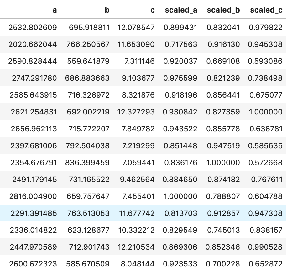
What I have shown above is how one individual feature may be transformed in different ways and how that data would adjust to a new interval (using histograms . What I have not shown is a visual of moving many features to one uniform interval can happen. While this is hard to visualize, I would like to provide the following data frame to get an idea of how scaling features of different magnitudes can change your data.
Conclusion
Scaling is important and essential to almost any data science project. Variables should not have their importance determined based on magnitude alone. Different types of scaling move your data around in different ways and can have moderate to meaningful effects depending on which model you apply them to. Sometimes, you will need to use one method of scaling in specific (see my blog on feature selection and principal component analysis). If that is not the case, I would encourage trying every type of scaling and surveying the results. I recently worked on a project myself where I effectively leveraged featured scaling into creating a metric to determine how valuable individual hockey and basketball players are to their team compared to the rest of the league on a per-season basis. Clearly, the virtues of feature scaling extend beyond just modeling purposes. In terms of models, though, I would expect that feature scaling would change outputs and results in metrics such as coefficients. If this happens, focus on relative relationships. If one coefficient is at… 0.06 and another is at… 0.23, what that tells you is that one feature is nearly 4 times as impactful in output. My point is that don’t let the change in magnitude fool you. You will find a story in your data.
I appreciate you reading my blog and hope you learned something today.


:no_upscale()/cdn.vox-cdn.com/uploads/chorus_asset/file/19412592/swish_4_.png)
:no_upscale()/cdn.vox-cdn.com/uploads/chorus_asset/file/19412589/swish_3_.png)