Devin Booker vs. Gregg Popovich (vs. Patrick McCaw)
Developing a process to predict which NBA teams and players will end up in the playoffs.

Introduction
Hello! Thanks for visiting my blog.
After spending the summer being reminded of just how incredible Michael Jordan was as a competitor and leader, the NBA is finally making a comeback and the [NBA] “bubble” is in full effect in Orlando. Therefore, I figured today would be the perfect time to discuss the NBA playoffs (I know the gif is for the NFL, but it is just too good to not use). Specifically, I’d like to answer the following question: if one were to look at some of the more basic NBA statistics recorded by an NBA player or team on a per-year basis, with what accuracy could you predict whether or not that player may find themselves in the NBA playoffs. Since the NBA has changed so much over time and each iteration has brought new and exciting skills to the forefront of strategies, I decided to stay up to date and look at the 2018-19 season for individual statistics (the three-point era). However, only having 30 data points to survey for team success will be insufficient to have a meaningful analysis. Therefore I expanded my survey to include data back to and including the 1979-80 NBA season (when Magic Johnson was still a rookie). I web-scraped basketball-reference.com to gather my data and it contains every basic stat and a couple advanced ones such as effective field goal percent (I don’t know how that is calculated but Wikipedia does: https://en.wikipedia.org/wiki/Effective_field_goal_percentage#:~:text=In%20basketball%2C%20effective%20field%20goal,only%20count%20for%20two%20points.) from every NBA season ever. As you go back in time, you do begin to lose data from some statistical categories that weren’t recorded yet. To give to examples here I would mention blocks which were not recorded until after the retirement of Bill Russell (widely considered the greatest defender to play the game) or three pointers made as three pointers were first introduced into the NBA in the late 1970s. So just to recap: if we look at fundamental statistics recorded by individuals or in a larger team setting – can we predict who will find themselves in the playoffs? Before we get started, I need to address the name of this blog. Gregg Popovich has successfully coached the San Antonio Spurs to the playoffs in every year since NBA legend Tim Duncan was a rookie. They are known to be a team that runs on good teamwork as opposed to outstanding individual play. This is not to say they have not had superstar efforts though. Devin Booker has been setting the league on fire, but his organization, the Phoenix Suns, have not positioned themselves to be playoff contenders. (McCaw just got lucky and was a role player for three straight NBA championships). This divide is the type of motivation that led me to pursue this project.

Plan
I would first like to mention that the main difficulty in this project was developing a good web-scraping function. However, I want to be transparent here and let you know that I worked hard developing that function a while back and now realized this would be a great use of that data. Anyhow, in my code I go through the basic data science process. In this blog, however, I think I will try to stick to the more exciting observations and conclusions I reached. (here’s a link to GitHub: https://github.com/ArielJosephCohen/postseason_prediction).
The Data
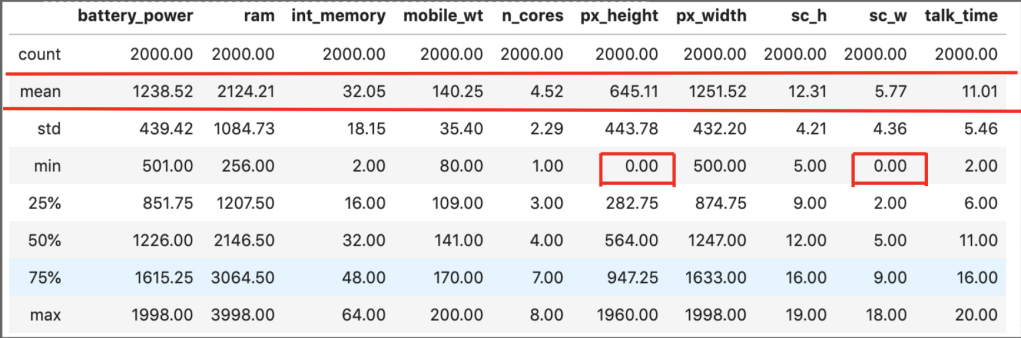
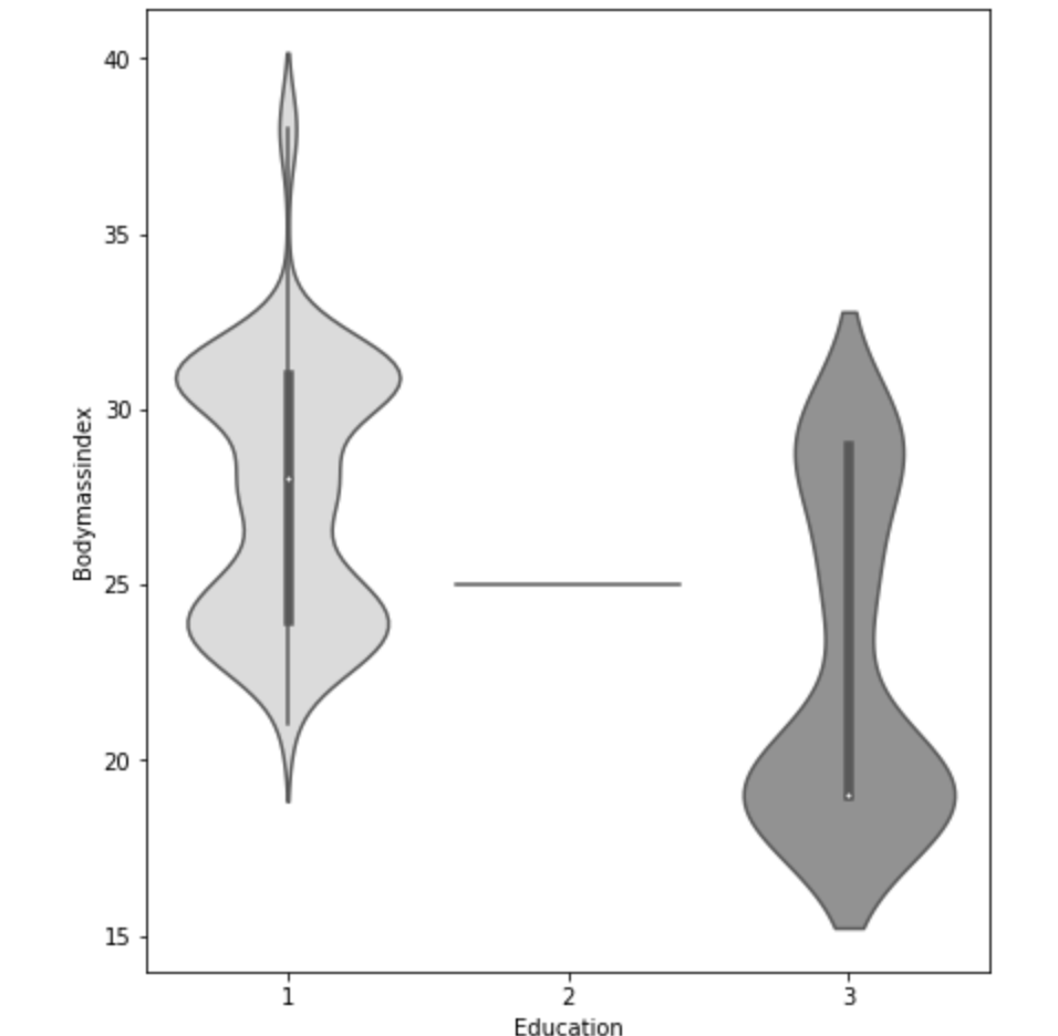
First things first, let’s discuss what my data looked like. In the 2018-19 NBA season, there were 530 total players to play in at least one NBA game. My features included: name, position, age, team, games played, games started, minutes played, field goals made, field goals attempted, field goal percent, three pointers made, three pointers attempted, three point percent, two pointers made, two pointers attempted, two point percent, effective field goal percent, free throws made, free throws attempted, free throw percent, offensive rebounds per game, defensive rebounds per game, total rebounds per game, assists per game, steals per game, blocks per game, points per game, turnovers per game, year (not really important but it only makes the most marginal difference in the team setting), college (or where they were before the NBA – many were null and were filled as unknown), draft selection (un-drafted players were assigned the statistical mean of 34 – which is later than I expected. Keep in mind the drat used to exceed 2 rounds). My survey of teams grouped all the numerical values (with the exception of year) by each team and every season using the statistical mean of all its players that season. In total, there were 1104 rows of data, some of which included teams like Seattle that no longer exist in their original form. My target feature was a binary 0 or 1 with 0 representing a failure to qualify for the playoffs and 1 representing a team that successfully earned a playoff spot.
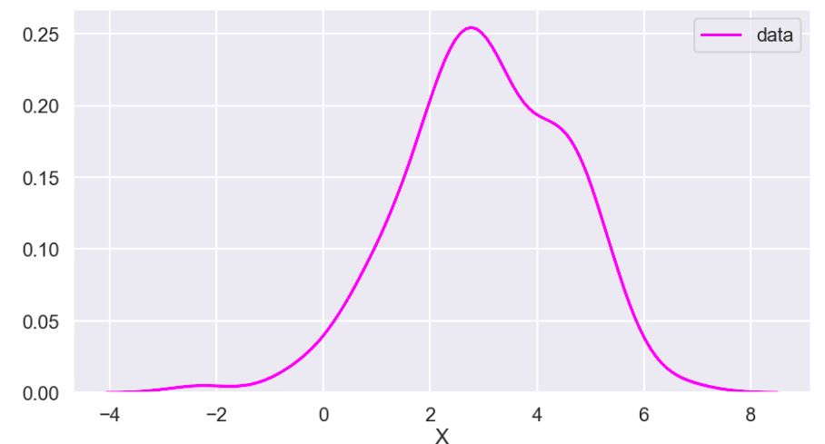
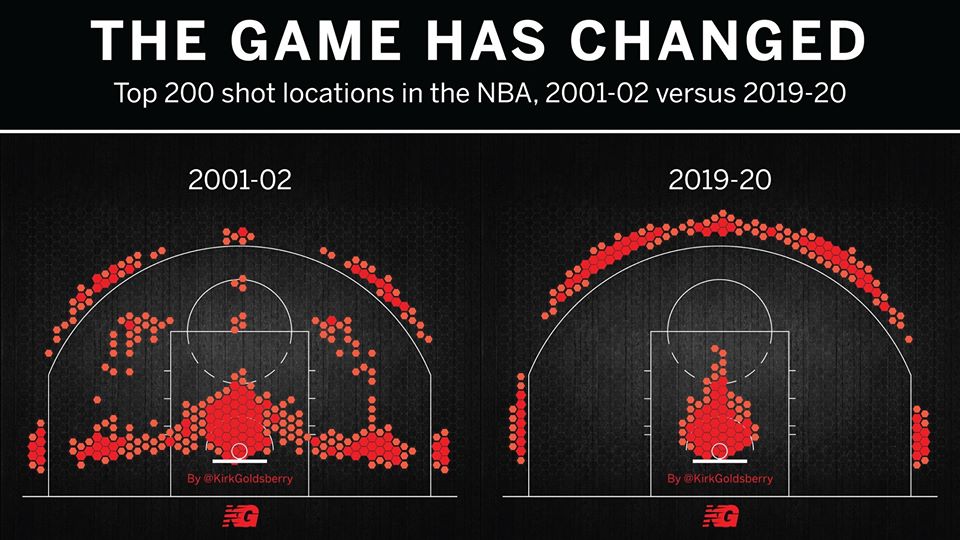
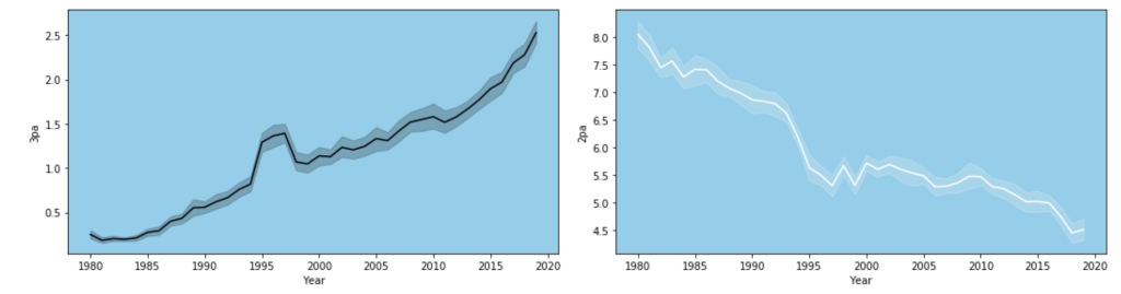
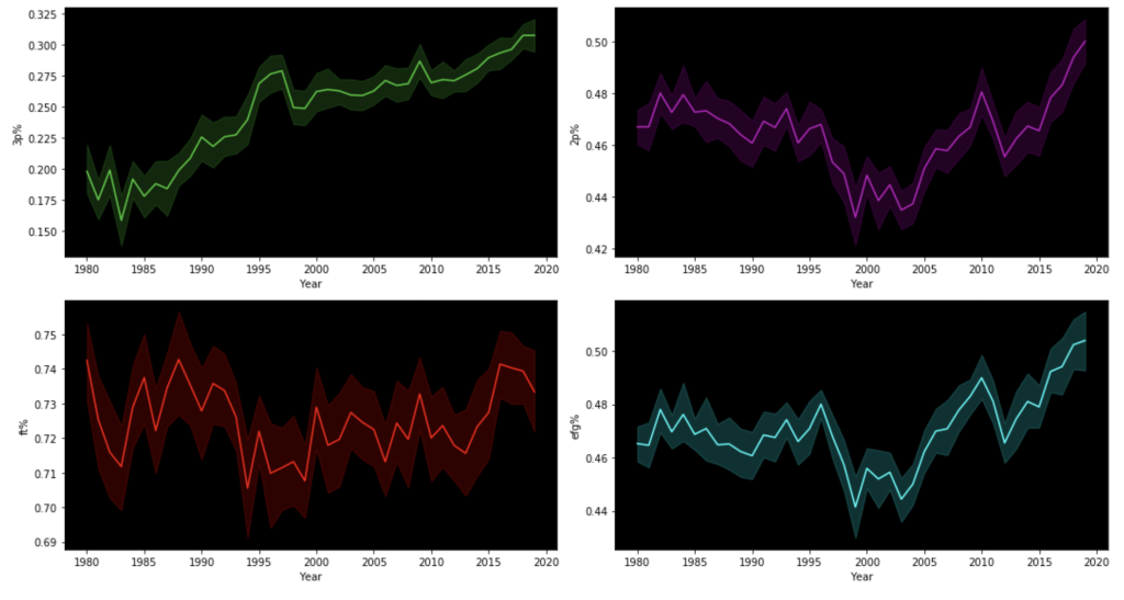
One limitation of this model is that it accounts for trades or other methods of player movement by assigning a player’s entire season stats to the team he ended the season with, regardless of how many games were actually played on his final team. In addition, this model doesn’t account for more advanced metrics like screen assists or defensive rating. Another major limitation is something that I alluded to earlier: the NBA changes and so does strategy. This makes this more of a study or transcendent influences that remain constant over time as opposed to what worked well in the 2015-16 NBA season (on a team level that is). Also, my model focuses on recent data for the individual player model, not what individual statistics were of high value in different basketball eras. A great example of this is the so-called “death of the big man.” Basketball used to be focused on big and powerful centers and power forwards who would control and dominate the paint. Now, the game has moved much more outside, mid-range twos have been shunned as the worst shot in basketball and even centers must develop a shooting range to develop. Let me show you what I mean:
Now let’s look at “big guy”: 7-foot-tall Brook Lopez:
:no_upscale()/cdn.vox-cdn.com/uploads/chorus_asset/file/19412592/swish_4_.png)
:no_upscale()/cdn.vox-cdn.com/uploads/chorus_asset/file/19412589/swish_3_.png)
In a short period of time, he has drastically changed his primary shot selection. I have one more visual from my data to demonstrate this trend.
Exploratory Data Analysis
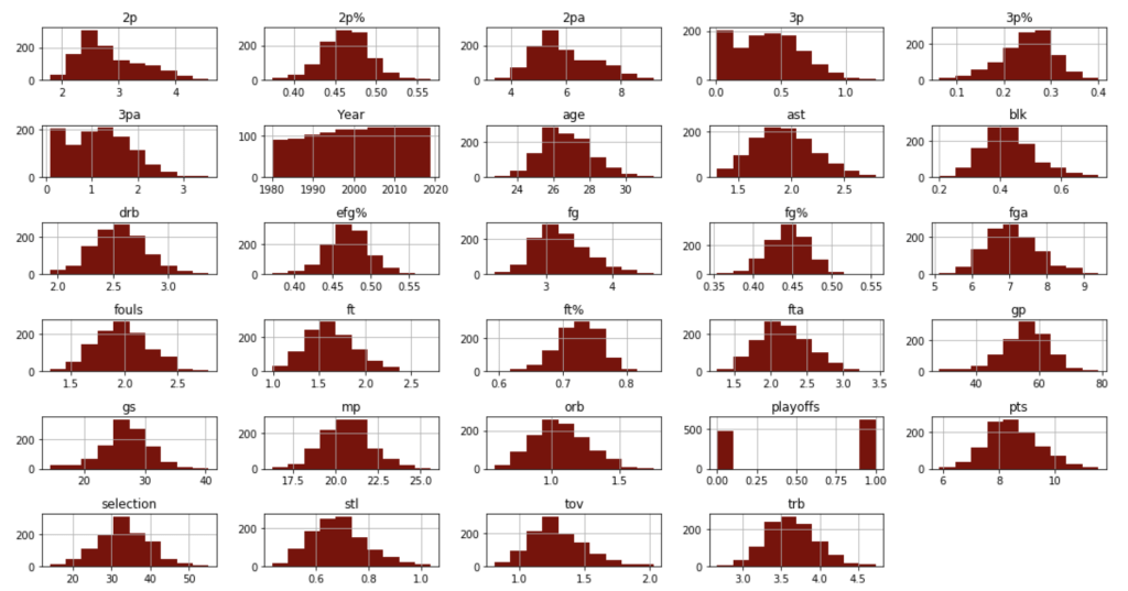
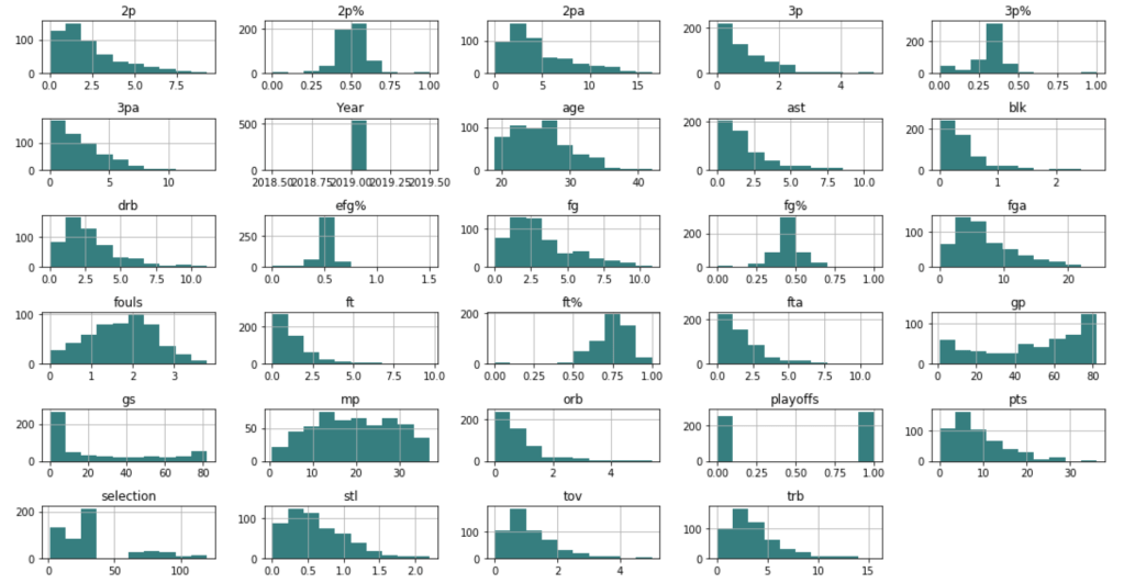
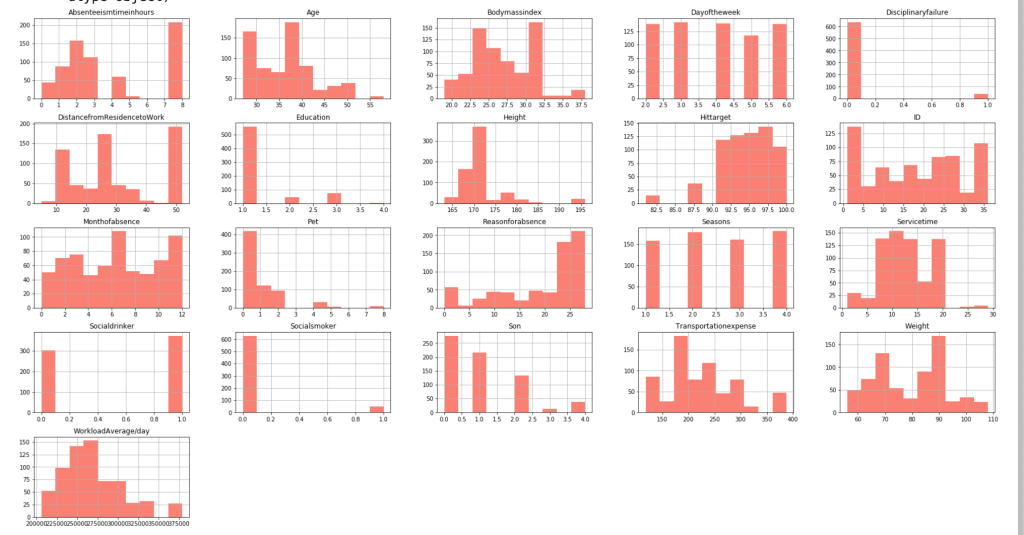
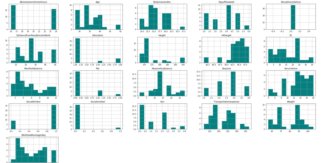
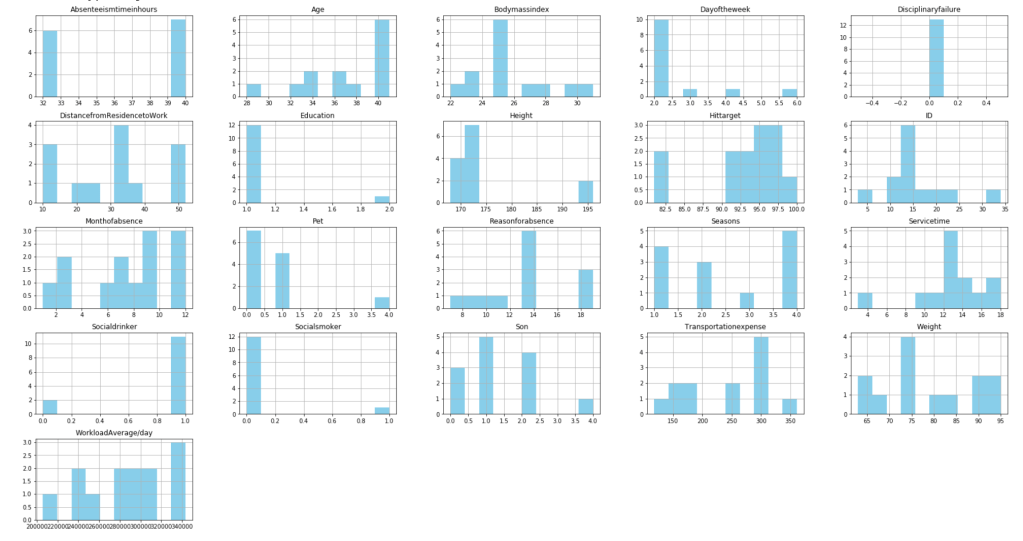
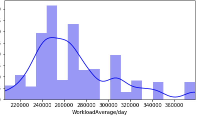
Before I get into what I learned from my model, I’d like to share some interesting observations from my data. I’ll start with two histograms groups:
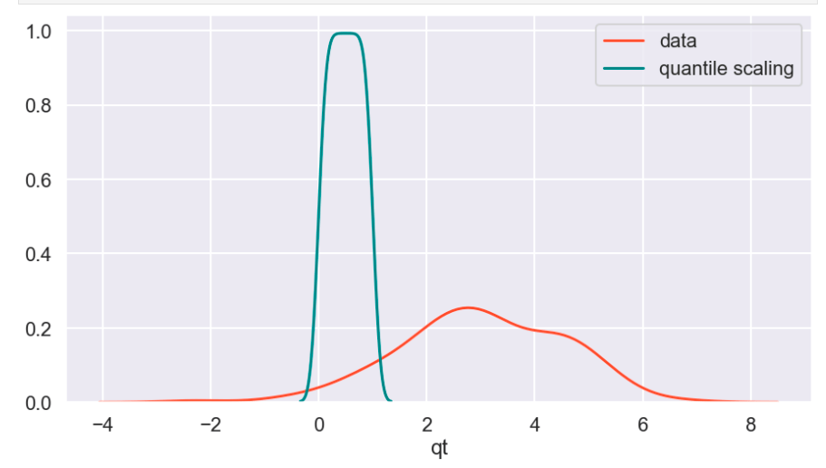
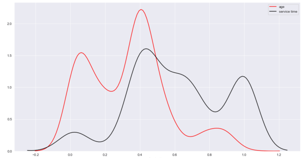
Here, I have another team vs. individual comparison testing various correlations. In terms of my expectations – I hypothesized that 3 point percent would correlate negatively to rebounds, while assists would correlate positively to 3 point percent, blocks would have positive correlation to steal, and assists would have positive correlation with turnovers.
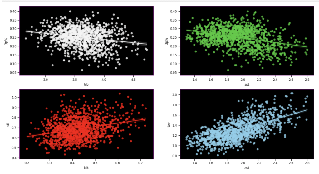
I seem to be most wrong about assists and 3 point percent while moderately correct in terms of team data.
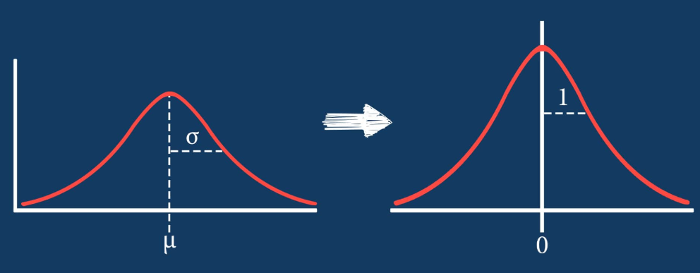
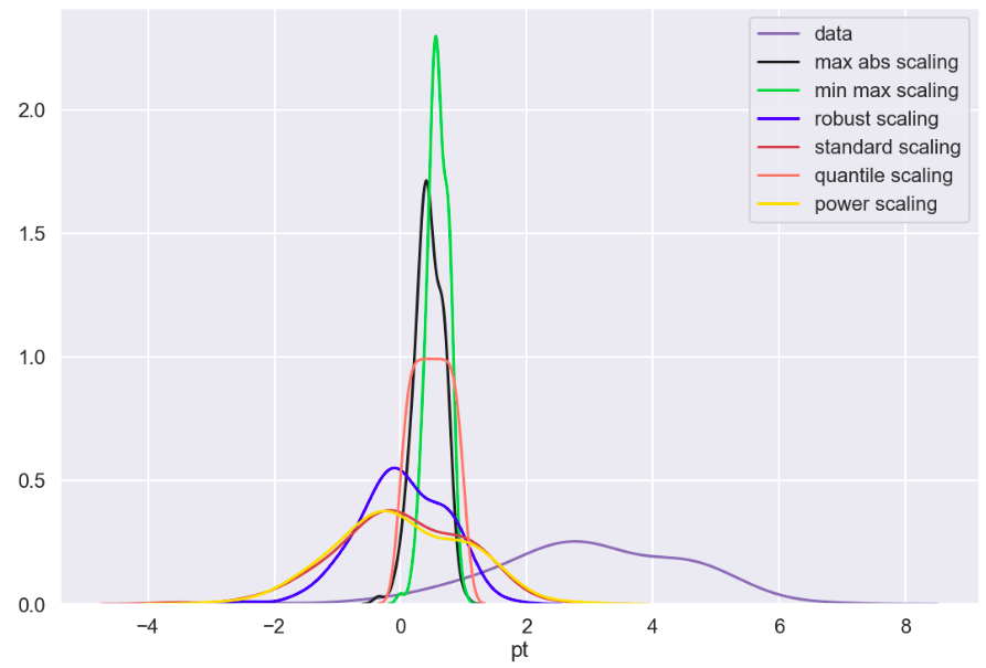
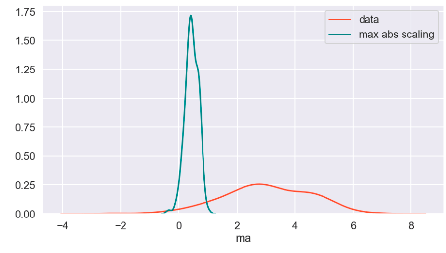
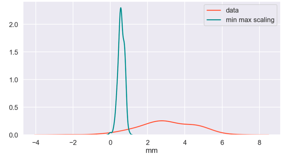
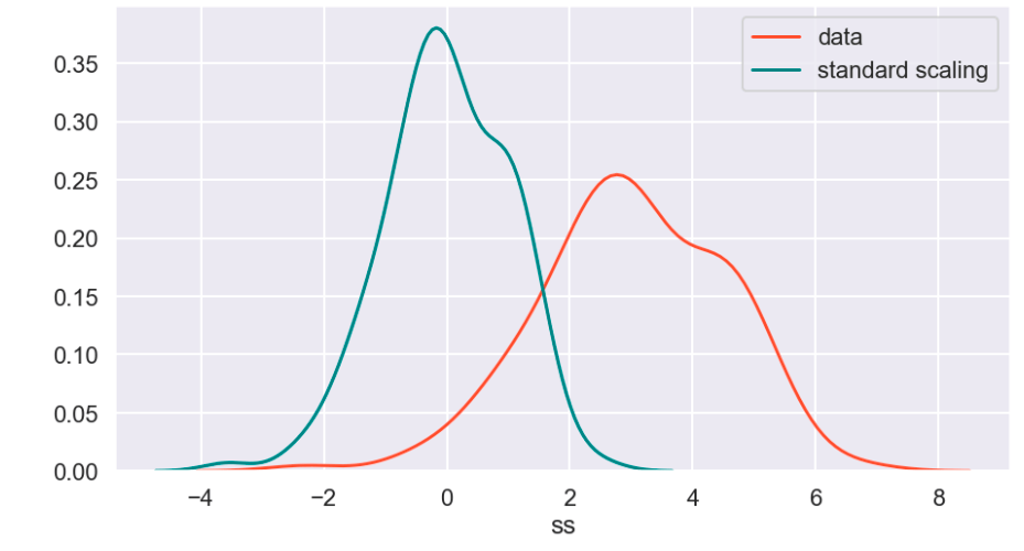
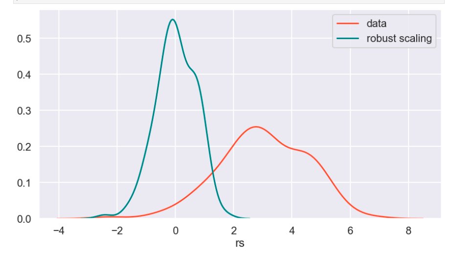
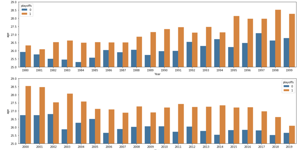
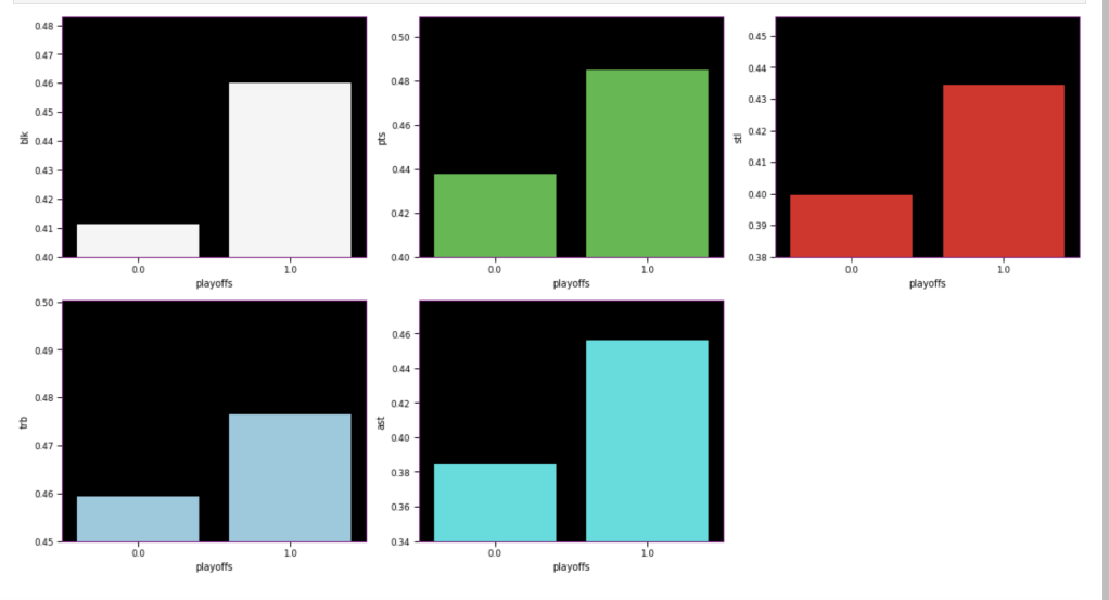
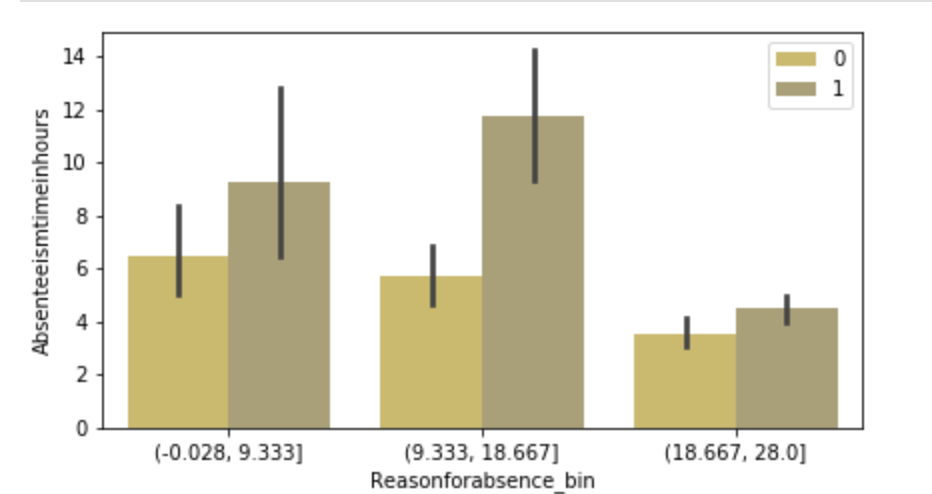
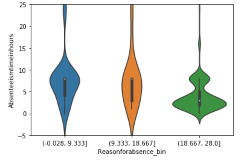
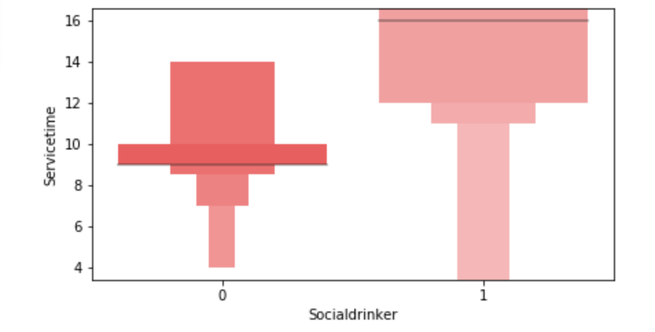
The following graph displays the common differences over ~40 years between playoff teams and non-playoff teams in the five main statistical categories in basketball. However, since the mean and extremes of these categories are all expressed in differing magnitudes, I applied scaling to allow for a more accurate comparison
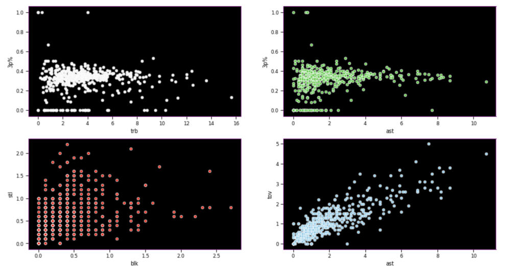
I’ll look at some individual stats now, starting with some basic sorting.
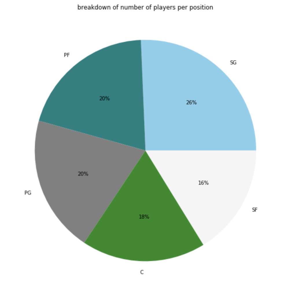
Here’s a graph to see the breakdown of current NBA players by position.
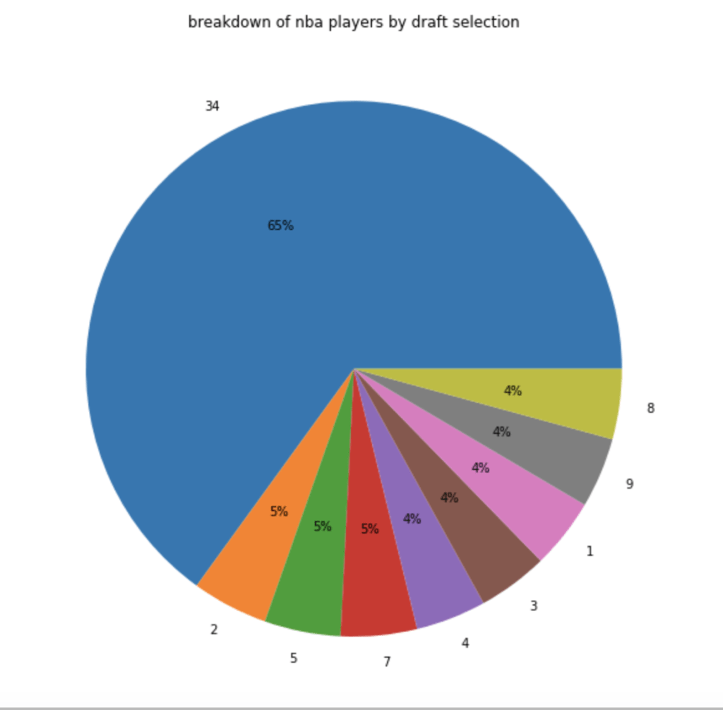
In terms of players by draft selection (with 34 = un-drafted basically):
In terms of how many players actually make the playoffs:

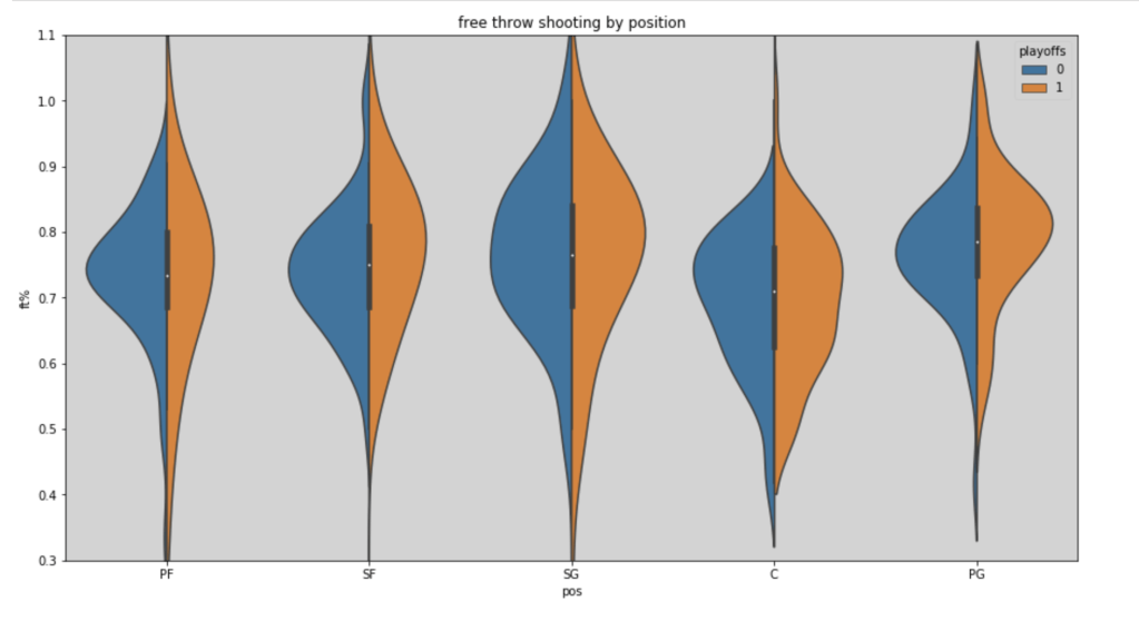
Here’s a look at free throw shooting by position in the 2018-19 NBA season (with an added filter for playoff teams):
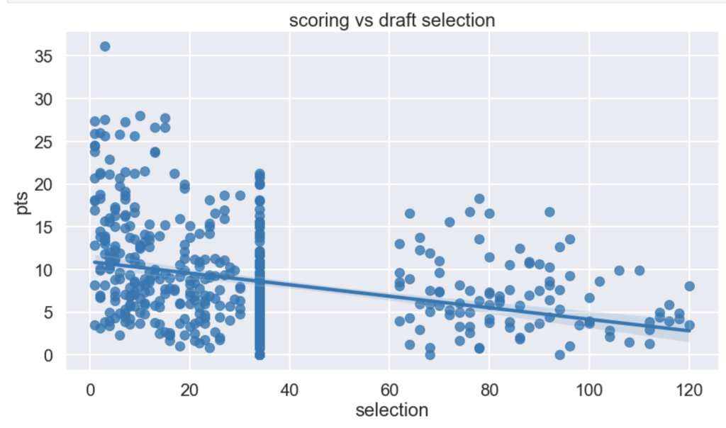
I had a hypothesis that players drafted earlier tend to have higher scoring averages (note that in my graph there is a large cluster of points hovering around x=34. This is because I used 34 as a mean value to fill null for un-drafted players).
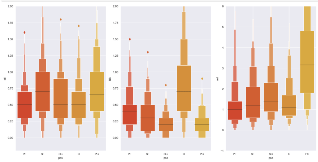
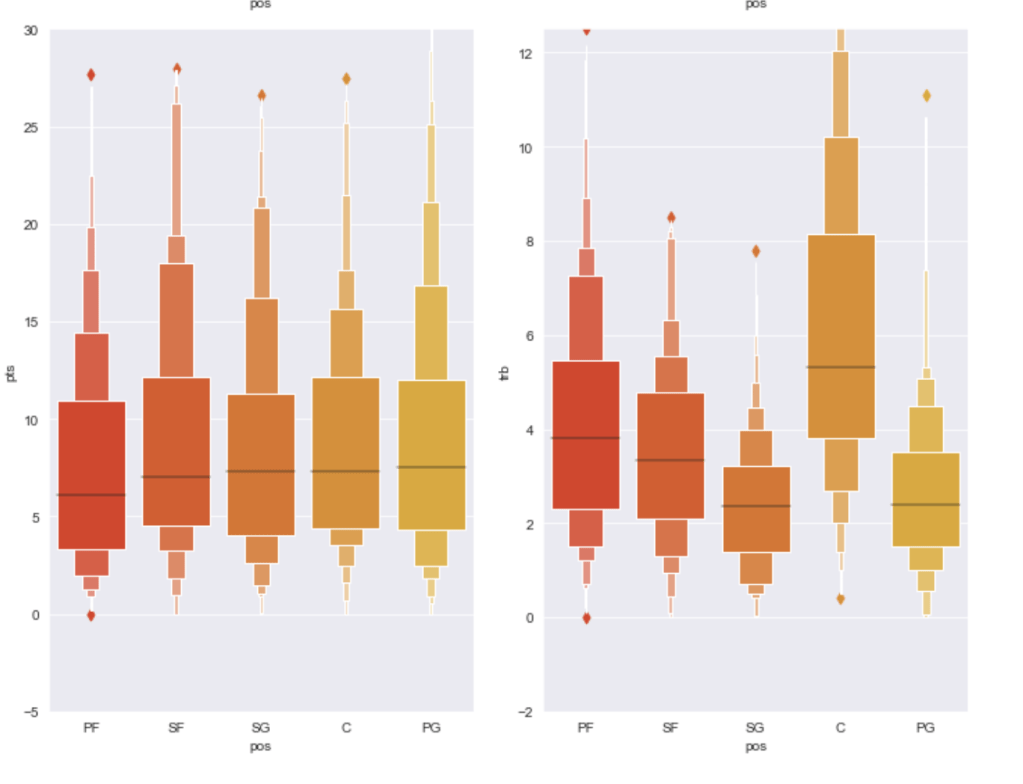
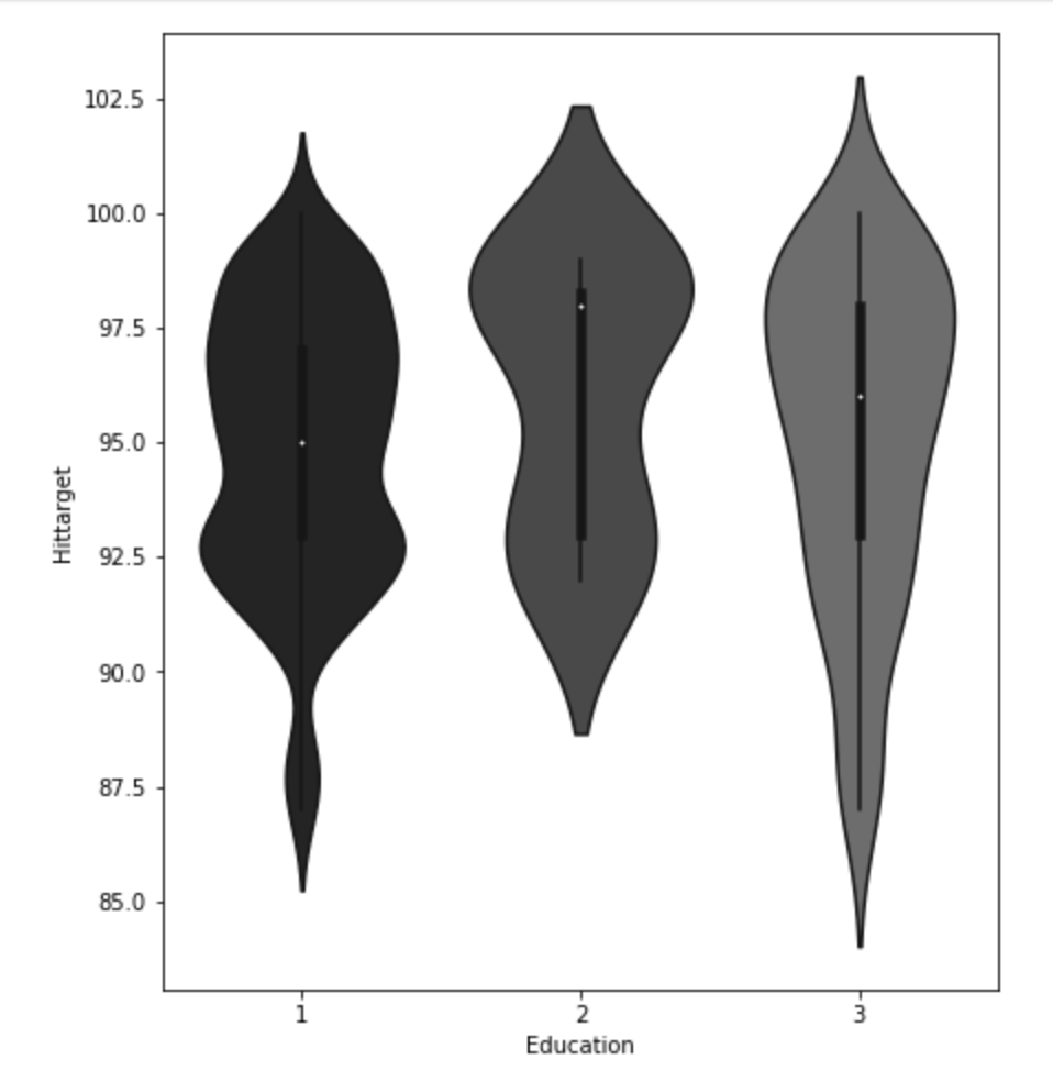
Finally I’d like to share the distribution of statistical averages by each of the five major statistics sorted by position:
Model Data
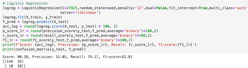
I ran a random forest classifier to get a basic model and then applied scaling and feature selection to improve my models. Let’s see what happend.
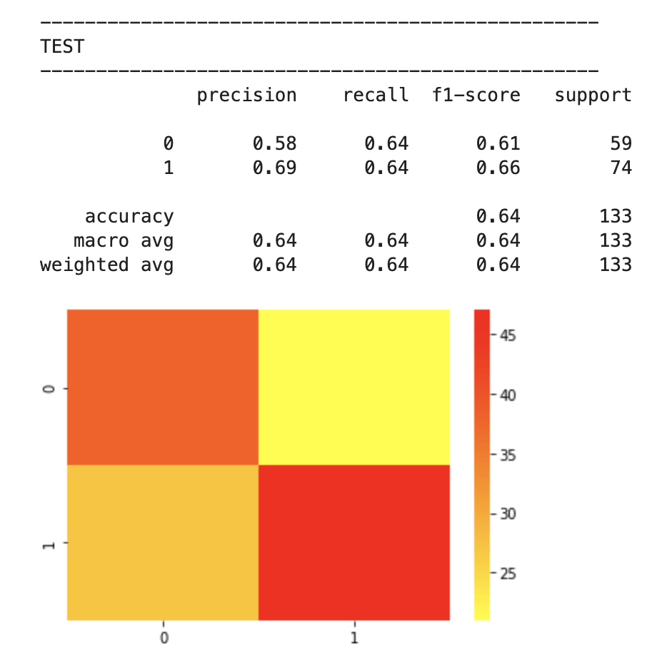
2018-19 NBA players:
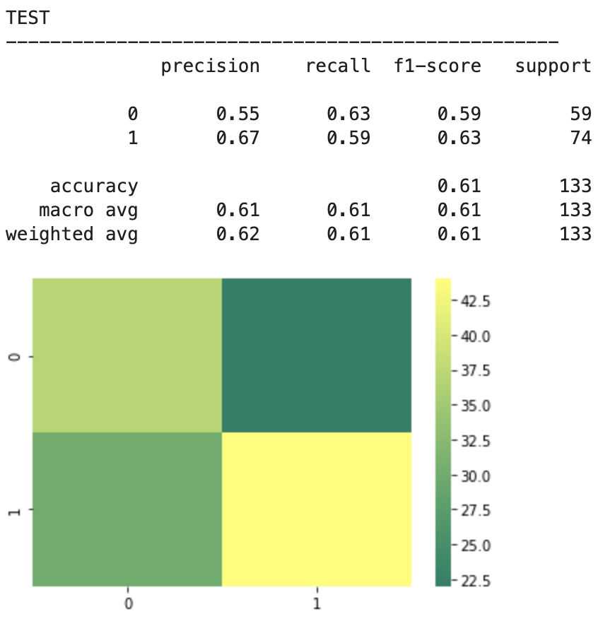
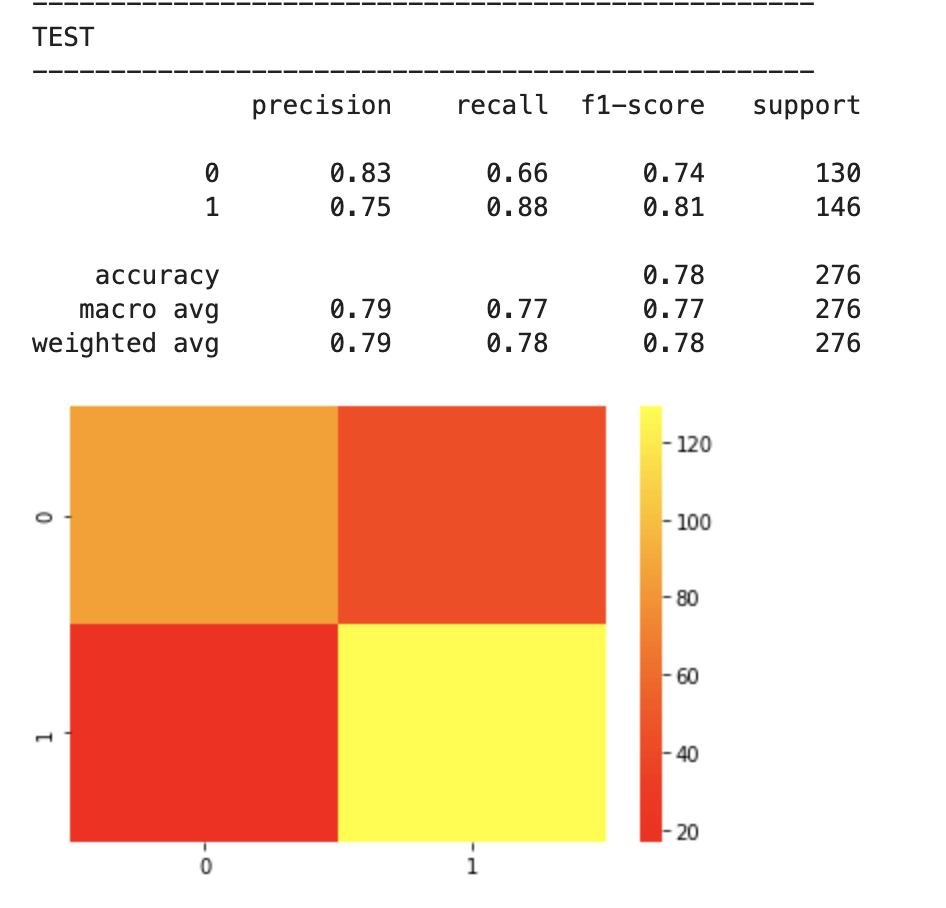
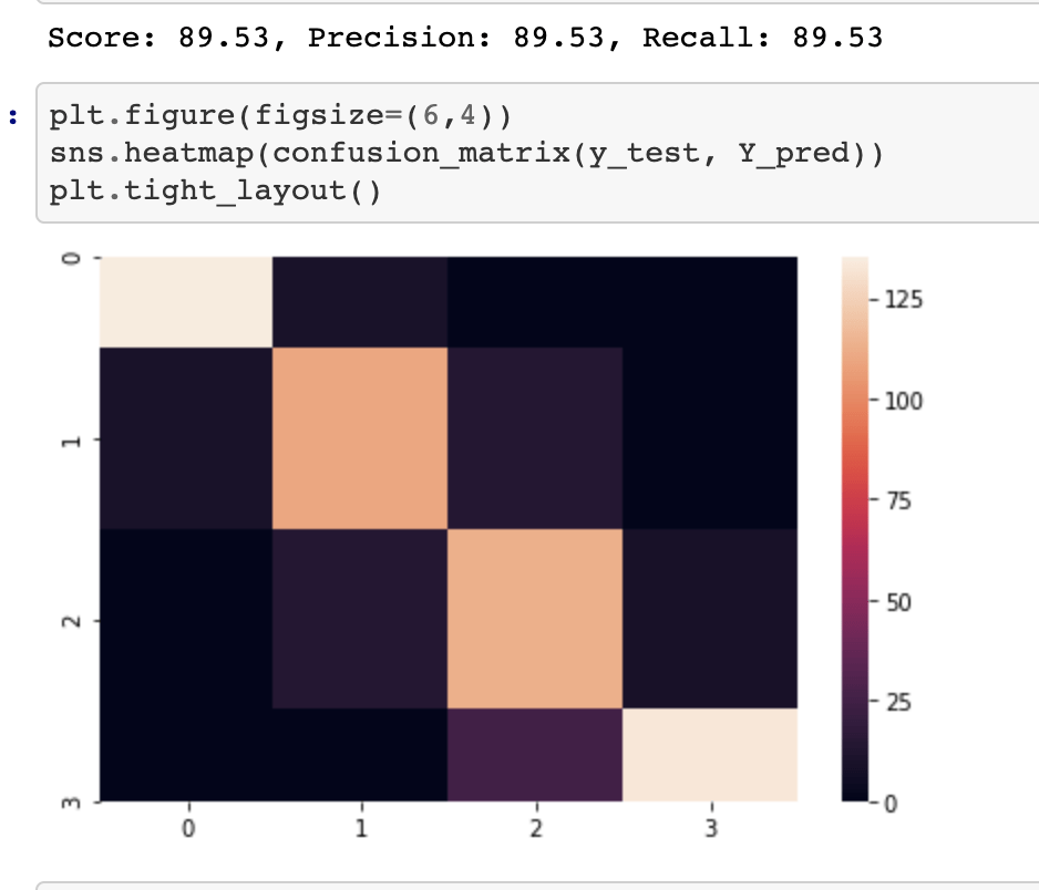
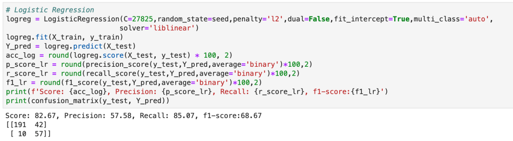
The above represents an encouraging confusion matrix with the rows representing predicted data vs columns which represent actual data. The brighter and more muted regions in the top left and bottom right correspond to the colors in the vertical bar adjacent to the matrix and indicate that brighter colors represent higher values (in this color palette). This means that my model had a lot more values whose prediction corresponded to its actual placement that incorrect predictions. The accuracy of this basic model sits around 61% which is a good start. The precision score represents the percentage of correct predictions in the bottom left and bottom right quadrants (in this particular depiction). Recall represents the percentage of correct positions in the bottom right and top right quadrants. In other words recall represents all the cases correctly predicted given that we were only predicting from a pool of teams that made the playoffs. Precision represents a similar pool, but with a slight difference. Precision looks at all the teams that were predicted to have made the playoffs and the precision score represents how many of those predictions were correct.
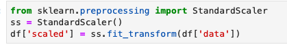
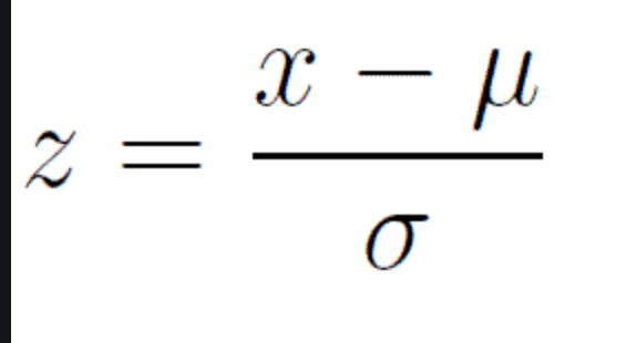
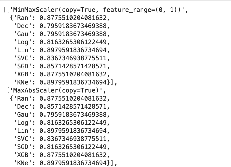
Next, I applied feature scaling which is a process of removing impacts from variables determined entirely by magnitude alone. For example: $40 is a lot to pay for a can of soda but quite little to pay for a functional yacht. In order to compare soda to yachts, it’s better to apply some sort of scaling that might, for example, place their costs in a 0-1 (or 0%-100%) range representing where there costs fall relative to the average soda or yacht. A $40 soda would be close to 1 and a $40 functional yacht would be closer to 0. Similarly, a $18 billion yacht and an $18 billion dollar soda would both be classified around 1 and conversely a 10 cent soda or yacht would both be classified around 0. A $1 soda would be around 0.5. I have no idea how much the average yacht costs.
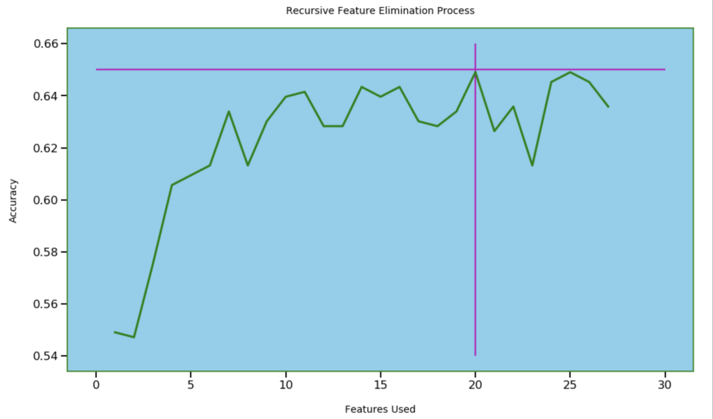
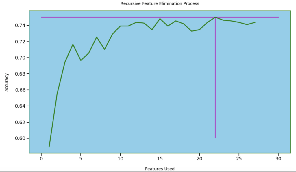
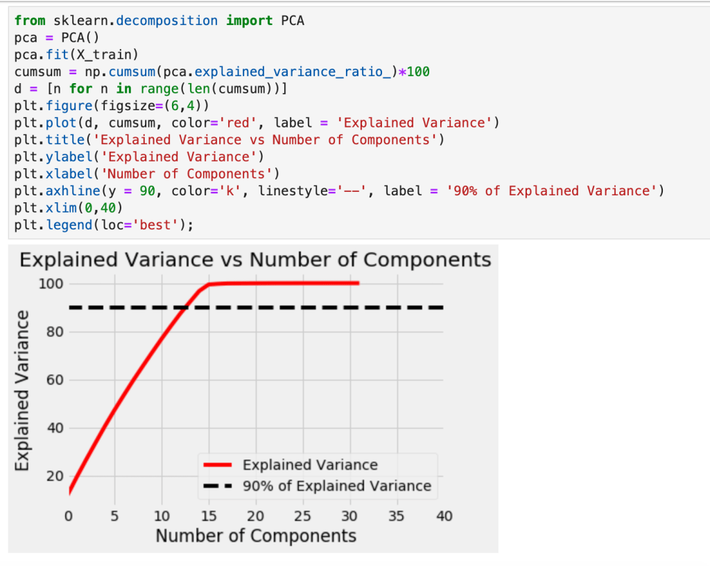
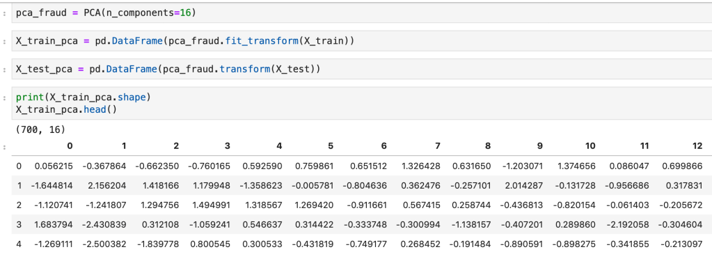
Next, I wanted to see how many features I needed for optimal accuracy. I used recursive feature elimination which is a process of designing a model and the using that model to look for which features may be removed to improve the model.
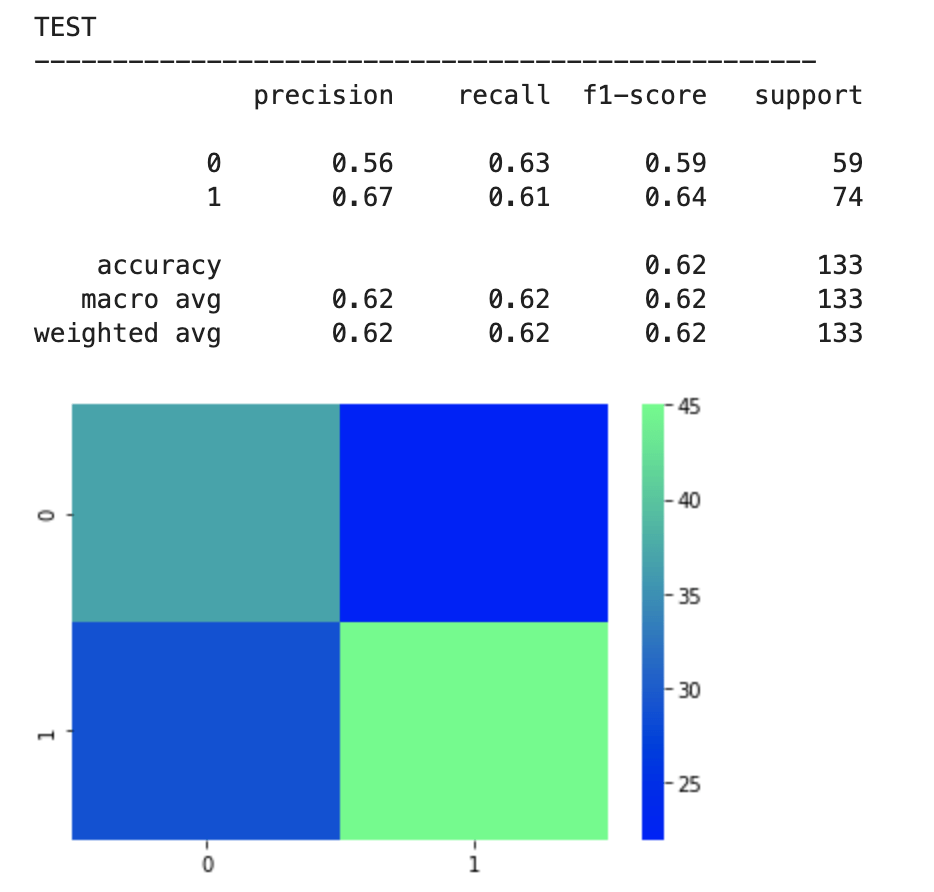
After feature selection, here were my results:
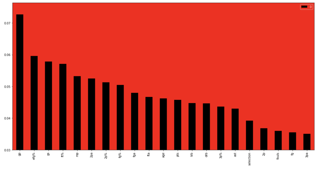
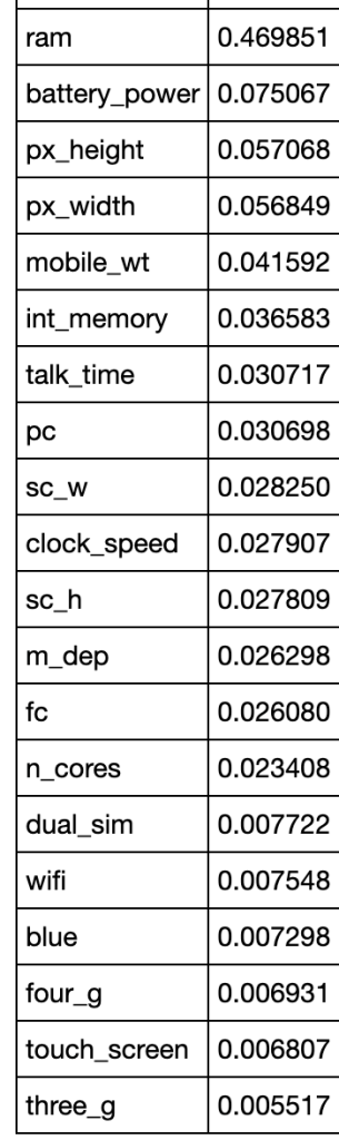
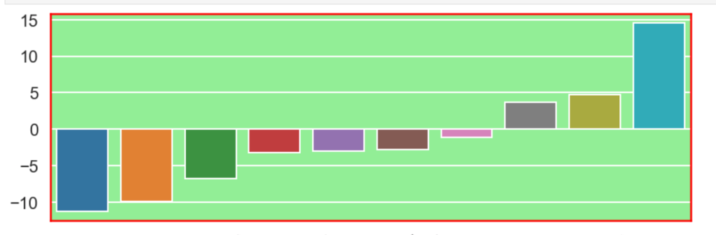
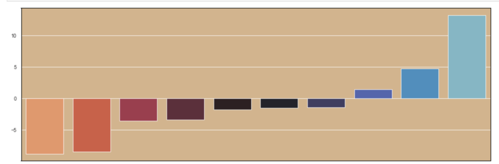
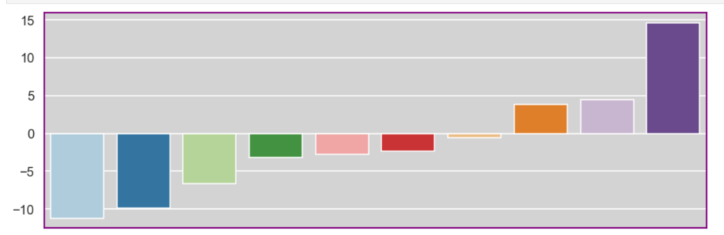
64% accuracy is not bad. Considering that a little over 50% of all NBA players make the playoffs every year, I was able to create a model that, without any team context at all, can predict to some degree which players will earn a trip to the playoffs. Let’s look at what features have the most impact. (don’t give too much attention to vertical axis values). I encourage you to keep these features in mind for later to see if they differ from the driving influences for the larger scale, team-oriented model.
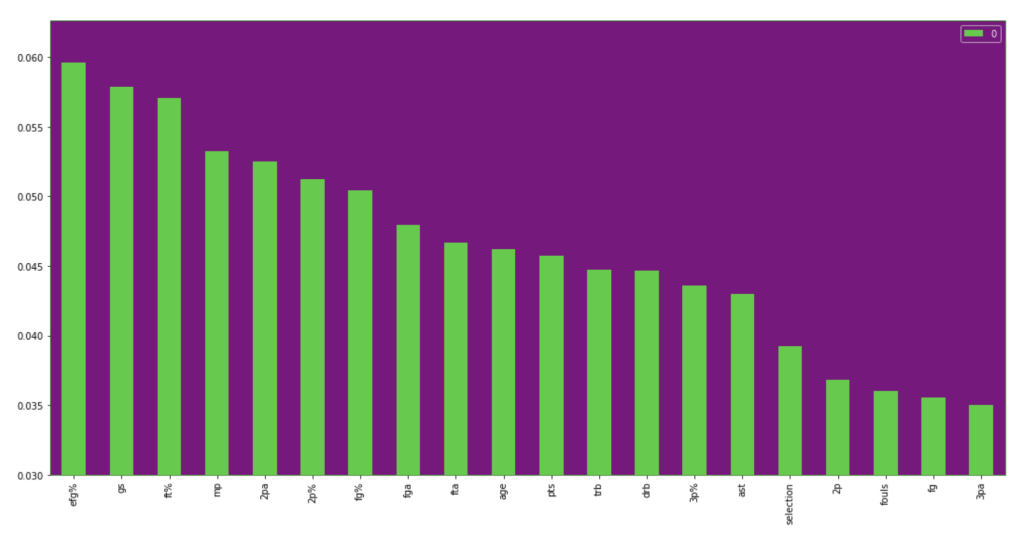
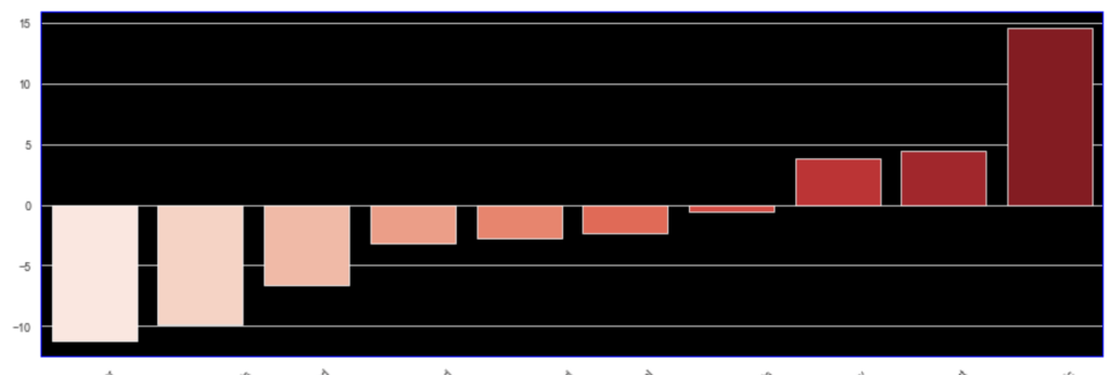
If I take out that one feature at the beginning that is high in magnitude for feature importance, we get the following visual:
I will now run through the same process with team data. I will skip the scaling step as it didn’t accomplish a whole lot.
First model:
Feature selection.
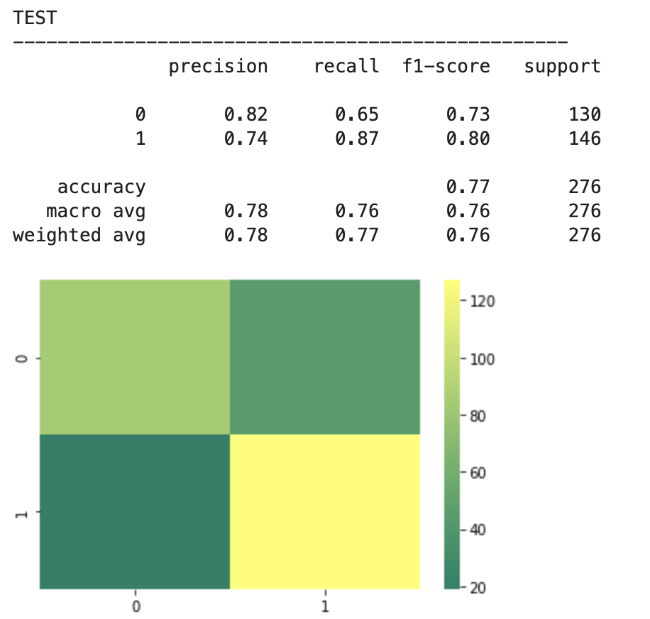
Results:
Feature importance:

Feature importance excluding age:

I think one interesting observation here is how much age matters in a team context over time, but less in the 2018-19 NBA season. Conversely, effective field goal percent had the opposite relationship.
Conclusion
I’m excited for sports to be back. I’m very curious to see the NBA playoffs unfold and would love to see if certain teams emerge as dark horse contenders. Long breaks from basketball can either be terrible or terrific. I’m sure a lot of players improved while others regressed. I’m also excited to see that predicting playoff chances both on individual and team levels can be done with an acceptable degree of accuracy. I’d like to bring this project full circle. Let’s look at the NBA champion San Antonio Spurs from 2013-14 (considered a strong team-effort oriented team) and Devin Booker from 2018–19. I don’t want to spend too much time here but let’s do a brief demo of the model using feature importance as a guide. The average age of the Spurs was two years above the NBA average with the youngest members of the team being 22, 22, and 25. The Spurs led the NBA in assists that year and were second to last in fouls per game. They were also top ten in fewest turnovers per game and free throw shooting. Now, for Devin Booker. Well, you’re probably expecting me to explain why he is a bad team player and doesn’t deserve a spot in the playoffs. That’s not the case. By every leading indicator in feature importance, Devin seems like he belongs in the playoffs. However, let’s remember two things. My individual player model was less accurate and Booker sure seems like an anomaly. However, I think there is a bigger story here, though. Basketball is a team sport. Having LeBron James as your lone star can only take you so far (it’s totally different for Michael Jordan because Jordan is ten times better, and I have no bias at all as a Chicago native). That’s why people love teams like the San Antonio Spurs. They appear to be declining now as their leaders have recently left the team in players such as Tim Duncan and Kawhi Leonard. Nevertheless, basketball is still largely a team sport. The team prediction model was fairly accurate. Further, talent alone seems like it is not enough either. Every year, teams that make the playoffs tend to have older players. Talent and athleticism is generally skewed toward younger players. Given these insights, I’m excited to have some fresh eyes with which to follow the NBA playoffs.
Thanks for reading.
Have a great day!


/close-up-of-thank-you-signboard-against-gray-wall-691036021-5b0828a843a1030036355fcf.jpg)