Today, I’m going to be doing the third part of my series in linear regression. I originally intended to end on part 3, but I have considered continuing with further blogs. We’ll see what happens. In my first blog, I introduced the concepts and foundations of linear regression. In my second blog, I talked about one topic often correlated to linear regression known as gradient descent. In many ways, this third blog represents the most exciting blog in the series, but also the shortest and easiest to compose blog. Why? The answer is that I hope to empower and inspire anyone with even moderate interest in python to perform meaningful analysis using linear regression. We’ll soon see that once you have the right framework, it is a pretty simple process. Now, keep in mind that the regression I will display is about as easy and simple as it gets. The data I chose was clean and based on what I had seen online, was not that complex. So pay attention to the parts that allow you to perform regression and not the parts that relate to data cleaning.
Data Collection
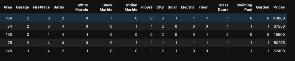
My data comes from kaggle.com and can be found at (https://www.kaggle.com/greenwing1985/housepricing). The data (which I think is not from a real world data set) talks about house pricing with features including (by name): area, garage, fire place, baths, white marble, black marble, Indian marble, floors, city, solar, electric, fiber, glass doors, swimming pool, and garden. The target feature was price.
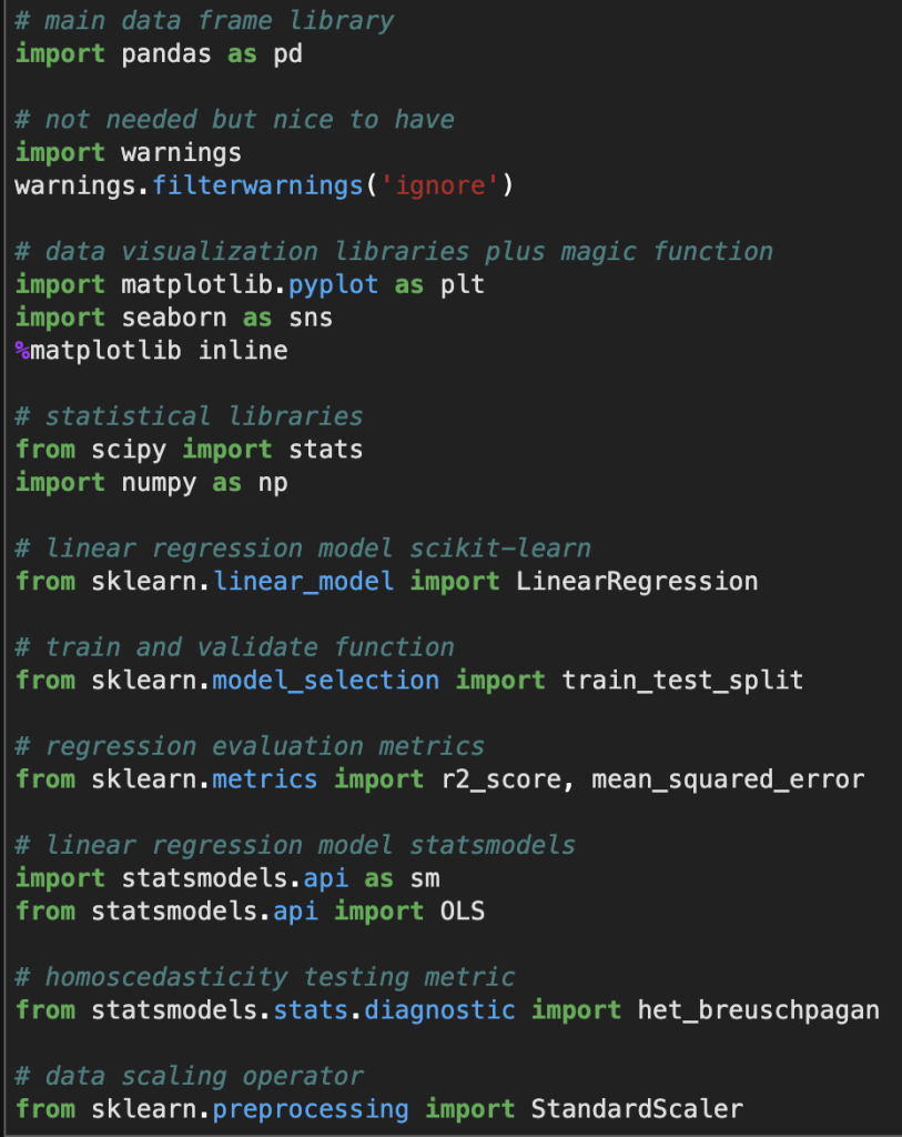
Before I give you screenshots with data, I’d like to provide all the necessary imports for python (plus some extra ones I didn’t use but are usually quite important).
Here’s a look at the actual data:
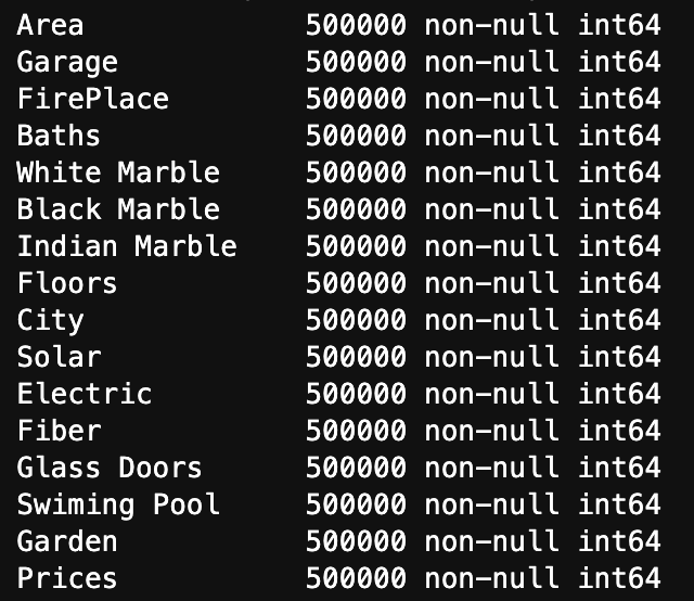
Here is a list of how many null values occur in each variable as well as each variable’s data type
We see three key observations here. One is that we have 500000 rows of each value. Two is that we have no null values. Finally, three is that they are all represented using integers.
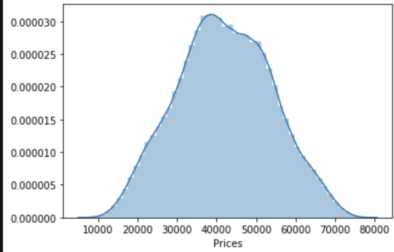
One last observation: the target class seems to be normally distributed to some degree.
Linear Regression Assumptions
Linearity
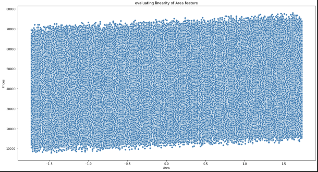
Conveniently, most of our data consists of discrete features with values consisting of whole numbers between 1 and 5. That makes life somewhat easier. The only feature to really test was area. Here goes:
This is not the most beautiful graph. I have however, concluded that it satisfies linearity and have confirmed this conclusion with others who look at this data.
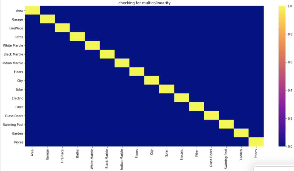
Multicollinearity
Do features correlate highly to each other?
Based on a filter of 70%, which is common, it seems like the features have no meaningful correlation with each other.
Normal Distribution of Residuals
First, of all the average of residuals is around zero, so that’s a good start. I realize that the following graph is not the most convincing visual but I was able to confirm that this assumption is satisfied.
Homoscedasticity
I’ll be very honest, this was a bit of a mess. In the imports above I show an import for the Breusch-Pagan test (https://en.wikipedia.org/wiki/Breusch%E2%80%93Pagan_test). I’ll save you the visuals, as I didn’t find them convincing. However, my conclusions appeared to be right as they were confirmed in the kaggle community. So, in the end there was homoscedasticity present.
Conclusion
We have everything we need to conduct linear regression.
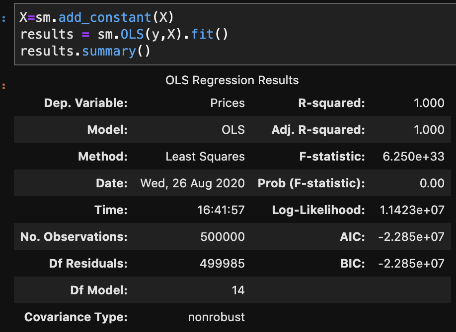
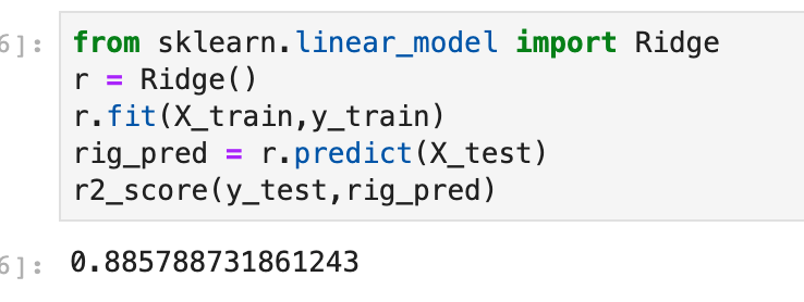
There are two primary methods of linear regression. One is by using statsmodels and the other one is by using sklearn. I don’t know how to split data in statsmodels and later evaluate on other data, in a quick way, at least within statsmodels. That said, statsmodels gives a more comprehensive summary as we are about to see. So there is a tradeoff between which package you choose. You’ll soon see what I mean in more detail. In three lines of code, I am going to create a regression model, fit the regression, and check results. Let’s see:
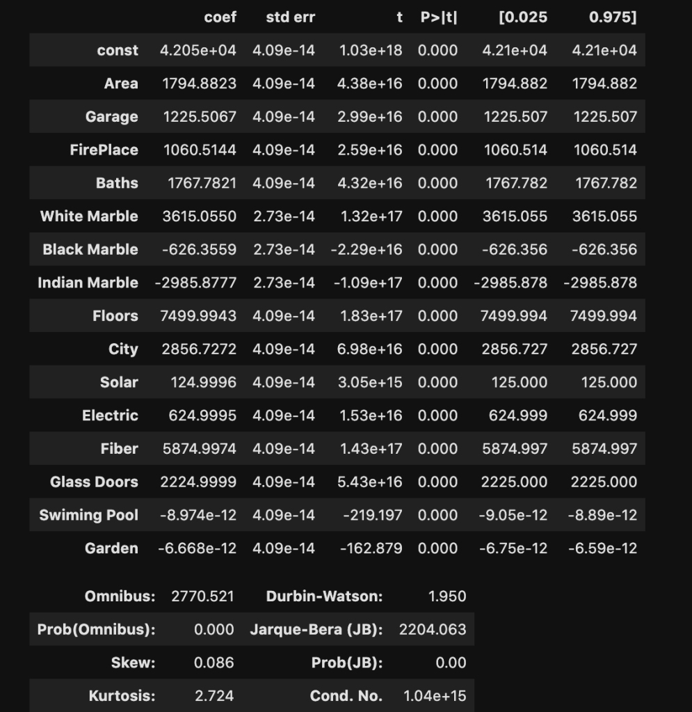
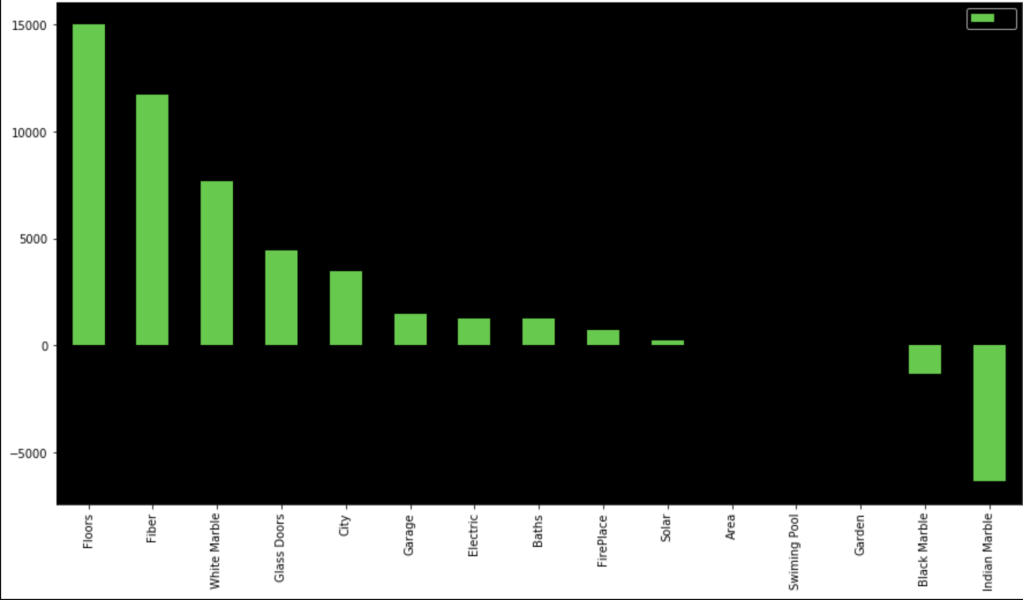
I won’t bore you with details that much. Just notice how much we were able to extract and understand in a simple three lines of code. If you’re confused, here is what you should know: R-squared is a scale of 0 to 1 representing how good your model is. 1 is the best score. Also the coef column, which we will look at later, represents coefficients. (The coefficients here make me really skeptical that this is real data. Although, that view comes from a Chicagoan’s perspective. I’m sure the dynamic changes as you move around geographically, though).
Sklearn Method
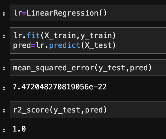
This is the method I use most often. In the code below, I create, train, and validate a regression model.
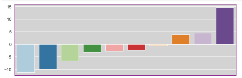
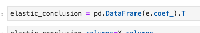
In terms of coefficients:
Even though regression can get fairly complex, running a regression is pretty simple once the data is ready. It’s also a nice data set as my R-squared is basically 100%. That’s obviously not realistic, but that’s not the point of this blog.
Conclusion
While linear regression is a powerful and complex analytical process, it turns out that running regression in the context of python, or other coding language, I would imagine, is actually quite simple. Checking assumptions is rather easy and so is creating, training, and evaluating models. That said, regression can get more difficult, but for less complex questions and data sets, it’s a fairly straight-forward process. So even if you have no idea how regression really works, you can fake it to some degree. In all seriousness, though, you can draw meaningful insights, in some cases, with a limited background.
Building an Understanding of Gradient Descent Using Computer Programming
Introduction
Thank you for visiting my blog.
Today’s blog is the second blog in a series I am doing on linear regression. If you are reading this blog, I hope you have a fundamental understanding of what linear regression is and what a linear regression model looks like. If you don’t already know about linear regression, you may want to read this blog: https://data8.science.blog/2020/08/12/linear-regression-part-1/ I wrote and come back later. In the blog referenced above, I talk at a high level about optimizing for parameters like slope and intercept. Well, we are going to talk about how machines minimize error in predictive models. We are going to introduce the idea of a cost function soon. Even though we will be discussing cost functions in the context of linear regression, you will probably realize that this is not the only application. That said, the title of this blog shouldn’t confuse anyone and all should understand that gradient descent is more of an overarching subject for many machine learning problems.
The Cost Function
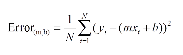
The first idea that needs to be introduced, as we begin to discuss gradient descent, is the cost function. As you may recall, we wrote out a pretty simple calculus formula that found the optimal slope and intercept for the 2D model in the last blog. If you didn’t read last blog, that’s fine. The main idea is that we started with an error function, or MSE. We then took partial derivatives of that function and applied optimization techniques to search for a minimum. What I didn’t tell you in my blog, and people who didn’t read my blog may or may not know is that there is in fact a name for the function that takes a partial derivate in an error function. We call it the cost function. Here is a common representation of the cost function (for 2-dimensional case):
This function should be familiar. This is basically just the sum of model error in linear regression. Model error is what we try to minimize in EVERY machine learning model, so I hope you see why gradient descent is not unique for linear algebra.
What is a Gradient?
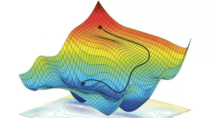
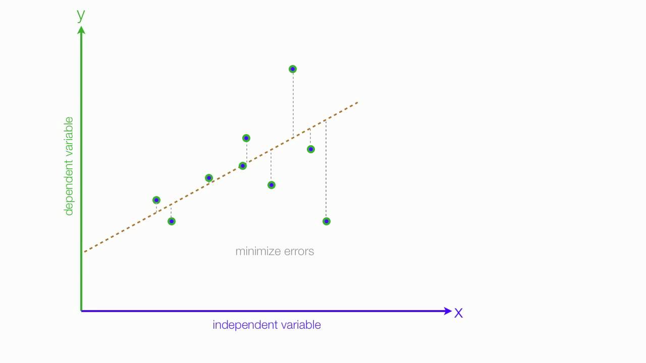
Simply put, a gradient is the slope of a curve, or derivative, at any point on a plane with regards to one variable (in a multivariate function). Since the function being minimized is the loss function, we follow the gradient down (hence the name gradient descent) until it approaches or hits zero (for each variable) in order to have minimal error. In gradient descent, we start by taking big steps and slow down as we get closer to that point of minimal error. That’s what gradient descent is; slowly descending down a curve or graph to the lowest point, which represents minimal error, and finding the parameters that correspond to that low point. Here’s a good visualization for gradient descent (for one variable).
The next equation is one I found online that illustrates how we use the graph above in practice:
The above two visual may seem confusing, so let’s work backwards. W t+1 corresponds to our next predicted value for optimal coefficient value. W t was our previous assumption for optimal coefficient value. The term on the right looks a bit funky, but it’s pretty simple actually. The alpha corresponds to the learning rate and the quotient is the gradient. The learning rate is essentially a parameter that tells us how quickly we move. If it is low, models can be computationally expensive, but if it is high, it may not hit the best concluding point. At this point, we can revisit the gif. The gif shows the movement in error as we iteratively update W t into W t+1.
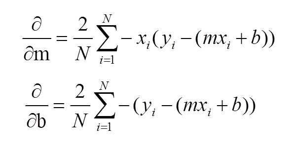
At this point, I have sort-of discussed the gradient itself and danced around the topic. Now, let’s address it directly using visuals. Now keep in mind, gradients are partial derivatives for variables in the cost function that enable us to search for a minimum value. Also, for the sake of keeping things simple, I will express gradients using the two-dimensional model. Hopefully, the following visual shows a clear progression from the cost function.
In case the above confuses you, I would not focus on the left side of either the top or bottom equation. Focus on the right side. These formulas should look familiar as they were part of my handwritten notes in my initial linear regression blog. These functions represent the gradients used for slope (m) and intercept (b) in gradient descent.
Let’s review: we want to minimize error and use the derivative of the error function to help that process. Again, this is gradient descent in a simple form:
I’d like to now go through some code in the next steps.
Gradient Descent Code
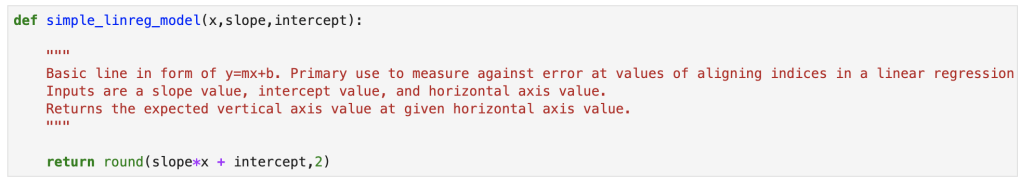
We’ll start with a simple model:
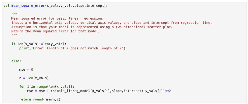
Next, we have our error:
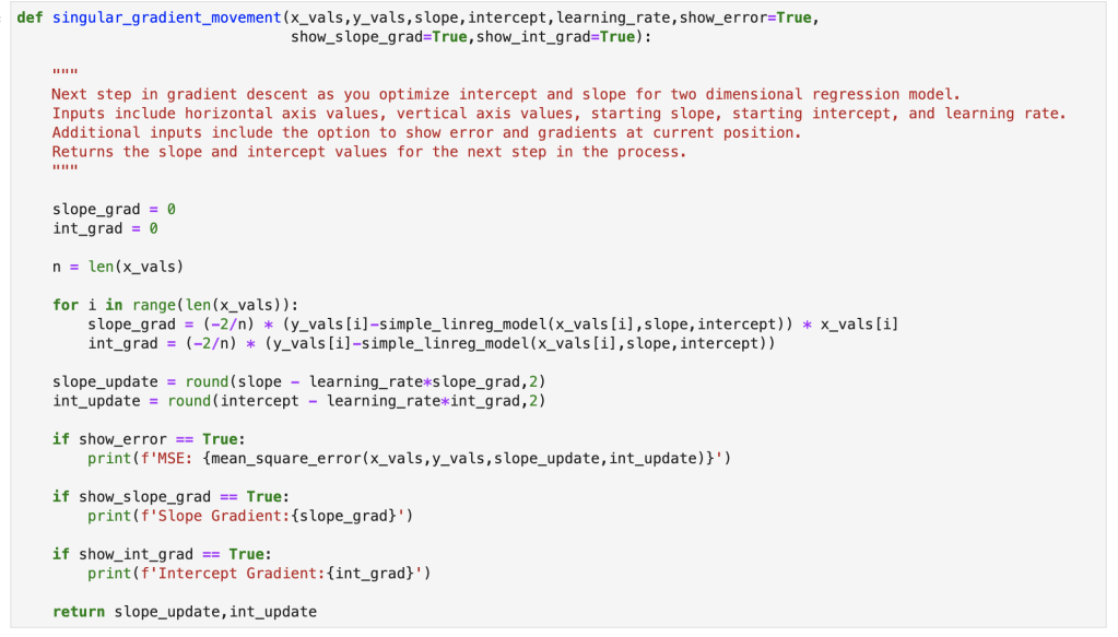
Here we have a single step in gradient descent:
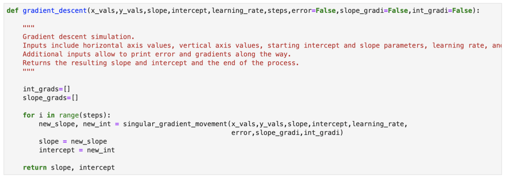
Finally, here is the full gradient descent:
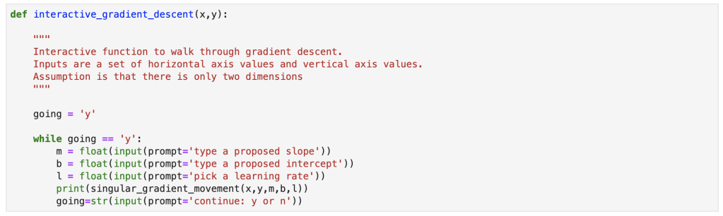
Bonus Content!
I also created an interactive function for gradient descent and will provide a demo. You can copy my notes from this notebook with your own x and y values to run an interactive gradient descent as well.
Gradient descent is a simple concept that can be incredibly powerful in many situations. It works well with linear regression, and that’s why I decided to discuss it here. I am told that often times, in the real world, using a simple sklearn or stastsmodels model is not good enough. If it were that easy, I imagine the demand for data scientists with advanced statistical skills would be lower. Instead, I have been told, that custom cost functions have to be carefully though out and gradient descent can be used to optimize those models. I also did my first blog video for today’s blog and hope it went over well. I have one more blog in this series where I go through regression using python.
Acquiring a baseline understanding of the ideas and concepts that drive linear regression.
Introduction
Thanks for visiting my blog!
Today, I’d like to do my first part in a multi-part blog series discussing linear regression. In part 1, I will go through the basic ideas and concepts that describe what a linear regression is at its core, how you create one and optimize its effectiveness, what it may be used for, and why it matters. In part 2, I will go through a concept called gradient descent and show how I would build my own gradient descent, by hand, using python. In part 3, I will go through the basic process of running linear regression using scikit-learn in python.
This may not be the most formal or by-the-book guide, but the goal here is to build a solid foundation and understanding of how to perform a linear regression and what the main concepts are.
Motivating Question
Say we have the following (first 15 of 250) rows of data (it was randomly generated and does not intentionally represent any real world scenario or data):
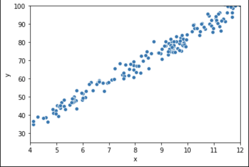
Graphically, here is what these 250 rows sort of look like:
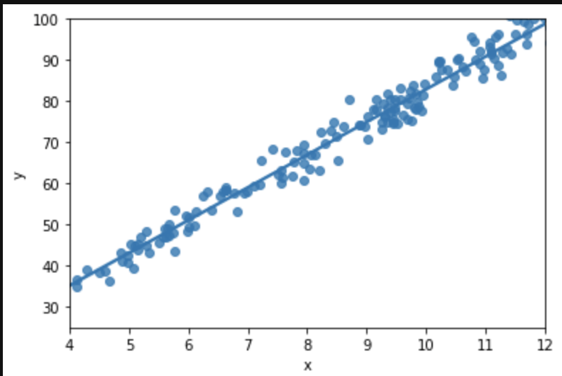
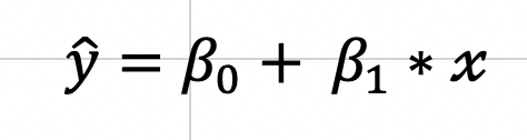
We want to impose a line that will guide our future predictions:
The above graph displays the relationship between input and output using a line, called the regression line, that has a particular slope as well as a starting point, the intercept, which is an initial value added to each output and in this case sits around 35. Now, if we see the value 9 in the future as an input, we can assume the output would lie somewhere around 75. Note that this closely resembles our actual data where we see the (9.17, 77.89) pairing. Moving on, this corresponds on our regression line to an intercept of 35 + 9 scaled by the slope which might be around 40/9, or 4.5. Or in basic algebra y=mx+b: 75 = 4.5*9 +35. That’s all regression is! Basic algebra using scatter plots. That was really easy I think. Now keep in mind that we only have one input here. In a more conventional regression, we have many variables and each one has its own “slope,” or in other words, effect on output. We need to use more complex math to allow for the ability to measure the effect of every input. For this blog we will consider the single input case, though. It will allow us to have a discussion about how linear regression works as a concept and also give us a starting point to think about how we might change our approach, or really adjust our approach, as we move into data that is contextualized or described in 3 or more dimensions. Basic case: find effect of height on wingspan. Less basic case: find effect of height, weight, country, and birth year on life expectancy. Case 2 is far more complex but we will be able to address it by the end of the blog!
Assumptions
Not every data set is suited for linear regression; there are rules, or assumptions, that must be in place.
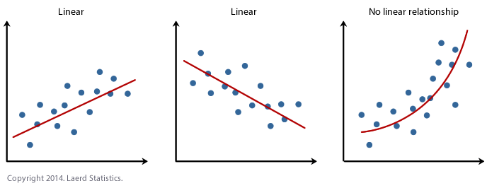
Assumption 1: Linearity. This one is probably one you already expected, just didn’t know you expected it. We can only use LINEAR regression if the relationship shown in the data is, you know, linear. If the trend in the scatter plot looks like it needs to be described using some higher degree polynomial or other type of non-linear function like a square root or logarithm than you probably can’t use linear regression. That being said, linear regression is only one method of supervised machine learning for predicting continuous outputs. There are many more options. Let’s use some visuals:
Now, you may be wondering the following: this is pretty simple in the 2D case, but is it easy to test this assumption in higher dimensions? The answer is yes.
Assumption 2: Low Correlation Between Predictive Features. Our 2D case is an exception in a sense. We are only discussing the simple y=mx+b case here and the particular assumption listed above is more suited to multiple linear regression. Multiple linear regression is more like y= m1x1+m2x2+…+b. Basically, it has multiple independent variables. Say you are trying to predict how many points a game a player might score on any given night in the NBA and your features include things like height, weight, position, all-star games made, and some stats about how their vertical leap or running speed. Now, let’s say you also have the features that say a player’s age and what year they were drafted. Age and draft year are inherently correlated. We would probably not want to use both draft year and age. We know what this idea of reducing correlation means by using that example, but why is it important to reduce correlation? Well, one topic to understand is coefficients. Coefficients are basically the conclusion of a regression. They tell us how important each feature is and what its impact is on output. In the y=mx+b equation, m is the coefficient of x, the independent variable, and basically tells us how the dependent variable responds to each x value. So if you have an m value of 2 it means that the output variable increases by twice the value of the input variable. Say you are trying to predict NBA salary based on points per game. Well, let’s use two data points. Stephen Curry makes about $1.5M per point averaged and LeBron James makes about $1.4M per point averaged. Now, these players are outliers, but we get a basic idea that star players make like $1.45M per point averaged. That’s the point of regression; finding causal relationship between input and output. We lose the ability to find the impact of unique features on output when there are highly correlated features as they often move together and represent being tied together in certain ways.
Assumption 3: Homoscedasticity. Basically, what homoscedasticity means is that there is no “trend” in your data. What do I mean by “trend?”. By this, I mean that if you take a look at all the error values in your data (say your first value is 86 and you predict 87 and the second prediction is 88 but the true value is 89, then your first two errors are valued at 1 and -1), whether positive or negative, and plot it around the line y=0 representing no error, then we would not see a pattern in the resulting scatter plot and we might assume that the points around that line (y=0) would look to be rather random and most importantly, have constant variance. This plot we just described, that has a baseline of y=0 and error terms around it is called a residual plot. Let me give you the visual you have been waiting for in terms of residual plots. Also note that we didn’t discuss heteroscedasticity – but it’s basically the opposite of homoscedasticity, I think that’s quite obvious.
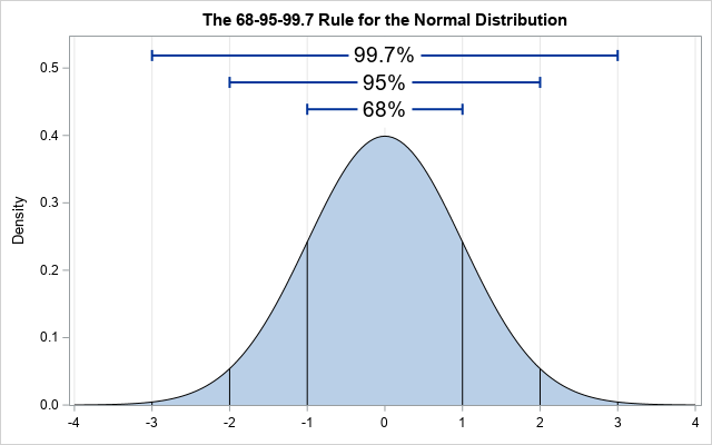
Assumption 4: Normality. This means that distribution of the error of the points that fall above and below the line is normally distributed. Note that this refers to the distribution of the value of the error (also called residuals – the value of which is calculated by subtracting the true value from the estimated value at every single value in the scatter plot measured against the closest value in the regression line), not the distribution of the y values. Here is a basic normal distribution. Hopefully, the largest portion of the value of the residuals fall around a center point (not necessarily at the value zero, it’s just an indicator of zero standard deviations from the mean – that’s what the x-axis is) and the amount of smaller and larger residuals appear in smaller quantities.
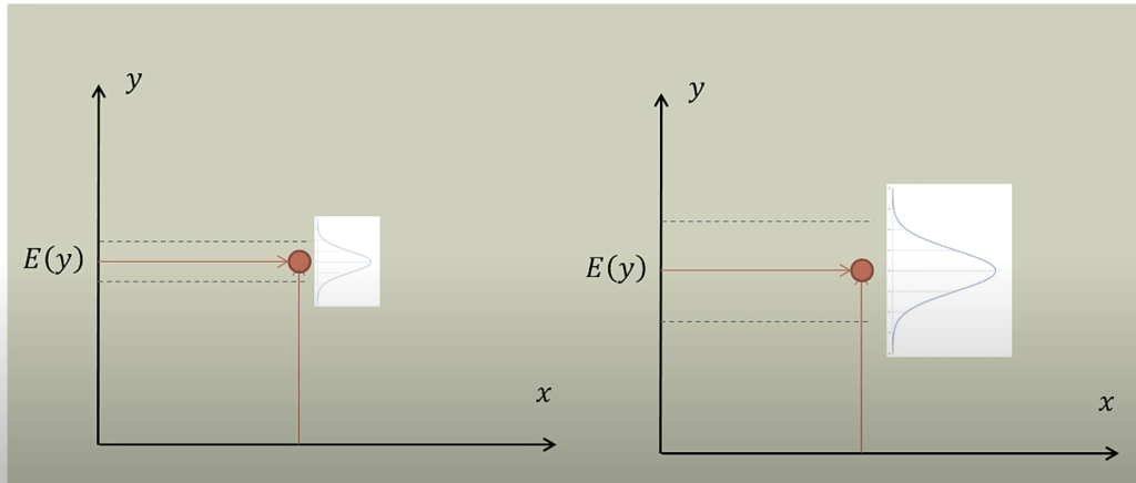
This next graph shows where the residuals should fall to have normality present, with E(y) representing the expected value (Credit to Brandon Foltz from YouTube for this visual).
Both graphs work, but at different scales.
Fitting A Line
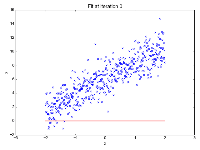
Ok, so now that we have our key assumptions in place, we can start searching for the line that best fits the data. The particular method I’d like to discuss here is called ordinary least squares, or OLS. OLS sums up the difference between every predicted point and every true value (once again, each of those values is called a “residual,” which represents error) and squares this difference, adds it to the sum of residuals, and divides that final sum over the total number of data points. We call this metric MSE; mean squared error. So it’s basically finding the average error and looking for the model with lowest average error. To do this, we optimize the slope and intercept for the regression line so that each point is as close as possible to the true value as judged by MSE. As you can see by the GIF below, we start with a simple assumptions and move quickly toward the best line but slow down as we get closer and closer. (Also notice that we almost always start with assumption of a slope of zero. This is basically testing the hypothesis that input has no effect on output. In higher dimension, we always start with the simple assumption that every feature in our model has no effect on output and move closer to its true value carefully. This idea relates to a concept called gradient descent which will be discussed in the next blog in this series).
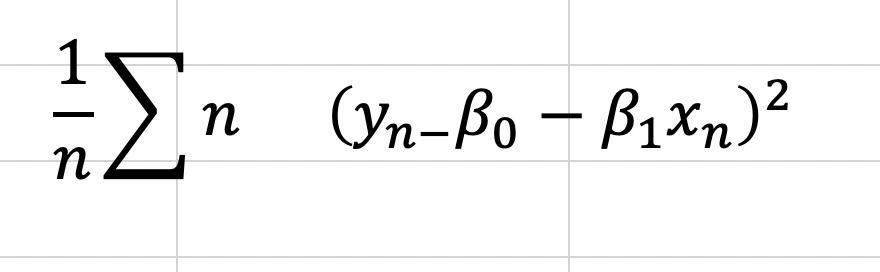
Now, one word you may notice that I used in the paragraph above is “optimize.” In case, you don’t already see where I’m going with this, we are going to need calculus. The following equation represents error and the metric we want to minimize as discussed above.
That E looking letter is the Greek letter Sigma which represents a sum. The plain y is the true value (one exists for every value of x), and the y with a ^ (called y-hat) on top represents the predicted value. We basically square these terms so that we can look at error in absolute value terms. I would add a subscript of a little “n” next to every y and y-hat value to indicate that there are like a lot of these observations. Now keep in mind, this is going to be somewhat annoying to derive, but once we know what our metrics are we can use the formulas going forward. To start, we are going to expand the equation for a regression line and write it in a more formal way:
So, now we can look at MSE as follows:
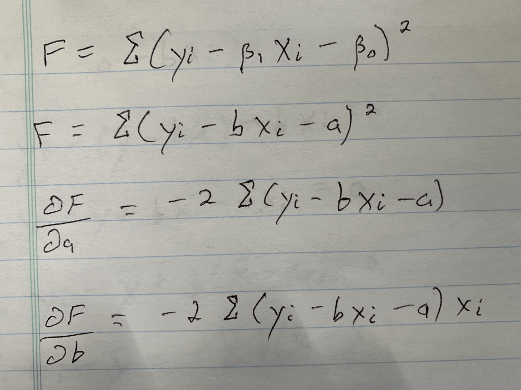
This is the equation we need to optimize. To do this we will take the derivative with respect to all of our two unknown constants and set those results equal to zero. I’m going to do this by hand and add some pictures as typing it would take a while.
Step 1: Write down what needs to be written down; the basic formula, a formula where I rename the variables, and the partial derivatives for each unknown (If you don’t know what a partial derivative is that’s okay, it just tells us the equation we need to set equal to zero, because at zero we have a minimum in the value we are investigating, which is error in this case. Both error for slope value and error for intercept value. Those funky swirls that with the letters F on top and A or B below represent those equations).
Conclusion: We have everything we need to go forward.
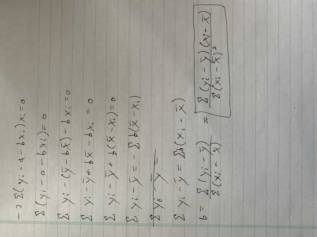
Step 2: Solve one equation. We have two variables, and in case you don’t know how this works, we will therefore need two equations. Let’s start with the simpler equation.
Conclusion: A, or our intercept term equals the average of y, as indicated by the bar, minus the slope scaled by the average of x (keep in mind this is an average due to the 1/n, or “1 over N”, term not included. Also remember that for the end of the next calculation).
Step 3: Solve the other equation, using substitution (apologies for the rotation).
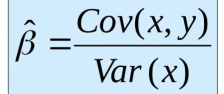
Conclusion: After a lot of math we got our answer. You may notice I took an extra step at the end and added a little box around that extra step. The reason for this is because that equation (hopefully, at the very least, you have encountered the denominator before) in that box is equal to the covariance between x and y divided by the variance of x. Those equations are fairly simple but are nevertheless beyond the scope of this blog. Let’s review how we calculate slope.
That was annoying, but we have our two metrics! Keep in mind that this process can be extended with increased complexity to higher dimensions. However, for those problems, which will be discussed in part 3, we are just going to use python and all its associated magic.
Evaluating Your Model
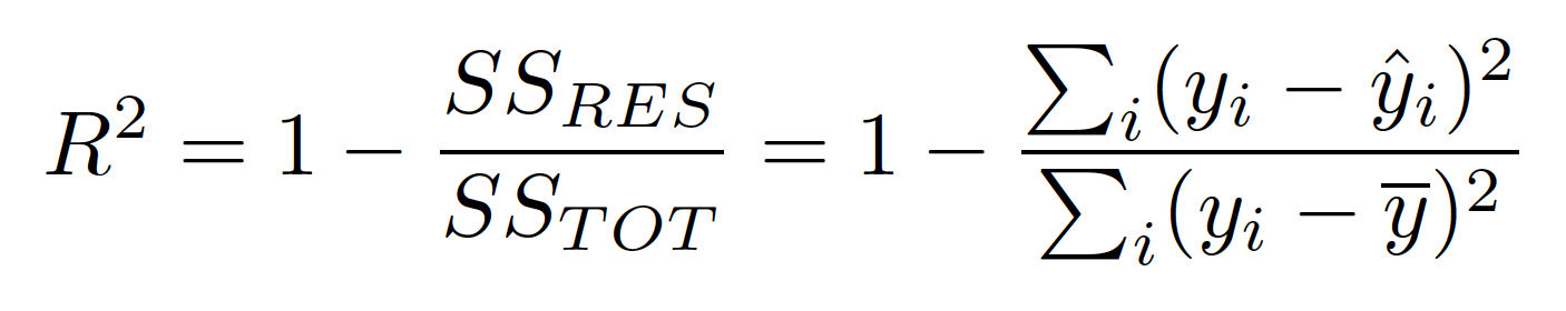
Now that we know how to build a basic slope-intercept model, how can we evaluate whether or not it is effective? Keep in mind that magnitude of the data you model may change which means that looking at MSE and only MSE will not be enough. We need the MSE to know what to optimize for low error, but we are going to need a bit more than that to evaluate a regression. Let’s now discuss R-Squared. R-Squared is a 0-1 or 0%-100% scale of how much variance is captured by our model. That sounds a bit weird and that’s because it’s a rather technical definition. R-Squared really answers the following question: How good is your model? Well, 0% means your model is the worst thing since the New York Yankees were introduced. A score in the 70%-90% range is more desirable. (100%, which you are no doubt wondering why I didn’t pick, means you probably overfit on training data and made a bad model). This is all nice, but how do we calculate this metric?
One minus the sum of each prediction’s deviation from the true value divided each true value’s deviation from the mean (with both the numerator and denominator squared to account for that absolute value issue discussed earlier). You can probably guess the SS-RES label alludes to the concept of residuals and the sum of squares from residuals; true values minus the predicted values squared. The bottom refers to total sum of squares; a metric for deviation from the mean. In other words, (one minus) the amount of error in our model versus the amount of total error. There is also metric you may have heard of called “Adjusted R-Squared.” The idea behind this is to penalize excessively complex models. We are looking at a simple case here with only one true input, so it doesn’t really apply. Just know it exists for other models. Keep in mind that R-Squared doesn’t always measure how effective you in particular were at creating a model. It could be that it’s just a hard model to construct or one that will never work well independent of who creates the model. (Now you may be wondering how to people can have a different regression model. It’s a simple question but I think it’s important. The real difference between two models can present themselves in many ways. A key one, for example, is how one decides to pre-process their data. One person may remove outliers to different degrees than others and that can make a huge difference. Nevertheless, even though models are not all created equally, some have a lower celling or higher floor than others for R-Squared values).
Conclusion
I think if there’s one point to take home from this blog, it’s that linear regression is a relatively easy concept to wrap your head around. It’s very encouraging that such a basic concept is also highly valued as a skill to have as linear regression can be used to model many real world scenarios and has so many applications (like modeling professional athlete salaries or forecasting sales). Linear regression is also incredibly powerful because it can measure the effect of multiple inputs and their isolated impact on a singular output.
Let’s review. In this blog, we started by introducing a scenario to motivate interest in linear regression, discussed when it would be appropriate to conduct linear regression, broke down a regression equation into its core components, derived a formula for those components, and introduced metrics to evaluate the effectiveness of our model.
From my perspective, this blog presented me with a great opportunity to brush up on my skills in linear regression. I conduct linear regression models quite often (and we’ll see how those work in part 3) but don’t always spend a lot of time thinking about the underlying math and concepts, so writing this blog was quite enjoyable. I hope you enjoyed reading part 1 of this blog and will stick around for the next segment in this series. The next concept (in part 2, that is) I will discuss is a lesser known concept (compared to linear regression) called gradient descent. Stay tuned!
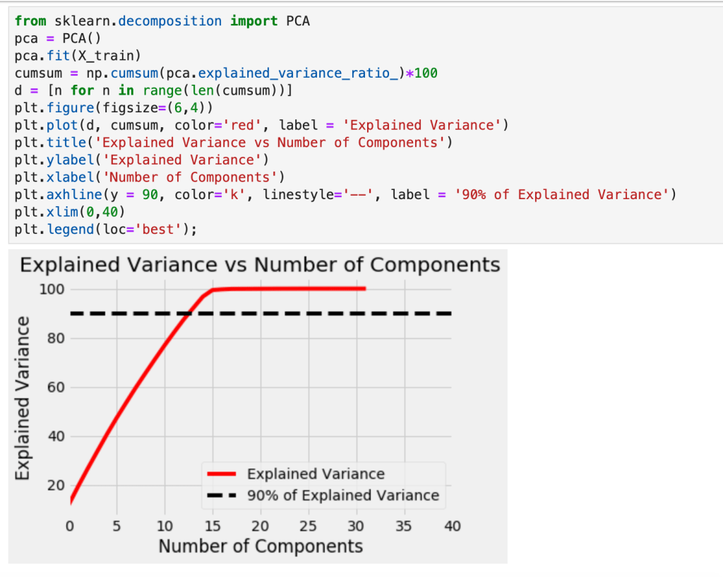
Often times, when addressing data sets with many features, reducing features and simplifying your data can be helpful. Usually, one particular juncture where you remove a lot of data or features is by reducing correlation using a filter of 70%, or so. (Having highly correlated variables usually leads to overfitting). However, you can continue to reduce features and improve your models by deleting features that not only correlate to each other, but also… don’t really matter. A quick example: Imagine I was trying to predict whether or not someone might get a disease and the information I had was height, age, weight, wingspan, and favorite song. I might have to remove height or wingspan since they probably have a high degree of correlation. Favorite song, on the other hand, likely has no impact on anything one would care about but would not be removed using correlation. That’s why we would just get rid of one feature. Similarly, if there are other features that are irrelevant or can be mathematically proven to have little impact, we could delete them. There are various methods and avenues one could take to accomplish this task. This blog will outline a couple them, particularly: Principal Component Analysis, Recursive Feature Elimination, and Regularization. The ideas, concepts, benefits, and drawbacks will be discussed and some coding snippets will be provided.
Principal Component Analysis (PCA)
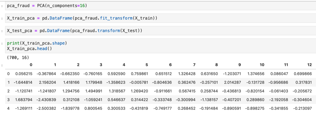
So, just off the bat, PCA is complicated and involves a lot of backend linear algebra and I don’t even understand it fully myself. This is not a blog about linear algebra, it’s a blog about making life easier, so I plan to keep this discussion at a pretty high level. First, I’ll start with a prerequisite; scale your data. Scaling data is a process of reducing impact based on magnitude alone and aligning all your data to be relatively in the same range of values. If you had a data point representing GDP and another data point representing year the country was founded, you can’t compare those variables easily as one is a lot bigger in magnitude than the other. There are various ways to scale your variables and I have a separate blog about that if you would like to learn more. For our purposes, though, we always need to apply standard scaling. Standard scaling takes each unique value of a variable, subtracts its mean, and finally divides by the standard deviation. The effect is that every value becomes compressed to the interval [-1,1]. Next, as discussed above, we filter out correlated variables. Okay, so now things get real. We’re ready to for the hard part. The first important idea to understand beforehand, however, is what a principal component is. Principal components are new features which are some linear representation of operations performed with other features. So If I have the two features weight and height – maybe I could combine the two by dividing weight by height to get some other feature. Unfortunately, however, as we will discuss more later, none of these new components we will replace our features with actually have a name, they are just assigned a numeric representation such as 0 or 1 (or 2 or….). While we don’t maintain feature names, the ultimate goal is to make life easier. So once we have transformed the structure of our features we want to find out how many features we actually need and how many are superfluous. Okay, so we know what a principal component is and what purpose they serve, but how are they constructed in the first place? We know they are derived from our initial features, but we don’t know where they come from. I’ll start by saying this: the amount of principal components created always matches the number of features, but we can easily see with visualization tools which ones we plan to delete. So the short answer to our question of where these things come from is that for each dimension (feature) in our data, we have two corresponding linear algebra metrics/results called eigenvectors and eigenvalues which you may remember from linear algebra. If you don’t, given a square matrix called “A” that has a non-zero determinant; multiplying that matrix by an eigenvector, called v, yields the same result as scaling that vector, v, by a scalar known as the eigenvalue, lambda. The story these metrics tell is apparent when you perform linear transformations. When you transform your axes in transformations, the eigenvectors will still maintain the same direction but will increase in scale by lambda. That may sound confusing, and it’s not critical to understand it completely but I wanted to leave a short explanation for those more familiar with linear algebra. What matters is that calculating these metrics/results in the context of data science gives us information about our features. The eigenvalues with highest magnitude yield the eigenvectors with the most impact on explaining variance in models. Source two below indicates that “Eigenvectors are the set of basis functions that are the most efficient set to describe data variability. The eigenvalues is a measure of the data variance explained by each of the new coordinate axis.” What’s important to keep in mind is that we use the eigenvalues to remind us of what new, unnamed, transformations matter most.
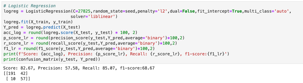
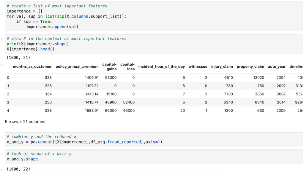
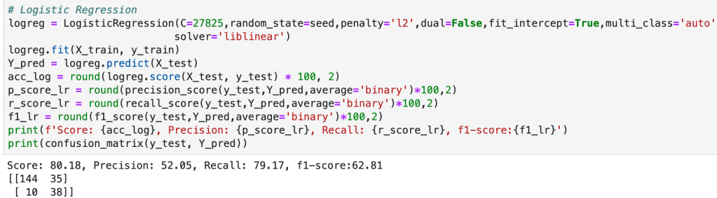
Code (from a fraud detection model)
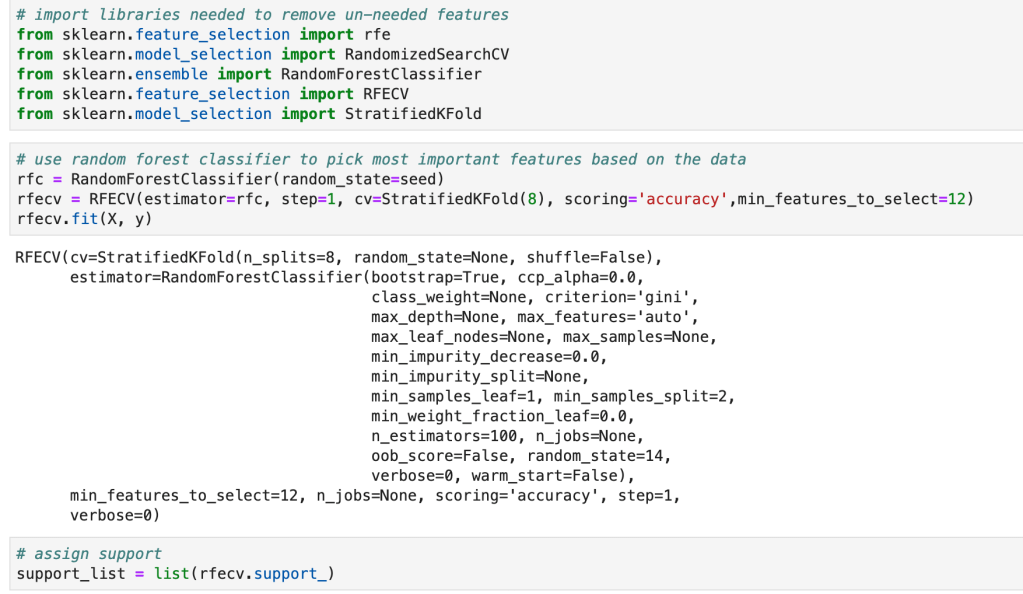
Recursive Feature Elimination (RFE)
RFE is different than PCA in the sense that it models data and then goes back in time so you can run a new model. What I mean by this is that RFE assumes you have model in place and then uses that model to find feature importances or coefficients. If you were running a linear regression model, for example, you would instantiate a linear regression model, run the model, and find the variables with the highest coefficients and drop all the other ones. This can work with a random forest classifier, for example, which has an attribute called feature importances. Usually, I like to find what model works best and then run RFE using that model. RFE will then run through different combinations of keeping different amounts of features and then solve for the features that matter most.
Code
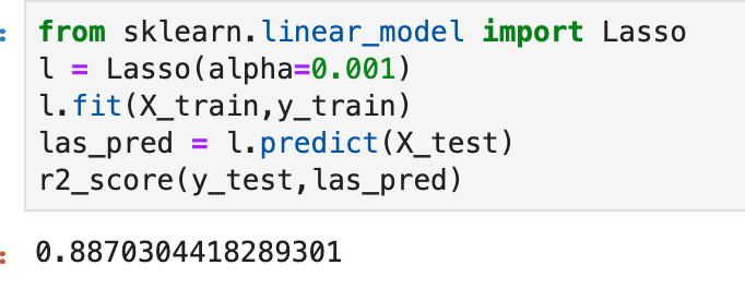
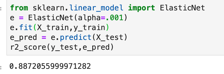
Regularization (Lasso and Ridge)
Regularization is a process designed to reduce overfitting in regression models by penalizing models for having excessive and misleading predictive features. According to Renu Khaldewal (see below): “When a model tries to fit the data pattern as well as noise then the model has a high variance a[n]d will be overfitting… An overfitted model performs well on training data but fails to generalize.” The point is that it works when you train the model but does not deal well with new data. Let’s think back to the “favorite song” feature I proposed earlier. If we were to survey people likely to get a disease and find they all have the same favorite song, while this would certainly be interesting, it would be pretty pointless. The real problem would be when we encounter someone who likes a different song but is checks off every other box. The model might say this person is unlikely to get the disease. Once we get rid of this feature, well now we’re talking and we can focus on the real predictors. So we know what regularization is (a method of placing focus on more predictive features and penalizing models that have excessive features), we know why we need it (overfitting), we don’t yet know how it works. Let’s get started. In gradient descent, one key term you better know is “cost function.” It’s a mildly complex topic, but basically it tells you how much error is in your model by subtracting the predicted values from the true values and summing up the total error. You then use calculus to optimize this cost function to find the inputs that produce the minimal error. Now keep in mind that the cost function captures every variable and the error present in each. In regularization, an extra term is added to that cost function which reduces the impact of larger variables. So the outcome is that you optimize your cost function and find the coefficients of a regression, however you now have reduced overfitting by scaling your terms using a value (often called) lambda and thus have produced more descriptive coefficients. So what is this Ridge and Lasso business? Well, there are two common ways of performing regularization (there is a third, less common, way which basically covers both). In ridge regularization you add a parameter designed to scale the magnitude of each coefficient. We call this L2. Lasso, or L1, is very similar. The difference in effect is that lasso regularization may actually remove features completely. Not just decrease their impact, but actually remove them. So ridge may decrease the impact of “favorite song” while lasso would likely remove it completely. In this sense, I believe lasso more closely resembles PCA and RFE than ridge. In Khandelwal’s summary, she mentions that L1 deals well with outliers but struggles with more complex cases, while ridge has the opposite effect on both accounts. I won’t get in to that third case I alluded above. It’s called Elastic Net and you can use if you’re unsure of whether you want to use ridge or lasso. That’s all I’m going to say… but I will provide code for it.
Code
(Quick note: alpha is a parameter which determines how much of a penalty is placed in regression).
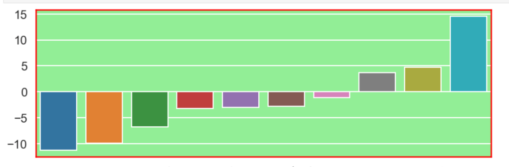
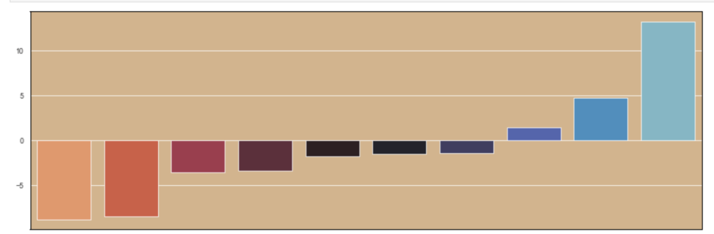
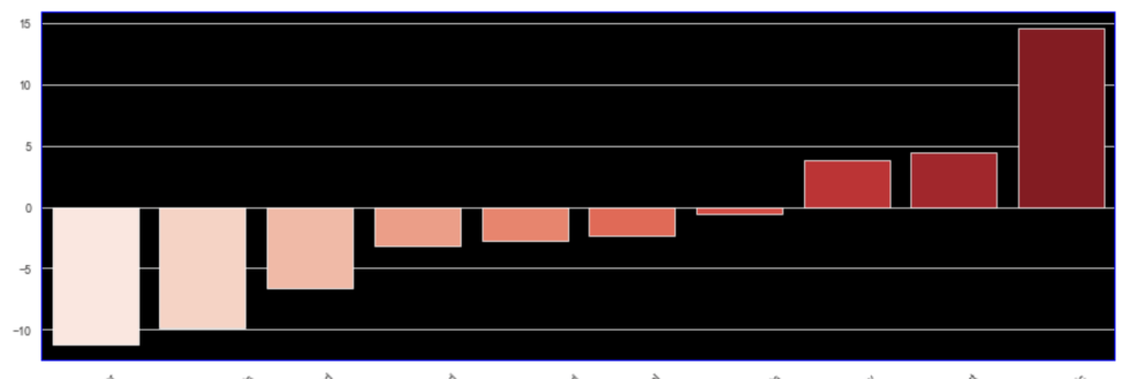
I’ll also quickly add a screenshot to capture context. The variables will not be displayed, but one should instead pay attention to the extreme y (vertical axis) values and see how each type of regularization affects the resulting coefficients.
Initial visual:
Ridge
(Quick note this accuracy is up from 86%)
Lasso
Elastic Net
Conclusion
Data science is by nature a bit messy and inquiries can get out of hand very quickly. By reducing features, you not only make the task at hand easier to deal with and less intimidating, but you tell a more meaningful story. To get back to an earlier example, I really don’t care if everyone whose favorite song is “Sweet Caroline” are likely to be at risk for a certain disease or not. Having that information is not only useless, but it also will make your models worse. Here, I have provided a high-level road map to improving models and distinguishing between important information and superfluous information. My advice to any reader is to get in the habit of reducing features and honing on what matters right away. As an added bonus, you’ll probably get to make some fun visuals, if you enjoy that sort of thing. I personally spent some time designing a robust function that can handle RFE pretty well in many situations. While I don’t have it posted here, it is likely all over my GitHub. It’s really exciting to get output and learn what does and doesn’t matter in different inquiries. Sometimes the variable you think matters most… doesn’t matter much at all and sometimes variables you don’t think matter, will matter a lot (not that correlation always equals causation). Take the extra step and make your life easier.
Accounting for the Effect of Magnitude in Comparing Features and Building Predictive Models
Introduction
The inspiration for this blog post comes from some hypothesis testing I performed on a recent project. I needed to put all my data on the same scale in order to compare it. If I wanted to compare the population of a country to its GDP, for example, well… it doesn’t sound like a good comparison in the sense that those are apples and oranges. Let me explain. Say we have the U.S. as our country. The population in 2018 was 328M and the GDP was $20T. These are not easy numbers to compare. By scaling these features you can put them on the same level and test relationships. I’ll get more into how we balance them later. However, the benefits of scaling data extend beyond hypothesis testing. When you run a model, you don’t want features to have disproportionate impacts based on magnitude alone. The fact is that features come in all different shapes and sizes. If you want to have an accurate model and understand what is going on, scaling is key. Now you don’t necessarily have to do scaling early on. It might be best after some EDA and cleaning. Also, while it is important for hypothesis testing, you may not want to permanently change the structure of your data just yet.
I hope to use this blog to discuss the scaling systems available from the Scikit-Learn library in python.
Plan
I am going to list all the options listed in the Sklearn documentation (see https://scikit-learn.org/stable/modules/preprocessing.html for more details). Afterward, I will provide some visuals and tables to understand the effects of different types of scaling.
This code can obviously be generalized to fit other scalers.
Anyway… lets’ get started
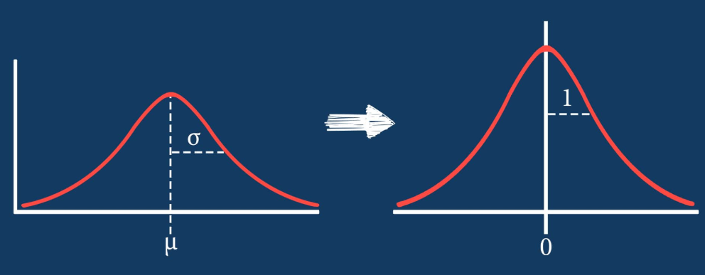
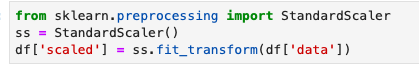
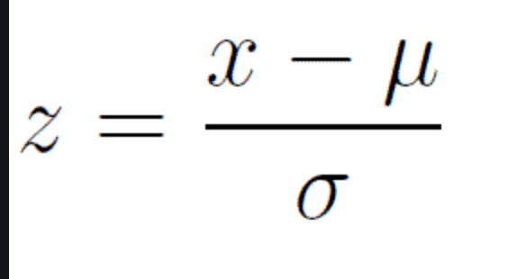
Standard Scaler
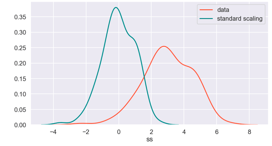
The standard scaler is similar to standardization in statistics. Every value has its overall mean subtracted from it and the final quantity is divided over the feature’s standard deviation. The general effect causes the data to have a mean of zero and a standard deviation of one.
Min Max Scaler
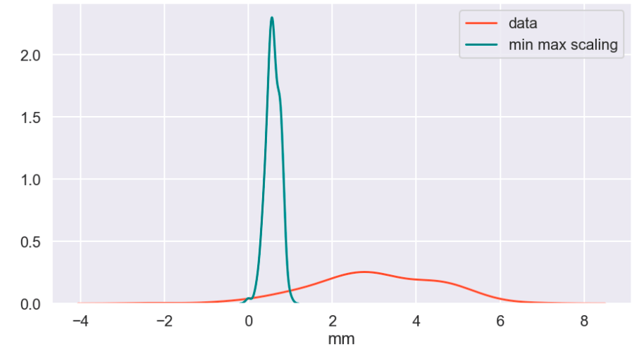
The min max scaler effectively compresses your data to [0,1]. However, one should be careful not to divide by negative values or fractions as that will not yield the most useful results. In addition, it does not deal well with outliers.
Max Abs Scaler
Here, you divide every value by the maximum absolute value of that feature. Effectively all your data gets put into the [-1,1] range.
Robust Scaler
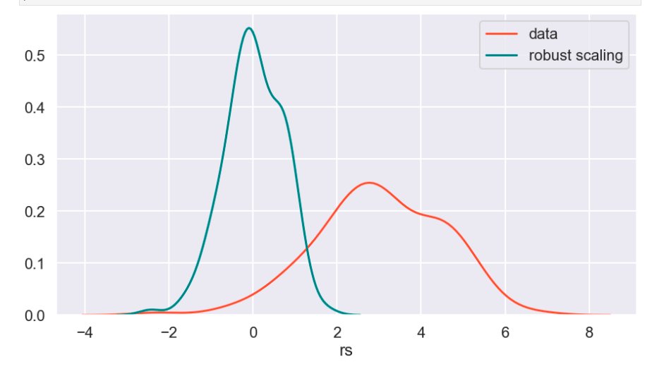
The robust scaler is designed to deal with outliers. It generally applies scaling using the inner-quartile range (IQR). This means that you can specify extremes using quantiles for scaling. What does that mean? If your data follows a standard normal distribution (mean 0, error 1), the 25% quantile is -0.5987 and the 75% quantile is 0.5987 (symmetry is not usually the case – this distribution is special). So once you hit -0.5987, you have covered 1/4 of the data. By 0, you hit 50%, and by 0.5987, you hit 75% of the data. Q1 represents the lower quantile of the two. It’s very similar to min-max-scaling but allows you to control how outliers affect the majority of your data.
“PowerTransformer applies a power transformation to each feature to make the data more Gaussian-like. Currently, PowerTransformer implements the Yeo-Johnson and Box-Cox transforms. The power transform finds the optimal scaling factor to stabilize variance and mimimize skewness through maximum likelihood estimation. By default, PowerTransformer also applies zero-mean, unit variance normalization to the transformed output. Note that Box-Cox can only be applied to strictly positive data. Income and number of households happen to be strictly positive, but if negative values are present the Yeo-Johnson transformed is to be preferred.”
Quantile Transform
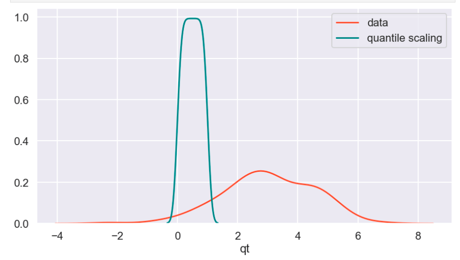
The Sklearn website describes this as a method to coerce one or multiple features into a normal distribution (independently, of course) – according to my interpretation. One interesting effect is that this is not a linear transformation and may change how certain variables interact with one another. In other words – if you were to plot values and just adjust the scale of the axes to match the new scale of the data, it would likely not look the same.
Visuals and Show-and-Tell
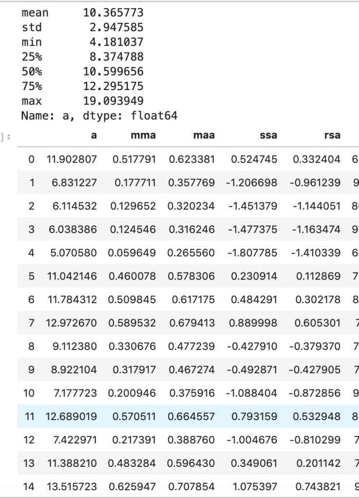
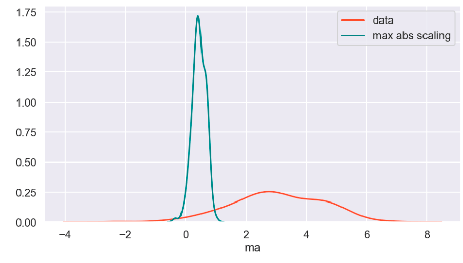
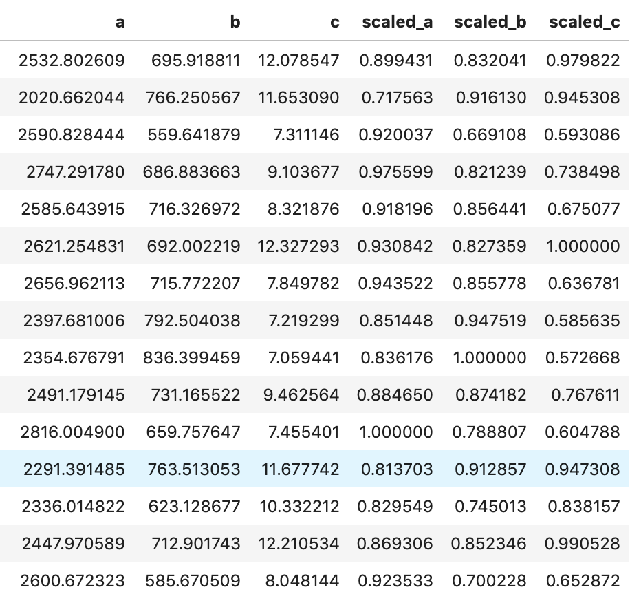
I’ll start with my first set of random data. Column “a” is the initial data (with description in the cell above) and the others are transforms (where the first two letters like maa indicate MaxAbsScaler).
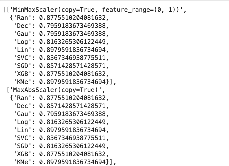
This next output shows 9 models’ accuracy scores across four types of scaling. I recommend every project contain some type of analysis that resembles this to find your optimal model and optimal scaling type (note: Ran = random forest, Dec = decision tree, Gau = Gaussian Naive Bayes, Log = logistic regression, Lin = linear svm, SVC = support vector machine, SGD = stochastic gradient descent, XGB = xgboost, KNe = K nearest neighbors. You can read more about these elsewhere… I may write a blog about this topic later).
More visuals…
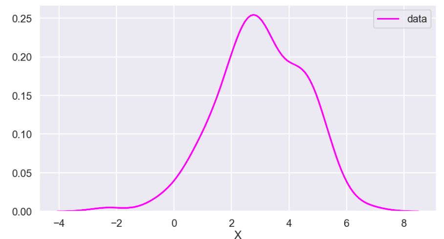
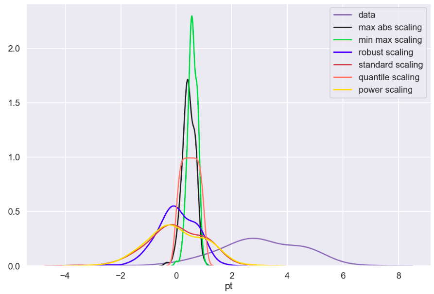
I also generated a set of random data that does not relate to any real world scenario (that I know of) to visualize how these transforms work. Here goes:
So I’ll start with the original data, show everything all together, and then break it into pieces. Everything will be labeled. (Keep in mind that the shape of the basic data may appear to change due to relative scale. Also, I have histograms below which show the frequency of a value in a data set).
Review
What I have shown above is how one individual feature may be transformed in different ways and how that data would adjust to a new interval (using histograms . What I have not shown is a visual of moving many features to one uniform interval can happen. While this is hard to visualize, I would like to provide the following data frame to get an idea of how scaling features of different magnitudes can change your data.
Conclusion
Scaling is important and essential to almost any data science project. Variables should not have their importance determined based on magnitude alone. Different types of scaling move your data around in different ways and can have moderate to meaningful effects depending on which model you apply them to. Sometimes, you will need to use one method of scaling in specific (see my blog on feature selection and principal component analysis). If that is not the case, I would encourage trying every type of scaling and surveying the results. I recently worked on a project myself where I effectively leveraged featured scaling into creating a metric to determine how valuable individual hockey and basketball players are to their team compared to the rest of the league on a per-season basis. Clearly, the virtues of feature scaling extend beyond just modeling purposes. In terms of models, though, I would expect that feature scaling would change outputs and results in metrics such as coefficients. If this happens, focus on relative relationships. If one coefficient is at… 0.06 and another is at… 0.23, what that tells you is that one feature is nearly 4 times as impactful in output. My point is that don’t let the change in magnitude fool you. You will find a story in your data.
I appreciate you reading my blog and hope you learned something today.


/close-up-of-thank-you-signboard-against-gray-wall-691036021-5b0828a843a1030036355fcf.jpg)