Imposing data balance in order to have meaningful and accurate models.
Introduction
Thanks for visiting my blog today!
Today’s blog will discuss what to do with imbalanced data. Let me quickly explain what I’m talking about for all you non-data scientists. If I am screening people too see if they have a disease and I accurately screen every single person (let’s say I screen 1000 people total). Sounds good, right? Well, what if I told you that 999 people had no issues and I predicted them as not having a disease. The other 1 person had the disease and I got it right. This clearly holds little meaning. In fact, I would basically hold just about the same level of overall accuracy if I had predicted this diseased person to be healthy. There was literally one person and we don’t really know if my screening tactics work or I just got lucky. In addition, if I were to have predicted this one diseased person to be healthy, then despite my high accuracy, my model may in fact be pointless since it always ends in the same result. If you read my other blog posts, I have a similar blog which discusses confusion matrices. I never really thought about confusion matrices and their link to data imbalance until I wrote this blog, but I guess they’re still pretty different topics since you don’t normally upsample validation data, thus giving the confusion matrix its own unique significance. However, if you generate a confusion matrix to find results after training on imbalanced data, you may not be able to trust your answers. Back to the main point; imbalanced data causes problems and often leads to meaningless models as we have demonstrated above. Generally, it is thought that adding more data to any model or system will only lead to higher accuracy and upsampling a minority class is no different. A really good example of upsampling a minority class is fraud detection. Most people (I hope) aren’t committing any type of fraud ever (I highly recommend you don’t ask me about how I could afford that yacht I bought last week). That means that when you look at something like credit card fraud, the majority of the time a person makes a purchase, their credit card was not stolen. Therefore, we need more data on cases when people are actually the victims of fraud to have a better understanding of what to look for in terms of red flags and warning signs. I will discuss two simple methods you can use in python to solve this problem. Let’s get started!
When To Balance Data
For model validation purposes, it helps to have a set of data with which to train the model and a set with which to test the model. Usually, one should balance the training data and leave the test data unaffected.
First Easy Method
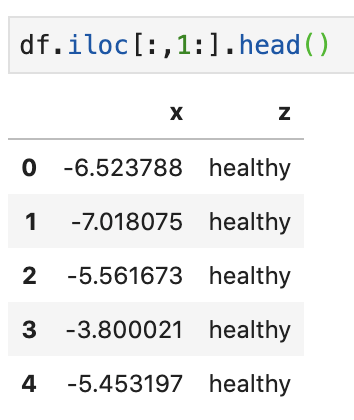
Say we have the following data…
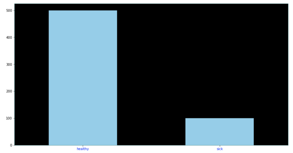
Target class distributed as follows…
The following code below allows you to extremely quickly decide how much of each target class to keep in your data. One quick note is that you may have to update the library here. It’s always helpful to update libraries every now and then as libraries evolve.
Look at that! It’s pretty simple and easy. All you do is decide how many of each class to keep. After that, a certain number of rows resulting in one target feature outcome and a certain number of rows resulting in an alternative target feature outcome remain. The sampling strategy states how many rows to keep from each target variable. Obviously you cannot exceed the maximum per class, so this can only serve to downsample, which is not the case with our second easy method. This method works well when you have many observations from each class and doesn’t work as well when one class has significantly less data.
Second Easy Method
The second easy method is to use resample from sklearn.utils. In the code below, I decided to point out that I was using train data as I did not point it out above. Also in the code below, I generate new data of class 1 (sick class) and artificially generate enough data to make it level with the healthy class. So all the training data stays the same, but I repeat some rows from the minority class to generate that balance.
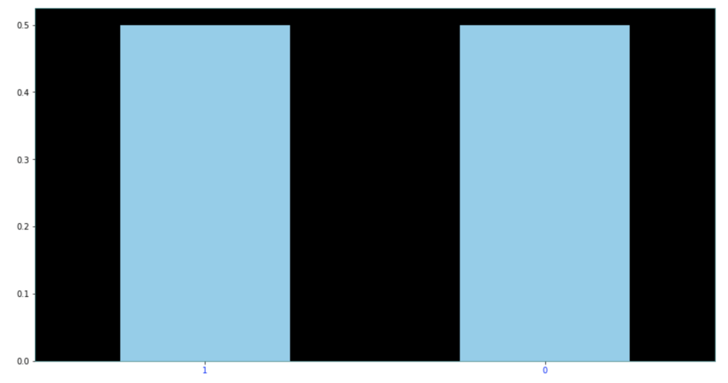
Here are the results of the new dataset:
As you can see above, each class represents 50% of the data. This method can be extended to cases with more than two classes quite easily as well.
Update!
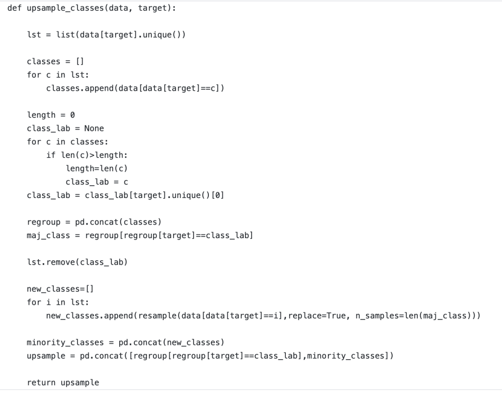
If you are coming back and seeing this blog for the first time, I am very appreciative! I recently worked on a project that required data balancing. Below, I have included a rough but good way to create a robust data balancing method that works well without having to specify the situation or context too much. I just finished writing this function but think it works well and would encourage any readers to take this function and see if they can effectively leverage it themselves. If it has any glitches, I would love to hear feedback. Thanks!
Conclusion
Anyone conducting any type of regular machine learning modeling will likely need to balance data at some point. Conveniently, it’s easy to do and I believe you shouldn’t overthink it. The code above provides a great way to get started balancing your data and I hope it can be helpful to readers.
It’s important to keep track of who does and does not show up to work when they are supposed to. I found some interesting data online that gives information on how much work from a range of 0 to 40 hours any employee is expected to miss in a certain week. I ran a couple models and came away with some insights on what my best accuracy would look like and what it would tell me are the most predictive of time expected to miss by an employee.
Process
Collect Data
Clean Data
Model Data
Collect Data
My data comes from the UC Irvine Machine Learning Repository (https://archive.ics.uci.edu/ml/datasets/Absenteeism+at+work). While I will not go through this part in full detail, the link above talks about the numerical representation for “reason for absence.” The features of the data set, other than the target feature of time missed, were: ID, reason for absence, month, age, day of week, season, distance from work, transportation cost, service time, work load, percent of target hit, disciplinary failure, education, social drinker, social smoker, pet, weight, height, BMI, and son. I’m not entirely sure what “son” means. So now I was ready for some data manipulation. However, before I did that, I performed some exploratory data analysis with some custom columns being binning the variables with many unique values such as transportation expense.
EDA
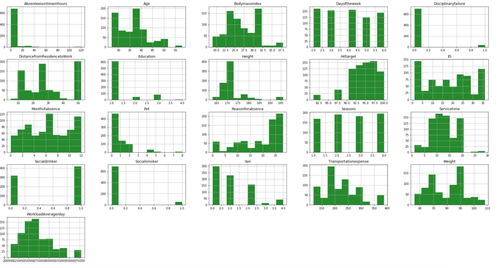
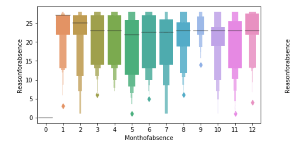
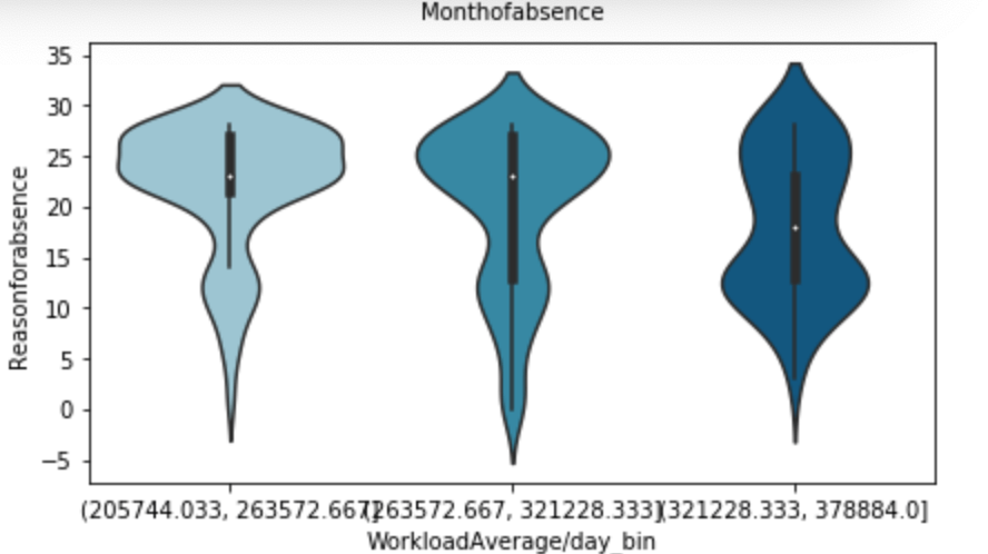
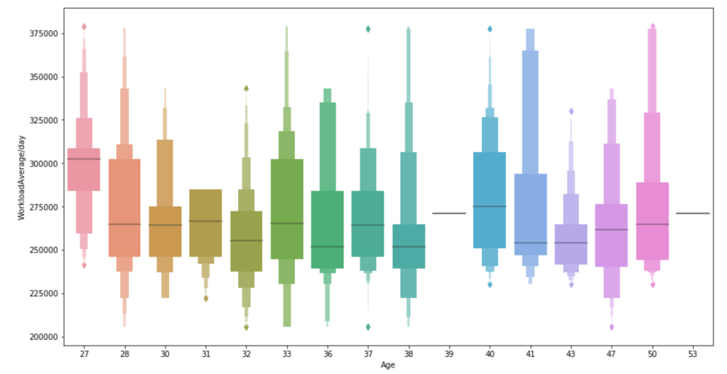
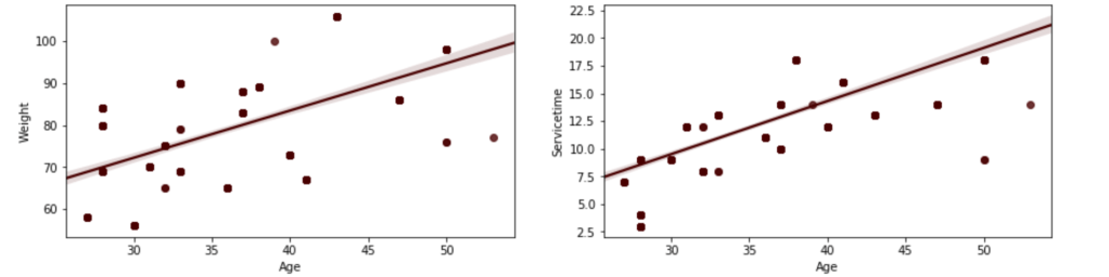
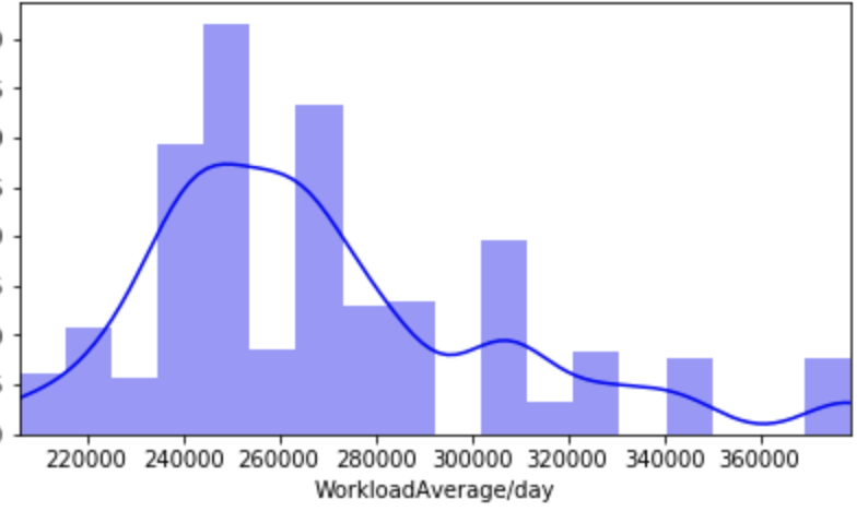
First, I have a histogram of each variable.
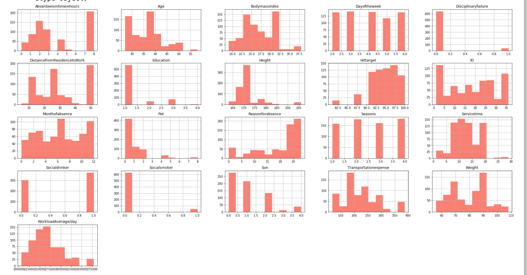
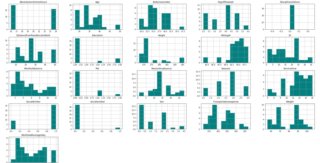
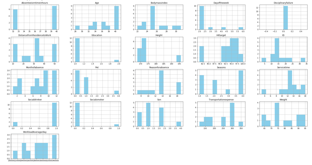
After filtering outliers, the next three histogram charts describe the distribution of variables in cases of missing low, medium, and high amounts of work, respectively.
LowMediumHigh
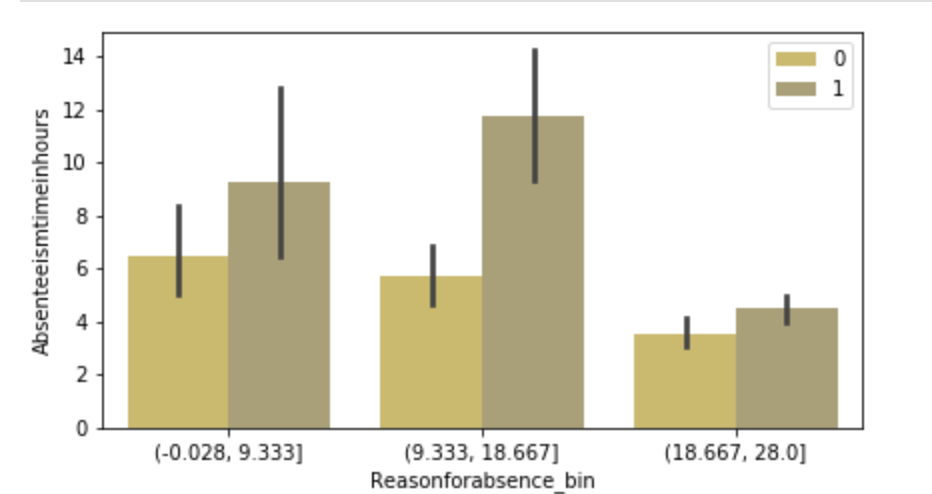
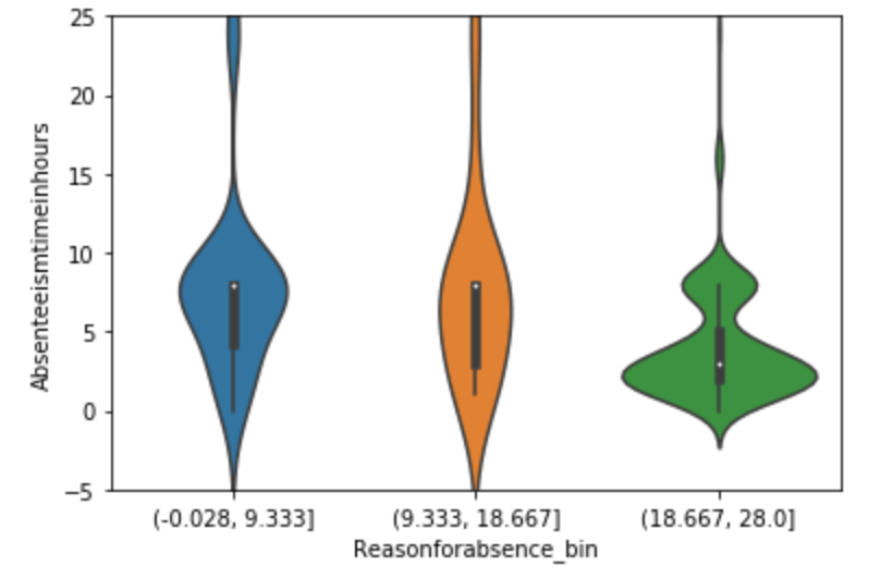
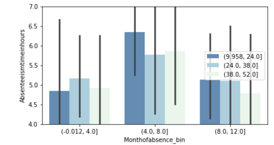
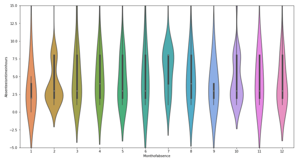
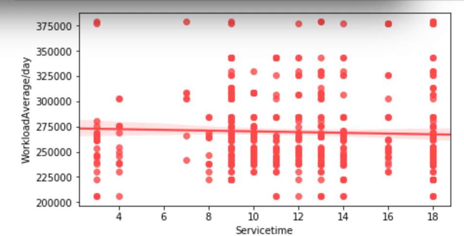
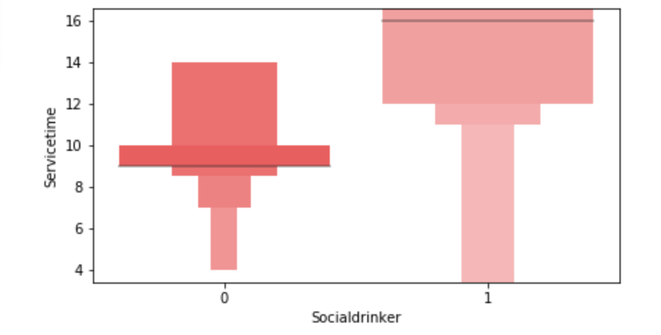
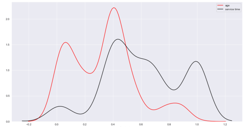
Below, I have displayed a sample of the visuals produced in my exploratory data analysis which I feel tell interesting stories. When an explanation is needed it will be provided.
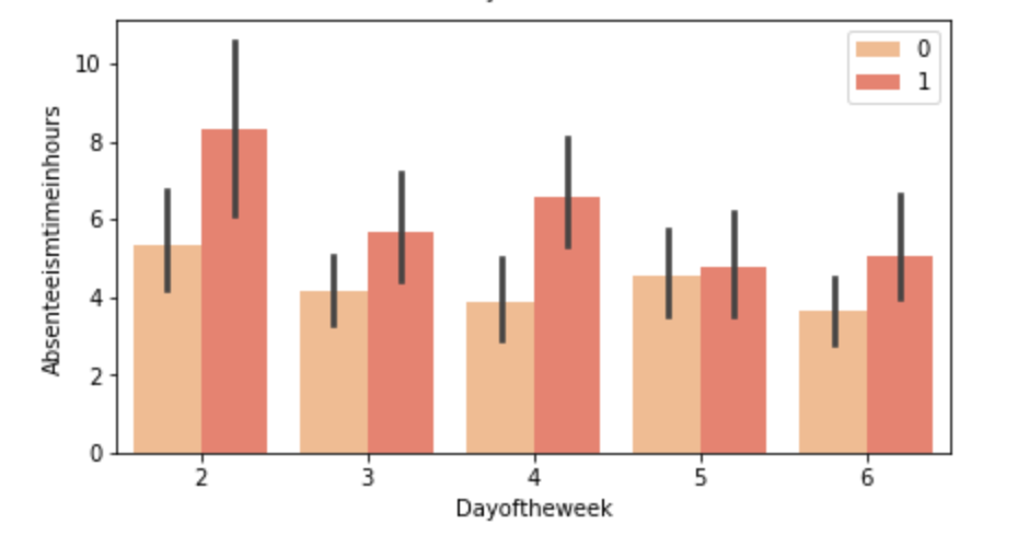
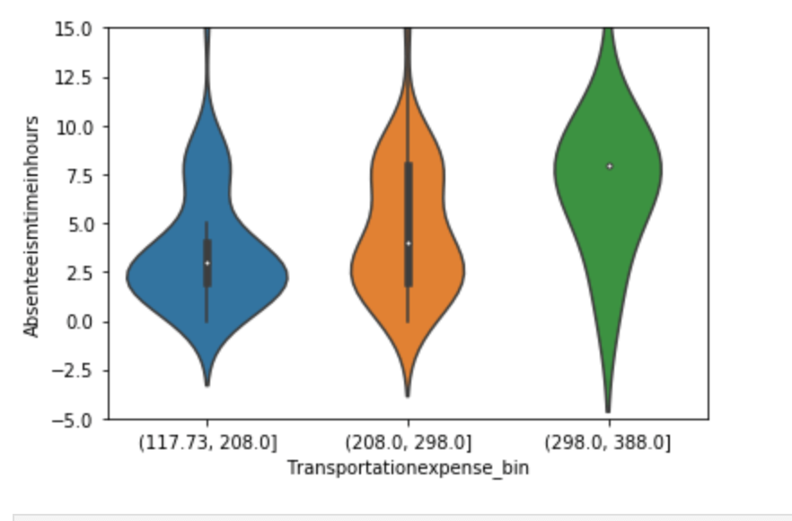
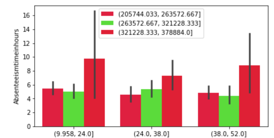
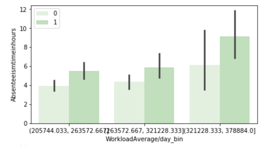
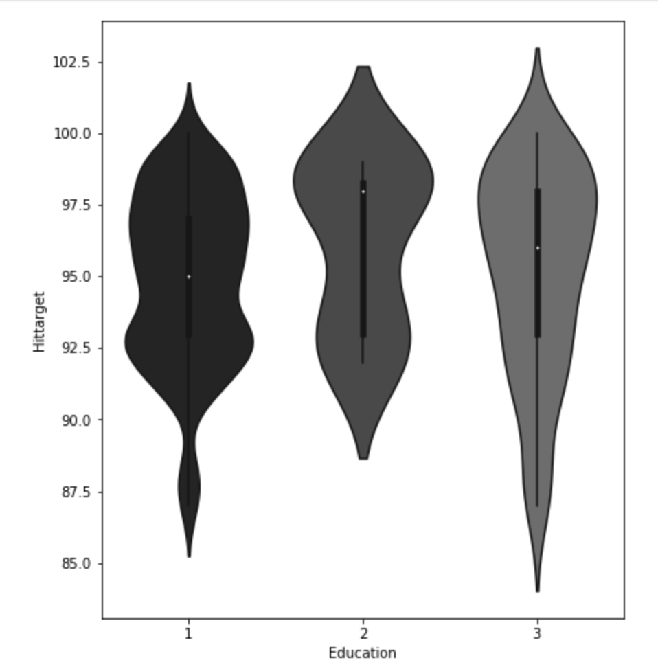
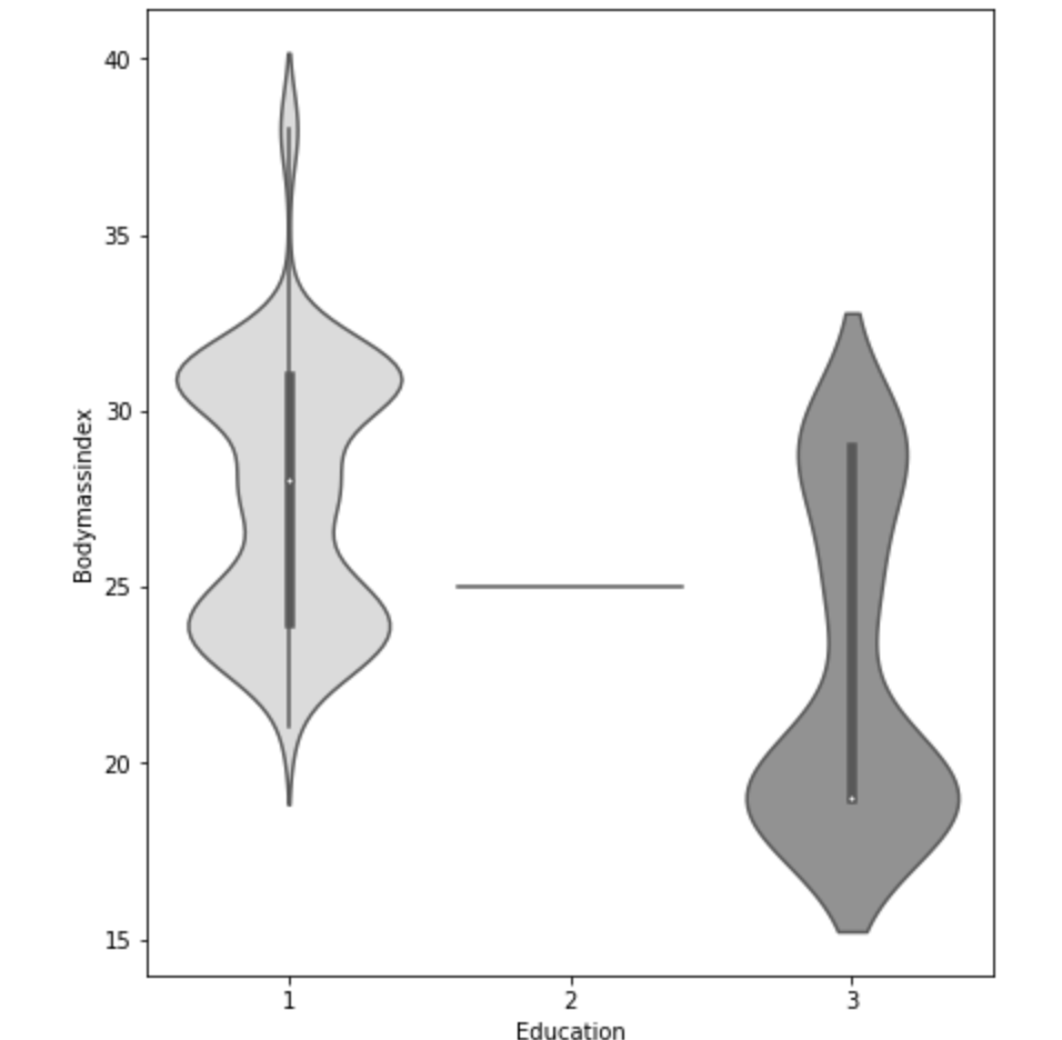
(O and 1 are binary for “Social Drinker”)(The legend refers distance from work)(O and 1 are binary for “Social Drinker”)(The legend refers transportation expense to get to work)(The legend reflect workload numbers)(O and 1 are binary for “Social Drinker”)Histogram(Values adjusted using Min-Max scaler)
This concludes the EDA section.
Hypothesis Testing
I’ll do a quick run-through here of some of the hypothesis testing I performed and what I learned. I examined the seasons of the year to see if there was a discrepancy in the absences observed in the Summer and Spring vs Winter and Fall. What I found was that there wasn’t much evidence to say a difference exists. I found with high statistical power that people with higher travel expenses tend to miss more work. This was also the case with people who have longer distances to work. Transportation costs as well as distance to work also have a moderate effect on service time at a company. Age has a moderate effect on whether people tend to smoke or drink socially but not enough to have statistical significance. In addition, there appears to be little correlation with time at the company and whether or not targets were hit. However, this test has low statistical power and has a p-value that is somewhat close to 5% implying that an adjusted alpha may change how we view this test both in terms of type 1 error and statistical power. People with less education tend to drink more as well. Education has a moderate correlation with service time. Anyway, that is very quick recap of the main hypotheses I tested boiled down to the most easy way to communicate their findings.
Clean Data
I started out by binning variables with wildly uneven distributions. Next, I used categorical data encoding to encode all my newly binned features. Next, I applied scaling so that all the data would be within 3 standard deviations of each variable’s mean. Having filtered out misleading values, I binned my target variable into three groups. Next, I removed correlation. I will go back and discuss some of these topics later in this blog when I discuss some of the difficulties I faced.
Model Data
My next step was to split and model my data. One problem came up. I had a huge imbalance among my classes. The “lowest amount of work missed” class had way more than the other two classes. Therefore, I synthetically created new data to have every class have the same amount of cases. To find my most ideal model and then improve it… well I first needed to find the best model. I applied 6 types of scaling across 9 models = 54 results and found that my best model would be a Random Forest model. I even found that adding polynomial features would give me near 100% accuracy on training data without much loss on test data. Anyway, I went back to my random forest model. I found the most indicative features of time missed in order from biggest indicator to smallest indicator were: month, reason for absence, work load, day of the week, season, and social drinker. There are obviously other features, but these are the most predictive ones. The others provide less information.
Problems Faced in Project
The first problem I had was not looking at the distribution of the target variable. It is a continuous variable, however, there are very few values in certain ranges. I therefore split it into three bins; missing little work, a medium amount of work, and a lot of work. I also experimented with having two bins as well as different cutoff points to pick the bins, but three bins worked better. This also affected my upsampling as the different binning methods resulted in different class breakdowns. The next problem I had was a similar one. How would I bin variables? In short, I tried a couple of ways and found that three bins worked well. All this binning was not done using quantiles, by the way. That would imply no target class imbalance which was not the case. I tried using quantiles, but did not find it effective. I also experimented with different categorical feature encoding but found that the most effective method was to bin based on mean value in connection with target variable (check my home page for a blog about that concept). I ran a gridsearch to optimize my random forest at the very end and then printed a confusion matrix. This was not good, but I nee to be intellectually honest. Predicting when someone would fall into class 0 (“missing low amount of work”) my model was amazing and its recall exceeded precision. However, it did not work well on the other two. Now keep in mind that you do not upsample test data and this could be a total fluke. However, that was still frustrating to see. An obvious next step is to collect more data and continue to improve the model. One last idea I want to talk about is exploratory data analysis. Now, to be fair, this could be inserted into any blog. Exploratory data analysis is both fun and interesting as it allows you to be creative and take a dive into your idea using visuals as quick story-tellers. The project I had just scrapped before acquiring the data for this project drove me kind of crazy because I didn’t really have a plan for my exploratory data analysis. It was arbitrary and unending. That is never a good plan. EDA should be planned and thought out. I will talk more / have talked more about this (depending on when you read this blog) in another blog but the main point is you want to think of yourself as person who doesn’t do programming who just wants to ask questions based on the names of the features. Having structure in place for EDA is less free-flowing and exciting than not having structure, but it ensures that you work efficiently and have a good start point as well as stop point. That really helped me save a lot of stress.
Conclusion
It’s time to wrap things up. At this point, I think I would need more data to continue to improve this project, and I’m not sure where that data would come from. In addition, there are a lot of ambiguities in this data set such as the numerical choices for reason for absence. Nevertheless, I think that by doing this project I learned how to create an EDA process and how to take a step back and rephrase your questions as well as rethink your thought process. Just because a variable is continuous, this does not imply it requires regression analysis. Think about your statistical inquiries as questions, think about what makes sense from an outsider’s perspective, and then go crazy!
(PLEASE READ – Later on in this blog I describe target encoding without naming it as such. I wrote this blog before I knew target encoding was a popular thing and I am glad to have learned that it is a common encoding method. If you read later on, I will include a quick-fix target encoder as an update to the long-form one I have provided. Thanks!).
For my capstone project at the Flatiron School, where I studied data science, I decided to build a car insurance fraud detection model. When building my model, I had a lot of categorical data to address. Variables like “years as customer” are easy to address but variables like “car brand” are less easy to address as they are not numerical. However, these types of problems are nothing new or novel. Up until this point, I had always used dummy variables to address these problems. However, by adding dummy variables to my model, things got very difficult to manage. In case you are not familiar – I will give a more comprehensive explanation of what dummy variables are and what purpose they serve later. It was at this point that I started panicking. I had bad scores, a crazy amount of features, and I lacked an overall feeling of clarity and control of my project. Then things changed. I spoke with the instructors and we began to explore other types of ways to encode categorical data. I’d like to share of these ideas as well as discuss their benefits and drawbacks. I think this will be beneficial to any reader for the sake of novelty, utility, and efficiency but most importantly, you can improve your models or tell different stories depending on how you choose to encode data.
Dummy Variables
Dummy variables are added features that exist only to tell you whether or not a certain instance of a variable is present in one row of data or not. If you wanted to classify colors of m&m’s using dummy variables and you had red, yellow, and blue m&m’s, then you would add a column for blue and a column for red. If the piece you are holding is red, give the red column a one and blue column a zero and vice-versa. With yellow, it is a little different, as you assign a zero to both blue and red since that automatically means your m&m in hand would be yellow. It’s important to note that just because you are using dummy variables, it does not mean that each possible instance (like colors, for example) carries the same weight (i.e. red may be more indicative of something than blue, per se). In fact, one of the great things about dummy variables is that, other than being easy, when you run some sort of feature importance or other analogous type of evaluation, you can see how important each unique instance can be. Say you are trying to figure out where the most home runs are hit every year in baseball. If you have an extra column for every single park, you can learn where many are hit and where fewer are hit. However, since you are dropping one instance for each variable, you must also consider the effect of your coefficient/feature importances on the instance you drop. For example if red and blue m&m’s have some high flavor profile, maybe yellow has a lower flavor profile and vice-versa. This relates to the dummy variable trap which is basically a situation where you may lose some information since you always must drop at least one instance of a variable to avoid multicollinearity/autocorrelation. To get back to benefits of dummy variables, you can search for feature interactions by multiplying, for example, two or more dummy variables together to create a new feature. However, this relates to one problem with dummy variables. If you have a lot of unique instances of a particular feature, you will inevitably add many many columns. Let’s say you want to know the effect of being born in anytime between 1900 and 2020 on life expectancy. That’s a lot of dummy columns to add. Seriously, a lot. I see two solutions to this dilemma. Don’t use dummy variables at all, as we will soon discuss, or just be selective on which features are best fit for dummies based on intuition. If you think about it, there is also another reason to limit the amount of columns you add; over-fitting. Imagine, for a second, that you want to know life expectancy based on every day between 1500 and 2020. That’s a lot of days. You can still do this inquiry effectively, so don’t worry about that, but using dummies is inefficient. You may want to bin your data or do another type of encoding as we will discuss later. (One-hot encoding is a very similar process. The difference there is that one-hot encoding you don’t drop the “extra” column and have a binary output for each instance).
Integer / Label Encoding
One simple way of making all your data numerical without adding extra confusing features is by assigning a value to each instance. For example, red = 0, blue = 1, yellow = 2. By doing this, your data frame maintains its original shape and you now have represented your dat numerically. One drawback here is that it blurs one’s understanding of the effect of variable magnitude as well as creating a false sense of some external order or structure. Say you have 80 colors in your data and not just 3. How do we pick our order and what does our order imply? Why would one color be first as opposed to 51st? In addition, wouldn’t color 80 have some larger scale impact just by virtue of being color 80 and not color 1. Let’s say color 80 is maroon and color 1 is red. That’s certainly misleading. So it is easy to do and is effective in certain situations but often creates more problems that solutions. (This method is not your easy way out).
Custom Dictionary Creation and Mapping
The next method is similar to the one above almost entirely, but merits discussion. Here, you use label encoding but you use some method, totally up to you, to establish meaning and order. Perhaps colors similar to each other are labeled 1 and 1.05 as opposed to 40 and 50. However, this requires some research and a lot of work to be done right and so much is undetermined as you start and therefore it is not the best method.
Binning Data and Assigning Values to Bins
Randomly assigning numerical values or carefully finding the perfect way to represent your data are not effective and/or efficient. However, one easy way to label encode in an effective way is to bin data with many unique values. Say you want to group students together. It would only be natural to draw some similarities between those getting 70.4, 75.9, and 73.2 averages and people scoring in the 90s. Here have you dealt with all the problems with label encoding in one quick step. Your labels have tell a story with a meaningful order and you don’t have to carefully examine your data to find groups. Pandas allows you to instantly bin subsets of a feature based on quantiles or other grouping methods in one line of code. After that you can create a dictionary and map it. (This is a similar process to my last suggestion). Binning also has helped me in the past to reduce overfitting and build more accurate models. Say you have groups of car buyers. While there may be differences between the people buying cars in the 20k-50k range compared to the 50k-100k range, there are probably far less differences between buyers in the 300k-600k range. That interval is 6 times as big as the 50k-100k range and there are probably fewer members than the previous to ranges. You can easily capture that divide if you just bin the 300k-600k buyers together and you will likely have a worse model if you don’t. You can take this idea of binning to the next level and add even more meaning to your encoding by combining binning with my final suggestion. (First bin, next follow my final suggestion)
Mapping (Mean) Value Based on Correlation with Target Variable (and Other Variations)
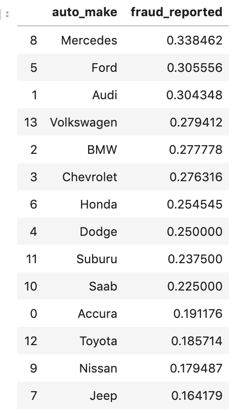
“Mapping (Mean) Value Based on Correlation with Target Variable (and Other Variations)” is a lot of words to digest and probably sounds confusing, so I will break this down and explain it using a visual. So first I’ll explain what I mean. For my explanation, I will use an example. I first came across this method studying car insurance fraud as discussed above. I found that ~25% of my reports survey were fraud, which was surprisingly high. Armed with this knowledge, I was now ready to use it to identify and replace my categorical features with meaningful numerical values. Say my categorical feature was car brand. It’s quite likely that Lamborghinis and Fords are present in fraud reports at different proportions. The mean is 25%, so we should expect both brands to be close to this number. However, just assigning a Ford the number 25% accomplishes nothing. Instead if 20% of reports involving Fords were fraud, Ford now became 20%. Similarly, if Lamborghinis had a higher rate, say 35%, Lamborghinis now became known as 35%. Here’s some code to demonstrate what I mean:
So what this process shows is that fraudulent reports are correlated more strongly with Mercedes cars and less with Jeep cars. Therefore, they are treated differently. This is a very powerful method; not only does it encode effectively, but it also solves the problem you lose when you avoid dummy variables by seeing the impact of unique instances of a variable. However, it is worth noting that you can only see each feature’s correlation with the target variable (here – insurance fraud rates) if you print out that data. If you just run a loop, everything will turn into a number. You do have to take the extra step and explore all the individual relationships. It is not that hard to do, though. What I like to do is create a two column data frame: an individual feature with the target grouped by the non-target feature (like above). I then use this information to create and map a dictionary of values. This can be scaled easily using a loop. Now, if you look back to the name of this section, I add in the words “other variations.” While I have only looked at the mean values, I imagine that you can try to use other aggregation methods like minimums and maximums (and others) to represent each unique instance of a feature. This method can also be very effective if you have already binned your data. Why assign a bunch of unique values to car buyers in the 300k-600k when you can bin them together?
Update!
This update comes around one month from the initial publishing of this blog. I describe target encoding above, but only recently learned that ‘target encoding’ was the proper name. More importantly, it can be done in one line of code. Here’s a link to the documentation so you can accomplish this task easily http://contrib.scikit-learn.org/category_encoders/targetencoder.html.
Conclusion
Categorical encoding is a very important part of any model with any qualitative data and even quantitative data at times. There are various methods of dealing with categorical data as we have explored above. While some methods may appear better than others, there is value in experimenting, optimizing your model, and using the one most appropriate or necessary methods in projects. Most of what I discussed was at a relatively simple level in the sense that I didn’t dig too deep into the code. If you look at my GitHub, you can find these types of encodings all over my code and can also find other online resources. It should be easy to find.
I’ll leave with one last note. Categorical encoding should be done later on in your notebooks. You can do EDA with encoded data, but you probably want to maintain your descriptive labels when doing the bulk of your EDA and hypothesis testing. Just to really drive this point home, I’ve got an example. If you want to know which m&m’s are most popular, it is far more beneficial to know the color than the color encoding. “Red has a high flavor rating” explains a lot to someone. “23.81 has a high flavor rating” on the other hand… well no one knows what that means, not even the person who produces that statistic. Categorical encoding should instead be though of as one of your last steps before modeling. Don’t rush.