Capstone Project at The Flatiron School

Insurance Companies and Fraud

Introduction

Thank you for visiting my blog today. Today I would like to discuss my capstone project that I worked on as I graduated from the Flatiron School data science boot camp (Chicago Campus). At the Flatiron School, I began to build a foundation in python and its applications in data science. It was an exciting and rewarding experience. For my capstone project, I investigated insurance fraud using machine learning. After having worked on some earlier projects, I definitely can say that this one was a bit more complete and suiting of a capstone project. I’d like to take you through my process and share what insights I gained and what problems I faced along the way. I’ve since worked on some other data science projects and have expanded my abilities in areas such as exploratory data analysis (EDA from henceforth) and this project represents where I had progressed as of my 4th month into data science. I’m very proud of this project and hope you enjoy reading this blog.

Data Collection

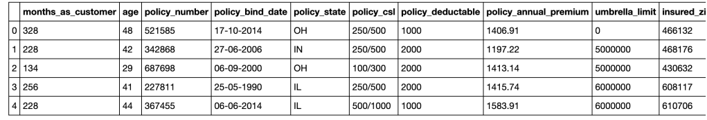
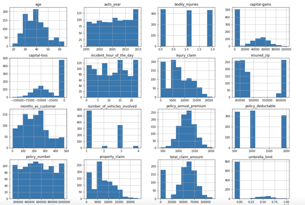
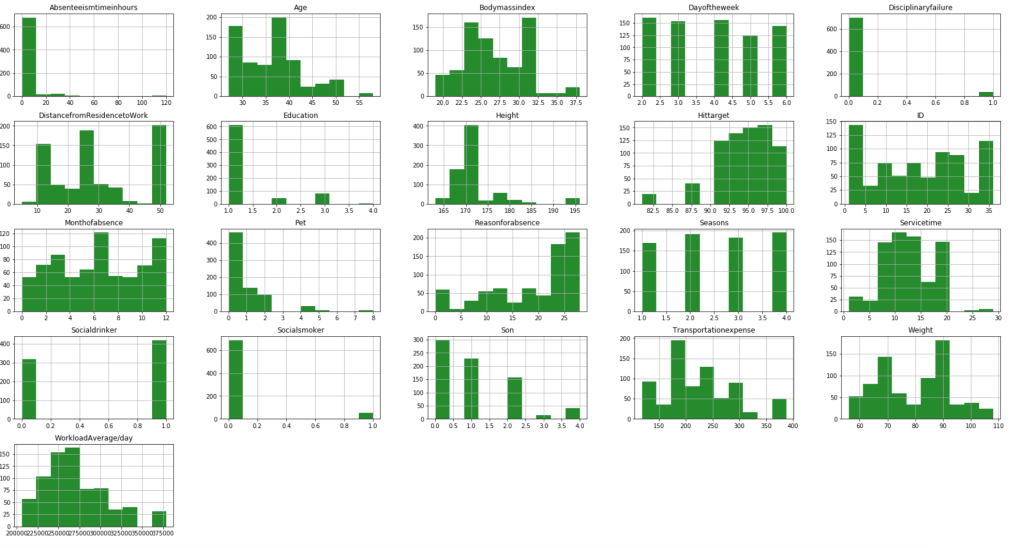
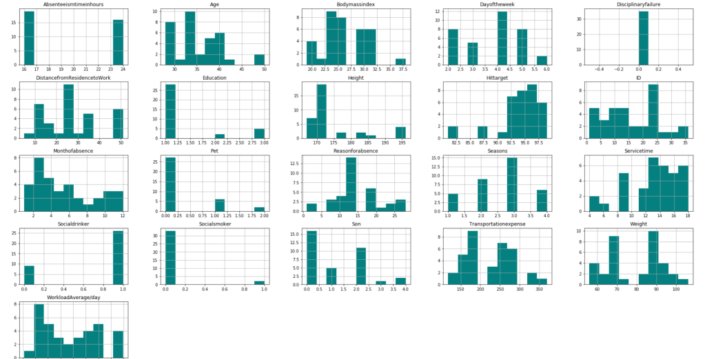
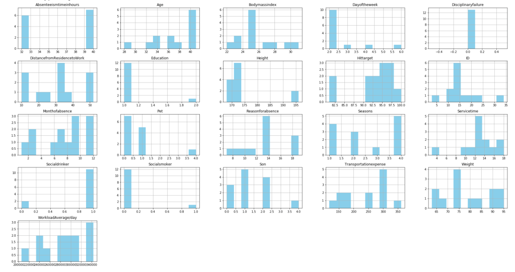
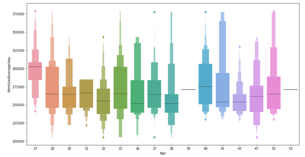
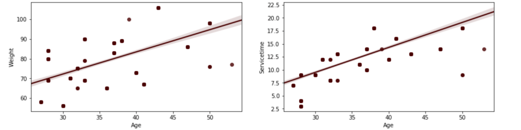
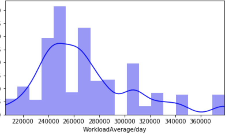
My data comes from kaggle.com, a site with many free data sets. I added some custom features but the ones that came from the initial file are as follows (across 1000 observations): months as customer, age, policy number, policy bind date, policy state, policy csl, policy deductible, policy premium, umbrella limit, zip code, gender, occupation, education level, relationship to policy owner, capital gains, capital losses, incident date, incident type, collision type, incident severity, authorities contacted, incident state, incident city, incident location, incident hour of the day, number of vehicles involved, property damage, witnesses, bodily injuries, police report available, total claim amount, injury claim, property claim, vehicle claim, car brand, model, car year, and the target of feature of whether or not the report was fraudulent. The general categories of these features can be described as: incident effects, policy information, incident information, insured information, car information. (Here’s a look at a preview of my data and some histograms of explicitly numerical features).

Data Preparation

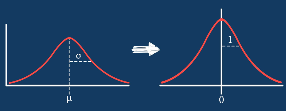
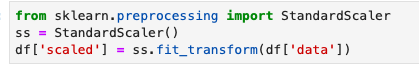
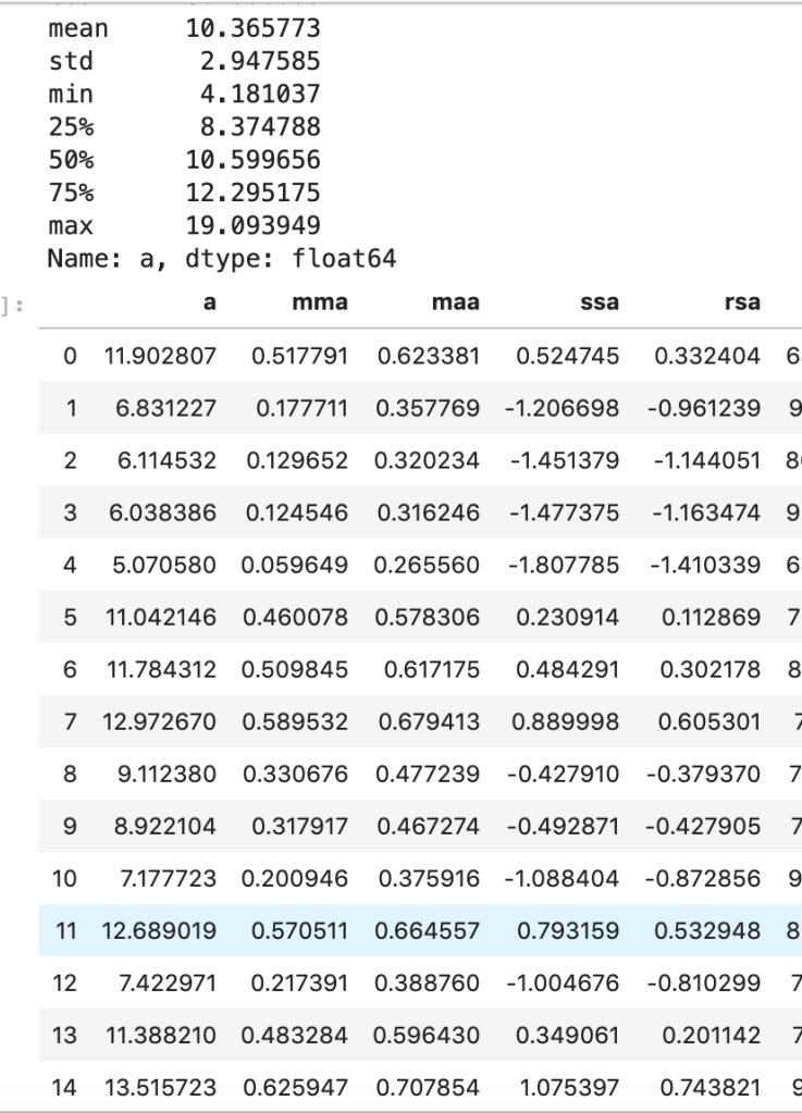
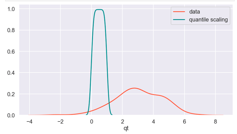
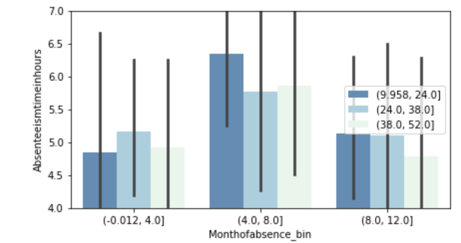
There weren’t many null values and the ones present were actually expressed in an unusual way, but in the end I was able to quickly deal with these values. After that, I encoded binary features in 0 and 1 form. I also broke down policy bind date and incident date into month and year format as day format was not general enough to be meaningful. I also added a timeline variable between policy bind and incident date. I then mapped a car type to each car model such as sedan or SUV. Next, I removed age, total claim amount, and vehicle claim from the data due to correlation with other features. I then was ready to encode my categorical data. Here, I used a new method I had never really used before and I discuss this process in detail in another blog on my website. I then revisited correlation having converted all my features to numeric values and remove incident type from my data. I performed very short exploratory data analysis that does not really warrant discussion. (This is one big change I have taken since doing more projects. EDA is a very exciting part of the data science process and provides exciting visuals, however at the time I was very focussed on modeling). (I’ll include one visual to show my categorical feature encoding).

Feature Selection

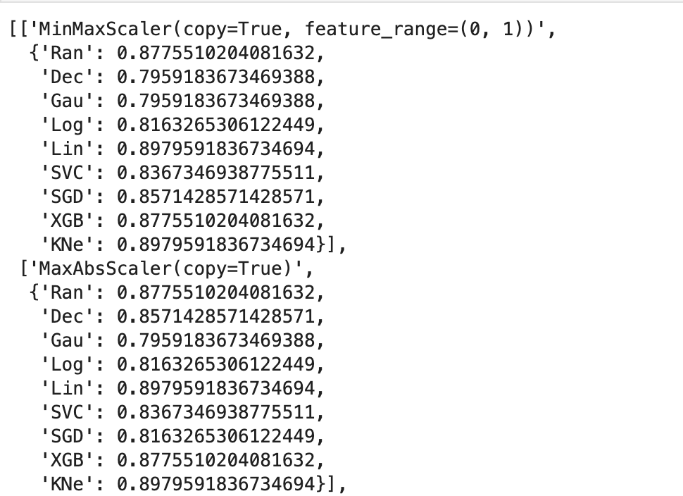
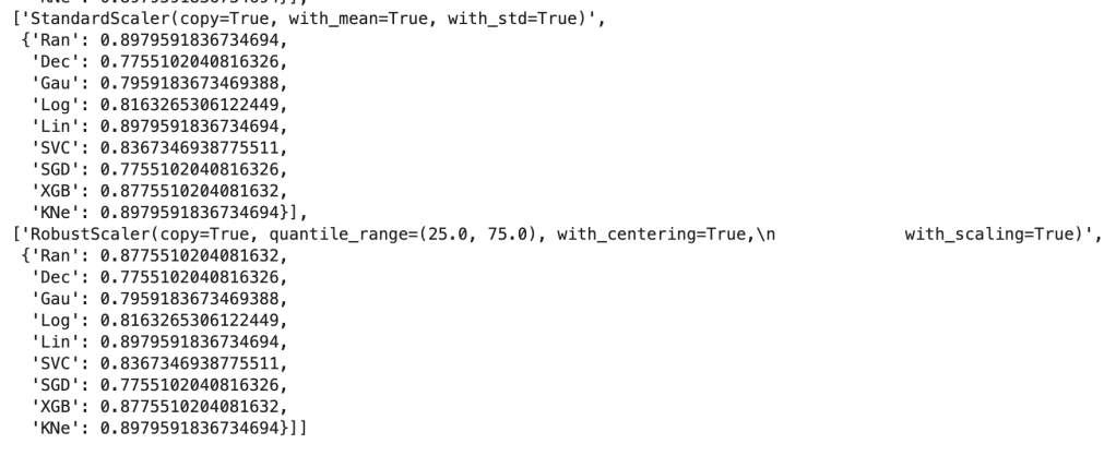
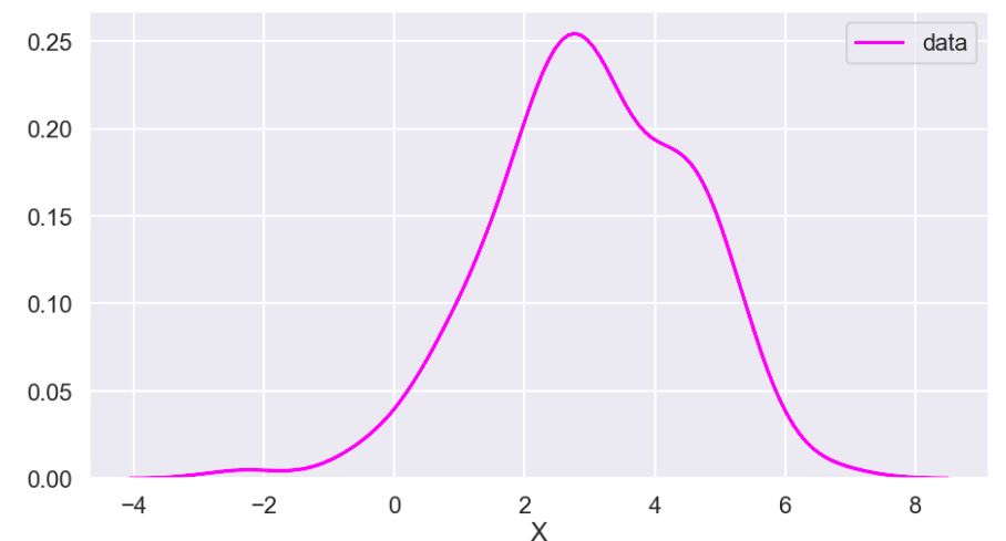
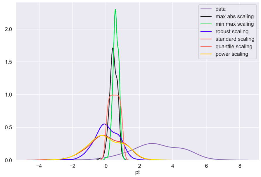
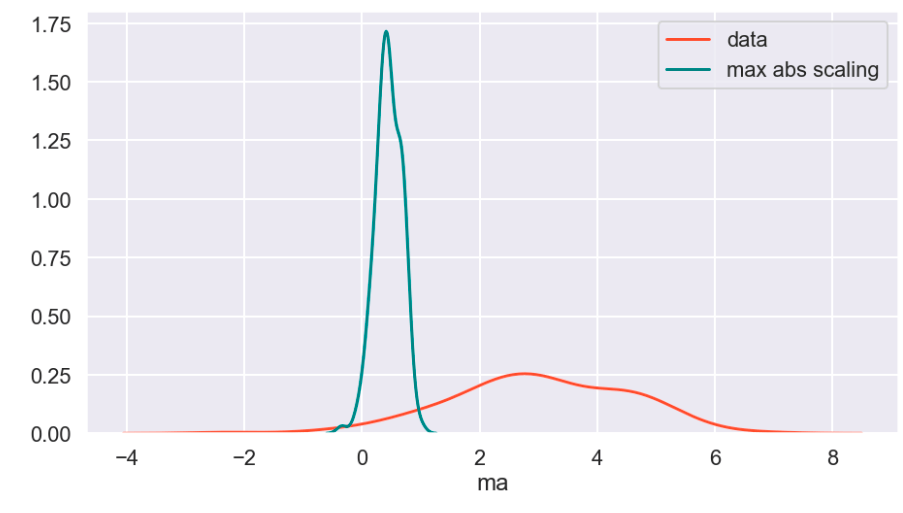
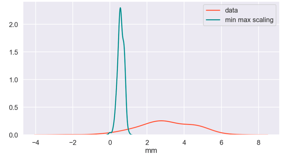
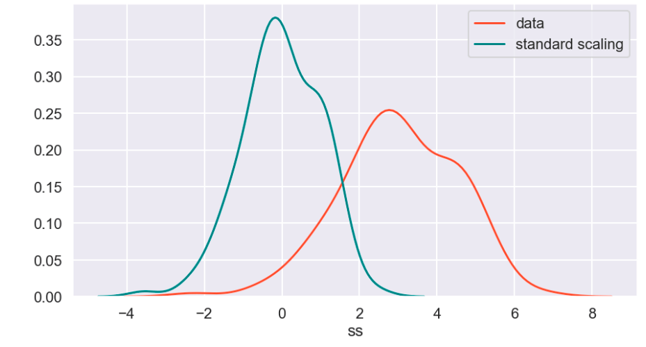
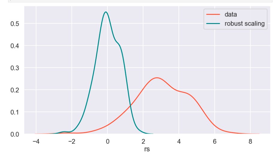
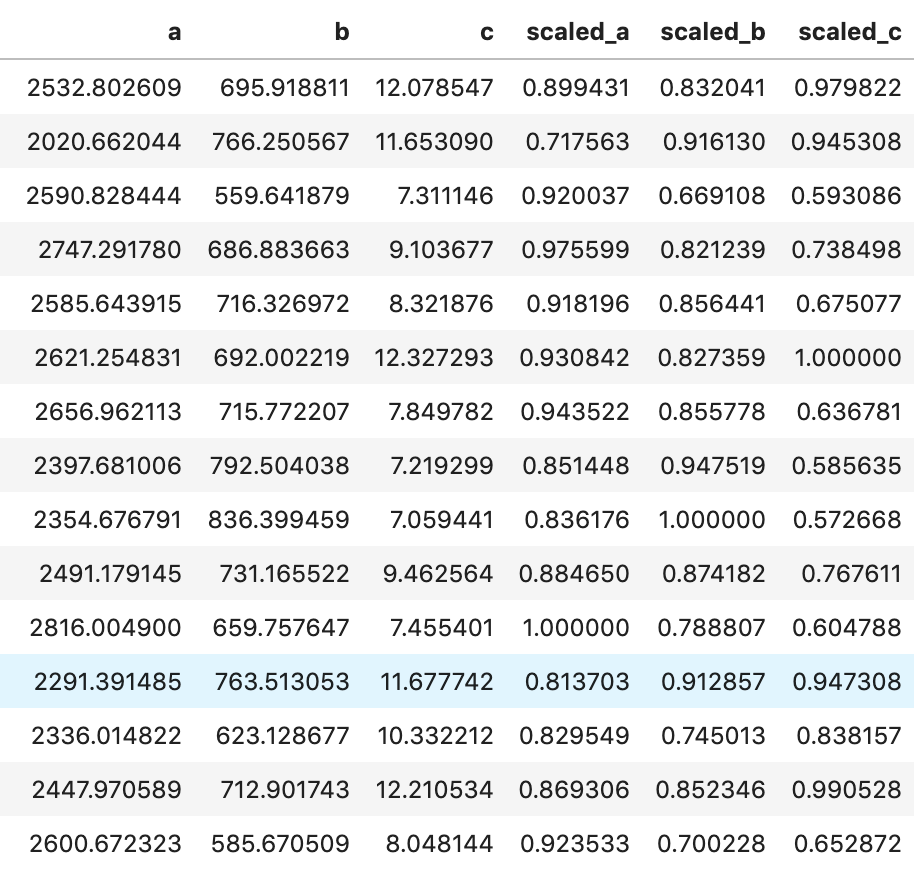
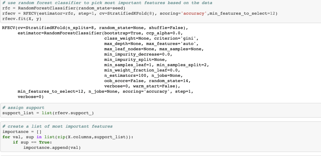
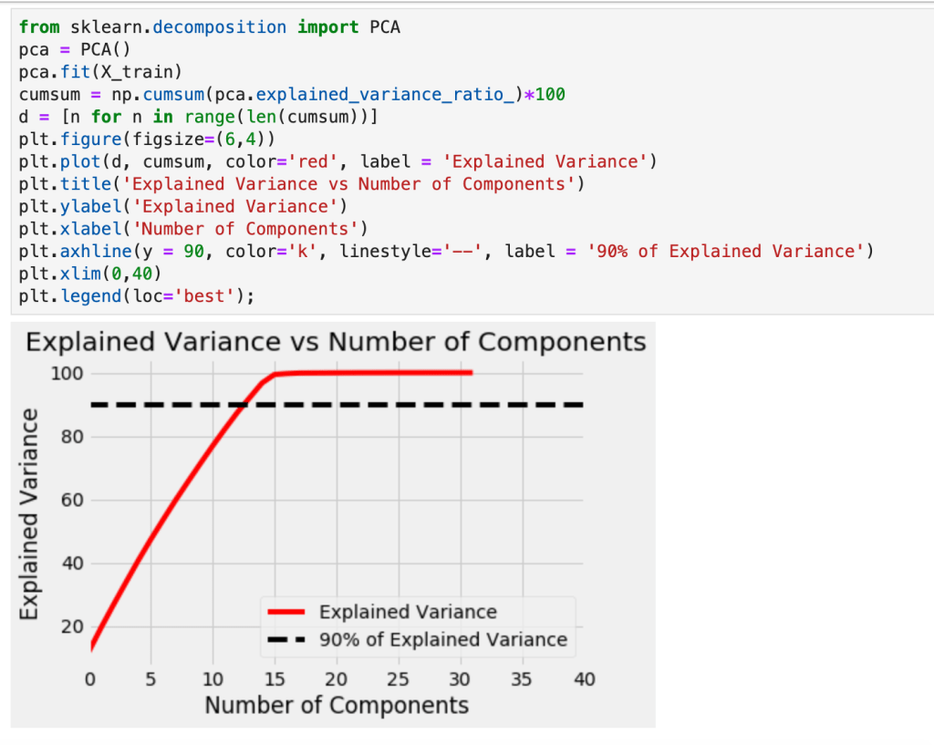
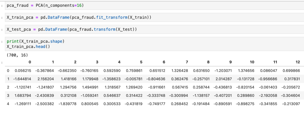
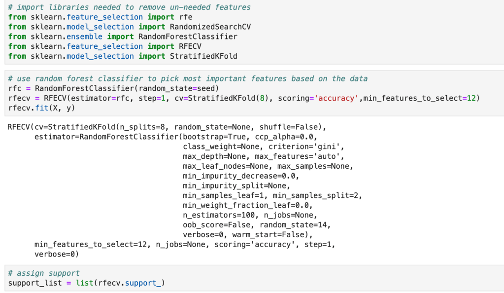
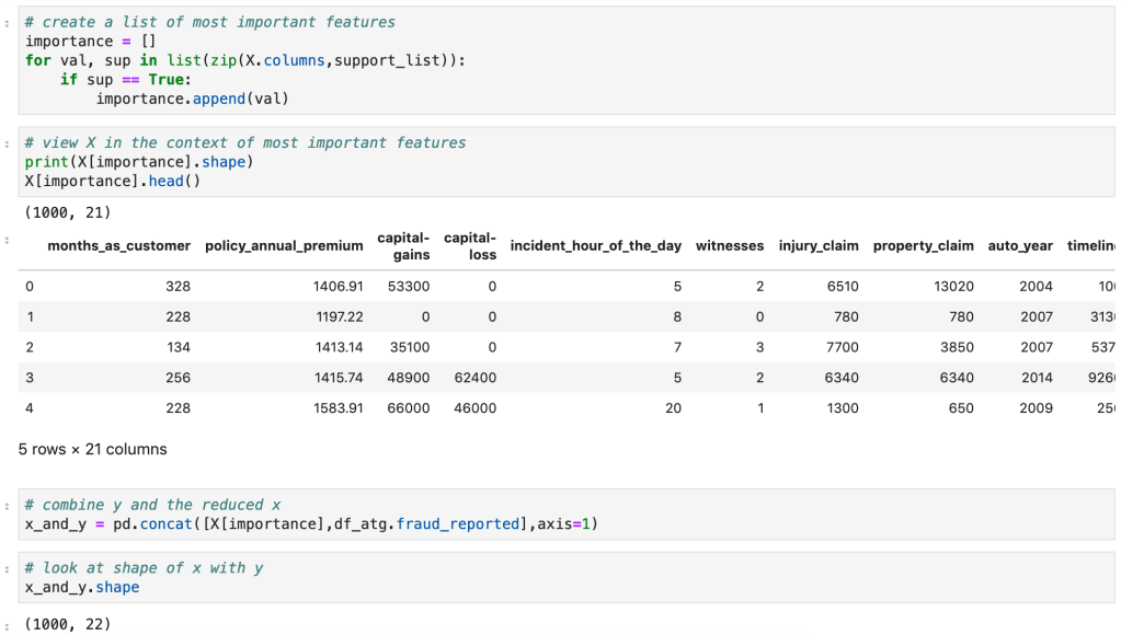
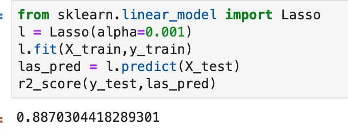
Next, I ran a feature selection method to reduce overfitting and build a more accurate model. This was very important as my model was not working well early on. The other item that helped improve my model was the new type of categorical feature encoding. To do this, I ran RFE (I have a blog about this) using a random forest classifier model (having already run this project and found random forest to work best, I went back and used it for RFE) and reduced my data to only 22 features. After doing this, I filtered outliers, scaled my data using min-max scaling, and applied Box-Cox transform to normalize my data. Having done this, I was now ready to split my data into a set with which to train a model and a separate set with which to validate my model. I also ran PCA but found RFE to work better and didn’t keep my PCA results. (Here’s a quick look at how I went about RFE).
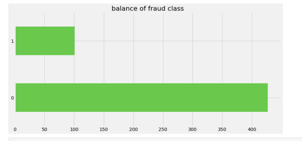
Balancing Data

One common task in the data science process is balancing your data. If you are predicting a binary outcome, for example, you may have many values of 0 and very few values of 1 or vice-versa. In order to have an accurate and representative model you need to have the same amount of 1 values and 0 values when training your models. In my case, there were a lot more cases that involved no fraud compared to those that involved fraud. I artificially created more cases that were fraudulent to have a more evenly distributed model.

Old Target Class Distribution
New Distribution (In terms of percentage)

Model Data

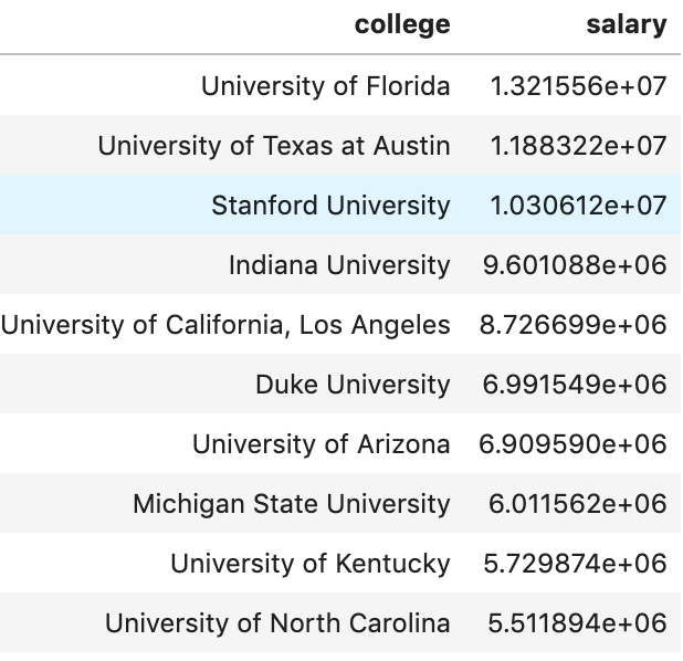
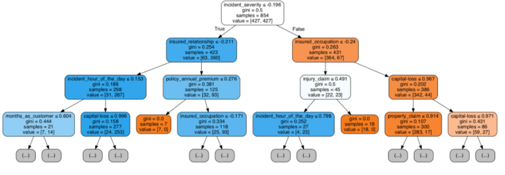
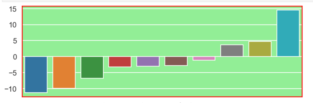
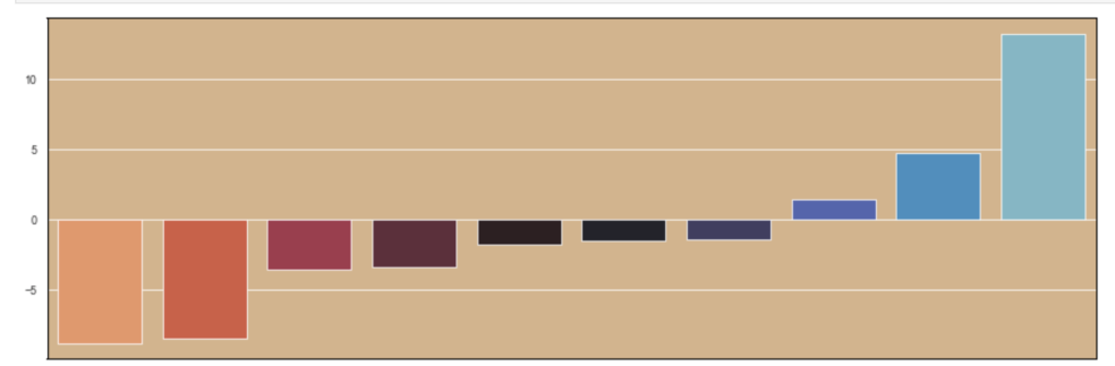
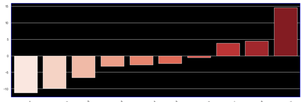
Having prepared all my data, I was now ready to model my data. I ran a couple of different models while implementing grid-search to get optimal results. I found the random forest model to work best with ~82% accuracy. My stochastic gradient descent model had ~78% accuracy but had the highest recall score at ~85%. This recall score matters as it captures how often fraud is identified when the case is actually a case that involved fraud (and not just a case that is said to be fraud but isn’t – recall is the true positives divided by true positives plus false negatives or fraud identified divided by fraud identified and fraud not identified). The most indicative features of potential fraud in order were: high incident severity, property claim, injury claim, occupation, and policy bind year. Here’s a quick decision tree visual:

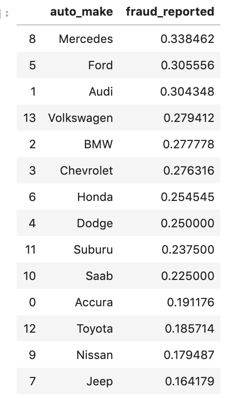
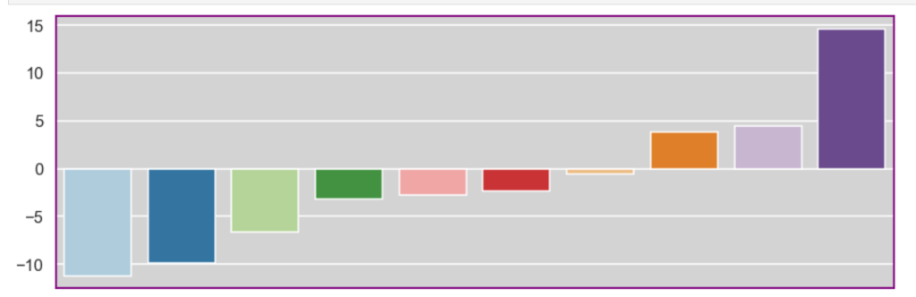
Here is the leading indicators sorted (top ten only):

Other Elements of the Project

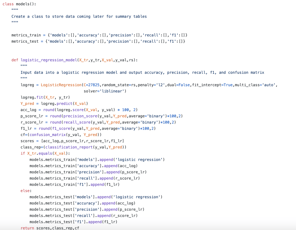
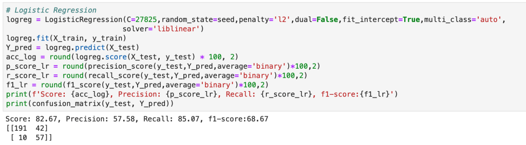
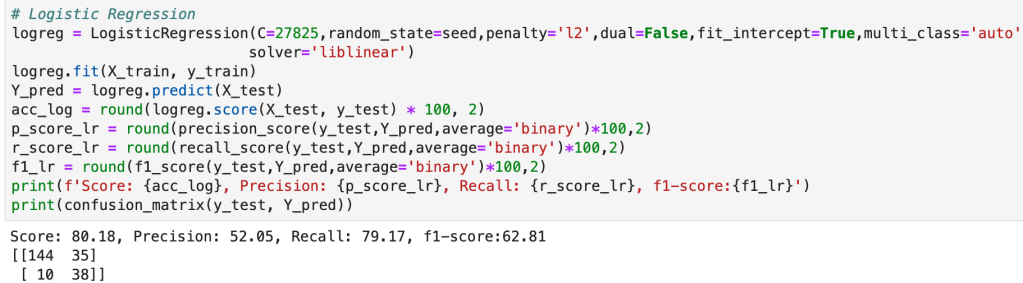
In addition to my high level process, there were many other elements of my capstone project that were not present in my other projects. The main item I would like to focus on is the helper module. The helper module (this may have a more proper term but I am just going to call it a helper module) was where I wrote 700 lines of backend code to create functions that would automate everything I wanted to happen in my project. I even used classes to organize things. This may sound basic to some readers, but I don’t really use classes that often. The functions I wrote were designed to be robust and not specific to my project (and I have actually been able to borrow a lot of code from that module when I have gotten stuck in recent projects). Having created a bunch of custom functions I was now able to compress my entire notebook where I did all my work into significantly fewer cells of code. Designing this module was difficult but was ultimately a rewarding experience. I think the idea of a helper module is valuable since you want to enable automation while allowing to account for the nuances and specifics present in each real-world scenario. (Here’s a look at running logistic regression and using classes).

Conclusion

In short, I was able to develop an efficient model that would do a good job of predicting fraudulent reports as well as identify key warning signs all in the context and framework of a designing what a complete data science project should look like.

Thank you for reading my blog and have a great day.

Church Leadership Breakfast - Hamilton District Christian High School

Method to the Madness

Imposing Structure and Guidelines in Exploratory Data Analysis

Sticking Many Graphs Charts Colorful Documents Stock Photo (Edit ...

Introduction

I like to start off my blogs with the inspiration that led me to write that blog and this blog is no different. I recently spent time working on a project. Part of my general process when performing data science inquiries and building models is to perform exploratory data analysis (EDA from henceforth). While I think modeling is more important than EDA, EDA tends to be the most fun part of a project and is very easy to share with a non-technical audience who don’t know what multiple linear regression or machine learning classification algorithms are. EDA is is often where you explore and manipulate your data to generate descriptive visuals. This helps you get a feel for your data and notice trends and anomalies. Generally, what makes this process exciting is the amount of unique types of visuals and customizations one can use to design said visuals. So now let’s get back to the beginning of the paragraph; I was working on a project and was up to the EDA step. I got really engrossed in this process and spent a lot of effort trying to explore every possible interesting relationship. Unfortunately, however, this soon became stressful as I was just randomly looking around and didn’t really know what I had already covered or at what point I would feel satisfied and therefore planned on stopping. It’s not reasonable to explore every possible relationship in every way. Creating many unique custom data frames, for example, is a headache, even if you get some exciting visuals as a result (and the payoff is not worth the effort you put in). After doing this, I was really uneasy about continuing to perform EDA in my projects. At this point, the most obvious thing in the entire world occurred to me and I felt pretty silly for not having thought of this before; I needed to make an outline and a process for all my future EDA. This may sound counter-intuitive as some people may agree with me that EDA shouldn’t be so rigorous and should be more free-flowing. Despite that opinion from some, that I have the mindset that imposing a structure and plan would be very helpful. Doing this would save me a whole lot of time and stress while also allowing me to keep track of what I had done and capture some of the most important relationships in my data. (I think when some people read this they may not agree with me about my thoughts about an approach to EDA. My response to them is that if there project is mainly focussed on EDA, as opposed to developing a model, then they should understand that this is not the scenario I have in mind. In addition, one still has the ability to impose structure and still perform more comprehensive EDA in the scenario that their project does in fact center around EDA).

Plan

I’m going to provide my process for EDA at a high level. How you decide to interpret my guidelines based on unique scenarios and which visuals you feel best describe and represent your data are up to you. I’d like to also note that I consider hypothesis testing to be part of EDA. I will not discuss hypothesis testing here, but understand that my process can extend to hypothesis testing to a certain degree.

Step 1 – Surveying Data And Binning Variables

I am of the opinion that EDA should be performed before you transform your data using methods such as feature scaling (unless you want to compare features of different average magnitudes). However, just like you would preprocess data for modeling, I believe there is an analogous way to “preprocess” data for EDA. In particular, I would like to focus on binning features. In case you don’t know – feature binning is a method of transforming old variables or generating new variables by splitting up numeric values into intervals. Say we have the data points 1, 4, 7, 8, 3, 5, 2, 2, 5, 9, 7, and 9. We could bin this as [1,5] and (5,9] and assign the labels 0 and 1 to each respective interval. So if we see the number 2 – it becomes a 0. If we see the number 8, however – it becomes a 1. I think it’s a pretty simple idea. It is so effective because often times you will have large gaps in your data or imbalanced features. I talk more about this in another blog about categorical feature encoding, but I would like to provide a quick example. People who buy cars between $300k-$2M probably include the same amount, if not less, than the amount of people buying cars between $10k-$50k. That’s all conjecture and may not in fact be true, but you get the idea. The first interval is significantly bigger than the second in terms of car price range but it is certainly logical to group these two types of people together. You can actually cut your data into bins easily (and assign labels) and even have the choice to cut at quantiles in pandas (pd.cut, pd.qcut). You can also feature engineer before you bin your data using transformations first, and binning second. So this is all great – and will make your models better if you have large gaps… and even give you the option to switch from regression to classification which also can be good – but why do we need to do this for EDA? I think there is a simple answer to this question. You can more efficiently add filters and hues to your data visualizations. Let me give you an example: if you want to find the GDP across all 7 continents (Antarctica must have like a zero GDP) in 2019 and add an extra filter to show large vs. small countries. You would need to add many filters for each unique country size. What a mess! Instead, split companies along a certain population threshold into big and small countries. Now you have 14 data points instead of 200+. 14 = 7 continents * (large population country + small population country). Now I’m sure that some readers can think of other ways to deal with this issue, but I’m just trying to prove a point here, not re-invent the wheel. When I do EDA, I like to first look at violin-plots and histograms to determine how to split my data and how many groups of data (2 bins, 3 bins…) I want, but I also keep my old variables as they are also valuable to EDA as I will allude at later on.

Step 2 – Ask Questions Without Diving Too Deep Into Your Data

This idea will be developed further later on and honestly doesn’t need much explanation right now. Once you know what your data is describing, you should begin to ask legitimate questions you would want to know the answers to and what relationships you would like to explore given the context of your data and write them down. I talk a lot about relationships later on. When you first write down your questions, don’t get too caught up in things like that, just thing about the things in your data you would like to explore using visuals.

Step 3 – Continue Your EDA By Looking At The Target Feature

I would always start an EDA process by looking at the most important and crucial piece of your data – the target feature (assuming it’s labeled data). Go through each of your predictive variables individually and compare them with the target variable with any number of filters you may like. Once you finish up with exploring the relationship with the target variable and variable number one, don’t include variable number one in any more visualizations. I’ll give an example: Say we have the following features: wingspan, height, speed and weight and we wanted to predict the likeliness that any given person played professional basketball. Well, start with variable number one – wingspan. You could see the average wingspan of regular folks versus professional players. However, you could also add other filters such as height to see if the average wingspan of tall professional players vs tall regular people is different. Here, we could have three variables in one simple bar graph: height, wingspan, and the target of whether a player plays professionally or not. You could continue doing this until you have exhausted all the relationships between wingspan, target variable, and anything else (if you so choose). Since you have explored all those relationships (primarily using bar graphs probably) you now can cross off one variable from your list, although it will come back later as we will soon see. Rinse and repeat this process until you go through every variable. The outcome is you have a really good picture of how your target variable moves around with different features as the guiding inputs. This will also give you some insight to reflect on when you run something such as feature importances or coefficients later on. I would like to add one last warning, though. Don’t let this process get out of hand. Just keep a couple visuals for each feature correlation with target variable and don’t be afraid to sacrifice some variables in to keep the more interesting ones. (I realize that there should be a modification to this part of the process if you have above a certain threshold of feature.

Step 4 – Explore Relationships Between Non-Target Features

The next step I usually take is to look at all the data (again), but without including the target feature. Similar to the process described above, if I have 8 non-target features I will think of all the ways that I can compare variable 1 with variables 2 through 8 (with filters). I then look at ways to compare feature 2 with features 3-8 and so on until I am at the comparison between 7 and 8. Now, obviously not every variable may be efficient to compare, easy to compare, or even worth comparing. Here, I tend to have a lot of different types of graphs as I am not focussed on the target feature. You can get more creative than you might be able to when comparing features to the target in a binary target classification problem. There are a lot of articles on how to leverage Seaborn to make exciting visuals and this step of the process is probably a great application of all those articles. I described an example above where we had height, wingspan, weight, and speed (along with a target feature). In terms of the relationships between the predictors, one interesting inquiry, for example, could be the relationship between height and weight in the form of a scatter plot, regression plot, or even joint plot. Developing visuals to demonstrate relationships can also affect your mindset upon filtering out correlation or feature engineering. I’d like to add a Step 4A at this point. When you look at your variables and start writing down all your questions and tracking relationships you want to explore, I highly recommend that you assign certain features as filters only. What I mean by this is the following: Say you have the following (new) example: feature 1 is normally distributed and has 1000 unique values and feature 2 (non-target) has 3 unique values (or distinct intervals). I highly recommend you don’t spend a lot of time exploring all the possible relationships that feature 2 has with other features. Instead, use it as a filter or “hue” (as it’s called in Seaborn). If you want to find the distribution of feature 1, which has many unique values, you could easily run a histogram or violin-plot, but you can tell a whole new story if you filter these data points into three categories dictated by feature 2. So when you write out your EDA plan, figure what works best as a filter and that will save you some more time.

Step 5 – Keep Track Of Your Work

Not much to say about this step. It’s very important though. You could end up wasting a lot of time if you don’t keep track of your work.

Step 6 – Move On With Your Results In Mind

When I am done with EDA, I often switch to hypothesis testing which I like to think as a more equation-y form of EDA. Like EDA, you should have a plan before you start running tests. However, now that you’ve done EDA and gotten a real good feel for your data, you should keep in mind your results for further investigation when you go into hypothesis testing. Say you find a visual that tells a puzzling story – then you should investigate further! Also, as alluded to earlier – your EDA could impact your feature engineering. Really, there’s too much to list in terms of why EDA is such a powerful process even beyond the initial visuals.

Conclusion:

I’ll be very direct about something here: there’s a strong possibility that I was in the minority as someone who often didn’t plan much before going into EDA. Making visuals is exciting and visualizations tend to be easy to share with others when compared to things like a regression summary. Due to this excitement, I used to dive right in without much of a plan beforehand. It’s certainly possible that everyone else already made plans. However, I think that this blog is valuable and important for two reasons. Number 1: Hopefully I helped someone who also felt that EDA was a mess. Number 2: I provided some structure that I think would be beneficial even to those who plan well. EDA is a very exciting part of the data science process and carefully carving out an attack plan will make it even better.

Thanks for reading and I hope you learned something today.

2018: thank u, next - The K.I.S.S Marketing Agency

Out Of Office

Predicting Absenteeism At Work

Out of Office Email – Auto Reply Email Templates | iHire

Introduction

It’s important to keep track of who does and does not show up to work when they are supposed to. I found some interesting data online that gives information on how much work from a range of 0 to 40 hours any employee is expected to miss in a certain week. I ran a couple models and came away with some insights on what my best accuracy would look like and what it would tell me are the most predictive of time expected to miss by an employee.

Process

  1. Collect Data
  2. Clean Data
  3. Model Data

Collect Data

My data comes from the UC Irvine Machine Learning Repository (https://archive.ics.uci.edu/ml/datasets/Absenteeism+at+work). While I will not go through this part in full detail, the link above talks about the numerical representation for “reason for absence.” The features of the data set, other than the target feature of time missed, were: ID, reason for absence, month, age, day of week, season, distance from work, transportation cost, service time, work load, percent of target hit, disciplinary failure, education, social drinker, social smoker, pet, weight, height, BMI, and son. I’m not entirely sure what “son” means. So now I was ready for some data manipulation. However, before I did that, I performed some exploratory data analysis with some custom columns being binning the variables with many unique values such as transportation expense.

EDA

First, I have a histogram of each variable.

After filtering outliers, the next three histogram charts describe the distribution of variables in cases of missing low, medium, and high amounts of work, respectively.

Low
Medium
High

Below, I have displayed a sample of the visuals produced in my exploratory data analysis which I feel tell interesting stories. When an explanation is needed it will be provided.

(O and 1 are binary for “Social Drinker”)
(The legend refers distance from work)
(O and 1 are binary for “Social Drinker”)
(The legend refers transportation expense to get to work)
(The legend reflect workload numbers)
(O and 1 are binary for “Social Drinker”)
Histogram
(Values adjusted using Min-Max scaler)

This concludes the EDA section.

Hypothesis Testing

I’ll do a quick run-through here of some of the hypothesis testing I performed and what I learned. I examined the seasons of the year to see if there was a discrepancy in the absences observed in the Summer and Spring vs Winter and Fall. What I found was that there wasn’t much evidence to say a difference exists. I found with high statistical power that people with higher travel expenses tend to miss more work. This was also the case with people who have longer distances to work. Transportation costs as well as distance to work also have a moderate effect on service time at a company. Age has a moderate effect on whether people tend to smoke or drink socially but not enough to have statistical significance. In addition, there appears to be little correlation with time at the company and whether or not targets were hit. However, this test has low statistical power and has a p-value that is somewhat close to 5% implying that an adjusted alpha may change how we view this test both in terms of type 1 error and statistical power. People with less education tend to drink more as well. Education has a moderate correlation with service time. Anyway, that is very quick recap of the main hypotheses I tested boiled down to the most easy way to communicate their findings.

Clean Data

I started out by binning variables with wildly uneven distributions. Next, I used categorical data encoding to encode all my newly binned features. Next, I applied scaling so that all the data would be within 3 standard deviations of each variable’s mean. Having filtered out misleading values, I binned my target variable into three groups. Next, I removed correlation. I will go back and discuss some of these topics later in this blog when I discuss some of the difficulties I faced.

Model Data

My next step was to split and model my data. One problem came up. I had a huge imbalance among my classes. The “lowest amount of work missed” class had way more than the other two classes. Therefore, I synthetically created new data to have every class have the same amount of cases. To find my most ideal model and then improve it… well I first needed to find the best model. I applied 6 types of scaling across 9 models = 54 results and found that my best model would be a Random Forest model. I even found that adding polynomial features would give me near 100% accuracy on training data without much loss on test data. Anyway, I went back to my random forest model. I found the most indicative features of time missed in order from biggest indicator to smallest indicator were: month, reason for absence, work load, day of the week, season, and social drinker. There are obviously other features, but these are the most predictive ones. The others provide less information.

Problems Faced in Project

The first problem I had was not looking at the distribution of the target variable. It is a continuous variable, however, there are very few values in certain ranges. I therefore split it into three bins; missing little work, a medium amount of work, and a lot of work. I also experimented with having two bins as well as different cutoff points to pick the bins, but three bins worked better. This also affected my upsampling as the different binning methods resulted in different class breakdowns. The next problem I had was a similar one. How would I bin variables? In short, I tried a couple of ways and found that three bins worked well. All this binning was not done using quantiles, by the way. That would imply no target class imbalance which was not the case. I tried using quantiles, but did not find it effective. I also experimented with different categorical feature encoding but found that the most effective method was to bin based on mean value in connection with target variable (check my home page for a blog about that concept). I ran a gridsearch to optimize my random forest at the very end and then printed a confusion matrix. This was not good, but I nee to be intellectually honest. Predicting when someone would fall into class 0 (“missing low amount of work”) my model was amazing and its recall exceeded precision. However, it did not work well on the other two. Now keep in mind that you do not upsample test data and this could be a total fluke. However, that was still frustrating to see. An obvious next step is to collect more data and continue to improve the model. One last idea I want to talk about is exploratory data analysis. Now, to be fair, this could be inserted into any blog. Exploratory data analysis is both fun and interesting as it allows you to be creative and take a dive into your idea using visuals as quick story-tellers. The project I had just scrapped before acquiring the data for this project drove me kind of crazy because I didn’t really have a plan for my exploratory data analysis. It was arbitrary and unending. That is never a good plan. EDA should be planned and thought out. I will talk more / have talked more about this (depending on when you read this blog) in another blog but the main point is you want to think of yourself as person who doesn’t do programming who just wants to ask questions based on the names of the features. Having structure in place for EDA is less free-flowing and exciting than not having structure, but it ensures that you work efficiently and have a good start point as well as stop point. That really helped me save a lot of stress.

Conclusion

It’s time to wrap things up. At this point, I think I would need more data to continue to improve this project, and I’m not sure where that data would come from. In addition, there are a lot of ambiguities in this data set such as the numerical choices for reason for absence. Nevertheless, I think that by doing this project I learned how to create an EDA process and how to take a step back and rephrase your questions as well as rethink your thought process. Just because a variable is continuous, this does not imply it requires regression analysis. Think about your statistical inquiries as questions, think about what makes sense from an outsider’s perspective, and then go crazy!

Happy National Thank You Day! - Inventionland

Feature Selection in Data Science

This image has an empty alt attribute; its file name is image-63.png

Introduction

Often times, when addressing data sets with many features, reducing features and simplifying your data can be helpful. Usually, one particular juncture where you remove a lot of data or features is by reducing correlation using a filter of 70%, or so. (Having highly correlated variables usually leads to overfitting). However, you can continue to reduce features and improve your models by deleting features that not only correlate to each other, but also… don’t really matter. A quick example: Imagine I was trying to predict whether or not someone might get a disease and the information I had was height, age, weight, wingspan, and favorite song. I might have to remove height or wingspan since they probably have a high degree of correlation. Favorite song, on the other hand, likely has no impact on anything one would care about but would not be removed using correlation. That’s why we would just get rid of one feature. Similarly, if there are other features that are irrelevant or can be mathematically proven to have little impact, we could delete them. There are various methods and avenues one could take to accomplish this task. This blog will outline a couple them, particularly: Principal Component Analysis, Recursive Feature Elimination, and Regularization. The ideas, concepts, benefits, and drawbacks will be discussed and some coding snippets will be provided.

Principal Component Analysis (PCA)

So, just off the bat, PCA is complicated and involves a lot of backend linear algebra and I don’t even understand it fully myself. This is not a blog about linear algebra, it’s a blog about making life easier, so I plan to keep this discussion at a pretty high level. First, I’ll start with a prerequisite; scale your data. Scaling data is a process of reducing impact based on magnitude alone and aligning all your data to be relatively in the same range of values. If you had a data point representing GDP and another data point representing year the country was founded, you can’t compare those variables easily as one is a lot bigger in magnitude than the other. There are various ways to scale your variables and I have a separate blog about that if you would like to learn more. For our purposes, though, we always need to apply standard scaling. Standard scaling takes each unique value of a variable, subtracts its mean, and finally divides by the standard deviation. The effect is that every value becomes compressed to the interval [-1,1]. Next, as discussed above, we filter out correlated variables. Okay, so now things get real. We’re ready to for the hard part. The first important idea to understand beforehand, however, is what a principal component is. Principal components are new features which are some linear representation of operations performed with other features. So If I have the two features weight and height – maybe I could combine the two by dividing weight by height to get some other feature. Unfortunately, however, as we will discuss more later, none of these new components we will replace our features with actually have a name, they are just assigned a numeric representation such as 0 or 1 (or 2 or….). While we don’t maintain feature names, the ultimate goal is to make life easier. So once we have transformed the structure of our features we want to find out how many features we actually need and how many are superfluous. Okay, so we know what a principal component is and what purpose they serve, but how are they constructed in the first place? We know they are derived from our initial features, but we don’t know where they come from. I’ll start by saying this: the amount of principal components created always matches the number of features, but we can easily see with visualization tools which ones we plan to delete. So the short answer to our question of where these things come from is that for each dimension (feature) in our data, we have two corresponding linear algebra metrics/results called eigenvectors and eigenvalues which you may remember from linear algebra. If you don’t, given a square matrix called “A” that has a non-zero determinant; multiplying that matrix by an eigenvector, called v, yields the same result as scaling that vector, v, by a scalar known as the eigenvalue, lambda. The story these metrics tell is apparent when you perform linear transformations. When you transform your axes in transformations, the eigenvectors will still maintain the same direction but will increase in scale by lambda. That may sound confusing, and it’s not critical to understand it completely but I wanted to leave a short explanation for those more familiar with linear algebra. What matters is that calculating these metrics/results in the context of data science gives us information about our features. The eigenvalues with highest magnitude yield the eigenvectors with the most impact on explaining variance in models. Source two below indicates that “Eigenvectors are the set of basis functions that are the most efficient set to describe data variability. The eigenvalues is a measure of the data variance explained by each of the new coordinate axis.” What’s important to keep in mind is that we use the eigenvalues to remind us of what new, unnamed, transformations matter most.

Code (from a fraud detection model)

This image has an empty alt attribute; its file name is image-47.png
This image has an empty alt attribute; its file name is image-48.png
This image has an empty alt attribute; its file name is image-49.png

Recursive Feature Elimination (RFE)

RFE is different than PCA in the sense that it models data and then goes back in time so you can run a new model. What I mean by this is that RFE assumes you have model in place and then uses that model to find feature importances or coefficients. If you were running a linear regression model, for example, you would instantiate a linear regression model, run the model, and find the variables with the highest coefficients and drop all the other ones. This can work with a random forest classifier, for example, which has an attribute called feature importances. Usually, I like to find what model works best and then run RFE using that model. RFE will then run through different combinations of keeping different amounts of features and then solve for the features that matter most.

Code

This image has an empty alt attribute; its file name is image-50.png
This image has an empty alt attribute; its file name is image-51.png
This image has an empty alt attribute; its file name is image-52.png
This image has an empty alt attribute; its file name is image-64.png

Regularization (Lasso and Ridge)

Regularization is a process designed to reduce overfitting in regression models by penalizing models for having excessive and misleading predictive features. According to Renu Khaldewal (see below): “When a model tries to fit the data pattern as well as noise then the model has a high variance a[n]d will be overfitting… An overfitted model performs well on training data but fails to generalize.” The point is that it works when you train the model but does not deal well with new data. Let’s think back to the “favorite song” feature I proposed earlier. If we were to survey people likely to get a disease and find they all have the same favorite song, while this would certainly be interesting, it would be pretty pointless. The real problem would be when we encounter someone who likes a different song but is checks off every other box. The model might say this person is unlikely to get the disease. Once we get rid of this feature, well now we’re talking and we can focus on the real predictors. So we know what regularization is (a method of placing focus on more predictive features and penalizing models that have excessive features), we know why we need it (overfitting), we don’t yet know how it works. Let’s get started. In gradient descent, one key term you better know is “cost function.” It’s a mildly complex topic, but basically it tells you how much error is in your model by subtracting the predicted values from the true values and summing up the total error. You then use calculus to optimize this cost function to find the inputs that produce the minimal error. Now keep in mind that the cost function captures every variable and the error present in each. In regularization, an extra term is added to that cost function which reduces the impact of larger variables. So the outcome is that you optimize your cost function and find the coefficients of a regression, however you now have reduced overfitting by scaling your terms using a value (often called) lambda and thus have produced more descriptive coefficients. So what is this Ridge and Lasso business? Well, there are two common ways of performing regularization (there is a third, less common, way which basically covers both). In ridge regularization you add a parameter designed to scale the magnitude of each coefficient. We call this L2. Lasso, or L1, is very similar. The difference in effect is that lasso regularization may actually remove features completely. Not just decrease their impact, but actually remove them. So ridge may decrease the impact of “favorite song” while lasso would likely remove it completely. In this sense, I believe lasso more closely resembles PCA and RFE than ridge. In Khandelwal’s summary, she mentions that L1 deals well with outliers but struggles with more complex cases, while ridge has the opposite effect on both accounts. I won’t get in to that third case I alluded above. It’s called Elastic Net and you can use if you’re unsure of whether you want to use ridge or lasso. That’s all I’m going to say… but I will provide code for it.

Code

(Quick note: alpha is a parameter which determines how much of a penalty is placed in regression).

I’ll also quickly add a screenshot to capture context. The variables will not be displayed, but one should instead pay attention to the extreme y (vertical axis) values and see how each type of regularization affects the resulting coefficients.

Initial visual:

This image has an empty alt attribute; its file name is image-53.png

Ridge

This image has an empty alt attribute; its file name is image-54.png

(Quick note this accuracy is up from 86%)

This image has an empty alt attribute; its file name is image-55.png
This image has an empty alt attribute; its file name is image-56.png

Lasso

This image has an empty alt attribute; its file name is image-57.png
This image has an empty alt attribute; its file name is image-58.png
This image has an empty alt attribute; its file name is image-59.png

Elastic Net

This image has an empty alt attribute; its file name is image-60.png
This image has an empty alt attribute; its file name is image-61.png
This image has an empty alt attribute; its file name is image-62.png

Conclusion

Data science is by nature a bit messy and inquiries can get out of hand very quickly. By reducing features, you not only make the task at hand easier to deal with and less intimidating, but you tell a more meaningful story. To get back to an earlier example, I really don’t care if everyone whose favorite song is “Sweet Caroline” are likely to be at risk for a certain disease or not. Having that information is not only useless, but it also will make your models worse. Here, I have provided a high-level road map to improving models and distinguishing between important information and superfluous information. My advice to any reader is to get in the habit of reducing features and honing on what matters right away. As an added bonus, you’ll probably get to make some fun visuals, if you enjoy that sort of thing. I personally spent some time designing a robust function that can handle RFE pretty well in many situations. While I don’t have it posted here, it is likely all over my GitHub. It’s really exciting to get output and learn what does and doesn’t matter in different inquiries. Sometimes the variable you think matters most… doesn’t matter much at all and sometimes variables you don’t think matter, will matter a lot (not that correlation always equals causation). Take the extra step and make your life easier.

That wraps it up.

——————————————————————————————————————–

Sources and further reading:

(https://builtin.com/data-science/step-step-explanation-principal-component-analysis)

(https://math.stackexchange.com/questions/23312/what-is-the-importance-of-eigenvalues-eigenvectors)

(https://medium.com/@harishreddyp98/regularization-in-python-699cfbad8622)

(https://www.youtube.com/watch?v=PFDu9oVAE-g)

(https://medium.com/datadriveninvestor/l1-l2-regularization-7f1b4fe948f2 )

(https://towardsdatascience.com/the-mathematics-behind-principal-component-analysis-fff2d7f4b643)

The 5 Best Thank You Memes to Use

Feature Scaling In Machine Learning

Accounting for the Effect of Magnitude in Comparing Features and Building Predictive Models

What is Feature Scaling? - Let Me Fail

Introduction

The inspiration for this blog post comes from some hypothesis testing I performed on a recent project. I needed to put all my data on the same scale in order to compare it. If I wanted to compare the population of a country to its GDP, for example, well… it doesn’t sound like a good comparison in the sense that those are apples and oranges. Let me explain. Say we have the U.S. as our country. The population in 2018 was 328M and the GDP was $20T. These are not easy numbers to compare. By scaling these features you can put them on the same level and test relationships. I’ll get more into how we balance them later. However, the benefits of scaling data extend beyond hypothesis testing. When you run a model, you don’t want features to have disproportionate impacts based on magnitude alone. The fact is that features come in all different shapes and sizes. If you want to have an accurate model and understand what is going on, scaling is key. Now you don’t necessarily have to do scaling early on. It might be best after some EDA and cleaning. Also, while it is important for hypothesis testing, you may not want to permanently change the structure of your data just yet.

I hope to use this blog to discuss the scaling systems available from the Scikit-Learn library in python.

Plan

I am going to list all the options listed in the Sklearn documentation (see https://scikit-learn.org/stable/modules/preprocessing.html for more details). Afterward, I will provide some visuals and tables to understand the effects of different types of scaling.

  1. StandardScaler
  2. MaxAbsScaler
  3. MinMaxScaler
  4. RobustScaler
  5. PowerTransformer
  6. QuantileTransformer

But First: Generalized Code

from sklearn.preprocessing import StandardScaler

ss = StandardScaler()

df[‘scaled_data’] = ss.fit_transform(df[[‘data’]])

This code can obviously be generalized to fit other scalers.

Anyway… lets’ get started

Standard Scaler

The standard scaler is similar to standardization in statistics. Every value has its overall mean subtracted from it and the final quantity is divided over the feature’s standard deviation. The general effect causes the data to have a mean of zero and a standard deviation of one.

Min Max Scaler

ML | Feature Scaling – Part 2 - GeeksforGeeks

The min max scaler effectively compresses your data to [0,1]. However, one should be careful not to divide by negative values or fractions as that will not yield the most useful results. In addition, it does not deal well with outliers.

Max Abs Scaler

Here, you divide every value by the maximum absolute value of that feature. Effectively all your data gets put into the [-1,1] range.

Robust Scaler

The robust scaler is designed to deal with outliers. It generally applies scaling using the inner-quartile range (IQR). This means that you can specify extremes using quantiles for scaling. What does that mean? If your data follows a standard normal distribution (mean 0, error 1), the 25% quantile is -0.5987 and the 75% quantile is 0.5987 (symmetry is not usually the case – this distribution is special). So once you hit -0.5987, you have covered 1/4 of the data. By 0, you hit 50%, and by 0.5987, you hit 75% of the data. Q1 represents the lower quantile of the two. It’s very similar to min-max-scaling but allows you to control how outliers affect the majority of your data.

Power Transform

According to Sklearn’s website (https://scikit-learn.org/stable/auto_examples/preprocessing/plot_all_scaling.html):

PowerTransformer applies a power transformation to each feature to make the data more Gaussian-like. Currently, PowerTransformer implements the Yeo-Johnson and Box-Cox transforms. The power transform finds the optimal scaling factor to stabilize variance and mimimize skewness through maximum likelihood estimation. By default, PowerTransformer also applies zero-mean, unit variance normalization to the transformed output. Note that Box-Cox can only be applied to strictly positive data. Income and number of households happen to be strictly positive, but if negative values are present the Yeo-Johnson transformed is to be preferred.”

Quantile Transform

The Sklearn website describes this as a method to coerce one or multiple features into a normal distribution (independently, of course) – according to my interpretation. One interesting effect is that this is not a linear transformation and may change how certain variables interact with one another. In other words – if you were to plot values and just adjust the scale of the axes to match the new scale of the data, it would likely not look the same.

Visuals and Show-and-Tell

I’ll start with my first set of random data. Column “a” is the initial data (with description in the cell above) and the others are transforms (where the first two letters like maa indicate MaxAbsScaler).

This next output shows 9 models’ accuracy scores across four types of scaling. I recommend every project contain some type of analysis that resembles this to find your optimal model and optimal scaling type (note: Ran = random forest, Dec = decision tree, Gau = Gaussian Naive Bayes, Log = logistic regression, Lin = linear svm, SVC = support vector machine, SGD = stochastic gradient descent, XGB = xgboost, KNe = K nearest neighbors. You can read more about these elsewhere… I may write a blog about this topic later).

More visuals…

I also generated a set of random data that does not relate to any real world scenario (that I know of) to visualize how these transforms work. Here goes:

So I’ll start with the original data, show everything all together, and then break it into pieces. Everything will be labeled. (Keep in mind that the shape of the basic data may appear to change due to relative scale. Also, I have histograms below which show the frequency of a value in a data set).

Review

What I have shown above is how one individual feature may be transformed in different ways and how that data would adjust to a new interval (using histograms . What I have not shown is a visual of moving many features to one uniform interval can happen. While this is hard to visualize, I would like to provide the following data frame to get an idea of how scaling features of different magnitudes can change your data.

Conclusion

Scaling is important and essential to almost any data science project. Variables should not have their importance determined based on magnitude alone. Different types of scaling move your data around in different ways and can have moderate to meaningful effects depending on which model you apply them to. Sometimes, you will need to use one method of scaling in specific (see my blog on feature selection and principal component analysis). If that is not the case, I would encourage trying every type of scaling and surveying the results. I recently worked on a project myself where I effectively leveraged featured scaling into creating a metric to determine how valuable individual hockey and basketball players are to their team compared to the rest of the league on a per-season basis. Clearly, the virtues of feature scaling extend beyond just modeling purposes. In terms of models, though, I would expect that feature scaling would change outputs and results in metrics such as coefficients. If this happens, focus on relative relationships. If one coefficient is at… 0.06 and another is at… 0.23, what that tells you is that one feature is nearly 4 times as impactful in output. My point is that don’t let the change in magnitude fool you. You will find a story in your data.

I appreciate you reading my blog and hope you learned something today.

Computer forensics powerpoint presentation

Encoding Categorical Data

M&M's - Wikipedia

Introduction

(PLEASE READ – Later on in this blog I describe target encoding without naming it as such. I wrote this blog before I knew target encoding was a popular thing and I am glad to have learned that it is a common encoding method. If you read later on, I will include a quick-fix target encoder as an update to the long-form one I have provided. Thanks!).

For my capstone project at the Flatiron School, where I studied data science, I decided to build a car insurance fraud detection model. When building my model, I had a lot of categorical data to address. Variables like “years as customer” are easy to address but variables like “car brand” are less easy to address as they are not numerical. However, these types of problems are nothing new or novel. Up until this point, I had always used dummy variables to address these problems. However, by adding dummy variables to my model, things got very difficult to manage. In case you are not familiar – I will give a more comprehensive explanation of what dummy variables are and what purpose they serve later. It was at this point that I started panicking. I had bad scores, a crazy amount of features, and I lacked an overall feeling of clarity and control of my project. Then things changed. I spoke with the instructors and we began to explore other types of ways to encode categorical data. I’d like to share of these ideas as well as discuss their benefits and drawbacks. I think this will be beneficial to any reader for the sake of novelty, utility, and efficiency but most importantly, you can improve your models or tell different stories depending on how you choose to encode data.

Dummy Variables

Dummy variables are added features that exist only to tell you whether or not a certain instance of a variable is present in one row of data or not. If you wanted to classify colors of m&m’s using dummy variables and you had red, yellow, and blue m&m’s, then you would add a column for blue and a column for red. If the piece you are holding is red, give the red column a one and blue column a zero and vice-versa. With yellow, it is a little different, as you assign a zero to both blue and red since that automatically means your m&m in hand would be yellow. It’s important to note that just because you are using dummy variables, it does not mean that each possible instance (like colors, for example) carries the same weight (i.e. red may be more indicative of something than blue, per se). In fact, one of the great things about dummy variables is that, other than being easy, when you run some sort of feature importance or other analogous type of evaluation, you can see how important each unique instance can be. Say you are trying to figure out where the most home runs are hit every year in baseball. If you have an extra column for every single park, you can learn where many are hit and where fewer are hit. However, since you are dropping one instance for each variable, you must also consider the effect of your coefficient/feature importances on the instance you drop. For example if red and blue m&m’s have some high flavor profile, maybe yellow has a lower flavor profile and vice-versa. This relates to the dummy variable trap which is basically a situation where you may lose some information since you always must drop at least one instance of a variable to avoid multicollinearity/autocorrelation. To get back to benefits of dummy variables, you can search for feature interactions by multiplying, for example, two or more dummy variables together to create a new feature. However, this relates to one problem with dummy variables. If you have a lot of unique instances of a particular feature, you will inevitably add many many columns. Let’s say you want to know the effect of being born in anytime between 1900 and 2020 on life expectancy. That’s a lot of dummy columns to add. Seriously, a lot. I see two solutions to this dilemma. Don’t use dummy variables at all, as we will soon discuss, or just be selective on which features are best fit for dummies based on intuition. If you think about it, there is also another reason to limit the amount of columns you add; over-fitting. Imagine, for a second, that you want to know life expectancy based on every day between 1500 and 2020. That’s a lot of days. You can still do this inquiry effectively, so don’t worry about that, but using dummies is inefficient. You may want to bin your data or do another type of encoding as we will discuss later. (One-hot encoding is a very similar process. The difference there is that one-hot encoding you don’t drop the “extra” column and have a binary output for each instance).

Integer / Label Encoding

Visiting: Categorical Features and Encoding in Decision Trees

One simple way of making all your data numerical without adding extra confusing features is by assigning a value to each instance. For example, red = 0, blue = 1, yellow = 2. By doing this, your data frame maintains its original shape and you now have represented your dat numerically. One drawback here is that it blurs one’s understanding of the effect of variable magnitude as well as creating a false sense of some external order or structure. Say you have 80 colors in your data and not just 3. How do we pick our order and what does our order imply? Why would one color be first as opposed to 51st? In addition, wouldn’t color 80 have some larger scale impact just by virtue of being color 80 and not color 1. Let’s say color 80 is maroon and color 1 is red. That’s certainly misleading. So it is easy to do and is effective in certain situations but often creates more problems that solutions. (This method is not your easy way out).

Custom Dictionary Creation and Mapping

The next method is similar to the one above almost entirely, but merits discussion. Here, you use label encoding but you use some method, totally up to you, to establish meaning and order. Perhaps colors similar to each other are labeled 1 and 1.05 as opposed to 40 and 50. However, this requires some research and a lot of work to be done right and so much is undetermined as you start and therefore it is not the best method.

Binning Data and Assigning Values to Bins

Grouping and Filtering Data to Identify Opportunities | QuestionPro

Randomly assigning numerical values or carefully finding the perfect way to represent your data are not effective and/or efficient. However, one easy way to label encode in an effective way is to bin data with many unique values. Say you want to group students together. It would only be natural to draw some similarities between those getting 70.4, 75.9, and 73.2 averages and people scoring in the 90s. Here have you dealt with all the problems with label encoding in one quick step. Your labels have tell a story with a meaningful order and you don’t have to carefully examine your data to find groups. Pandas allows you to instantly bin subsets of a feature based on quantiles or other grouping methods in one line of code. After that you can create a dictionary and map it. (This is a similar process to my last suggestion). Binning also has helped me in the past to reduce overfitting and build more accurate models. Say you have groups of car buyers. While there may be differences between the people buying cars in the 20k-50k range compared to the 50k-100k range, there are probably far less differences between buyers in the 300k-600k range. That interval is 6 times as big as the 50k-100k range and there are probably fewer members than the previous to ranges. You can easily capture that divide if you just bin the 300k-600k buyers together and you will likely have a worse model if you don’t. You can take this idea of binning to the next level and add even more meaning to your encoding by combining binning with my final suggestion. (First bin, next follow my final suggestion)

Mapping (Mean) Value Based on Correlation with Target Variable (and Other Variations)

“Mapping (Mean) Value Based on Correlation with Target Variable (and Other Variations)” is a lot of words to digest and probably sounds confusing, so I will break this down and explain it using a visual. So first I’ll explain what I mean. For my explanation, I will use an example. I first came across this method studying car insurance fraud as discussed above. I found that ~25% of my reports survey were fraud, which was surprisingly high. Armed with this knowledge, I was now ready to use it to identify and replace my categorical features with meaningful numerical values. Say my categorical feature was car brand. It’s quite likely that Lamborghinis and Fords are present in fraud reports at different proportions. The mean is 25%, so we should expect both brands to be close to this number. However, just assigning a Ford the number 25% accomplishes nothing. Instead if 20% of reports involving Fords were fraud, Ford now became 20%. Similarly, if Lamborghinis had a higher rate, say 35%, Lamborghinis now became known as 35%. Here’s some code to demonstrate what I mean:

So what this process shows is that fraudulent reports are correlated more strongly with Mercedes cars and less with Jeep cars. Therefore, they are treated differently. This is a very powerful method; not only does it encode effectively, but it also solves the problem you lose when you avoid dummy variables by seeing the impact of unique instances of a variable. However, it is worth noting that you can only see each feature’s correlation with the target variable (here – insurance fraud rates) if you print out that data. If you just run a loop, everything will turn into a number. You do have to take the extra step and explore all the individual relationships. It is not that hard to do, though. What I like to do is create a two column data frame: an individual feature with the target grouped by the non-target feature (like above). I then use this information to create and map a dictionary of values. This can be scaled easily using a loop. Now, if you look back to the name of this section, I add in the words “other variations.” While I have only looked at the mean values, I imagine that you can try to use other aggregation methods like minimums and maximums (and others) to represent each unique instance of a feature. This method can also be very effective if you have already binned your data. Why assign a bunch of unique values to car buyers in the 300k-600k when you can bin them together?

Update!

This update comes around one month from the initial publishing of this blog. I describe target encoding above, but only recently learned that ‘target encoding’ was the proper name. More importantly, it can be done in one line of code. Here’s a link to the documentation so you can accomplish this task easily http://contrib.scikit-learn.org/category_encoders/targetencoder.html.

Conclusion

Categorical encoding is a very important part of any model with any qualitative data and even quantitative data at times. There are various methods of dealing with categorical data as we have explored above. While some methods may appear better than others, there is value in experimenting, optimizing your model, and using the one most appropriate or necessary methods in projects. Most of what I discussed was at a relatively simple level in the sense that I didn’t dig too deep into the code. If you look at my GitHub, you can find these types of encodings all over my code and can also find other online resources. It should be easy to find.

I’ll leave with one last note. Categorical encoding should be done later on in your notebooks. You can do EDA with encoded data, but you probably want to maintain your descriptive labels when doing the bulk of your EDA and hypothesis testing. Just to really drive this point home, I’ve got an example. If you want to know which m&m’s are most popular, it is far more beneficial to know the color than the color encoding. “Red has a high flavor rating” explains a lot to someone. “23.81 has a high flavor rating” on the other hand… well no one knows what that means, not even the person who produces that statistic. Categorical encoding should instead be though of as one of your last steps before modeling. Don’t rush.

That wraps it up. Thank you for visiting my blog!

5 Five Minute Tips on Thanking Your Clients, Customers, and ...

Bank Shot: Inside The Vault

Journal Subscription and Open Access Expenditures: Opening the ...

Introduction

Thanks for visiting my blog today!

To provide some context to today’s blog, I have another blog I have yet to release called “Bank Shot” which talks about NBA salaries. Over there, I talked a little bit about contracts and designing a model to predict NBA player salaries. However, that analysis was pretty short and to the point. Over here, I want to take a deeper and more technical dive into the data as well as the more technical aspects of how I created and tuned my model.

What about the old model?

What do we need to know about the old model? For the purposes of this blog, all we need to know is that it included a lot of individual NBA statistics from the 2017-18 season predicting next year’s salary (look at GitHub for a full list) and that my accuracy when all was said and done sat just below 62%. I was initially pleased with this score until revisiting my project with fresh eyes. After doing so, I made my code more efficient, added meaningful EDA, and had a better accuracy score.

Step 1 – Collect and merge data

My data came from kaggle.com. In addition, it was in the form of a three different files, so I merged them all into one database representing one NBA season even though some of them went a lot further back in history (So that should intuitively be like 450 total rows before accounting for null values; 15 player rosters, 30 teams). Also, even though this doesn’t really belong here, I added a BMI feature before any data cleaning or feature engineering so I might as well mention that.

Step 2 – Hypothesis Testing (Round 1)

General Concepts And Goals Of Hypothesis Testing

Here are a couple inquiries I investigated before feature generation, engineering, and data cleaning. This is not nearly comprehensive. There is so much to investigate so I chose a couple of questions. First: can we say with statistical significance (I’m going to start skipping that prelude) that shorter players shoot better than taller players? Yup! Better yet, we have high statistical power despite a small sample size. In other words, we can trust this finding. Next: do shooting guards shoot 2-pointers better than point guards? We fail to reject the null hypothesis (likely their averages are basically the same) but we have low power. So this finding is harder to trust. However, what we do find, with high statistical power, is that centers shoot 2-pointers better than power forwards. Next: do point guards tend to play more or less minutes than shooting guards? We can say with high power that these players tend to play very similar amounts of minutes. The next logical question is to compare small forwards and centers who, on an absolute basis, play the most and least minutes respectively. Well, as no surprise, we can say with high power that they tend to play different amounts of minutes.

Step 3 – Feature Generation and Engineering

So one of the first things I did here was to generate per game statistics like turning points and games into points per game. Points per games is generally more indicative of scoring ability. Next, I dropped the season totals (in favor of per game statistics) and some other pointless columns. I also created some custom and non-existent stats to see if they would yield any value. An example includes: PER/Games Started – I call this “start efficiency.” Before I dropped more columns to reduce correlation, I did some visual EDA. Let’s talk about that.

Step 4 – EDA

Here is the fun part. Just going to hit you with lots of visuals. Not comprehensive, just some interesting inquiries that can be explained visually.

Distribution of NBA Salaries (ignore numerical axis labels):

What do we see? Most players don’t make that much money. Some, however, make a lot of money. Interestingly, there is a local peak between x-labels 2 and 2.5. Perhaps this is some representation of the average max salary whereas beyond the salaries get higher but appear far less frequently. That’s just conjecture, keep in mind.

Distribution of Salary by Position (ignore y-axis labels)

We see here that centers and small forwards have the highest salaries within their interquartile range but the outliers on point guards are more numerous and have a higher maximum. Centers, interestingly, have very few outliers.

Salary by Age

This graph is a little messy so sort it out yourself, but we see that the time players make the most money is between the ages of 24 and 32 on average. Rookie contracts tend to be less lucrative and older players tend to be less relied on, so this visual makes a lot of sense.

Distribution of BMI

Well, there you have it; BMI is looks normally distributed.

In terms of a pie chart:

Next: A couple height metrics

Next: Eight Per Game Distributions and PER

Minutes Per Game vs. Total Minutes (relative scale)

Next is a Chart of Different Shooting Percentages by Type of Shot

Next: Do Assist Statistics and 3-Point% Correlate?

There are a couple peaks, but the graph is pretty messy. Therefore, it is hard to say whether or not players with good 3-Point% get more assists.

Next, I’d like to look at colleges:

Does OWS correlate to DWS highly?

It looks like there is very little correlation observed.

What about scoring by age? We already looked at salary by age.

Scoring seems to drop off around 29 years old with a random peak at 32 (weird…).

Step 2A – Hypothesis Testing (Round 2)

Remember how I just created a bunch of features? Time to investigate those features also. Well, one question I had was to compare the older half of the NBA to the younger half. I used the median of 26 to divide my groups. In terms of stats like scoring, rebounding, and PER I found little statistically significant differences. I decided to do an under-30 and 30+ split and check PER. Still nothing doing. Moderately high statistical power was present in this test which leaves room for suggesting that age matters somewhat. This is especially likely since I had to relax alpha in the power formula despite the absurdly high p-value. In other words, the first test said that age doesn’t affect PER one bit with high likelihood, but the power metric suggests that we can’t trust that test enough to be confident. I’ll provide a quick visual to show you what I mean where I measure Power against number of observations. (es = effect size). The following visual actually represents pretty weak power in our PER evaluation. I’ll have a second visual to show what strong power looks like.

We find ourselves on the orange curve. It’s not promising.

Anyway, I also wanted to see if height and weight correlated highly on a relative scale. Turns out that we can say that they are likely deeply intertwined and have high correlation. This test also has high power, indicating we can trust its result.

Above, I just showed one curve. As you can see, the effect size is 0.5. In the actual example, however, the effect size is actually much higher. Even with lower effect size, we can see how quickly the power spikes, so I chose to use this visual.

Step 3A – Feature Engineering (Round 2)

When I initially set up my model, I did very little feature engineering and just cut straight to a linear regression model that ultimately wasn’t great. This time around I decided to use pd.qcut(df.column,q) from the Pandas library to bin the values of certain features and generalize my model. I gave the specific code above because it is very powerful and I encourage its use for anyone who wants a quick way to simplify complex projects. for most of the variables I used 4 or 5 different ranges of values. Example (1,10) becomes (1,2 , 2,5 , 5,9 , 9,10). Having simplified the inputs, I encoded all non-numerical data (including my new binned intervals). Next, I removed correlation by dropping highly correlated features while also dropping some other columns of no value.

I’d like to quickly let you know you how I encoded non-numeric variables as it was a great bit of code. There are many ways to deal with categorical or non-numeric data. Often times people use dummy variables (see here for explanation: https://conjointly.com/kb/dummy-variables/) or will assign a numeric value. That means either adding many extra columns or just assigning something like gender the values of 0 and 1. What I did is a little different – and I think everyone should learn this practice. I ran a loop to run through a lot of data so I’ll try and break down what I did for a couple features. Ok… so my goal was to find the mean salary for each subset of a feature. So let’s say (for example only) that average salary is $5M. I then grouped individual features together with the target variable of salary in special data frames organized by the mean salary for each unique value.

What we see above is an example of this. Here we looked at a couple (hand-picked) universities to see the average salary by that university in the 2017-18 NBA season. I then assigned the numerical value to each occurrence of that college. Now, University of North Carolina is equal to ~5.5M. There we have it! I repeated this process with every variable (and then later applied scaling across all columns).

Here is a look at my code I used.

I run a for loop where cat_list represents all of my categorical features. I then created a local data frame grouping one feature together wit the target. I then created a dictionary using this data and mapped each unique value in the dictionary to each occurrence of those values. Feel free to steal this code.

Step 5 – Model Data

So I actually did two steps together. I ran RFE to reduce my features (dear reader – always reduce the amount of features, it helps a ton) and found I could drop 5 features (36 remain) while coming away with an accuracy of 78%. That’s pretty good! Remember: by binning and reducing features I got my score from ~62% to ~78% on the validation set. Not the train set, the test set. That is higher than my initial score on my initial train set. In other words, the model got way better. (Quick note: I added polynomial features with no real improvement, and if you look at GitHub you will see what I mean).

Step 6 – Findings

What correlates to a high salary? High field goal percentage when compared to true shooting percentage (that’s a custom stat I made), high amounts of free throws taken per game, Start% (games started/total games), STL%, VORP, points per game, blocks per game and rebounds per game to name some top indicators. Steals per game, for example, has low correlation to high salary. I find some of these findings rather interesting, whereas some seem more obvious.

Conclusion

Models can always get better and become more informative. It’s also interesting to revisit a model and compare it to newer information as I’m sure the dynamics of salary are constantly changing, especially with salary cap movements and a growing movement toward more advanced analytics.

Thanks For Stopping By and Have a Great One!

First Grade a la Carte: Closing the Vault...