Understanding the Elements and Metrics Derived from Confusion Matrices when Evaluating Model Performance in Machine Learning Classification

Introduction
Thanks for visiting my blog.
I hope my readers get the joke displayed above. If they don’t and they’re also millennials, they missed out on some great childhood fun.
What are confusion matrices? Why do they matter? Well… a confusion matrix, in a relatively simple case, shows the distribution of predictions compared to real values in a machine learning classification model. Classification can theoretically have many target classes, but for this blog we are going to keep it simple and discuss prediction of a binary variable. In today’s blog, I’m going to explain the whole concept and how to understand confusion matrices on sight as well as the metrics you can pick up by looking at them.
Plan
- Provide Visual
- Accuracy
- Recall
- Precision
- F-1
- AUC-ROC Curve
Quick note: there are more metrics that derive from confusion matrices beyond what’s listed above. However, these are the most important and relevant metrics generally discussed.
Visualization
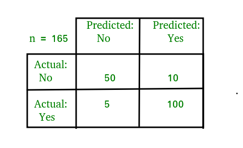
I have three visuals. The first one displays the actual logic behind confusion matrices while the second displays an example and the third displays a heat-map. Often, using a heat-map can be easier to decode and also easier to share with others. I’d like to also note that confusion matrix layouts can change. I would not get caught up on one particular format and just understand that rows correspond to predicted values columns correspond to actual values. The way the numbers within each of those are arranged is variable.
Basic explanation.
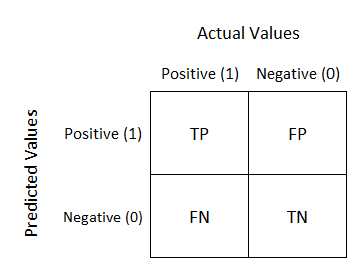
Now you will always have numbers in those quadrants and generally hope that the top left and bottom right have the highest values.
Heat-map.
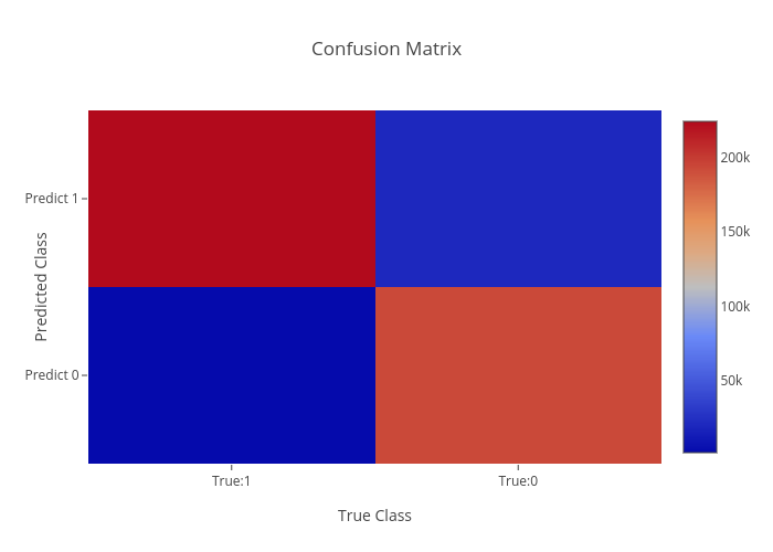
As we can see above, knowing that red corresponds to higher values quickly gives us the reflection that our model worked well. In “error” locations, we have a strong blue color, while in “correct” areas we see a lot of red.
Before I get into the metrics, I need to quickly explain what TP, FP, TN, and FN mean. This won’t take long. TP is a true positive, like someone correctly being predicted to have a disease. TN is true negative, like someone correctly predicted to not have a disease. FN is a false negative, like some who was predicted to not have a disease but actually does. FP is a false positive, like some predicted to have a disease but actually doesn’t. This is a preview of some metrics to be discussed, but for certain models the importance of FN, FP, TN, and TP is variable and some may matter more than others.
Quick note: When I think of the words “accuracy” and “precision,” the first thing that comes to mind is what I learned back in Probability Theory; accuracy means unbiasedness and precision means minimal variance. I’ll talk about bias and variance in a later blog. For this blog, I’m not going to place too much focus on those particular definitions.
Accuracy
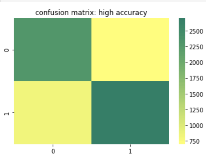
Accuracy is probably the most basic and simple idea. Accuracy is determined by summing true positive and true negative results over both the true positive and true negative predictions but also false positive and false negative predictions. In other words, of every single prediction you made, how many of them were right. So this means we want to know that if it was a negative how many times did you predict correctly and vice-versa for a positive. That being the case, when does accuracy become the most important metric to your model and when does accuracy fall short of being a strong or important metric? Let’s start with the cases where accuracy falls short. If you have a large class imbalance such as 10 billion rows in class 0 and 1 row in class 1, than you don’t necessarily have a strong model if it accurately predicts most of the majority class and predicts the minority class accurately the one time it occurs (or doesn’t predict the minority class correctly for that matter). Accuracy works well and tells a good story with more balanced data. However, as discussed above, it can lose meaning with a target class imbalance.
Here is a heat map of a high accuracy model.
Recall
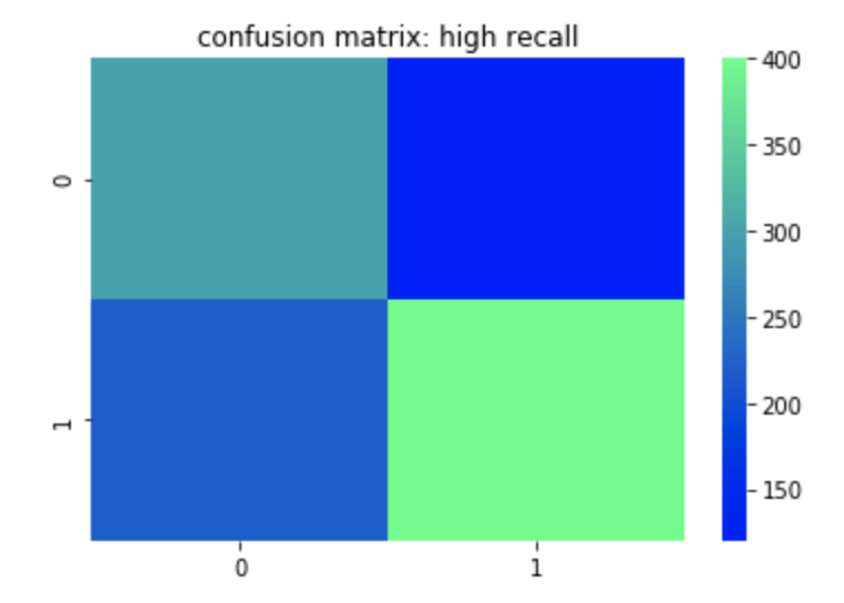
Recall can most easily be described as true positives divided by true positives and false negatives. This corresponds to the number of positives correctly identified when in fact the case was positive. A false negative means an unidentified positive. False positives and true negatives are not meant to be positives (in a perfect model) so are not included. So if you are trying to identify if someone has a disease or not, having high recall would be good for you model since it means that when the disease is present, you identify it well. You could still have low accuracy or precision in this model if you don’t predict the non-disease class well. In other words if you predict every row as having the disease than your recall will be high since you will have correctly predicted every occurrence where the disease was actually present. Unfortunately, however, the impact of having a correct prediction will be diminished and mean a whole lot less. That leads us to precision.
Here is a heat map of a high recall model.
Precision
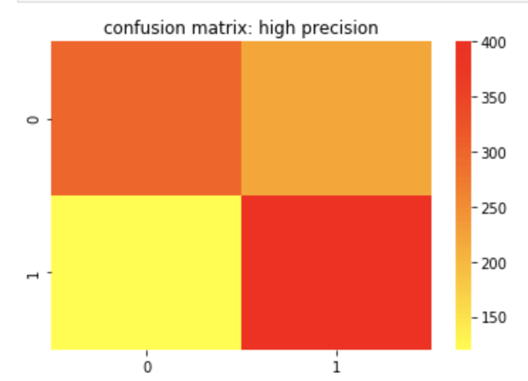
Precision can most easily be described as true positives divided by true positives and false positives. Unlike recall, which is a measure of actual positives discovered from the pool of all positives, precision is a measure of actual positives from predicted positives. So false negatives and true negatives don’t matter as they were not predicted to have been positive in the first place. A great way to think about precision is how meaningful a positive prediction is given the context of your model. Off the top of my head, I would assume that in a business where you owe some sort of service or compensation based on a predicted positive, having high precision would be important as you would not want to waste resources. I recently worked on an email spam detector. That is another example where high precision is ideal.
Here is a confusion matrix of a high precision model.
F-1 Score
The F-1 score is the harmonic mean of the precision and recall score which means its maximum value is the arithmetic mean of the two. (For more info on what a harmonic mean actually is – here is a Wikipedia page you may find helpful: https://en.wikipedia.org/wiki/Harmonic_mean). As you may have gathered or assumed from what’s written above, the F-1 score matters more in situations where accuracy may fall short.
Receiver Operating Curve (ROC) Curve
The basic description of this curve is that it measures how an increase in false positives to a model would correspond to increasing true positives which can evaluate your models ability to distinguish between classes. The horizontal axis values extend from 0% to 100% (or 0 to 1). The larger the area covered using the curve, the better your model is. You may be confused due to the lack of a visual. Let me show you what I mean:

Above, the “No Skill” label means that you’ll get 50% of classifications right at random (don’t get too caught up on that point). The high increase early in the x values on the corresponding vertical axis are a good sign that as more information is introduced into your model, than its true positive rate climbs quickly. It maxes out around 30% and then begins a moderate plateau. This is a good sign and shows a lot of area covered by this orange curve. The more area covered, the better.
Conclusion
Confusion matrices are often a key part of machine learning models and can help tell and important story about the effectiveness of your model. Since there are varying ways data can present itself, it is important to have different metrics that derive from these matrices to measure success for each situation. Conveniently, you can view confusion matrices with relative ease using heat maps.
Sources and Further Reading
(https://towardsdatascience.com/metrics-to-evaluate-your-machine-learning-algorithm-f10ba6e38234)
(https://towardsdatascience.com/is-accuracy-everything-96da9afd540d)
(https://towardsdatascience.com/beyond-accuracy-precision-and-recall-3da06bea9f6c)
(https://towardsdatascience.com/understanding-auc-roc-curve-68b2303cc9c5)


2 comments