Predicting Absenteeism At Work

Introduction
It’s important to keep track of who does and does not show up to work when they are supposed to. I found some interesting data online that gives information on how much work from a range of 0 to 40 hours any employee is expected to miss in a certain week. I ran a couple models and came away with some insights on what my best accuracy would look like and what it would tell me are the most predictive of time expected to miss by an employee.
Process
- Collect Data
- Clean Data
- Model Data
Collect Data
My data comes from the UC Irvine Machine Learning Repository (https://archive.ics.uci.edu/ml/datasets/Absenteeism+at+work). While I will not go through this part in full detail, the link above talks about the numerical representation for “reason for absence.” The features of the data set, other than the target feature of time missed, were: ID, reason for absence, month, age, day of week, season, distance from work, transportation cost, service time, work load, percent of target hit, disciplinary failure, education, social drinker, social smoker, pet, weight, height, BMI, and son. I’m not entirely sure what “son” means. So now I was ready for some data manipulation. However, before I did that, I performed some exploratory data analysis with some custom columns being binning the variables with many unique values such as transportation expense.
EDA
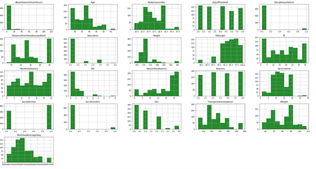
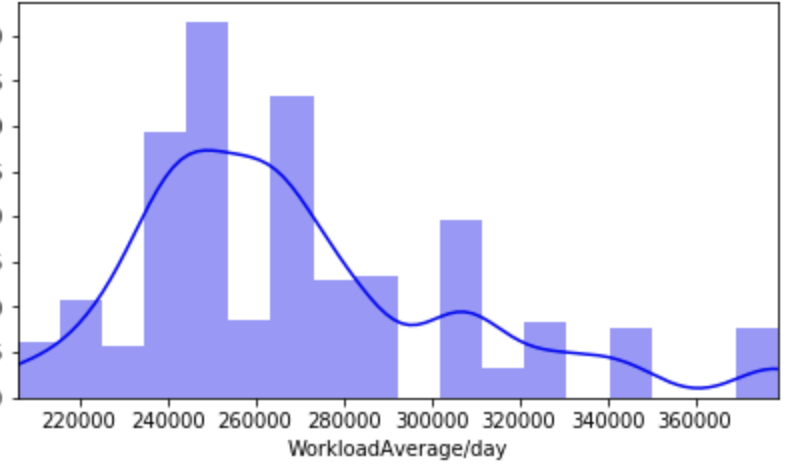
First, I have a histogram of each variable.
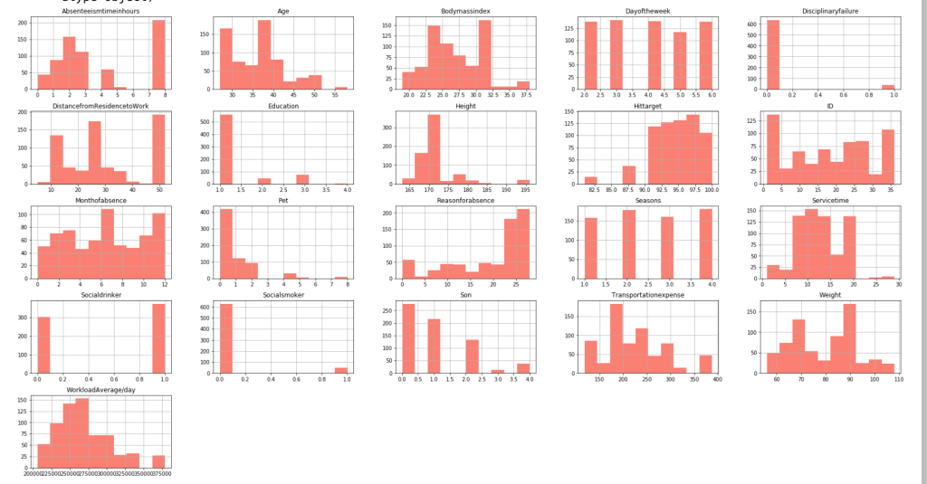
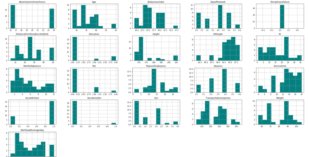
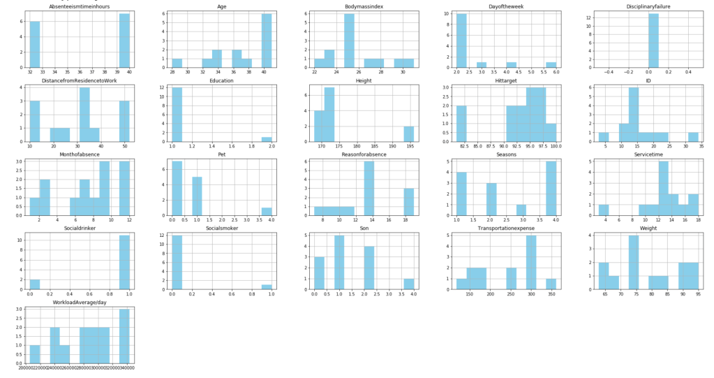
After filtering outliers, the next three histogram charts describe the distribution of variables in cases of missing low, medium, and high amounts of work, respectively.
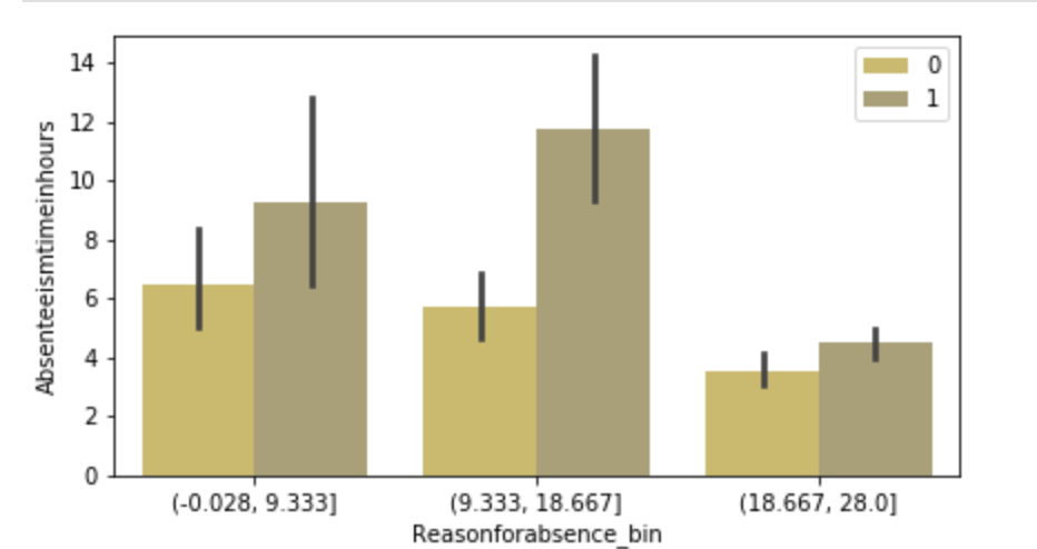
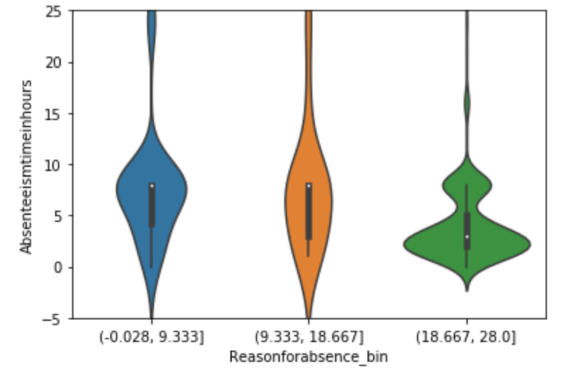
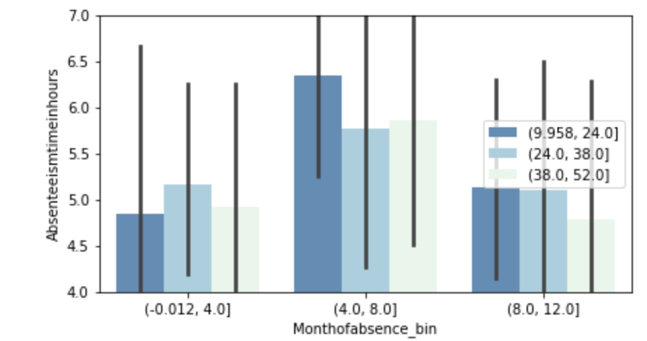
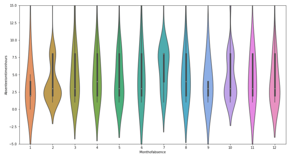
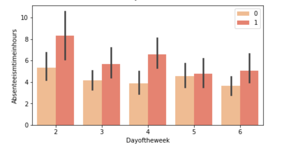
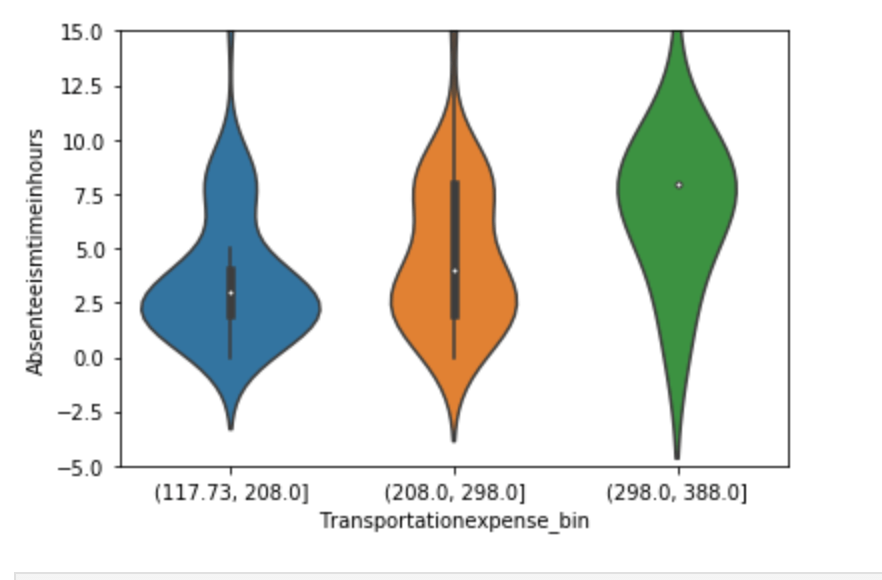
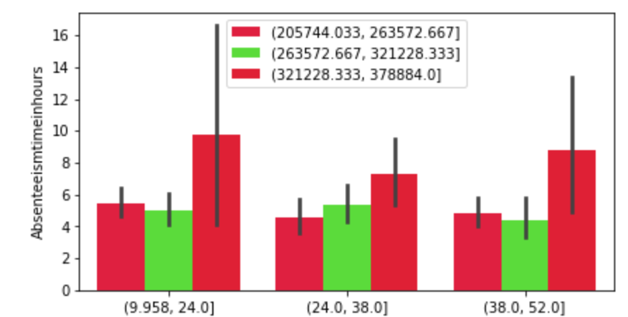
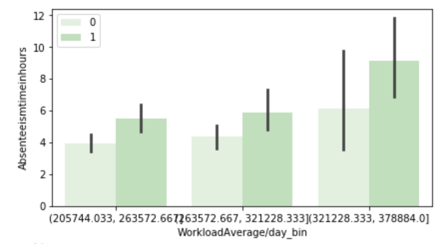
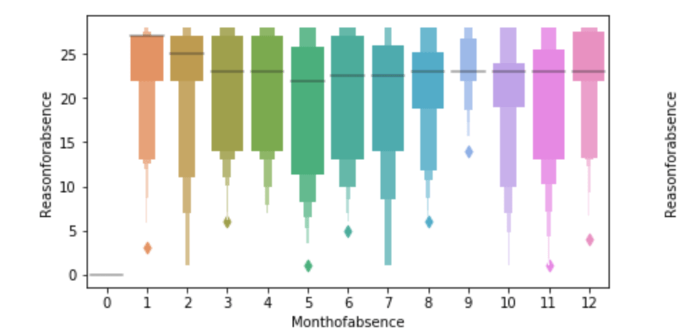
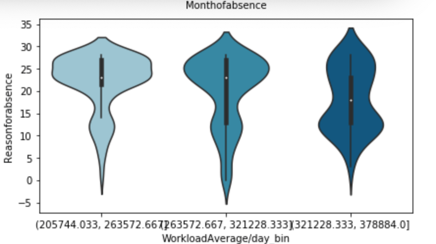
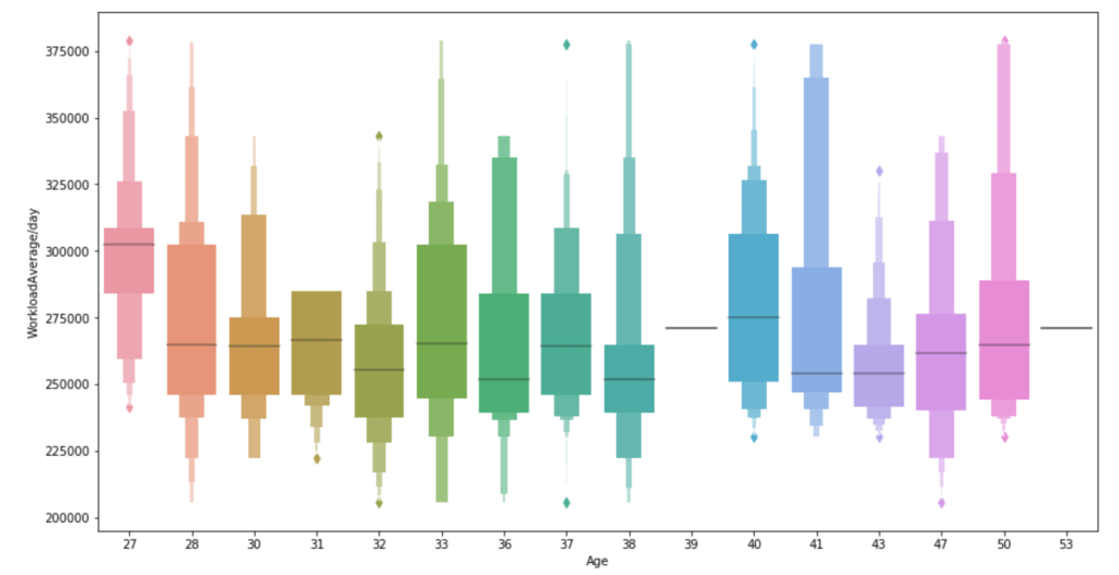
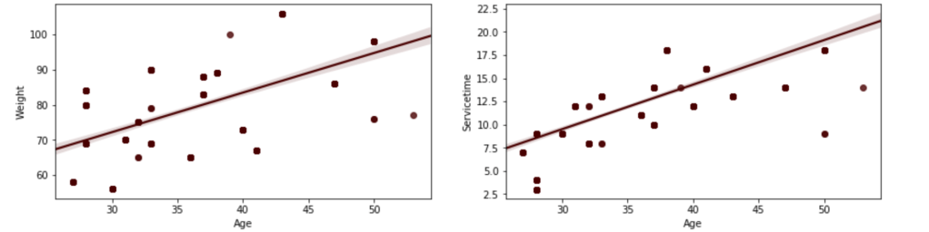
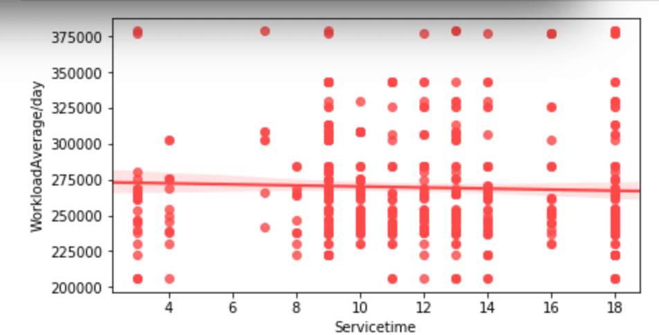
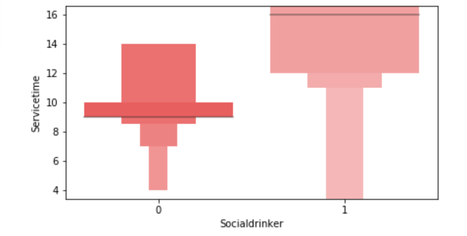
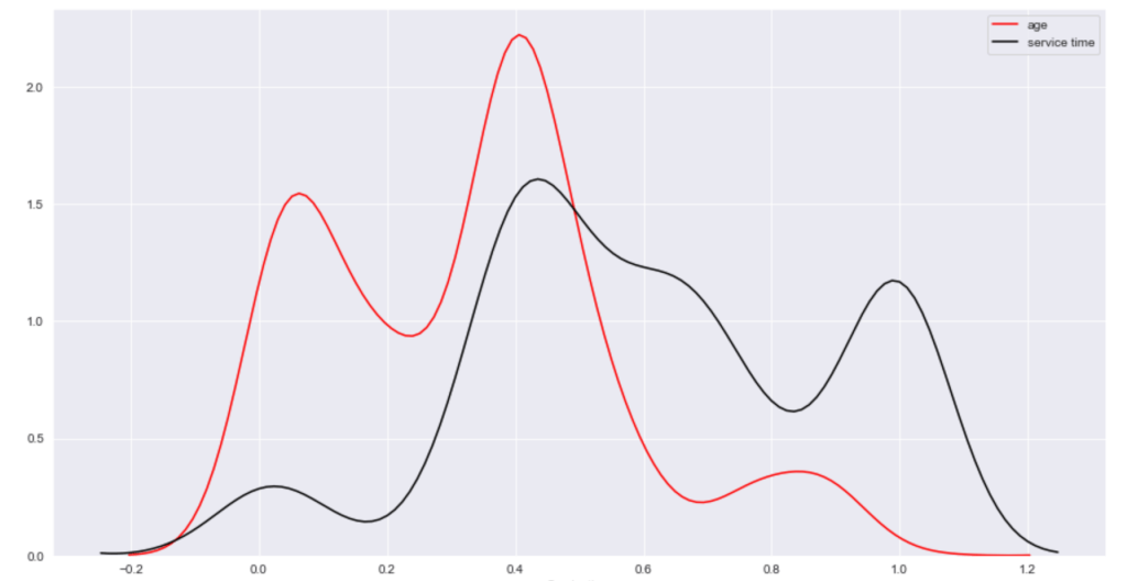
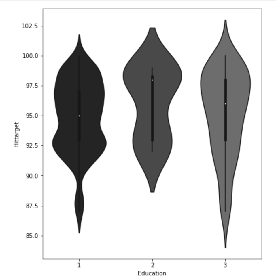
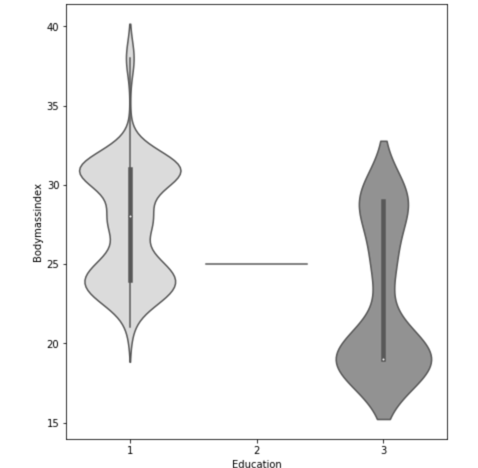
Below, I have displayed a sample of the visuals produced in my exploratory data analysis which I feel tell interesting stories. When an explanation is needed it will be provided.


This concludes the EDA section.
Hypothesis Testing
I’ll do a quick run-through here of some of the hypothesis testing I performed and what I learned. I examined the seasons of the year to see if there was a discrepancy in the absences observed in the Summer and Spring vs Winter and Fall. What I found was that there wasn’t much evidence to say a difference exists. I found with high statistical power that people with higher travel expenses tend to miss more work. This was also the case with people who have longer distances to work. Transportation costs as well as distance to work also have a moderate effect on service time at a company. Age has a moderate effect on whether people tend to smoke or drink socially but not enough to have statistical significance. In addition, there appears to be little correlation with time at the company and whether or not targets were hit. However, this test has low statistical power and has a p-value that is somewhat close to 5% implying that an adjusted alpha may change how we view this test both in terms of type 1 error and statistical power. People with less education tend to drink more as well. Education has a moderate correlation with service time. Anyway, that is very quick recap of the main hypotheses I tested boiled down to the most easy way to communicate their findings.
Clean Data
I started out by binning variables with wildly uneven distributions. Next, I used categorical data encoding to encode all my newly binned features. Next, I applied scaling so that all the data would be within 3 standard deviations of each variable’s mean. Having filtered out misleading values, I binned my target variable into three groups. Next, I removed correlation. I will go back and discuss some of these topics later in this blog when I discuss some of the difficulties I faced.
Model Data
My next step was to split and model my data. One problem came up. I had a huge imbalance among my classes. The “lowest amount of work missed” class had way more than the other two classes. Therefore, I synthetically created new data to have every class have the same amount of cases. To find my most ideal model and then improve it… well I first needed to find the best model. I applied 6 types of scaling across 9 models = 54 results and found that my best model would be a Random Forest model. I even found that adding polynomial features would give me near 100% accuracy on training data without much loss on test data. Anyway, I went back to my random forest model. I found the most indicative features of time missed in order from biggest indicator to smallest indicator were: month, reason for absence, work load, day of the week, season, and social drinker. There are obviously other features, but these are the most predictive ones. The others provide less information.
Problems Faced in Project
The first problem I had was not looking at the distribution of the target variable. It is a continuous variable, however, there are very few values in certain ranges. I therefore split it into three bins; missing little work, a medium amount of work, and a lot of work. I also experimented with having two bins as well as different cutoff points to pick the bins, but three bins worked better. This also affected my upsampling as the different binning methods resulted in different class breakdowns. The next problem I had was a similar one. How would I bin variables? In short, I tried a couple of ways and found that three bins worked well. All this binning was not done using quantiles, by the way. That would imply no target class imbalance which was not the case. I tried using quantiles, but did not find it effective. I also experimented with different categorical feature encoding but found that the most effective method was to bin based on mean value in connection with target variable (check my home page for a blog about that concept). I ran a gridsearch to optimize my random forest at the very end and then printed a confusion matrix. This was not good, but I nee to be intellectually honest. Predicting when someone would fall into class 0 (“missing low amount of work”) my model was amazing and its recall exceeded precision. However, it did not work well on the other two. Now keep in mind that you do not upsample test data and this could be a total fluke. However, that was still frustrating to see. An obvious next step is to collect more data and continue to improve the model. One last idea I want to talk about is exploratory data analysis. Now, to be fair, this could be inserted into any blog. Exploratory data analysis is both fun and interesting as it allows you to be creative and take a dive into your idea using visuals as quick story-tellers. The project I had just scrapped before acquiring the data for this project drove me kind of crazy because I didn’t really have a plan for my exploratory data analysis. It was arbitrary and unending. That is never a good plan. EDA should be planned and thought out. I will talk more / have talked more about this (depending on when you read this blog) in another blog but the main point is you want to think of yourself as person who doesn’t do programming who just wants to ask questions based on the names of the features. Having structure in place for EDA is less free-flowing and exciting than not having structure, but it ensures that you work efficiently and have a good start point as well as stop point. That really helped me save a lot of stress.
Conclusion
It’s time to wrap things up. At this point, I think I would need more data to continue to improve this project, and I’m not sure where that data would come from. In addition, there are a lot of ambiguities in this data set such as the numerical choices for reason for absence. Nevertheless, I think that by doing this project I learned how to create an EDA process and how to take a step back and rephrase your questions as well as rethink your thought process. Just because a variable is continuous, this does not imply it requires regression analysis. Think about your statistical inquiries as questions, think about what makes sense from an outsider’s perspective, and then go crazy!
