Accounting for the Effect of Magnitude in Comparing Features and Building Predictive Models
Introduction
The inspiration for this blog post comes from some hypothesis testing I performed on a recent project. I needed to put all my data on the same scale in order to compare it. If I wanted to compare the population of a country to its GDP, for example, well… it doesn’t sound like a good comparison in the sense that those are apples and oranges. Let me explain. Say we have the U.S. as our country. The population in 2018 was 328M and the GDP was $20T. These are not easy numbers to compare. By scaling these features you can put them on the same level and test relationships. I’ll get more into how we balance them later. However, the benefits of scaling data extend beyond hypothesis testing. When you run a model, you don’t want features to have disproportionate impacts based on magnitude alone. The fact is that features come in all different shapes and sizes. If you want to have an accurate model and understand what is going on, scaling is key. Now you don’t necessarily have to do scaling early on. It might be best after some EDA and cleaning. Also, while it is important for hypothesis testing, you may not want to permanently change the structure of your data just yet.
I hope to use this blog to discuss the scaling systems available from the Scikit-Learn library in python.
Plan
I am going to list all the options listed in the Sklearn documentation (see https://scikit-learn.org/stable/modules/preprocessing.html for more details). Afterward, I will provide some visuals and tables to understand the effects of different types of scaling.
- StandardScaler
- MaxAbsScaler
- MinMaxScaler
- RobustScaler
- PowerTransformer
- QuantileTransformer
But First: Generalized Code
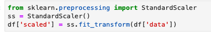
from sklearn.preprocessing import StandardScaler
ss = StandardScaler()
df[‘scaled_data’] = ss.fit_transform(df[[‘data’]])
This code can obviously be generalized to fit other scalers.
Anyway… lets’ get started
Standard Scaler
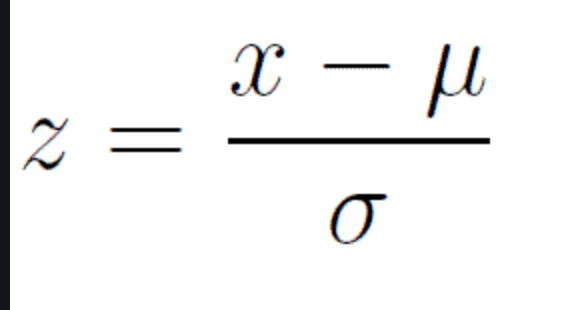
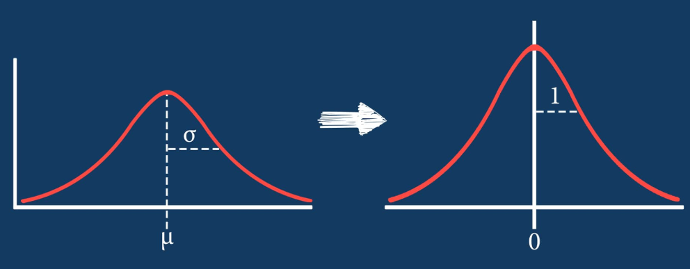
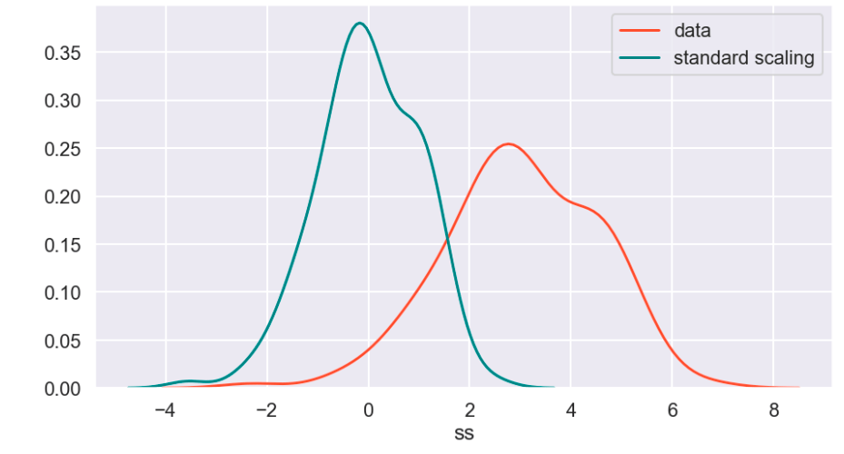
The standard scaler is similar to standardization in statistics. Every value has its overall mean subtracted from it and the final quantity is divided over the feature’s standard deviation. The general effect causes the data to have a mean of zero and a standard deviation of one.
Min Max Scaler

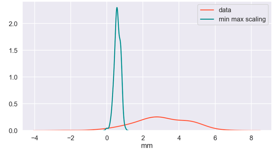
The min max scaler effectively compresses your data to [0,1]. However, one should be careful not to divide by negative values or fractions as that will not yield the most useful results. In addition, it does not deal well with outliers.
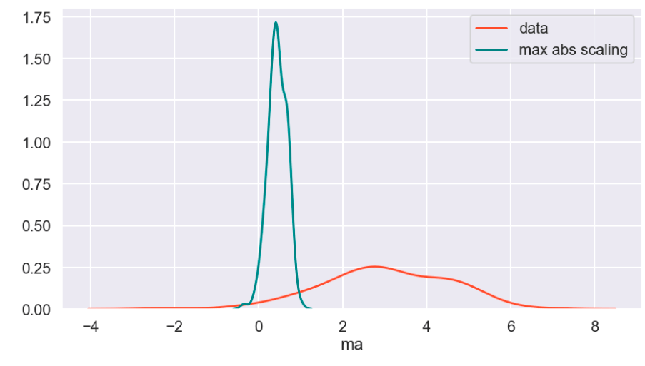
Max Abs Scaler

Here, you divide every value by the maximum absolute value of that feature. Effectively all your data gets put into the [-1,1] range.
Robust Scaler

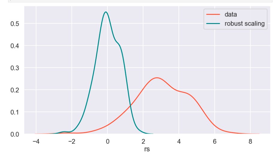
The robust scaler is designed to deal with outliers. It generally applies scaling using the inner-quartile range (IQR). This means that you can specify extremes using quantiles for scaling. What does that mean? If your data follows a standard normal distribution (mean 0, error 1), the 25% quantile is -0.5987 and the 75% quantile is 0.5987 (symmetry is not usually the case – this distribution is special). So once you hit -0.5987, you have covered 1/4 of the data. By 0, you hit 50%, and by 0.5987, you hit 75% of the data. Q1 represents the lower quantile of the two. It’s very similar to min-max-scaling but allows you to control how outliers affect the majority of your data.
Power Transform
According to Sklearn’s website (https://scikit-learn.org/stable/auto_examples/preprocessing/plot_all_scaling.html):
“PowerTransformer applies a power transformation to each feature to make the data more Gaussian-like. Currently, PowerTransformer implements the Yeo-Johnson and Box-Cox transforms. The power transform finds the optimal scaling factor to stabilize variance and mimimize skewness through maximum likelihood estimation. By default, PowerTransformer also applies zero-mean, unit variance normalization to the transformed output. Note that Box-Cox can only be applied to strictly positive data. Income and number of households happen to be strictly positive, but if negative values are present the Yeo-Johnson transformed is to be preferred.”
Quantile Transform
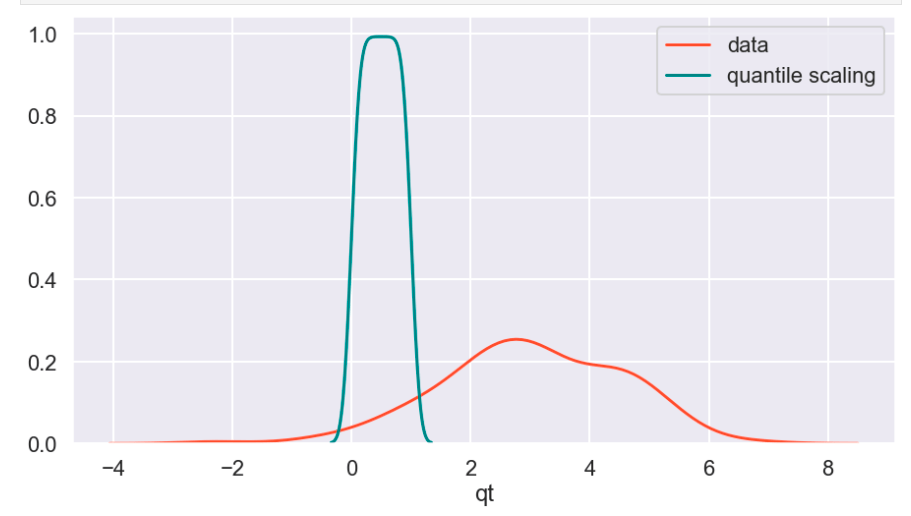
The Sklearn website describes this as a method to coerce one or multiple features into a normal distribution (independently, of course) – according to my interpretation. One interesting effect is that this is not a linear transformation and may change how certain variables interact with one another. In other words – if you were to plot values and just adjust the scale of the axes to match the new scale of the data, it would likely not look the same.
Visuals and Show-and-Tell
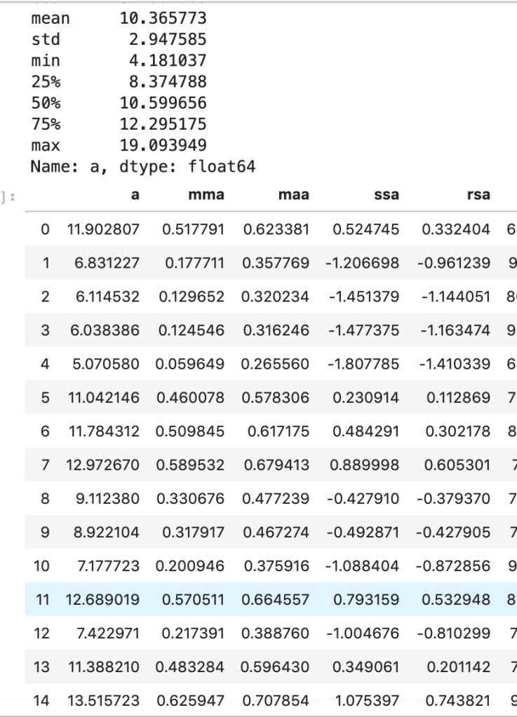
I’ll start with my first set of random data. Column “a” is the initial data (with description in the cell above) and the others are transforms (where the first two letters like maa indicate MaxAbsScaler).
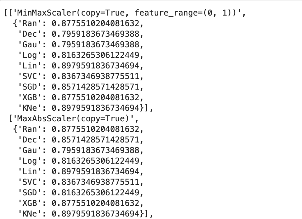
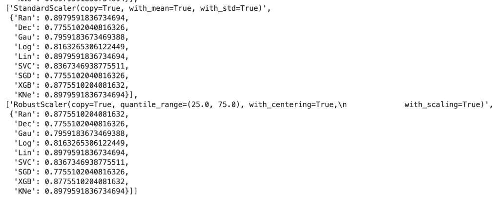
This next output shows 9 models’ accuracy scores across four types of scaling. I recommend every project contain some type of analysis that resembles this to find your optimal model and optimal scaling type (note: Ran = random forest, Dec = decision tree, Gau = Gaussian Naive Bayes, Log = logistic regression, Lin = linear svm, SVC = support vector machine, SGD = stochastic gradient descent, XGB = xgboost, KNe = K nearest neighbors. You can read more about these elsewhere… I may write a blog about this topic later).
More visuals…
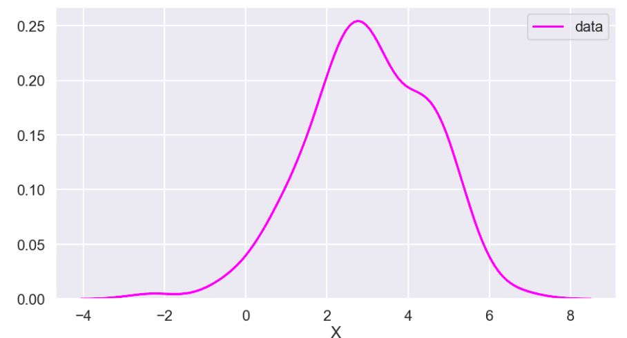
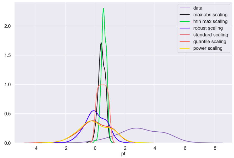
I also generated a set of random data that does not relate to any real world scenario (that I know of) to visualize how these transforms work. Here goes:
So I’ll start with the original data, show everything all together, and then break it into pieces. Everything will be labeled. (Keep in mind that the shape of the basic data may appear to change due to relative scale. Also, I have histograms below which show the frequency of a value in a data set).

Review
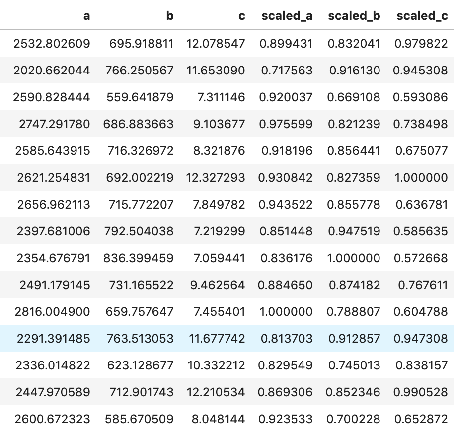
What I have shown above is how one individual feature may be transformed in different ways and how that data would adjust to a new interval (using histograms . What I have not shown is a visual of moving many features to one uniform interval can happen. While this is hard to visualize, I would like to provide the following data frame to get an idea of how scaling features of different magnitudes can change your data.
Conclusion
Scaling is important and essential to almost any data science project. Variables should not have their importance determined based on magnitude alone. Different types of scaling move your data around in different ways and can have moderate to meaningful effects depending on which model you apply them to. Sometimes, you will need to use one method of scaling in specific (see my blog on feature selection and principal component analysis). If that is not the case, I would encourage trying every type of scaling and surveying the results. I recently worked on a project myself where I effectively leveraged featured scaling into creating a metric to determine how valuable individual hockey and basketball players are to their team compared to the rest of the league on a per-season basis. Clearly, the virtues of feature scaling extend beyond just modeling purposes. In terms of models, though, I would expect that feature scaling would change outputs and results in metrics such as coefficients. If this happens, focus on relative relationships. If one coefficient is at… 0.06 and another is at… 0.23, what that tells you is that one feature is nearly 4 times as impactful in output. My point is that don’t let the change in magnitude fool you. You will find a story in your data.
I appreciate you reading my blog and hope you learned something today.


One comment