Introduction
Thanks for visiting my blog today!
To provide some context to today’s blog, I have another blog I have yet to release called “Bank Shot” which talks about NBA salaries. Over there, I talked a little bit about contracts and designing a model to predict NBA player salaries. However, that analysis was pretty short and to the point. Over here, I want to take a deeper and more technical dive into the data as well as the more technical aspects of how I created and tuned my model.
What about the old model?
What do we need to know about the old model? For the purposes of this blog, all we need to know is that it included a lot of individual NBA statistics from the 2017-18 season predicting next year’s salary (look at GitHub for a full list) and that my accuracy when all was said and done sat just below 62%. I was initially pleased with this score until revisiting my project with fresh eyes. After doing so, I made my code more efficient, added meaningful EDA, and had a better accuracy score.
Step 1 – Collect and merge data
My data came from kaggle.com. In addition, it was in the form of a three different files, so I merged them all into one database representing one NBA season even though some of them went a lot further back in history (So that should intuitively be like 450 total rows before accounting for null values; 15 player rosters, 30 teams). Also, even though this doesn’t really belong here, I added a BMI feature before any data cleaning or feature engineering so I might as well mention that.
Step 2 – Hypothesis Testing (Round 1)

Here are a couple inquiries I investigated before feature generation, engineering, and data cleaning. This is not nearly comprehensive. There is so much to investigate so I chose a couple of questions. First: can we say with statistical significance (I’m going to start skipping that prelude) that shorter players shoot better than taller players? Yup! Better yet, we have high statistical power despite a small sample size. In other words, we can trust this finding. Next: do shooting guards shoot 2-pointers better than point guards? We fail to reject the null hypothesis (likely their averages are basically the same) but we have low power. So this finding is harder to trust. However, what we do find, with high statistical power, is that centers shoot 2-pointers better than power forwards. Next: do point guards tend to play more or less minutes than shooting guards? We can say with high power that these players tend to play very similar amounts of minutes. The next logical question is to compare small forwards and centers who, on an absolute basis, play the most and least minutes respectively. Well, as no surprise, we can say with high power that they tend to play different amounts of minutes.
Step 3 – Feature Generation and Engineering
So one of the first things I did here was to generate per game statistics like turning points and games into points per game. Points per games is generally more indicative of scoring ability. Next, I dropped the season totals (in favor of per game statistics) and some other pointless columns. I also created some custom and non-existent stats to see if they would yield any value. An example includes: PER/Games Started – I call this “start efficiency.” Before I dropped more columns to reduce correlation, I did some visual EDA. Let’s talk about that.
Step 4 – EDA
Here is the fun part. Just going to hit you with lots of visuals. Not comprehensive, just some interesting inquiries that can be explained visually.
Distribution of NBA Salaries (ignore numerical axis labels):
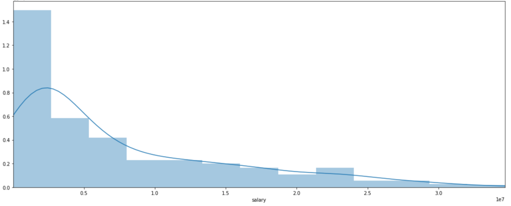
What do we see? Most players don’t make that much money. Some, however, make a lot of money. Interestingly, there is a local peak between x-labels 2 and 2.5. Perhaps this is some representation of the average max salary whereas beyond the salaries get higher but appear far less frequently. That’s just conjecture, keep in mind.
Distribution of Salary by Position (ignore y-axis labels)
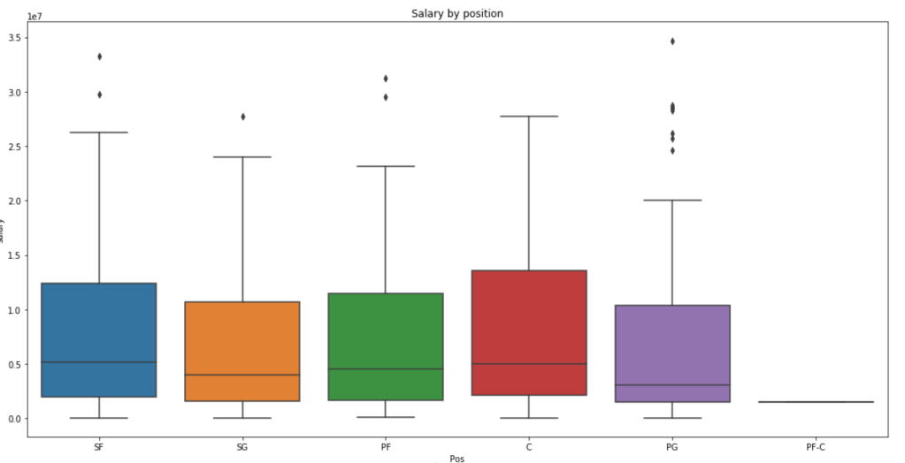
We see here that centers and small forwards have the highest salaries within their interquartile range but the outliers on point guards are more numerous and have a higher maximum. Centers, interestingly, have very few outliers.
Salary by Age
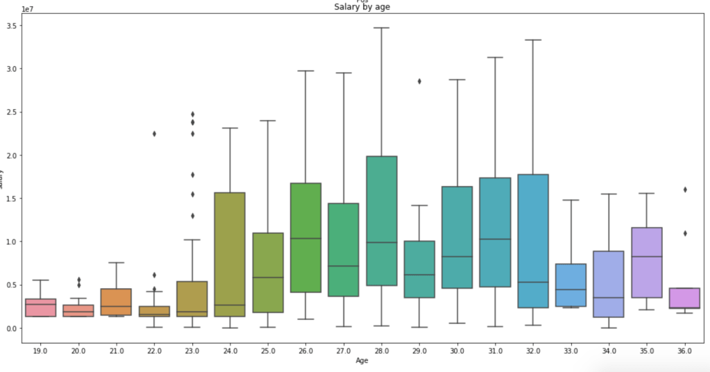
This graph is a little messy so sort it out yourself, but we see that the time players make the most money is between the ages of 24 and 32 on average. Rookie contracts tend to be less lucrative and older players tend to be less relied on, so this visual makes a lot of sense.
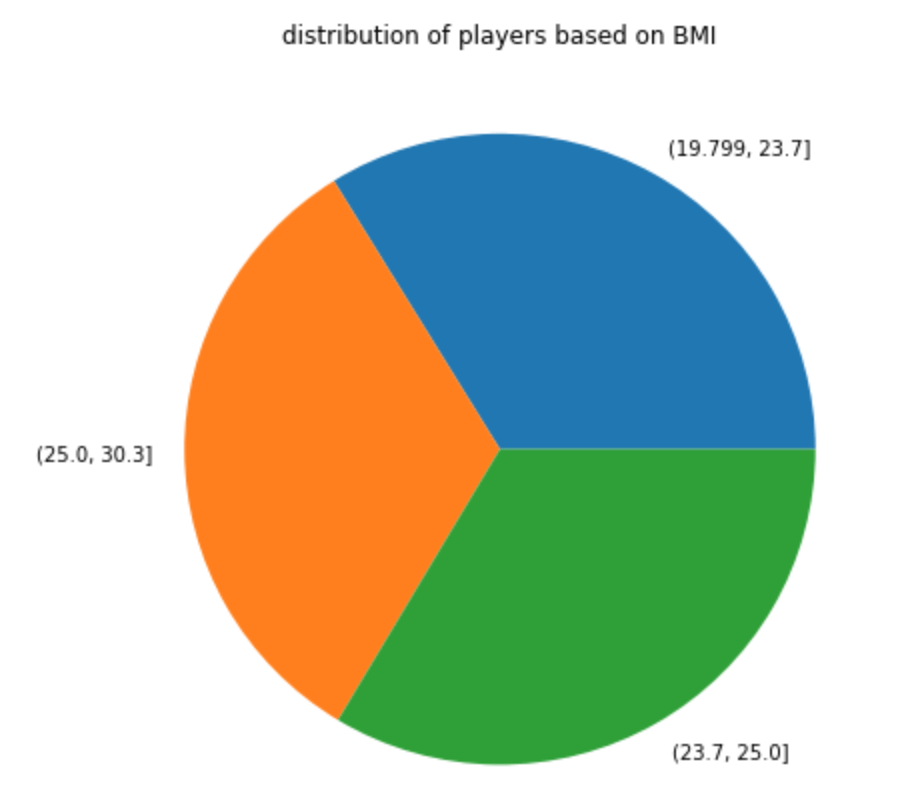
Distribution of BMI
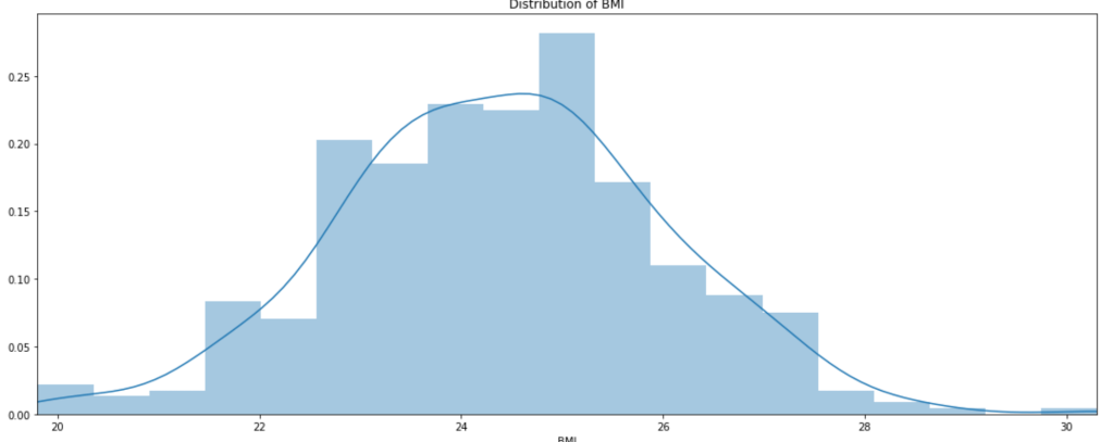
Well, there you have it; BMI is looks normally distributed.
In terms of a pie chart:
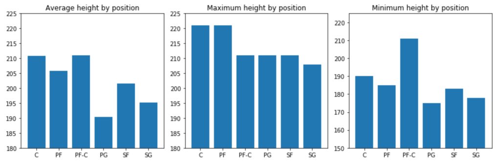
Next: A couple height metrics
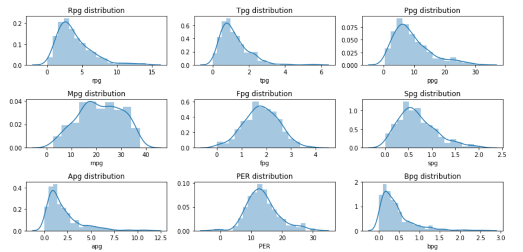
Next: Eight Per Game Distributions and PER
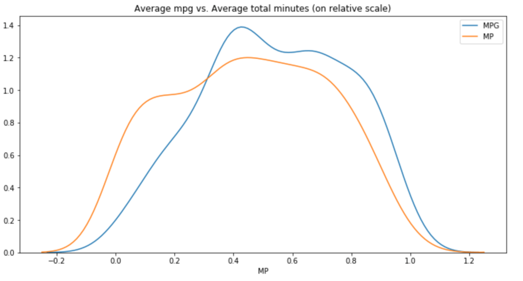
Minutes Per Game vs. Total Minutes (relative scale)
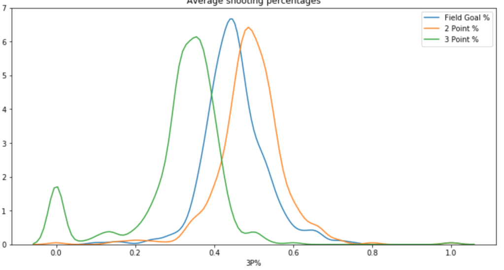
Next is a Chart of Different Shooting Percentages by Type of Shot
Next: Do Assist Statistics and 3-Point% Correlate?
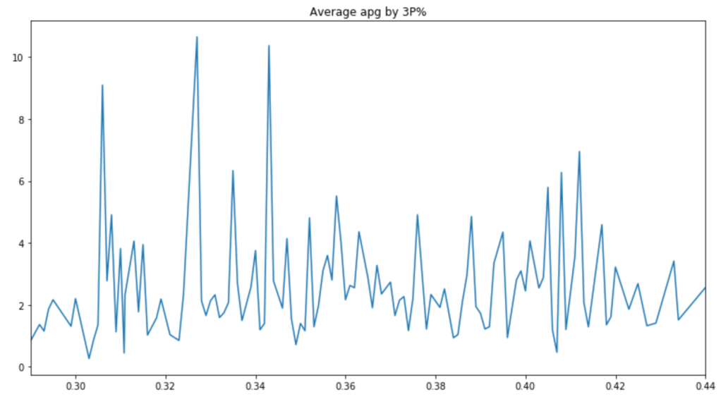
There are a couple peaks, but the graph is pretty messy. Therefore, it is hard to say whether or not players with good 3-Point% get more assists.
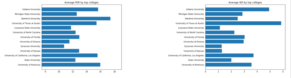
Next, I’d like to look at colleges:
Does OWS correlate to DWS highly?
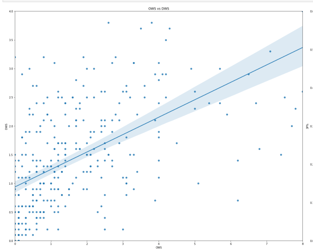
It looks like there is very little correlation observed.
What about scoring by age? We already looked at salary by age.
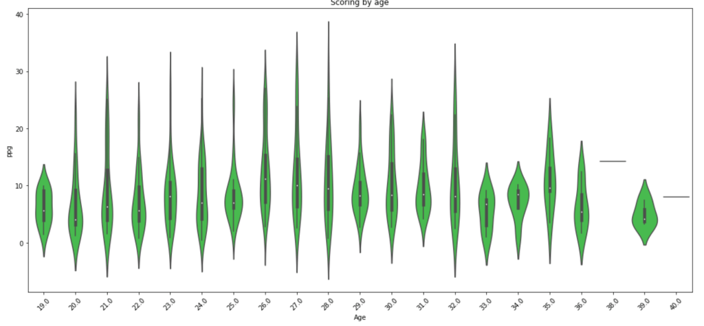
Scoring seems to drop off around 29 years old with a random peak at 32 (weird…).
Step 2A – Hypothesis Testing (Round 2)
Remember how I just created a bunch of features? Time to investigate those features also. Well, one question I had was to compare the older half of the NBA to the younger half. I used the median of 26 to divide my groups. In terms of stats like scoring, rebounding, and PER I found little statistically significant differences. I decided to do an under-30 and 30+ split and check PER. Still nothing doing. Moderately high statistical power was present in this test which leaves room for suggesting that age matters somewhat. This is especially likely since I had to relax alpha in the power formula despite the absurdly high p-value. In other words, the first test said that age doesn’t affect PER one bit with high likelihood, but the power metric suggests that we can’t trust that test enough to be confident. I’ll provide a quick visual to show you what I mean where I measure Power against number of observations. (es = effect size). The following visual actually represents pretty weak power in our PER evaluation. I’ll have a second visual to show what strong power looks like.
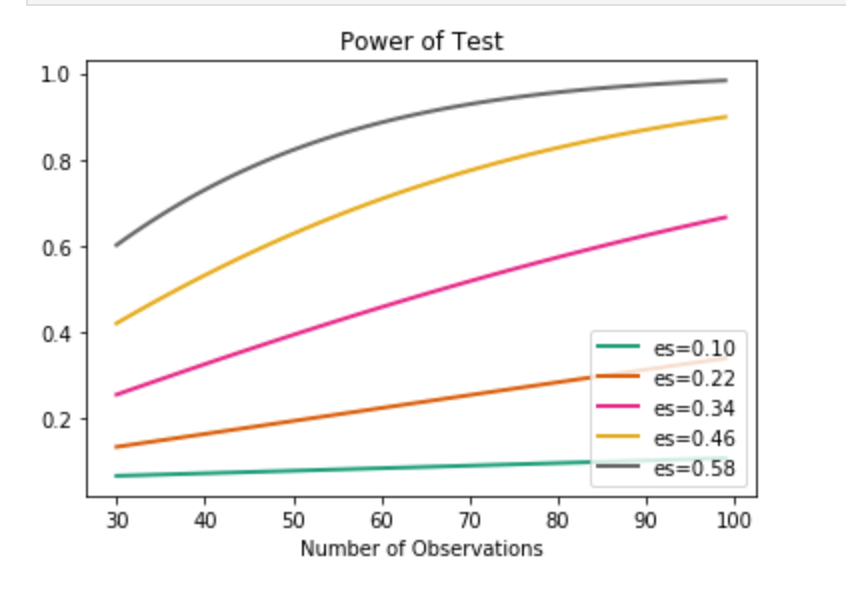
We find ourselves on the orange curve. It’s not promising.
Anyway, I also wanted to see if height and weight correlated highly on a relative scale. Turns out that we can say that they are likely deeply intertwined and have high correlation. This test also has high power, indicating we can trust its result.
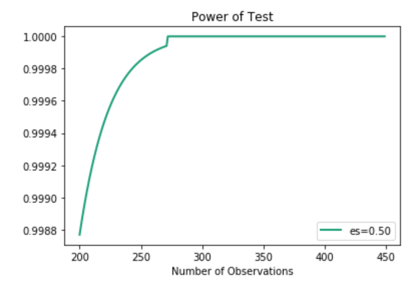
Above, I just showed one curve. As you can see, the effect size is 0.5. In the actual example, however, the effect size is actually much higher. Even with lower effect size, we can see how quickly the power spikes, so I chose to use this visual.
Step 3A – Feature Engineering (Round 2)
When I initially set up my model, I did very little feature engineering and just cut straight to a linear regression model that ultimately wasn’t great. This time around I decided to use pd.qcut(df.column,q) from the Pandas library to bin the values of certain features and generalize my model. I gave the specific code above because it is very powerful and I encourage its use for anyone who wants a quick way to simplify complex projects. for most of the variables I used 4 or 5 different ranges of values. Example (1,10) becomes (1,2 , 2,5 , 5,9 , 9,10). Having simplified the inputs, I encoded all non-numerical data (including my new binned intervals). Next, I removed correlation by dropping highly correlated features while also dropping some other columns of no value.
I’d like to quickly let you know you how I encoded non-numeric variables as it was a great bit of code. There are many ways to deal with categorical or non-numeric data. Often times people use dummy variables (see here for explanation: https://conjointly.com/kb/dummy-variables/) or will assign a numeric value. That means either adding many extra columns or just assigning something like gender the values of 0 and 1. What I did is a little different – and I think everyone should learn this practice. I ran a loop to run through a lot of data so I’ll try and break down what I did for a couple features. Ok… so my goal was to find the mean salary for each subset of a feature. So let’s say (for example only) that average salary is $5M. I then grouped individual features together with the target variable of salary in special data frames organized by the mean salary for each unique value.
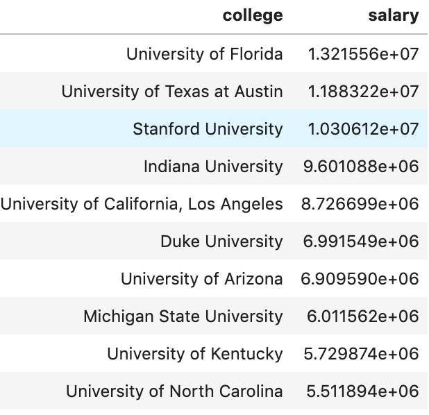
What we see above is an example of this. Here we looked at a couple (hand-picked) universities to see the average salary by that university in the 2017-18 NBA season. I then assigned the numerical value to each occurrence of that college. Now, University of North Carolina is equal to ~5.5M. There we have it! I repeated this process with every variable (and then later applied scaling across all columns).
Here is a look at my code I used.

I run a for loop where cat_list represents all of my categorical features. I then created a local data frame grouping one feature together wit the target. I then created a dictionary using this data and mapped each unique value in the dictionary to each occurrence of those values. Feel free to steal this code.
Step 5 – Model Data
So I actually did two steps together. I ran RFE to reduce my features (dear reader – always reduce the amount of features, it helps a ton) and found I could drop 5 features (36 remain) while coming away with an accuracy of 78%. That’s pretty good! Remember: by binning and reducing features I got my score from ~62% to ~78% on the validation set. Not the train set, the test set. That is higher than my initial score on my initial train set. In other words, the model got way better. (Quick note: I added polynomial features with no real improvement, and if you look at GitHub you will see what I mean).
Step 6 – Findings
What correlates to a high salary? High field goal percentage when compared to true shooting percentage (that’s a custom stat I made), high amounts of free throws taken per game, Start% (games started/total games), STL%, VORP, points per game, blocks per game and rebounds per game to name some top indicators. Steals per game, for example, has low correlation to high salary. I find some of these findings rather interesting, whereas some seem more obvious.
Conclusion
Models can always get better and become more informative. It’s also interesting to revisit a model and compare it to newer information as I’m sure the dynamics of salary are constantly changing, especially with salary cap movements and a growing movement toward more advanced analytics.
Thanks For Stopping By and Have a Great One!